pCharts Attribute Based Control Charts By James Patterson
p-Charts: Attribute Based Control Charts By James Patterson 1/21/2022 1
Topics of Discussion l What is a Control Chart? l What is a p-Chart? l What information does a p-Chart convey? l How are p-Charts developed? l An example from the real world l A sample exercise 1/21/2022 2
What is a Control Chart? A Control Chart is a graphical display of process information which compares item attributes or quantitative values against a standard or reference value, within a series of upper and lower constraint values Adapted From the World Wide Web, 10/02/04: 1/21/2022 http: //www. sytsma. com/tqmtools/pchart. html 3
What is a Control Chart? • Why are control charts used? – To determine if the rate of production of nonconforming products is stable – To detect when a deviation from process stability has occurred Adapted From the World Wide Web, 10/02/04: 1/21/2022 http: //deming. eng. clemson. edu/pub/tutorials/qctools/ccmain 1. htm 4
What is a Control Chart? • Control charts are good for: – – – Improving Productivity Preventing Defects Preventing Unnecessary Process Adjustments Provide Diagnostic Information Provide Information About Process Capability From the World Wide Web: 1/21/2022 http: //deming. eng. clemson. edu/pub/tutorials/qctools/ccmain 1. htm 5
What are the features of a control chart? • A graphical representation of a range of acceptable values that suggest whether or not a process is in control • Contains a reference or optimum target value, an upper control limit, and a lower control limit 1/21/2022 6
What is a p-Chart? • A process control chart that measures a proportion of defective or nonconforming items within a sample or population 1/21/2022 7
What information does a p-Chart convey? • An element or item under inspection may have one or more definable attributes… (an attribute is an intrinsic property of a given item that either does or does not exist) • If any one of the inspected attributes is nonconforming, the entire item is counted as nonconforming • The number of items in the sample that are determined to be nonconforming are summed and a proportion of the total is evaluated 1/21/2022 8
What information does a p-Chart convey? • The p-Chart is a graph of the proportion of nonconforming items in each sample or population • The graph is then used to determine whether or not a process is stable 1/21/2022 9
Rationale for a p-Chart • What is the statistical basis for p-Charts? • The Binomial Distribution – Binomial probability distributions exist when the element in question can have only two possible values, each of which is mutually exclusive of the other. – For example: Is the item defective? Yes or No? It cannot be both Yes AND No. 1/21/2022 10
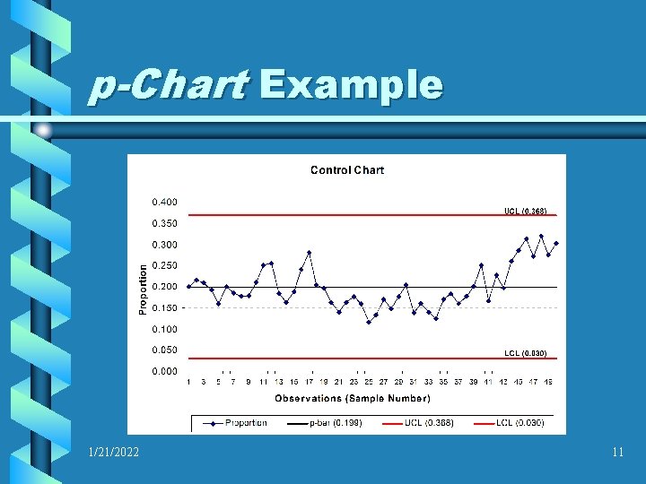
p-Chart Example 1/21/2022 11
Collecting a dataset for a p-Chart • The data required for a p-Chart should meet the following criteria: – Subgroup Sample Size (n) ≥ 50 • Sample size may be up to 100 or more, but between 50 and 100 is adequate – Number of subgroups (or samples taken) ≥ 25 1/21/2022 12
Collecting a dataset for a p-Chart • The data required for a p-Chart should meet the following criteria: – When gathering data in the subgroup samples, it is preferable (but not mandatory) that the sample sizes be the same – If sample sizes are not the same, a different calculation will be required 1/21/2022 13
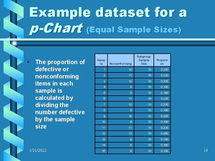
Example dataset for a p-Chart (Equal Sample Sizes) • The proportion of defective or nonconforming items in each sample is calculated by dividing the number defective by the sample size 1/21/2022 Nonconforming Subgroup Sample Size Proporti on 1 10 50 0. 200 2 11 50 0. 220 3 10 50 0. 200 4 9 50 0. 180 5 8 50 0. 160 6 11 50 0. 220 7 10 50 0. 200 8 9 50 0. 180 9 10 50 0. 200 10 9 50 0. 180 11 11 50 0. 220 12 13 50 0. 260 13 9 50 0. 180 14 8 50 0. 160 15 9 50 0. 180 Samp le 14
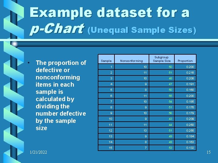
Example dataset for a p-Chart (Unequal Sample Sizes) • The proportion of defective or nonconforming items in each sample is calculated by dividing the number defective by the sample size 1/21/2022 Sample Subgroup Sample Size Nonconforming Proportion 1 10 50 0. 200 2 11 51 0. 216 3 10 48 0. 208 4 9 47 0. 191 5 8 50 0. 160 6 11 55 0. 200 7 10 54 0. 185 8 9 51 0. 176 9 10 56 0. 179 10 9 43 0. 209 11 11 44 0. 250 12 13 51 0. 255 13 9 49 0. 184 14 8 49 0. 163 15 7 53 0. 132 15
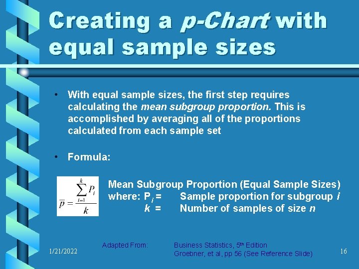
Creating a p-Chart with equal sample sizes • With equal sample sizes, the first step requires calculating the mean subgroup proportion. This is accomplished by averaging all of the proportions calculated from each sample set • Formula: Mean Subgroup Proportion (Equal Sample Sizes) where: Pi = Sample proportion for subgroup i k = Number of samples of size n 1/21/2022 Adapted From: Business Statistics, 5 th Edition Groebner, et al, pp 56 (See Reference Slide) 16
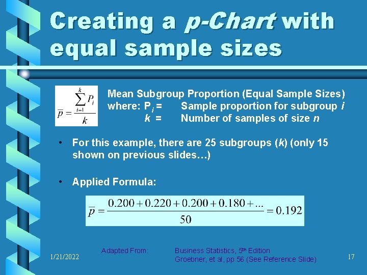
Creating a p-Chart with equal sample sizes Mean Subgroup Proportion (Equal Sample Sizes) where: Pi = Sample proportion for subgroup i k = Number of samples of size n • For this example, there are 25 subgroups (k) (only 15 shown on previous slides…) • Applied Formula: 1/21/2022 Adapted From: Business Statistics, 5 th Edition Groebner, et al, pp 56 (See Reference Slide) 17
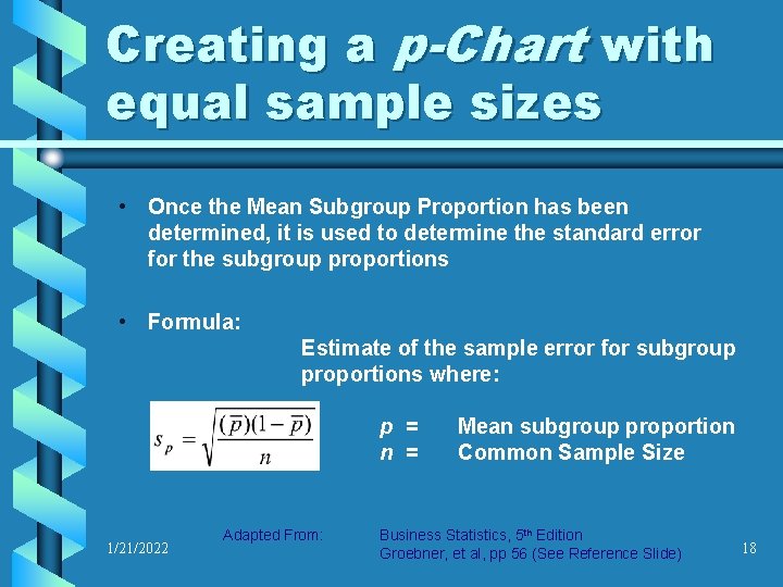
Creating a p-Chart with equal sample sizes • Once the Mean Subgroup Proportion has been determined, it is used to determine the standard error for the subgroup proportions • Formula: Estimate of the sample error for subgroup proportions where: p = n = 1/21/2022 Adapted From: Mean subgroup proportion Common Sample Size Business Statistics, 5 th Edition Groebner, et al, pp 56 (See Reference Slide) 18
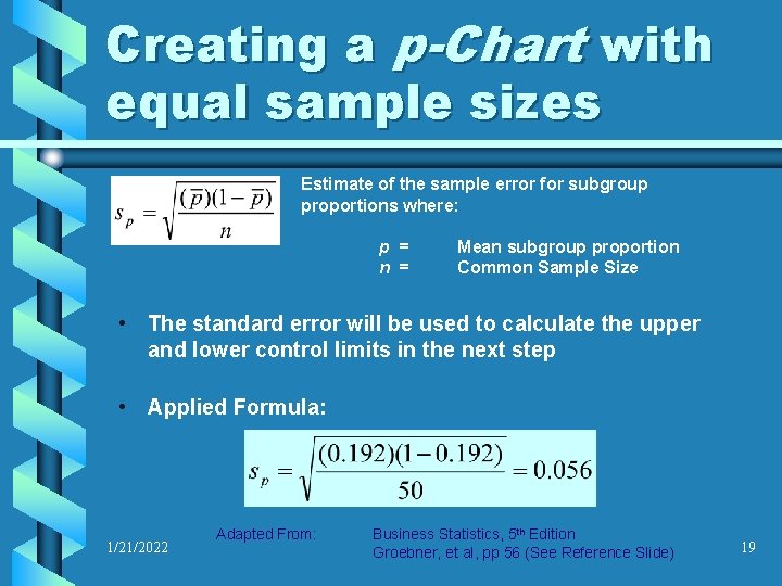
Creating a p-Chart with equal sample sizes Estimate of the sample error for subgroup proportions where: p = n = Mean subgroup proportion Common Sample Size • The standard error will be used to calculate the upper and lower control limits in the next step • Applied Formula: 1/21/2022 Adapted From: Business Statistics, 5 th Edition Groebner, et al, pp 56 (See Reference Slide) 19
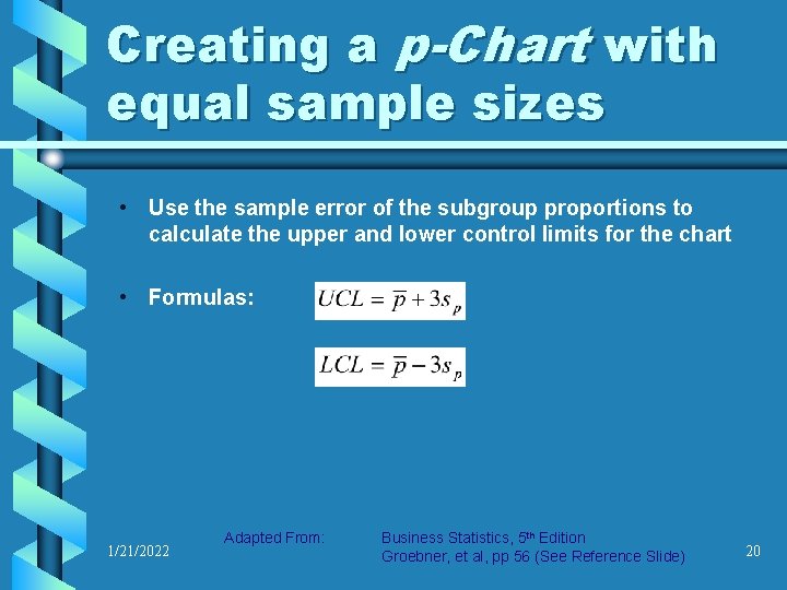
Creating a p-Chart with equal sample sizes • Use the sample error of the subgroup proportions to calculate the upper and lower control limits for the chart • Formulas: 1/21/2022 Adapted From: Business Statistics, 5 th Edition Groebner, et al, pp 56 (See Reference Slide) 20
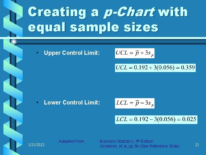
Creating a p-Chart with equal sample sizes • Upper Control Limit: • Lower Control Limit: 1/21/2022 Adapted From: Business Statistics, 5 th Edition Groebner, et al, pp 56 (See Reference Slide) 21
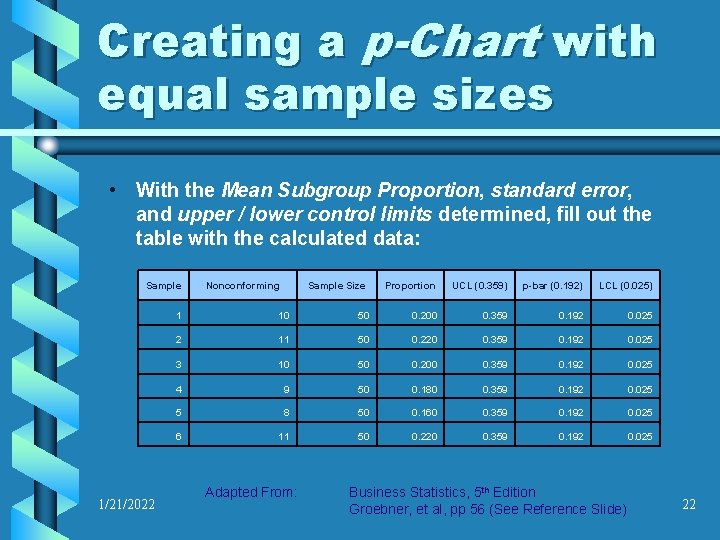
Creating a p-Chart with equal sample sizes • With the Mean Subgroup Proportion, standard error, and upper / lower control limits determined, fill out the table with the calculated data: Sample 1/21/2022 Nonconforming Sample Size Proportion UCL (0. 359) p-bar (0. 192) LCL (0. 025) 1 10 50 0. 200 0. 359 0. 192 0. 025 2 11 50 0. 220 0. 359 0. 192 0. 025 3 10 50 0. 200 0. 359 0. 192 0. 025 4 9 50 0. 180 0. 359 0. 192 0. 025 5 8 50 0. 160 0. 359 0. 192 0. 025 6 11 50 0. 220 0. 359 0. 192 0. 025 Adapted From: Business Statistics, 5 th Edition Groebner, et al, pp 56 (See Reference Slide) 22
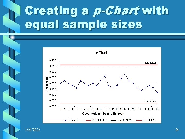
Creating a p-Chart with equal sample sizes • The data table has been completed, and all of the information necessary to construct the p-Chart is compiled. • The upper and lower control limits, as well as the “pbar” (Mean Subgroup Proportion) lines are fitted to the graph. These should be equally spaced horizontal lines, plotted as a line graph / chart • Plot the subgroup proportions on the line graph… 1/21/2022 23
Creating a p-Chart with equal sample sizes 1/21/2022 24
Creating a p-Chart with unequal sample sizes • If the subgroup sample sizes are not equal, a slightly different approach is required for calculating the upper and lower control limits. • First, begin by calculating the mean subgroup proportion, using the same method as was done in the equal sample size example 1/21/2022 Adapted From: Business Statistics, 5 th Edition Groebner, et al, pp 56 (See Reference Slide) 25
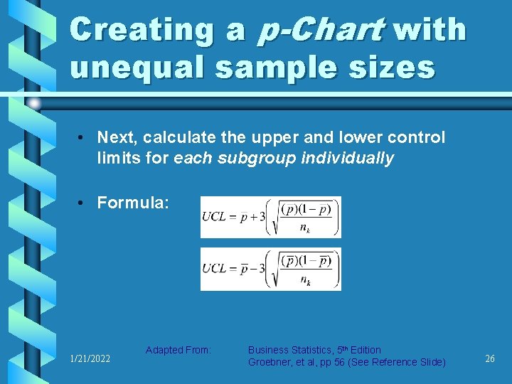
Creating a p-Chart with unequal sample sizes • Next, calculate the upper and lower control limits for each subgroup individually • Formula: 1/21/2022 Adapted From: Business Statistics, 5 th Edition Groebner, et al, pp 56 (See Reference Slide) 26
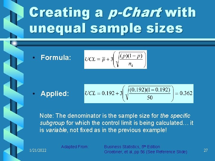
Creating a p-Chart with unequal sample sizes • Formula: • Applied: Note: The denominator is the sample size for the specific subgroup for which the control limit is being calculated… it is variable, not fixed as in the previous example! 1/21/2022 Adapted From: Business Statistics, 5 th Edition Groebner, et al, pp 56 (See Reference Slide) 27
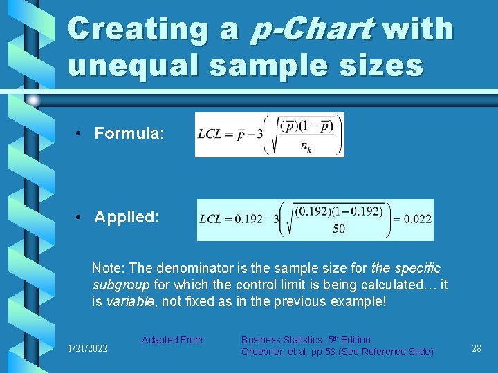
Creating a p-Chart with unequal sample sizes • Formula: • Applied: Note: The denominator is the sample size for the specific subgroup for which the control limit is being calculated… it is variable, not fixed as in the previous example! 1/21/2022 Adapted From: Business Statistics, 5 th Edition Groebner, et al, pp 56 (See Reference Slide) 28
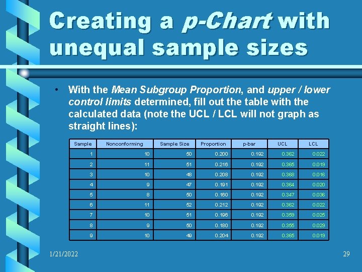
Creating a p-Chart with unequal sample sizes • With the Mean Subgroup Proportion, and upper / lower control limits determined, fill out the table with the calculated data (note the UCL / LCL will not graph as straight lines): Sample 1/21/2022 Nonconforming Sample Size Proportion p-bar UCL LCL 1 10 50 0. 200 0. 192 0. 362 0. 022 2 11 51 0. 216 0. 192 0. 365 0. 019 3 10 48 0. 208 0. 192 0. 368 0. 016 4 9 47 0. 191 0. 192 0. 364 0. 020 5 8 50 0. 160 0. 192 0. 347 0. 036 6 11 52 0. 212 0. 192 0. 362 0. 022 7 10 51 0. 196 0. 192 0. 359 0. 025 8 9 50 0. 180 0. 192 0. 355 0. 029 9 10 49 0. 204 0. 192 0. 365 0. 019 29
Creating a p-Chart with unequal sample sizes • The data table has been completed, and all of the information necessary to construct the p-Chart is compiled. • The upper and lower control limits, as well as the “pbar” (Mean Subgroup Proportion) lines are fitted to the graph. Note that the upper and lower control limits will not be straight lines, and should be mirror images of one another • Plot the subgroup proportions on the line graph… 1/21/2022 30
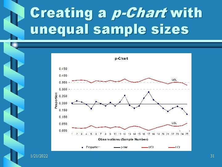
Creating a p-Chart with unequal sample sizes 1/21/2022 31
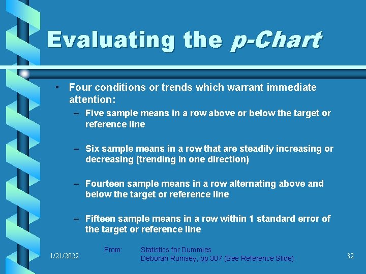
Evaluating the p-Chart • Four conditions or trends which warrant immediate attention: – Five sample means in a row above or below the target or reference line – Six sample means in a row that are steadily increasing or decreasing (trending in one direction) – Fourteen sample means in a row alternating above and below the target or reference line – Fifteen sample means in a row within 1 standard error of the target or reference line 1/21/2022 From: Statistics for Dummies Deborah Rumsey, pp 307 (See Reference Slide) 32
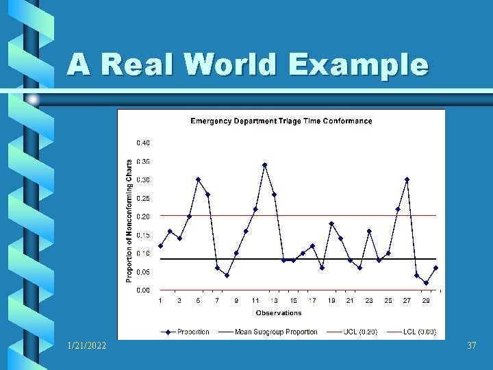
A Real World Example A local hospital emergency department manager keeps track of whether or not patients that are awaiting treatment are interviewed by the triage nurse within a standard time, established by the department’s medical director. The medical staff requests that the patients be interviewed within 10 minutes of arrival to the emergency department waiting room. Each day, 50 charts are reviewed, and the triage time is compared with the administration desk sign in time. If the time elapsed is greater than 10 minutes, the chart is counted as “nonconforming. ” 1/21/2022 33
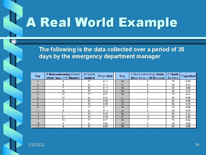
A Real World Example The following is the data collected over a period of 30 days by the emergency department manager 1/21/2022 34
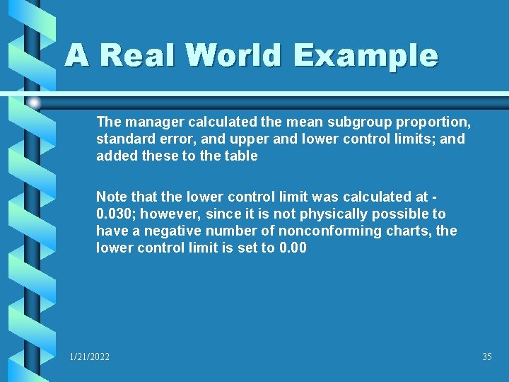
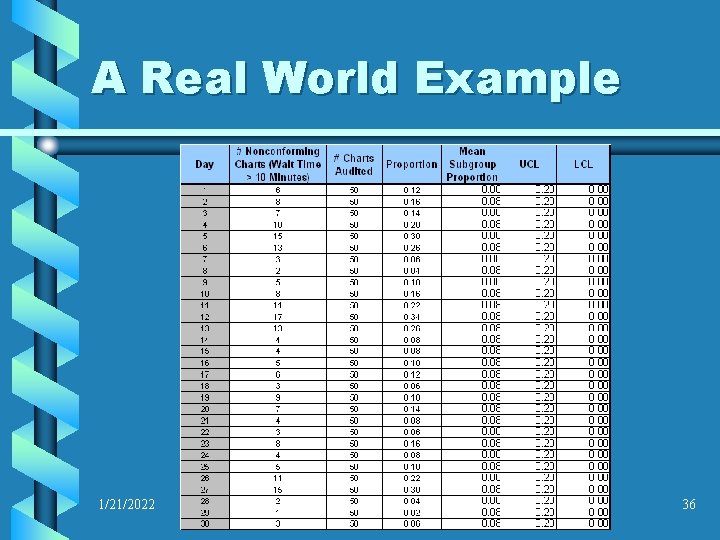
A Real World Example The manager calculated the mean subgroup proportion, standard error, and upper and lower control limits; and added these to the table Note that the lower control limit was calculated at 0. 030; however, since it is not physically possible to have a negative number of nonconforming charts, the lower control limit is set to 0. 00 1/21/2022 35
A Real World Example 1/21/2022 36
A Real World Example 1/21/2022 37
A Real World Example Interpretation of the chart: The department manager was concerned with several aspects of the stability of the triage process. It was obvious that patients were not consistently being seen within the 10 minute requested time, but there appeared to be a pattern to it. When the department manager compared the numerous peaks to the calendar, he noted that this was consistently occurring on weekends, when patient volume was highest. He decided to adjust staffing levels to see if this would rectify the problem. 1/21/2022 38
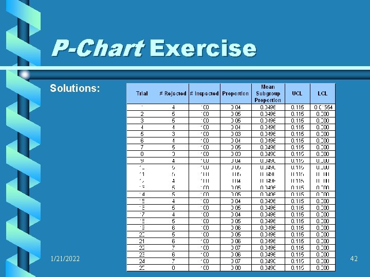
P-Chart Exercise As the quality assurance manager for a small, contract manufacturing company, you have been notified by a customer that several recent orders have been rejected due to nonconforming defects that were unacceptable. The customer identified three separate defect categories; however, any one defect would cause the whole part to be rejected. You have decided to evaluate the process by running several batches through production and then counting the number of parts that fail inspection for any reason. The data you collect is on the following page 1/21/2022 39
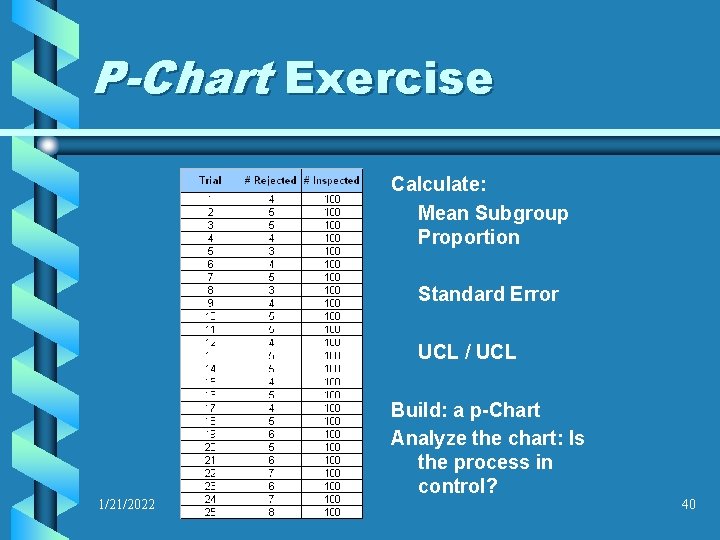
P-Chart Exercise Calculate: Mean Subgroup Proportion Standard Error UCL / UCL 1/21/2022 Build: a p-Chart Analyze the chart: Is the process in control? 40
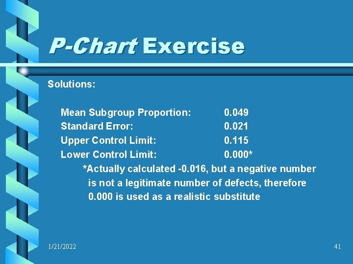
P-Chart Exercise Solutions: Mean Subgroup Proportion: 0. 049 Standard Error: 0. 021 Upper Control Limit: 0. 115 Lower Control Limit: 0. 000* *Actually calculated -0. 016, but a negative number is not a legitimate number of defects, therefore 0. 000 is used as a realistic substitute 1/21/2022 41
P-Chart Exercise Solutions: 1/21/2022 42
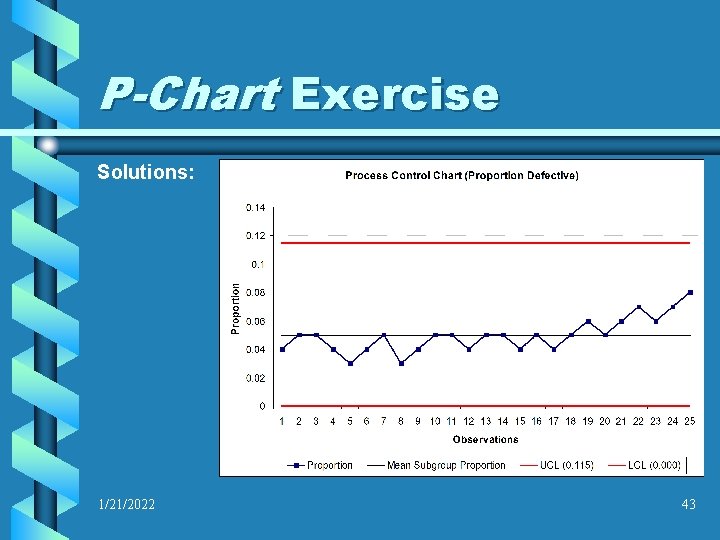
P-Chart Exercise Solutions: 1/21/2022 43
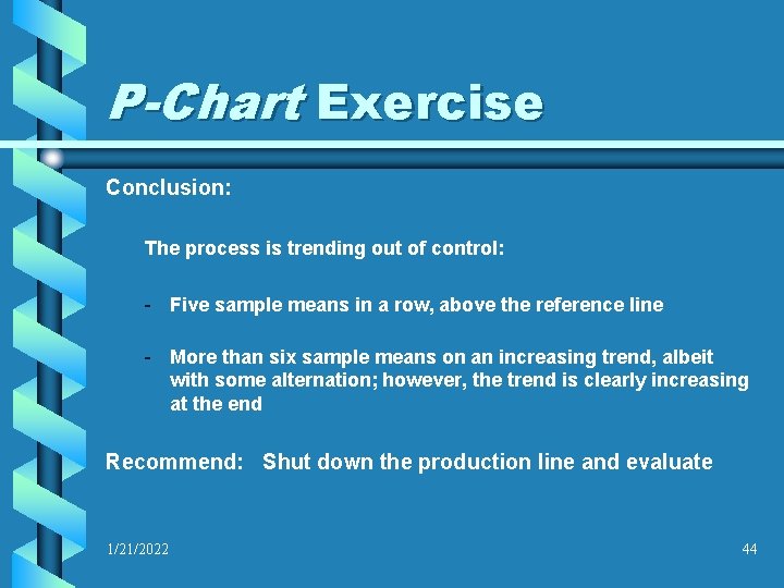
P-Chart Exercise Conclusion: The process is trending out of control: - Five sample means in a row, above the reference line - More than six sample means on an increasing trend, albeit with some alternation; however, the trend is clearly increasing at the end Recommend: Shut down the production line and evaluate 1/21/2022 44
References Rumsey, Deborah (2003). Statistics for Dummies. Hoboken, NJ: Wiley Publishing, Inc. Jaising, Lloyd (2000). Statistics for the Utterly Confused. New York, NY: Mc. Graw-Hill Groebner, David F. , Shannon, Patrick W. , Fry, Phillip C. , Smith, Kent D. (2001). Business Statistics: A Decision Making Approach, 5 th Edition. Upper Saddle River, NJ: Prentice Hall, Inc. Foster, S. Thomas (2004). Managing Quality: An Integrative Approach. Upper Saddle River, NJ: Prentice Hall, Inc. 1/21/2022 45
p-Charts: Attribute Based Control Charts By James Patterson 1/21/2022 46
- Slides: 46