Overview of Data Visualization Tufte Turning Data into


- Slides: 23
Overview of Data Visualization
Tufte? Turning Data into Art The purpose of visualization is insight, not pictures. - Henry D Hubbard Visualizations act as a campfire around which we gather to tell stories. - Al Shalloway Above all else, show the data. - Edward Tufte
Data from 2014 Ebola Outbreak WHO report date Total Cases, Guinea Total Deaths, Guinea Total Cases, Liberia Total Deaths, Liberia Total Cases, Sierra Leone Total Deaths, Sierra Leone 7/24/14 7/28/14 7/31/14 8/3/14 8/4/14 8/8/14 8/12/14 8/13/14 8/15/14 8/19/14 8/21/14 8/22/14 8/28/14 9/6/14 9/8/14 9/12/14 9/16/14 9/18/14 9/22/14 9/24/14 9/26/14 10/1/14 10/3/14 10/8/14 10/10/14 10/15/14 10/17/14 10/22/14 10/25/14 10/29/14 10/31/14 11/5/14 11/7/14 11/12/14 11/14/14 415 427 460 472 485 495 506 510 519 543 579 607 648 812 861 936 942 1008 1022 1074 1157 1199 1298 1350 1472 1519 1540 1553 1906 1667 1731 1760 1878 1919 314 319 339 346 358 367 373 377 380 394 396 406 430 517 555 557 595 601 632 635 648 710 739 768 778 843 862 904 926 997 1018 1041 1054 1142 1166 224 249 329 391 486 554 599 670 786 834 972 1082 1378 1871 2046 2081 2407 2710 3022 3280 3458 3696 3834 3924 4076 4249 4262 4665 6535 6525 6619 6822 6878 127 129 156 227 255 294 323 355 348 466 576 624 694 1089 1224 1137 1296 1459 1578 1677 1830 1998 2069 2210 2316 2458 2484 2705 2413 2697 2766 2836 2812 454 525 533 574 646 717 730 783 810 848 907 910 1026 1261 1361 1424 1620 1673 1813 1940 2021 2304 2437 2789 2950 3252 3410 3706 3896 5235 5338 4759 4862 5368 5586 219 224 233 252 273 298 315 334 348 365 374 392 422 491 509 524 562 593 597 605 622 623 879 930 1183 1200 1359 1281 1500 1510 1070 1130 1169 1187
Line Graph Image: www. CDC. gov
Map Image: www. CDC. gov
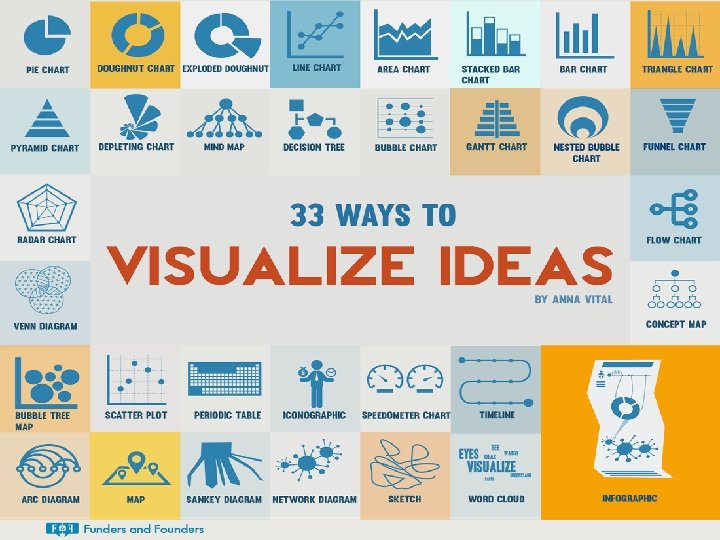
Infographic
Data Visualization • Data Visualization helps to visually represent data • Helps tell the story • Great tool for advocacy and decision making • Aids visual perception and cognitive thinking
More Examples
Traditional Designs Image: GHe. L
Infographics and Dashboards
Reality to People’s Brains Image: datathenewoil. com
Reality of data visualization in health
Important Steps Image: GHe. L
Know your Audience • Align data visualizations with the goals of your stakeholders • Consider their literacy • Don’t assume everyone is comfortable with technology • Think about how your audience will use the visualizations
Find your Story • Look for patterns, trends, and surprises • Compare and contrast • Avoid cherry picking • Avoid exaggeration
Consider design • Choose the right image to represent your data • Try sketching on paper to brainstorm In-Service Training Needs of all Nurses in X District Family Planning MNCH Infectious Diseases HIV Malaria Chronic Disesase 140 120 Family Planning 100 19% 25% MNCH 80 Infectious Disease 60 HIV Malaria 40 9% 23% 10% 14% Chronic Diseases 20 0 2011 2012 2013 2014 2015
Share and Communicate • Obtain input and feedback from your colleagues • Sharing data visualization can help improve awareness and use of data • Consider sharing through social media
m. Hero and Data Visualization • Some tools are available in Rapidi. Pro • Good data analysis will help you tell a story about data from: • A full workflow • Multiple workflows on a health worker or a facility’s needs • Overall use of m. Hero in a facility; country • Infographics for awareness raising
Build with Tools You Know • • Maintain focus for your target audience Simple images Keep data focused Ensure it is easy to read Include a great headline Make sure the information flows Cite your sources
Build with Tools You Know • Use Excel to Create Pie Charts, Line Graphs, Scatter Plots and more • Helpful tip is to use the Filter to help identify data you want to use. This can help you identify the counts you need for making charts.
Want to Learn More • Deep Dive into Ghel Course: https: //www. globalhealthlearning. org/c ourse/data-visualization-introduction • Read Edward Tufte, Alberto Cairo • Obtain training using Arc. GIS, Tableau, Easel. ly, Picktochart or Infogra. am • Another great source: www. datavizhub. co • Checkout blogger Cole Knaflic at www. storytellingwithdata. com
Thank you! © Intra. Health International. This document is made available under a Creative Commons Attribution-Share. Alike 4. 0 International: https: //creativecommons. org/licenses/by-sa/4. 0/ This information is made possible by the generous support of the American people through the United States Agency for International Development (USAID). The contents are the responsibility of Intra. Health International and do not necessarily reflect the views of USAID or the United States Government.