Overall design standards 2 Overall design standards There










- Slides: 30


Overall design standards 2

Overall design standards • There are five basic slide samples presented here to help you build a Power. Point® presentation: • Cover slide with David Geffen School of Medicine and UCLA Health logo • Section • Title title slide + Text slides • Photo slides • Other slides • Select and edit any of the following sample slides to create your own custom presentation. 3

Overall design standards • These standards are a tool to help guide you • These sample slides will not cover every design challenge needed in a Power. Point presentation • By using these standards for color, type size, backgrounds and placement, a presentation can be created that is in keeping with our brand 4

Overall design standards • Please follow these basic guidelines when creating a new presentation: • The cover slide should always be the first and last slide of every presentation • Never • change the background color of a slide This means never use a photo, illustration or pattern for the background of any slide that contains copy • All slide transitions should be set to default; no animation should be applied 5


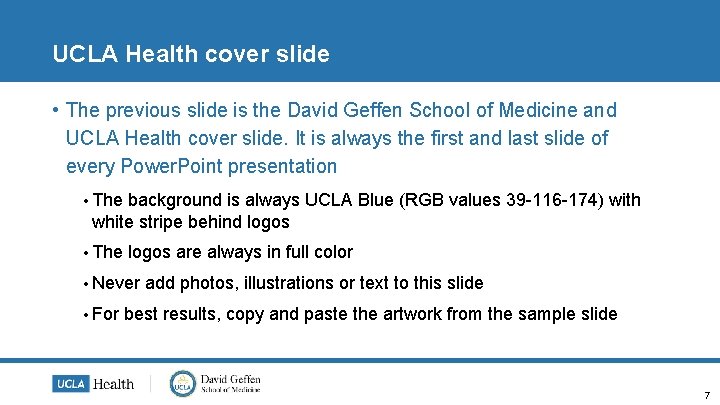
UCLA Health cover slide • The previous slide is the David Geffen School of Medicine and UCLA Health cover slide. It is always the first and last slide of every Power. Point presentation • The background is always UCLA Blue (RGB values 39 -116 -174) with white stripe behind logos • The logos are always in full color • Never • For add photos, illustrations or text to this slide best results, copy and paste the artwork from the sample slide 7

Section title Slide 8

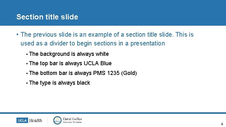
Section title slide • The previous slide is an example of a section title slide. This is used as a divider to begin sections in a presentation • The background is always white • The top bar is always UCLA Blue • The bottom bar is always PMS 1235 (Gold) • The type is always black 9

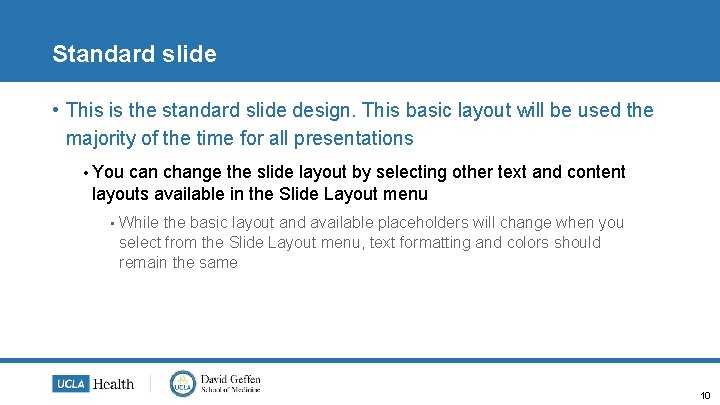
Standard slide • This is the standard slide design. This basic layout will be used the majority of the time for all presentations • You can change the slide layout by selecting other text and content layouts available in the Slide Layout menu • While the basic layout and available placeholders will change when you select from the Slide Layout menu, text formatting and colors should remain the same 10

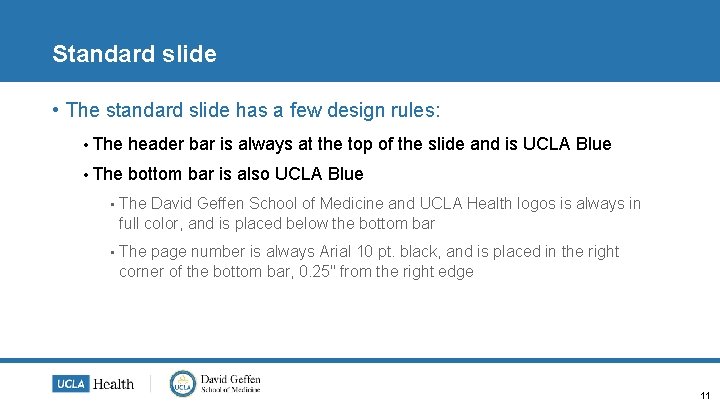
Standard slide • The standard slide has a few design rules: • The header bar is always at the top of the slide and is UCLA Blue • The bottom bar is also UCLA Blue • The David Geffen School of Medicine and UCLA Health logos is always in full color, and is placed below the bottom bar • The page number is always Arial 10 pt. black, and is placed in the right corner of the bottom bar, 0. 25" from the right edge 11

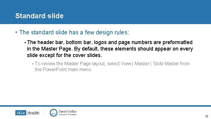
Standard slide • The standard slide has a few design rules: • The header bar, bottom bar, logos and page numbers are preformatted in the Master Page. By default, these elements should appear on every slide except for the cover slides. • To review the Master Page layout, select View | Master | Slide Master from the Power. Point main menu 12

Color palette 13

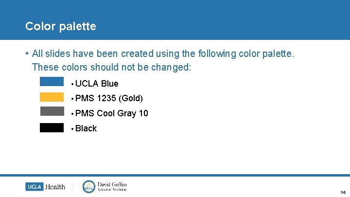
Color palette • All slides have been created using the following color palette. These colors should not be changed: • UCLA Blue • PMS 1235 (Gold) • PMS Cool Gray 10 • Black 14

Text formatting 15

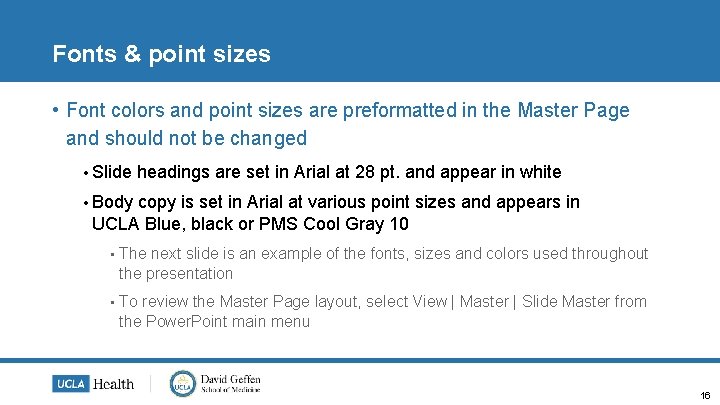
Fonts & point sizes • Font colors and point sizes are preformatted in the Master Page and should not be changed • Slide headings are set in Arial at 28 pt. and appear in white • Body copy is set in Arial at various point sizes and appears in UCLA Blue, black or PMS Cool Gray 10 • The next slide is an example of the fonts, sizes and colors used throughout the presentation • To review the Master Page layout, select View | Master | Slide Master from the Power. Point main menu 16

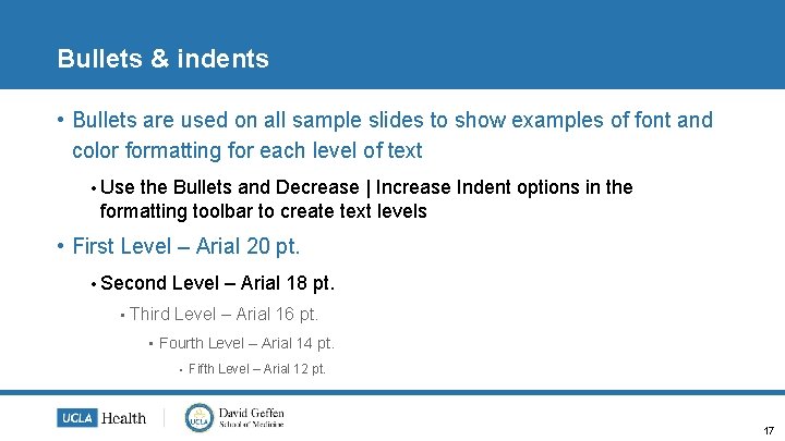
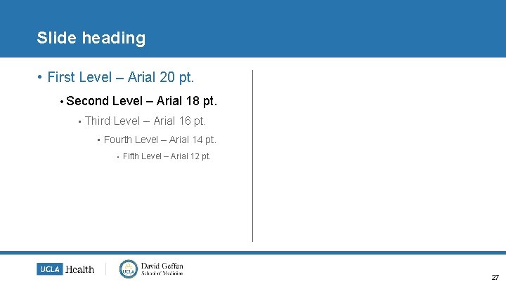
Bullets & indents • Bullets are used on all sample slides to show examples of font and color formatting for each level of text • Use the Bullets and Decrease | Increase Indent options in the formatting toolbar to create text levels • First Level – Arial 20 pt. • Second • Level – Arial 18 pt. Third Level – Arial 16 pt. • Fourth Level – Arial 14 pt. • Fifth Level – Arial 12 pt. 17

18

Click to edit photo caption 19

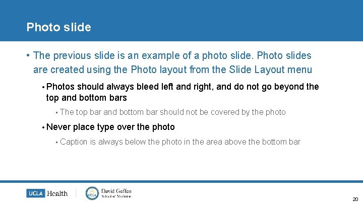
Photo slide • The previous slide is an example of a photo slide. Photo slides are created using the Photo layout from the Slide Layout menu • Photos should always bleed left and right, and do not go beyond the top and bottom bars • The top bar and bottom bar should not be covered by the photo • Never • place type over the photo Caption is always below the photo in the area above the bottom bar 20

Photo slide • The previous slide is an example of a photo slide. Photo slides are created using the Photo layouts from the Slide Layout menu • By default, the photo will conform to the size of the placeholder provided in the basic slide layout • You will need to manually scale and crop your image to be full-bleed using the format picture options and tools in the drawing toolbar 21

Other slide layouts 22

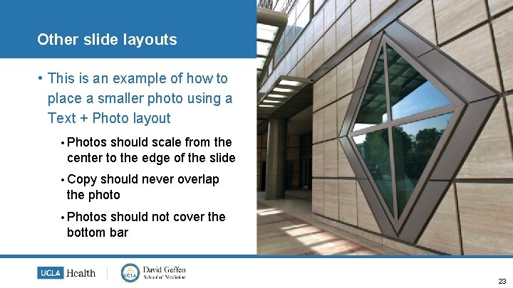
Other slide layouts • This is an example of how to place a smaller photo using a Text + Photo layout • Photos should scale from the center to the edge of the slide • Copy should never overlap the photo • Photos should not cover the bottom bar 23

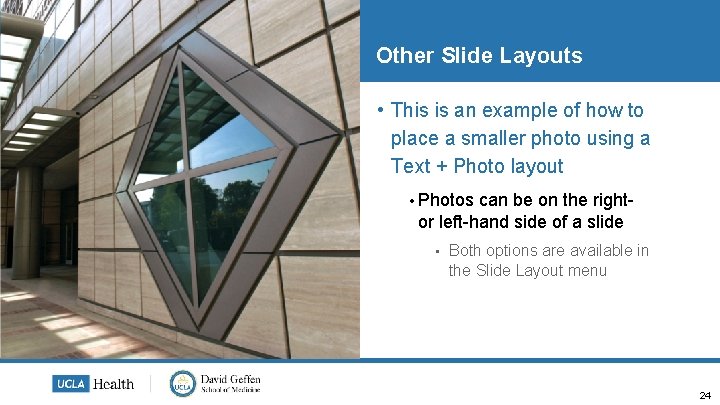
Other Slide Layouts • This is an example of how to place a smaller photo using a Text + Photo layout • Photos can be on the rightor left-hand side of a slide • Both options are available in the Slide Layout menu 24

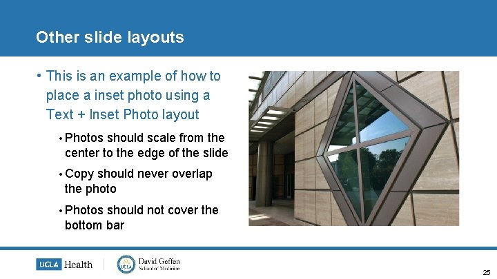
Other slide layouts • This is an example of how to place a inset photo using a Text + Inset Photo layout • Photos should scale from the center to the edge of the slide • Copy should never overlap the photo • Photos should not cover the bottom bar 25

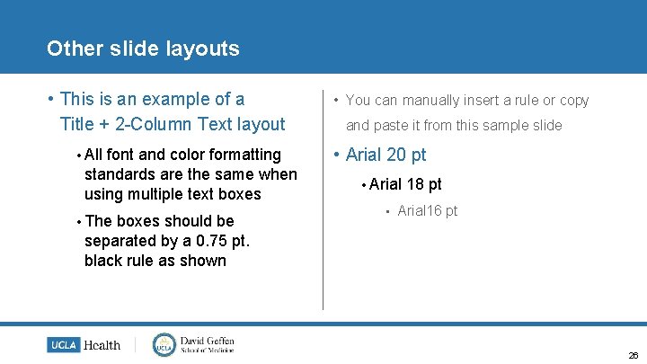
Other slide layouts • This is an example of a Title + 2 -Column Text layout • All font and color formatting standards are the same when using multiple text boxes • The boxes should be separated by a 0. 75 pt. black rule as shown • You can manually insert a rule or copy and paste it from this sample slide • Arial 20 pt • Arial • 18 pt Arial 16 pt 26

Slide heading • First Level – Arial 20 pt. • Second • Level – Arial 18 pt. Third Level – Arial 16 pt. • Fourth Level – Arial 14 pt. • Fifth Level – Arial 12 pt. 27

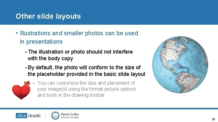
Other slide layouts • Illustrations and smaller photos can be used in presentations • The illustration or photo should not interfere with the body copy • By default, the photo will conform to the size of the placeholder provided in the basic slide layout • You can customize the size and placement of your image(s) using the format picture options and tools in the drawing toolbar 28

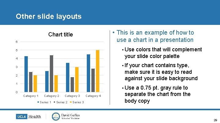
Other slide layouts • This is an example of how to use a chart in a presentation Chart title 6 • Use colors that will complement your slide color palette 5 4 • If your chart contains type, make sure it is easy to read against your slide background 3 2 1 • Use 0 Category 1 Category 2 Series 1 Category 3 Series 2 Series 3 Category 4 a 0. 75 pt. gray rule to separate the chart from the body copy 29
