Out of many one Summarising multiple data points


/(Total # across categories) • In Centre County, the proportion")


 / 2 • Middle case =")


+(4*25)=281 • 281/12=23.")


 • IQV: Total differences in the distribution, expressed as")


- Slides: 58
Out of many, one: Summarising multiple data points meaningfully SESSION THREE: DATA SOURCES, DATA CHALLENGES, AND DESCRIPTIVE STATISTICS JASMINE FLEDDERJOHANN
Session outline • Basic concepts • Description vs. inference • Univariate vs. bivariate description • Core descriptive tools • • Frequencies, proportions, and percentages Graphic displays Measures of central tendency Measures of dispersion
Description vs. inference • Statistics are summaries of data • Descriptive statistics: Generating a summary of the data in your sample • Can (and usually should) be used with any sampling method • Inferential statistics: Generating conclusions about the population based on your sample • Requires probability sampling, representative sample • More on why in later workshops
Univariate vs. bivariate description • Descriptive statistics come in two main varieties. • Univariate (“one variable”) • How are observations distributed across categories of your variable? • Bivariate (“two variables”) • Describe the strength and direction of the relationship between two variables • There is a strong positive association between educational attainment and income • Older students tend to have higher GPAs • But does NOT test whether this observation would hold in the population • (That’s inferential statistics!)
Frequencies • Most basic summary of your data • Frequency table produced from quantitative data • Numeric count of how many respondents in each category • Useful for summarizing variables with few categories • Good for nominal or ordinal variables • Cluttered/uninformative if too many categories • Overview of the distribution of your variables • That is, the pattern of how many observations fall into each category
Proportions • Also called relative frequencies • Express the number of cases in each category in relationship the total • Compare the part (specific category) to the whole (all categories) • Ex: I’m interested in foreign-born residents in Pennsylvania • I know 9, 764 people in Centre County PA were born outside of the US • Is this figure meaningful on its own? • Is this a large share of the population?
Proportions • (# in category)/(Total # across categories) • In Centre County, the proportion of foreign-born residents is: • (Foreign-born people) / (Total people in Centre County) • 9, 764 / 124, 059 • 0. 079 • The larger the number, the higher the proportion • Maximum 1. 00 Table 1. Nativity in Centre County, PA Nativity Born outside US Frequency 9, 764 Born in US 114, 295 Total 124, 059
Proportions Table 2. Nativity in Philadelphia Nativity Born outside US Born in US Total Frequency 157, 661 • What about Philadelphia? • Compare 9, 764 in Centre County to 157, 661 in Philly • Massive difference in nativity • But relative to the population… ? 1, 231, 488 • (Foreign-born people) / 1, 389, 149 (Total people) • 157, 661 / 1, 389, 149 =. 113 • Compared to 0. 079 in Centre County
A word of caution • Don’t assume proportion is a superior description of data compared to frequency • Both frequency and proportion can be helpful • Proportion can help to understand relative occurrence of a phenomenon • As with comparing nativity in populations of very different sizes • But sometimes the proportion is high but the absolute # is small • 66% of people in my intervention don’t reoffend. Sounds great, right? • If I’ve only worked with 3 people so far, does that dampen your enthusiasm?
Percentages • Percentages express the number of cases in each category as a number of cases per one hundred • Percentage = Proportion * 100 • Summing percentages across categories should add to 100% • Subject to rounding error • Where categories are mutually exclusive and exhaustive • With some exceptions, should usually be the case • In Centre County, the percent foreign-born is: • Proportion: (9, 764 / 124, 059) =0. 079 • Percentage: 0. 079 * 100= 7. 9 % • Of every 100 CC residents, about 8 were foreign born
Constructing frequency distributions • List all of the categories of your variable • The categories for nominal variables need not be listed in any particular order • Ordinal categories should be ordered (highest to lowest or vice versa) • Tally the number of cases that fall into each category • Tally the total number of cases (add up all the frequencies) • Get the percentages • Divide each frequency by the total (this gives you the proportion) • Multiply the proportion by 100
Grouped frequency distributions • Recall, frequency distributions best for nominal/ordinal variables • For interval/ratio variables, • Must use grouped frequency distributions • I. e. recode your I/R variable into a manageable number of groups • Collapse the categories into a reduced number of grouped categories, called intervals (<= 10 intervals) • E. g. ages 20, 21, 22, … 28, 29 are now a single category: 20 -29 • Intervals should be exhaustive and mutually exclusive • The rest is the same: • Tally # of cases that fall into each category • Tally the total # of cases • Get the percentages
Cumulative frequency distributions • Can be helpful to include cumulative frequencies • # of cases in a certain category and in the categories above • Presented alongside regular frequency • Gives a sense of how many cases are in the category • Plus in all previous categories • Ex: How many people are aged 40 -49? How many are under age 50? • Both answers from 1 line of the table • For ordinal and recoded I/R variables only • Nominal variables can’t be ordered • The idea of categories “above” a certain category doesn’t make sense
Cumulative frequency distributions Age Category Frequency Cumulative Frequency 20 -29 7 7 30 -39 7 7+7 = 14 40 -49 12 12+7+7 = 26 50 -59 3 3+12+7+7 = 29 60 -69 3 32 70 -79 6 38 80 -89 2 40 Total 40
Cumulative percentage distributions Age Category Frequenc y Percentag e Cumulative Percentage 20 -29 7 17. 5 30 -39 7 17. 5+17. 5 = 35. 0 40 -49 12 30. 0+17. 5 = 65. 0 50 -59 3 7. 5+30. 0+17. 5 = 72. 5 60 -69 3 7. 5 80. 0 70 -79 6 15. 0 95. 0 80 -89 2 5. 0 100. 0 Total 40 100. 0
Rates • Ratio of actual occurrences of an event compared to the possible number of occurrences • Specific kind of proportion, often used to describe population trends (using pop data) • Ratio: (# of actual occurrences) / (# of possible occurrences) • Murder rate = (# of murders) / (Total population) • Usually expressed as # per 1, 000 or # per 100, 000 • Ratio*1, 000 or 100, 000 • Carefully consider population at risk for your denominator! • Not always just the total population • Ex: Birth rate denominator based on total women of reproductive age • Children, elderly, men not at risk of giving birth
Percentage change • Percentage change gives you the difference between two cases or two time points • Unlike percentage points (as in frequency distributions), can exceed 100% • Here’s how to do it: • ([New Statistic – Old Statistic] / Old Statistic) * 100 • UK incarceration rates (per 100, 000) • • • 2006: 751 (new statistic) 2000: 684 (old statistic) Percent change in the rate: ([751 – 684] / 684) * 100 9. 8 percent increase between 2000 and 2006
Pie charts • Graph showing percentage points among categories of nominal/ordinal variable • May also list the frequencies • Usually univariate • Categories displayed as segments of a circle • Pieces add to 100% across categories • Note: Programs will let you make silly pie charts—you must double-check that it doesn’t sum to more than 100%! • Technically, I/R variables can be displayed if recoded into intervals • … but there are better methods for I/R
Bar graphs • Graph showing frequencies/ percentages among categories of a nominal/ordinal variable • Univariate or bivariate • Categories displayed as rectangles of equal width • Space between bars for each category • Height proportional to the frequency or percentage of cases in the category
Histograms • Graph showing frequencies or percentages among categories of I/R variable • Usually univariate • Categories displayed as contiguous (touching) bars • Width of bars proportional to the width of the category • Where intervals are even, bars will be of equal width • Height is proportional to the frequency or percentage of that category
Frequency polygons/line graphs • Graphs showing frequencies or percentages among categories of an I/R variable • Univariate or bivariate • Points representing the frequencies of each category are placed above the category • Points are jointed by a straight line • Excellent for displaying trends across categories • E. g. increases/decreases Source: Adapted from U. S. Bureau of the Census, Center for International Research, International Data Base, 2003.
Time series charts Time series chart of percentage change in imprisonment and punishment rate in the US, 1983 -2013 • Specific kind of line graph • Always bivariate (time is a variable) • Shows time measured in units such as years or months on the horizontal axis • Frequencies/ percentages/rates of another variable on the vertical axis
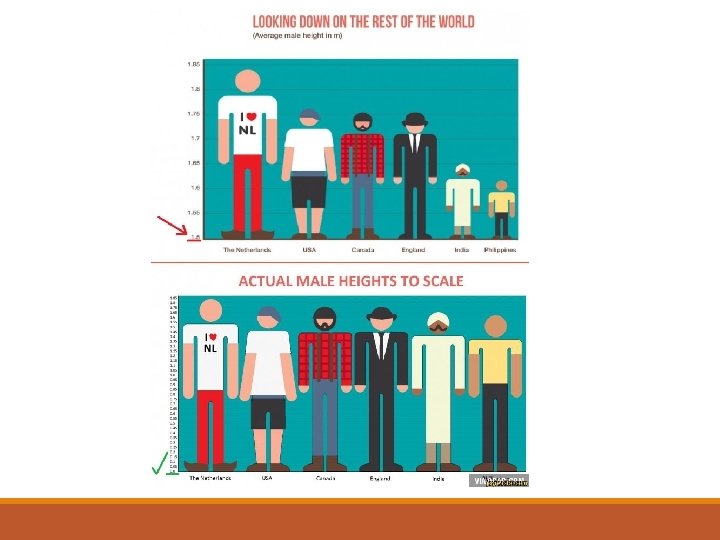
Distortions in graphs • Graphs quickly inform, can also quickly deceive • Common distortions include • Shrinking/ stretching to distort proportions • Too complex to see all data • Uneven tickmarks on axes to distort data • Truncating axes to emphasize difference • I. e. leaving off top/bottom of the distribution
Pros and cons of charts and graphs • Pros • Ability to direct readers’ attention to one aspect of the evidence • People are drawn to flashy figures • Ability to reach readers who might otherwise be intimidated by the same data in a tabular format • Ability to focus on bigger picture rather than perhaps minor technical details • Cons • Lose ability to examine numeric detail offered by a table • Potentially lose ability to see additional relationships within the data • Time: get caught up in selecting colours and formatting charts when a simply formatted table is sufficient
Measures of central tendency • Univariate descriptive statistics • Allow us to summarize a distribution in a single figure • What does the typical case look like on this variable? • Doesn’t summarize all properties of the distribution • We also need to know about dispersion/variability
The mode �Mode �The most frequent value �Generally most useful for nominal variables �Tally # of respondents in each category �Then identify the most frequent response �Some distributions might have multiple modes, or no mode at all
The mode • What’s the mode for race in Bronx County, NY? Racial Group Percentage White 12. 9 Black 30. 8 American Indian 0. 1 Asian 3. 3 Hispanic Other / 2+ races Total 51. 0 2. 1 100. 0
The mode • What’s the mode for race in Bronx County, NY? Racial Group Percentage White 12. 9 Black 30. 8 American Indian 0. 1 Asian 3. 3 Hispanic Other / 2+ races Total 51. 0 2. 1 100. 0
The median �Median �The center value �Put all responses in ranked order �Count to and select the middle case �Can’t use nominal variables �Find the middle case: (n + 1) / 2 �Where n = total number of cases
The median • Middle case: (n + 1) / 2 • Middle case = (7 + 1) / 2 = 8/2 = 4 Robbery Rate for 7 Cities per 100, 000 People 1. New York 406. 6 2. Boston 416. 0 3. Los Angeles 420. 1 4. San Francisco 445. 9 5. Dallas 582. 8 6. Chicago 668. 0 7. Atlanta 1037. 8
The median • Let’s add San Diego to the list • Middle case: (8 + 1) / 2 = 9 / 2 = 4. 5 • Huh? ? Robbery Rate for 8 Cities per 100, 000 People 1. San Diego 145. 3 2. New York 406. 6 3. Boston 416. 0 4. Los Angeles 420. 1 5. San Francisco 445. 9 6. Dallas 582. 8 7. Chicago 668. 0 8. Atlanta 1037. 8
The median • The median is the 4. 5 th case • The number between cases 4 and 5 • Where there is an even cases, we average the two middle cases: • (Case 4 + Case 5) / 2 = (420. 1 + 445. 9) / 2 = 866 / 2 • The median murder rate in these 8 cities is 433 Robbery Rate for 8 Cities per 100, 000 People 1. San Diego 145. 3 2. New York 406. 6 3. Boston 416. 0 4. Los Angeles 420. 1 5. San Francisco 445. 9 6. Dallas 582. 8 7. Chicago 668. 0 8. Atlanta 1037. 8
The median • Special type of a percentile • Percentile: Score below which a certain percentage of the distribution falls • If you’re at the 75 th percentile, 75 percent of the distribution is below you • The median is the score below which half (50 percent) the distribution falls • The median is the 50 th percentile • So, we can find the median from cumulative percentages
The Median • We’re looking for the 50 th percentile • The 50 th percentile is somewhere in the “agree somewhat” category, so this is the median category Category Frequency Agree strongly 310 29. 1 Agree somewhat 384 36. 1 65. 2 Neutral 164 15. 4 80. 6 Disagree somewhat 164 15. 4 96. 0 43 4. 0 100. 0 1, 065 100. 0 Disagree strongly Total Percentage Cumulative Percentage
The mean �Mean, aka the ‘average’ �Calculated only for I/R variables �In practice, sometimes take the mean of ordinal variables �If 1 = not too happy, 2 = somewhat happy, and 3 = very happy, average happiness=2. 4 useful �To calculate �Add up all cases’ scores �Divide by the total number of cases
The mean • Given by the formula: = mean = score on variable Y for case I = total number of cases
The mean • What’s the mean age of this distribution? • 21+21+22+(3*23)+(4*25)=281 • 281/12=23. 42
The mean • Let’s add 115 -year-old Edna Parker to our age distribution • • • Sum of Yi=396 396/n=396/13=30. 46 Yet our median is 23. 5 And our mode is 25 Before Edna • Our mean was 23. 42
Central tendency is only part of the picture… • Symmetric distribution, mean=median=mode • Extreme values (Edna) introduce complications • Means use all information in the distribution • Medians, modes use only the relative position/frequency of the scores • Means use the actual scores, so all scores affect the mean • BUT, sensitive to extreme values, so may be misleading • Measure of dispersion can help us to document the distribution more fully!
Choosing measures of central tendency • Mean most common. Use it if you can. BUT… • Use the median when: • You have a interval-ratio variable with a very skewed distribution • You really want to report the middle score or category • Use the mode when: • Variables are measured at the nominal level • You want a quick and easy measure for ordinal and interval-ratio variables • You really want to report the most common score or category • Pick more than one whenever you can! Nominal Ordinal Interval-Ratio Mode? Yes Yes Median? NO! Yes Mean? NO! Technically, no… but yes. Yes
Distributions and skew • Consider this bar graph of a distribution with: • Mode = 4; Median = 4; Mean = 4. 11 • Very minor skew: more extreme values on the right side of the distribution • As a result, mean, median, and mode diverge very slightly • Here, skewed to the right
Distributions and skew • The direction of skew is defined by where the extreme values are • Negative skew/left skew: Extreme values at low end of distribution • Mean is pulled lower (more negative) than the median • Positive skew/right skew: Extreme values at high end of distribution • Mean is pulled higher (more positive) the median • Ask yourself: which side has a longer tail?
Where does variability fit in? • Central tendency may give similar results for very different distributions • Typically a lot of variation around them Medium Low High • Variability: How far cases are typically distributed from the center • Given by measures of dispersion • Animating principle behind much social science research • “Do men and women have different incomes? ” = “Does gender explain variability in income? ”
Why consider variability? • Mean political preference = 4. 11
Why consider variability? • Mean political preference = 4. 11
Index of qualitative variation (IQV) • IQV: Total differences in the distribution, expressed as a proportion of all the differences there could be in the distribution • I. e. ratio of observed variation to the maximum possible variation • Typically used for nominal variables, but sometimes for ordinal • Ranges between 0 and 1 • Where IQV = 0, variability is at its lowest • # actual differences in the various categories of the distribution is 0 • I. e. the cases are concentrated in only one category • Where IQV = 1, variability is at its highest • # of actual differences in the distribution is equal to the maximum differences that can occur (given the number of categories you have) • I. e. the cases are spread equally across all of the categories
Index of qualitative variation • Expressed formally, the IQV is: • K = number of categories • ∑Pct 2 = sum of all squared percentages • *Note, this can also be done with raw frequencies. Substitute n for 100 and f for Pct.
Category Frequency Percentage Squared Percentage Liberal 1, 180 27. 2 739. 84 Moderate 1, 683 38. 8 1, 505. 44 Conservative 1, 470 33. 9 1, 149. 21 Total 4, 433 100. 0 3, 394. 49 • K (number of categories) = 3 • ∑Pct 2 (sum of all squared percentages) = 3, 394. 49
Variance and standard deviation • I/R variables have scores that are meaningful • We’d like to use all that information when considering variability • The variance and standard deviation take those scores into account • The variance and standard deviation summarize how far the cases are from the mean • Based on the mean, so should only be used for interval-ratio variables • In practice, used with ordinal variables too • Minimum for both variance and SD is 0 • No maximum; depends on the variable and the values of the cases • Higher score indicates greater variability
Variance and standard deviation • Take this data on ages for 6 people: Age Mean Deviation from Mean 20 22. 4 -2. 4 21 22. 4 -1. 4 22 22. 4 -0. 4 28 22. 4 5. 6
Variance and standard deviation • The variance is the average squared deviation of the cases from the mean. Formally: = deviation from mean = sum of squared deviations from mean n= total number of cases
Variance and standard deviation Age Mean Deviation from Mean Squared Deviation from Mean 20 22. 4 -2. 4 5. 76 21 22. 4 -1. 4 1. 96 22 22. 4 -0. 4 0. 16 28 22. 4 5. 6 31. 36 (N/A) 0 43. 16 Total (n=6)
Variance and standard deviation • The typical case is 8. 632 “squared years” away from the mean • What does this mean substantively? • To get back to the original unit (years), we take the square root of the variance. This is the standard deviation: • So, we found a variance of 8. 632…
Rules for tables • All good tables should include an informative title • The table number should be provided (numbered consecutively throughout the document) • The title should give us some clue about the variable or relationship being described • Columns should be clearly labeled • Any source information for the data or special notes should be included at the bottom • The total sample size should be listed at the bottom or in the title • For frequency tables, the frequencies should sum to the total n • Metrics should be listed (GBP? Percentage change? Rate per 1, 000 women aged 15 -49? )
Rules for figures • Should have an informative title • Labelled as Figure 1, Figure 2, etc. • These are numbered consecutively, but separate from table numbering • Should include a key and(/or) a clearly labeled x and y axis • Lines, colors, etc. should be clearly distinguishable and aesthetically pleasing • Graphs are a tool with limited utility for showing the relationship between multiple variables—do not let your graphs become cluttered • List any sources or notes at the bottom of the figure • Metrics should be listed (GPB? Percentage point? )
Measuring vulnerability • What is vulnerability? • How would you conceptualize vulnerability? • How would you measure it? • Are there multiple dimensions to vulnerability? • What indicator(s) would you use to measure vulnerability? • Would you use a single indicator? Index? Scale? • Does your answer differ if you are interested in children? In people with mental health concerns?
Measuring reality? • Does relying on a • Is there such a thing particular social as objective reality, or theory shape the way are postmodernists that we perceive the right? world? • Are measures useful if • If so, what are the objective reality consequences of this for doesn’t exist? research? • What are we measuring?