Organizing Displaying and Interpreting Data Chapter 3 Hawkes



- Slides: 25

Organizing, Displaying and Interpreting Data Chapter 3: Hawkes STAT 3090

Statistics: The science of data l l Data: information about individuals Variables: characteristics of individuals – l The information Exploratory Data Analysis – – – How to extract information from data? First step => “Plot the data” “A picture is worth 1000 words. ”

What can we learn from a picture? l Distribution of the variable(s) – – – Value and Frequency Shape Center Spread Variability Extreme values

Two Basic Types of Data Categorical l Qualitative – – l male/female, colors, phone numbers, race Places individual into one or several “categories” Have no “value” – can’t perform math functions Quantitative l l Numerical values – temperature, money, time Can perform mathematical functions Can be discrete (finite) – number of children in famly. Or continuous – age, time, distance

Displaying Data Categorical (Qualitative) l l Counts, Discrete Data Pie Charts Bar Graphs (bars do not touch) Frequency Tables – l Spreadsheets Relative Frequency Tables Quantitative l Numerical values – l Frequency plots – l l Maintain original values Histograms – l Continuous or discrete Create ‘groups’ ‘bins’ Bars touch (continuous data) Stemplots Dot plots Time Series

QUALITATIVE DATA: THE COMMON DISPLAYS

Frequency distribution Summarizes data into classes and provides in tabular form a list of classes along with the number of observations in each class Must have a frequency distribution before any type of graph can be constructed Use Excel “count if” function

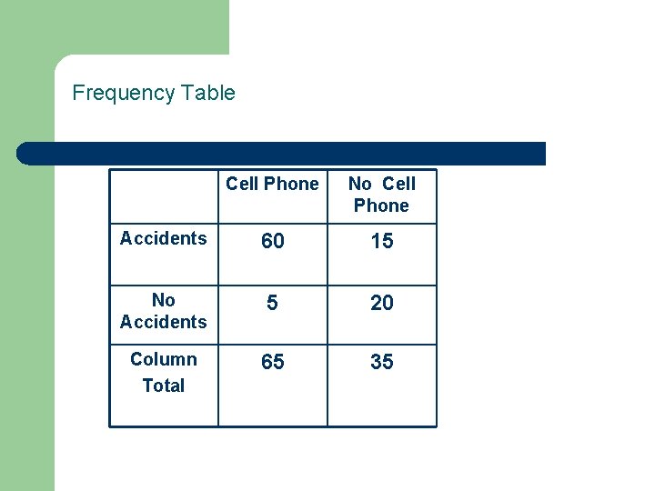
Frequency Table Cell Phone No Cell Phone Accidents 60 15 No Accidents 5 20 Column Total 65 35

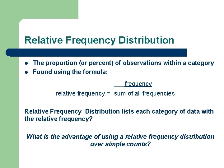
Relative Frequency Distribution l l The proportion (or percent) of observations within a category Found using the formula: ___frequency relative frequency = sum of all frequencies Relative Frequency Distribution lists each category of data with the relative frequency? What is the advantage of using a relative frequency distribution over simple counts?

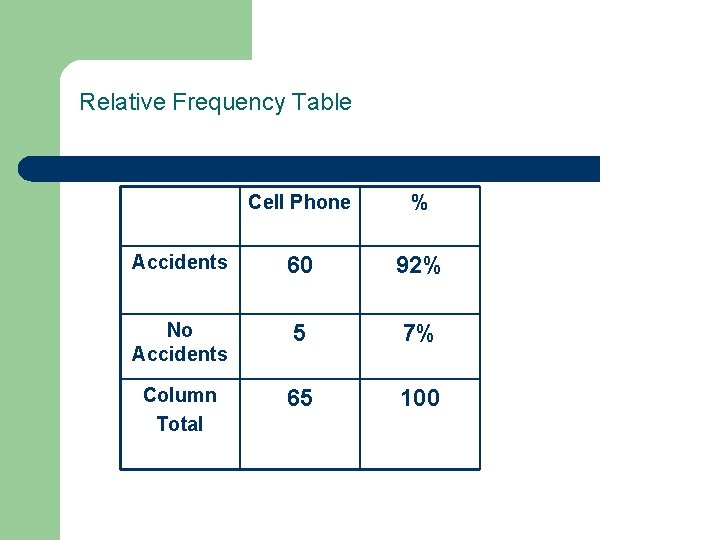
Relative Frequency Table Cell Phone % Accidents 60 92% No Accidents 5 7% Column Total 65 100

Bar graph (or chart) l A simple graphical display in which each bar corresponds to the number of observations in a category – – – Label each category of data on either horizontal or vertical axis Rectangles of equal width for each category Height of each rectangle represents category’ frequency OR relative frequency Bars don’t touch Bars should always start at zero Used for qualitative or discrete quantitative data

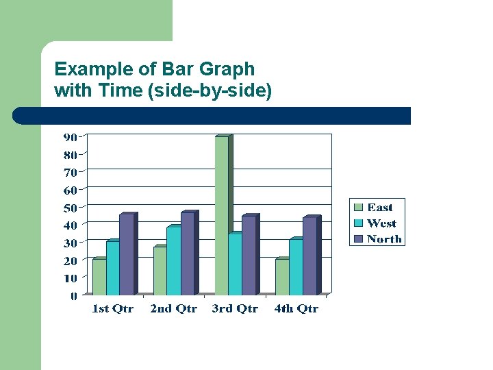
Example of Bar Graph with Time (side-by-side)

Pareto Chart l A Pareto chart is a bar graph where the bars are drawn in decreasing order of frequency or relative frequency

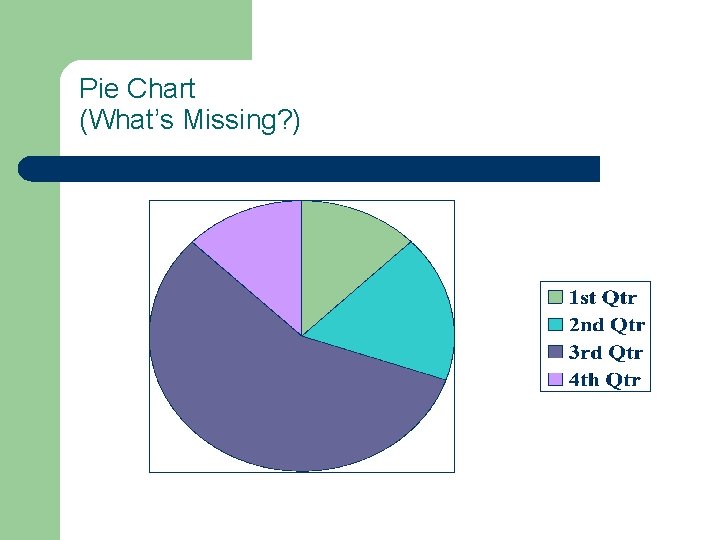
Pie Charts l l l A circle divided into sectors. Each sector represents a category of data. The area of each sector is proportional to the frequency of the data. Proportions (percents)MUST add to 1 (100%) Angle of the “wedges” : – – (frequency)/(total # observations) = proportion (proportion)(360) = Angle

Pie Chart (What’s Missing? )

QUANTITATIVE DATA: THE COMMON DISPLAYS

Frequency Distribution for Quantitative Data l Not appropriate to have a bar for each value so develop classes Number of classes generally more than 4 but less than 20 l Class Width = (Largest Value – Smallest Value)/Number of Classes l – l Should be rounded to whole numbers for ease of understanding Class boundaries: Subtract 0. 5 from lower limit and add 0. 5 to upper limit. – (See page 93)

Other Frequency Distribution for Quantitative Data l Relative Frequency Distribution – l Same process as for Qualitative Data Cumulative Frequency Distribution – Add frequencies in each successive class l Total must equal total number of observations

Histogram A bar graph of a frequency or relative frequency distribution in which the heights of each bar corresponds to the frequency or relative frequency of each class. Edges touching Covers entire range of values of a variable May need to create “bins”

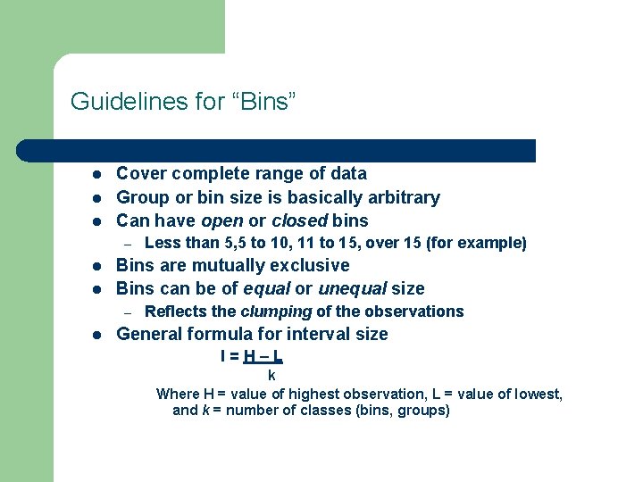
Guidelines for “Bins” l l l Cover complete range of data Group or bin size is basically arbitrary Can have open or closed bins – l l Bins are mutually exclusive Bins can be of equal or unequal size – l Less than 5, 5 to 10, 11 to 15, over 15 (for example) Reflects the clumping of the observations General formula for interval size I=H–L k Where H = value of highest observation, L = value of lowest, and k = number of classes (bins, groups)

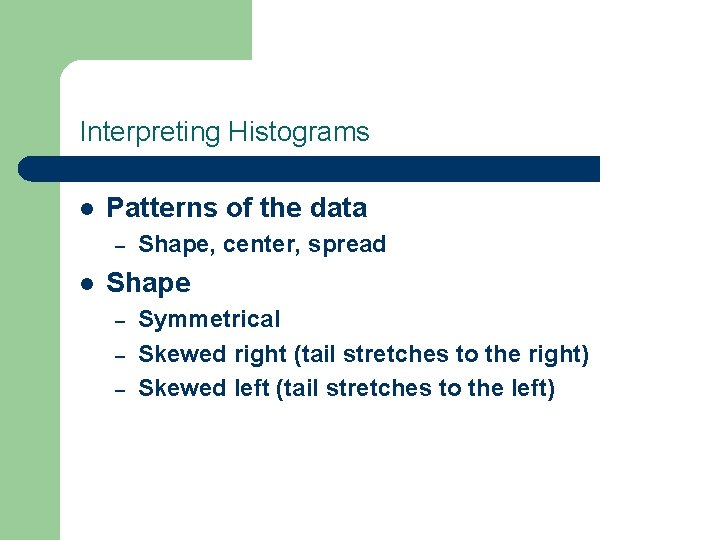
Interpreting Histograms l Patterns of the data – l Shape, center, spread Shape – – – Symmetrical Skewed right (tail stretches to the right) Skewed left (tail stretches to the left)

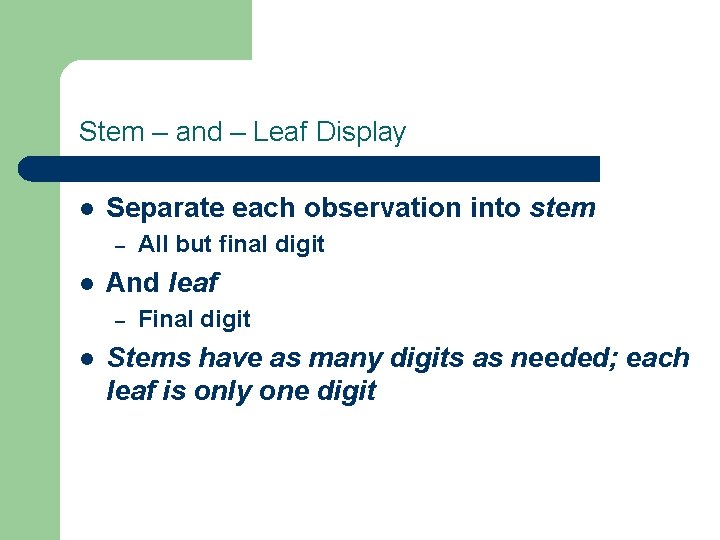
Stem – and – Leaf Display l Separate each observation into stem – l And leaf – l All but final digit Final digit Stems have as many digits as needed; each leaf is only one digit

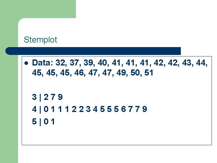
Stemplot l Data: 32, 37, 39, 40, 41, 41, 42, 43, 44, 45, 45, 46, 47, 49, 50, 51 3|279 4|011122345556779 5|01

Timeplots l Plots each observation against the time at which it was measured – – Time on x-axis (horizontal) Variable on y-axis (vertical)

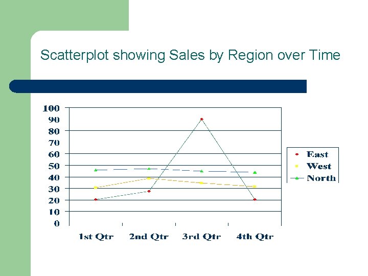
Scatterplot showing Sales by Region over Time