One to twodimensional visualization Chong Ho Alex Yu


")
 • SAS is the focus in 521. It is")


 • SPSS is not the focus of 551.")
 • More males achieved the highest scores than")
 • From Graphs choose Chart Builder • Choose")
 • Drag SAT into Y-axis • Drag gender")


 • Because both the violin plot and the")


- Slides: 47
One- to two-dimensional visualization Chong Ho Alex Yu
What is dimension? • A graphical representation of a variable by a vector or a line (usually, but not always). • One variable One dimension • Two variables Two dimensions • When there are too many, the problem is called the curse of dimensionality. • This unit focuses on 1 dimension or 2 dimensions only.
Examples of 1 -dimensional graph • Pie chart, bar chart, and histogram • Very easy to make. You can use Excel instead of JMP, SAS, or Tableau. • Caution: Research shows that Pie chart and its variant, donut chart, could be confusing and misleading.
Examples of 1 -dimensional graph • Pie charts use angle and curvature to display data, producing most errors in perception (Evergreen , 2017). • Academic journal articles seldom use pie charts.
Stacking pie charts • When 1 -dimensional pie chart is expanded to multi-dimensional, it could be worse. • Very difficult to make comparison between or link across different dimensions. • Can you really tell which green area is bigger?
bar chart vs. Pie chart • Barchart is much clearer. • If you sort the data by frequency, it is even better (especially when there are many bars)
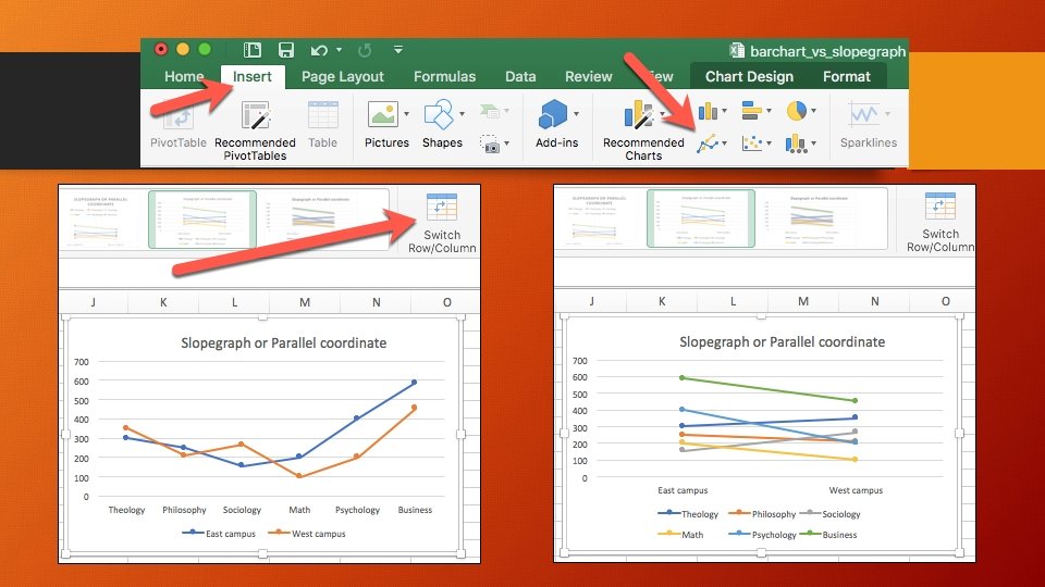
Side by side barchart or stacked barchart • Another variable: Campus location • They could be very confusing!
Slopegraph or parallel coordinate • Slopegraph or parallel coordinate is easier to compare across two campuses. • In business, psychology, and math, East campus enrollment outnumbers West campus enrollment. • In theology and sociology, it is opposite. • In philosophy, East campus enrollment and West campus enrollment are similar.
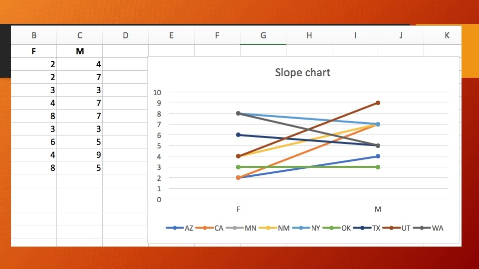
Summarize the data in JMP for Excel • Excel plots the summary data i. e. the frequency count by department and by campus is already done. • What should I do when I have individual-level data, not summary data? • For example, I want to create a slopegraph. I want to compare the numbers of male and female students by their home state based on the data set visualization_data. jmp.
Summarize the data in JMP for Excel • Analyze Tabulate • Drag state code into the Y axis. • Drag gender into the x axis. • Red triangle Make Into Data Table
Summarize the data in JMP for Excel • In Windows: File Save as Choose the xls or xlsx format. • In Mac: File Export Choose Excel
Ungraded Exercise • Use visualization_data. jmp • I want to compare the numbers of male and female students by academic rank (1 = freshman, 2 = sophomore, 3 = junior, 4 = senior). • Use Tabulate to create a summary table. • Export the summary table to Excel • Create a slopegraph. • Copy and paste the graph into Word, upload the Word file or the Excel file.
Bar chart with coloring and centering • At first glance usage of bar chart is straight–forward because there is not any issue about bandwidth in using discrete data (e. g. department: psychology, philosophy, sociology…etc. ). • But when the variable contains 50– 100 categories, the bar chart becomes too cluttered to be interpreted. • When the data are centered and standardized at the mean of zero and different bars representing different items are colored by their distance from the center, the graph becomes more interpretable.
Bar chart with coloring and centering • SAS example: Showing psychometric results of item response theory
Histogram: Bandwidth issue • Barchart is for discrete data whereas historgram is for continuous data. • The preset binwidth (bandwidth) may mislead you. • You can go back and forth to look at the histogram with different binwidths (noise – smooth). • Smoothing algorithms: The process can be thought of as constructing numerous histograms of differing interval widths and averaging the heights of the different bars: a sort of average all possible histograms.
Histogram: Smoothing • Example in SAS (Optional)
Density smoothing in SAS (Optional) • SAS is the focus in 521. It is optional in 551. • When you do visualization in SAS, always turn on the Output Delivery System (ODS graphics on; ) • All SAS procedures start with the syntax PROC • The kernel density smoothing procedure is PROC KDE; • You can run the file kde. sas to see how it works.
Mixed variables • Discrete or categorical data alone do not suffer from the bandwidth problem (e. g. the frequency of males and female students) • However, in a bivariate data set when one variable is categorical and the other is continuous, the noisy one “contaminates” the discrete one (e. g. SAT by gender).
Two Histograms • You may use continuous data as the primary variable and a grouping factor as the secondary variable. • To exam SAT (continuous) by gender (categorical). • Use visualization_data. jmp • In JMP Graph Builder drag SAT into the X-axis. • Drag gender into the Y-axis.
Two Histograms • JMP shows that male SAT is a fairly normal distribution but female SAT is not. • But it would be easier to compare their performance at different score level if the two histograms are back to back.
Pyramid graph (back to back histogram) • SPSS is not the focus of 551. This exercise is optional. • Two ways • Graph legacy dialog Population pyramid
Pyramid graph (back to back histogram) • More males achieved the highest scores than females (At the top the red bars are longer than the blue bars). • But males also obtained the lowest scores. • Shortcoming: The graph is not dynamic. No further manipulation.
Pyramid graph (back to back histogram) • From Graphs choose Chart Builder • Choose Histogram • Drag the rightmost icon to the canvas.
Pyramid graph (back to back histogram) • Drag SAT into Y-axis • Drag gender into X-axis • Press OK
Binning can be helpful! • Noise reduction • Use PISA 2018_WLE. jmp • WLE: Weighted Likelihood Estimates • PV: Plausible values (test score) • Too many data! It obscures us from seeing the relationship between science test performance and teacher-directed instruction.
Select the variable and classify the data into different bins
Select the variable and classify the data into different bins
Non-linear pattern emerges!
Ungraded assignment • Use PISA 2018_WLE. jmp • Bin all other WLE variables • Use either PV science or PV math as the dependent variable • Use a few binned variables and examine how they are related to science or math test performance.
Violin plot • Another way to deal with one continuous variable and one categorical variable. • In JPM, open Hybrid fuel economy. jmp from Sample Data Library. • Open Graph Builder • Drag Engine into X • Drag City MPG into Y
Violin plot • Drag the contour icon into the canvas. • The violin plot is a onedimensional contour plot. • It shows the density outline of the observations (how many observations at each level).
Violin plot • Drag the boxplot into the canvas. • There are three displays in one: raw data, violin plot showing the distribution, and the boxplot showing the 5 point summary.
Violin plot in SAS • Use the heart data set in the HELP library. • In SAS the 5 -point summary is embedded in the violin plot (by color) • It displays full distribution information, like the density curves, and quantile information (the five– point summary), like the boxplot. • Example: violin. sas (optional)
Violin plot • Unlike the boxplot, it does not explicitly indicate outliers. • Because the violin plot models after the boxplot, the density curve is doubled in order to make it as symmetrical as the boxplot.
Violin plot This graphical configuration is counter– intuitive because most users do not understand the reason of creating a symmetrical violin plot and what additional information we can obtain from the mirror.
Graphs in SAS programming environment • Graphics in the traditional SAS programming environment are NOT dynamic. • But newer SAS products (e. g. SAS Viya, SAS Visual Analytics) offer dynamic graphics.
Combine violin plot and boxplot (again) • Because both the violin plot and the boxplot have merits and shortcomings, you are encouraged to both. • Use visualization_data. jmp • Graph builder • Drag state code into X. • Drag college test scores into Y. • Click on the boxplot icon. • Drag the contour icon into the canvas.
Combine violin plot and boxplot • Now you can see both distribution and quantile information. • And you can spot outliers, too (There is one in “CA” and one in “WA”).
Combine violin plot, boxplot, & raw data • Hold down the shiftkey and press the scatterplot icon at the left. • Now you can see the violin plot, the boxplot, and the raw data.
Assignment 4. 1 • Use visualization_data. jmp • I want to examine GPA by gender. • Use Graph Builder to superimpose a boxplot on a violin plot, and also show the raw data. • Compare the GPA distribution of male and female students. • Compare the GPA quantile information of male and female students. • Save the output into a Word file or RTF file and then upload it Canvas.
Overplotting • Use PISA 2015. jmp in Unit 2 • n = 54, 978 • Analyze Fit Y by X • A big cloud: Overplotting
Overplotting • One way to “see through” the cloud is using the heat map (see Unit 3). • Limitation: • Density is shown by colors only. • It hides the raw data.
Nonparametric Bivariate Density • From the red triangle choose Nonpar density. • The density of data points is represented by both colors and contour lines. • Its interpretation is straight– forward and no mental translation is required.
Contour plot • How about using the contour lines without showing the raw data? • It could be confusing and misleading. • The appearance of a one-dimensional histogram is tied to its binwidth or bandwidth. • By the same token, the bandheight of the isolines determines how a contour plot appears. • The two contour plots are based on the same data and they use different bandheights!
Assignment 4. 2 • Use PISA 2015. JMP from Unit 2 • Analyze Fit Y by X • Put Enjoyment to science into Y • Put Interest in broad science topics into X • Create a nonparametric density graph. • Can you see any pattern?