Official Interface Guidelines User interface documentation published by
Official Interface Guidelines User interface documentation published by Apple and Microsoft 1
Basic Principles (everybody agrees on these) See-and-point } Metaphors } § Files and folders Direct manipulation } User control } § Actions initiated by the user, not the computer § Modelessness § Interactive and responsive 2
Basic Principles Feedback and communication } Consistency } § § Internal and external Consistent with the guidelines WYSIWYG } Forgiveness } Perceived stability } Aesthetic integrity } § Good visual design } Simplicity § Simple, not simplistic 3
Basic Principles } Good first experience § Clear and simple installer § Convenient default settings } Follow the platform’s own guidelines § Ignoring them reduces their usefulness for all other applications 4
Platform-Specific Details Appearance, layout and usage of interface elements } Keyboard shortcuts and other actions } § Navigation § Modifier keys (shift, control, etc. ) Mouse cursors and meanings of buttons } File organization on disk } 5
Dealing With Differences Pet peeve: porting an application without adapting to the new platform’s standards } What do these keys do when editing text: } § Home § End § Page up/down 6
Beyond the Guidelines There are cases when you have to create new interface elements } Make sure they appear integrated } § Give them an appearance consistent with everything else § Make the different behavior obvious Don’t just use a standard element and make it do something else 7
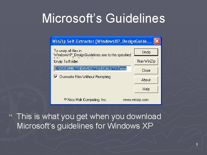
Microsoft’s Guidelines } This is what you get when you download Microsoft’s guidelines for Windows XP 8
Push Buttons You click it, and something happens } Choose the title text carefully } § Apple: “Button names should be verbs that describe the action performed” § Microsoft: “Aim for the shortest possible label; one word is best. ” “If possible, use label text that makes sense when read out of context — for example, when a user reads or hears only the label of the current control. ” 9
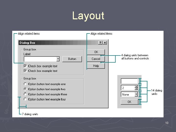
Layout 10
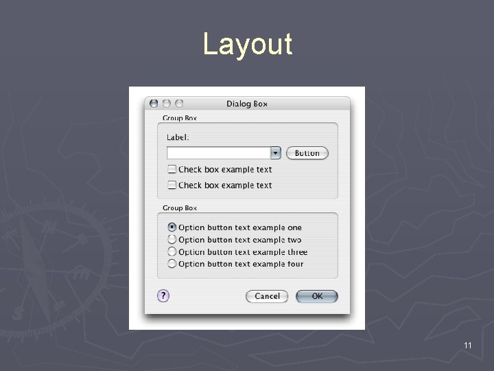
Layout 11
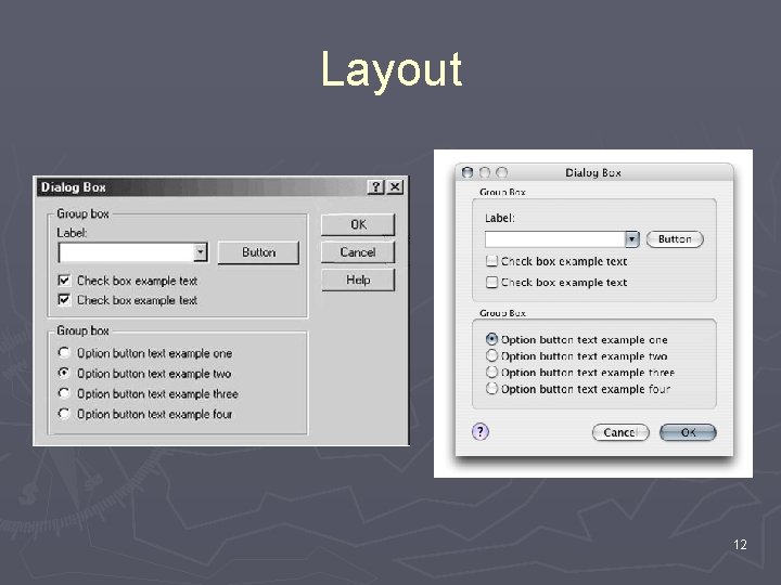
Layout 12
Icons } Icons get used for lots of different things § Representing objects Files Tools § Representing commands Open Undo . . often shortcuts to menu commands that have no icon 13
Icons } There are guidelines for these too § Apple: Design and composition should indicate purpose Perspective should agree with real-life interactions Differentiate them from other UI elements § Microsoft: Colors that complement the XP design Perspective is either at a certain angle, or straight-on Everyday objects should look modern 14
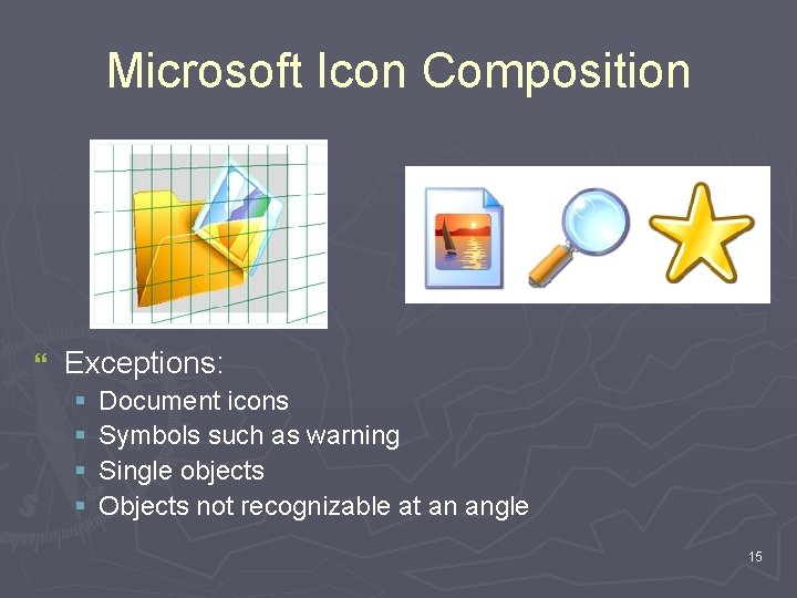
Microsoft Icon Composition } Exceptions: § § Document icons Symbols such as warning Single objects Objects not recognizable at an angle 15
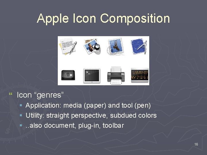
Apple Icon Composition } Icon “genres” § § § Application: media (paper) and tool (pen) Utility: straight perspective, subdued colors. . also document, plug-in, toolbar 16
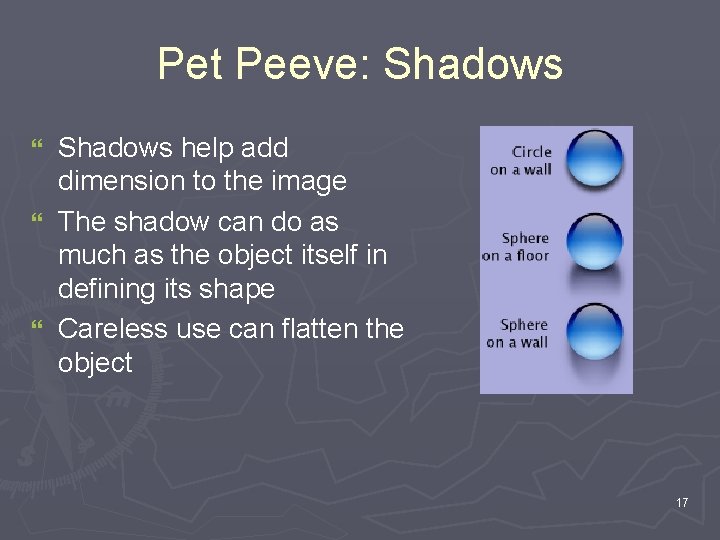
Pet Peeve: Shadows help add dimension to the image } The shadow can do as much as the object itself in defining its shape } Careless use can flatten the object } 17
Summary Concrete examples of the principles we’ve been discussing } There are professionals who actually believe in what we’ve been discussing } You don’t have to design every single element of your application } §. . in fact you shouldn’t §. . most of the time 18
Sources } Apple’s User Experience page § http: //developer. apple. com/ue } Microsoft’s User Interface Design and Development page § http: //msdn. microsoft. com/library/default. asp? url =/nhp/default. asp? contentid=28000443 19
- Slides: 19