Objectives Understand the use of spreadsheets and Excel

Objectives • • • Understand the use of spreadsheets and Excel Explore (Learn the parts of the Excel window) Scroll through a worksheet and navigate between worksheets Create and save a workbook file Enter text, numbers, and dates into a worksheet Formatting Cells manipulation Resize, insert, and remove columns and rows Using Find and replace Printing Worksheet Views Worksheet manipulation Data types • • Filling, sorting and filtering Formulas Operators Functions Auto. Sum Functions Error Types Charts Statistics and Analysis Tools
Introducing Excel • Microsoft Office Excel (or Excel) is a computer program used to enter, analyze, and present quantitative data • Divided into rows and columns – Columns identified with alphabetic headings – Rows identified with numeric headings • Cell – the intersection of a row and a column – Cell reference uniquely identifies a cell • Consists of column letter and row number • A spreadsheet is a collection of text and numbers laid out in a rectangular grid. • Often used in business for budgeting, inventory management, and decision making.
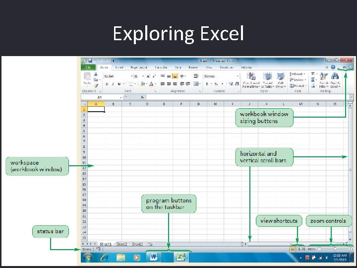
Exploring Excel

Toolbars • Appear beneath the menu bar • Contain buttons that perform commonly-used commands • Standard toolbar – buttons correspond to most basic commands in Excel – Examples include opening, closing, and saving a workbook • Formatting toolbar – buttons correspond to common formatting operations – Examples include boldface and cell alignment

The File Menu • Contains most common commands related to Excel files • Examples: – New command creates a new workbook – Open command opens an existing workbook – Save command saves a workbook – Save As command saves a copy of an existing workbook under a different name or file type – Print command prints all or part of a worksheet
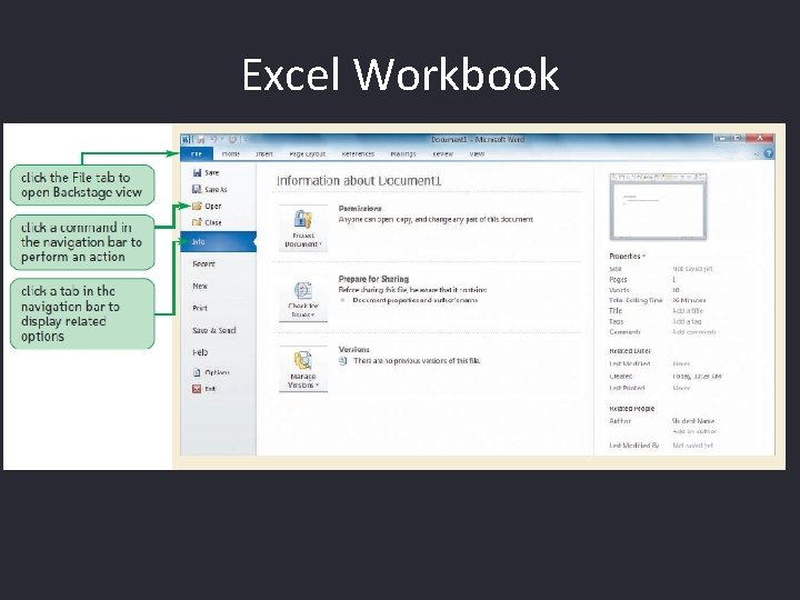
Excel Workbook

Opening a Workbook

Save and Save As
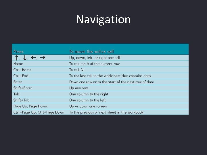
Navigation

Formatting Cells
Cells Manipulation • Insertion, Deletion, Clearing Cells Selection Click , drag, release mouse Or use Shift and click, or Click and Ctrl key, or Ctrl+A � Cells (Range) Moving or Copying Click , drag, release mouse Or use Shift and click, or Click and Ctrl key, or Ctrl+A �

Entering Multiple Lines of Text Within a Cell • Click the cell in which you want to enter the text • Type the first line of text • For each additional line of text, press the Alt+Enter keys (that is, hold down the Alt key as you press the Enter key), and then type the text

Using Find and Replace • You can use the Find command to locate numbers and text in the workbook and the Replace command to overwrite them (Press CTRL+F to find, CTRL+H to replace)

Page Setup

Page Setup (continued) Header/Footer tab allows user to create headers and footers for each printed sheet Sheet tab is used to control repeating rows or columns or print gridlines
Changing Worksheet Views • You can view a worksheet in three ways: – Normal view simply shows the contents of the worksheet – Page Layout view shows how the worksheet will appear on the page or pages sent to the printer – Page Break Preview displays the location of the different page breaks within the worksheet

Changing Worksheet Views � Page Break Preview
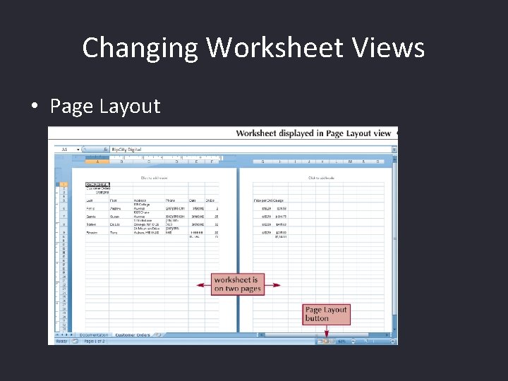
Changing Worksheet Views • Page Layout

Inserting, Deleting, Renaming, Copying, Moving a Worksheet
Data Types in Excel • The formula bar displays the content of the active cell • Text data is a combination of letters, numbers, and some symbols • Number data is any numerical value that can be used in a mathematical calculation • Date and time data are commonly recognized formats for date and time values

Formulas • A formula is an expression that returns a value • A formula is written using operators that combine different values, returning a single value that is then displayed in the cell – The most commonly used operators are arithmetic operators • The order of precedence is a set of predefined rules used to determine the sequence in which operators are applied in a calculation
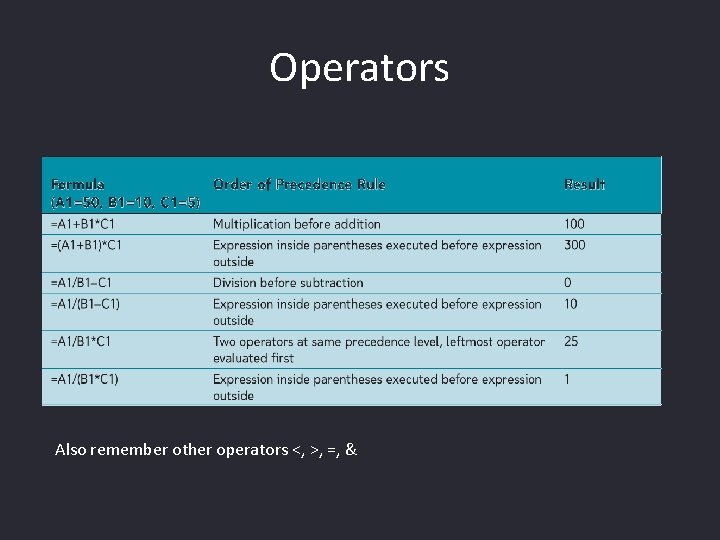
Operators Also remember other operators <, >, =, &
Entering a formula • Click the cell in which you want the formula results to appear • Type = and an expression that calculates a value using cell references and arithmetic operators • Press the Enter key or press the Tab key to complete the formula

Introducing Functions • A function is a named operation that returns a value • For example, to add the values in the range A 1: A 10, you could enter the following long formula: =A 1+A 2+A 3+A 4+A 5+A 6+A 7+A 8+A 9+A 10 Or, you could use the SUM function to accomplish the same thing: =SUM(A 1: A 10)
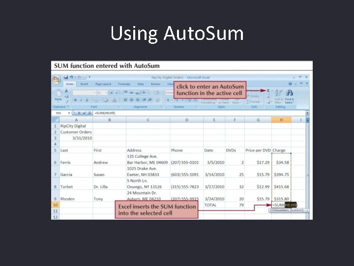
Using Auto. Sum

Error Types Description Correct a ##### error Excel displays this error when a column is not wide enough to display all the characters in a cell, or a cell contains negative date or time values. For example, a formula that subtracts a date in the future from a date in the past, such as =06/15/2008 -07/01/2008, results in a negative date value. Correct a #DIV/0! error Excel displays this error when a number is divided either by zero (0) or by a cell that contains no value. Correct a #N/A error Excel displays this error when a value is not available to a function or formula. Correct a #NAME? error This error is displayed when Excel does not recognize text in a formula. For example, a range name or the name of a function may be spelled incorrectly. = 1+leno Correct a #NULL! error Excel displays this error when you specify an intersection of two areas that do not intersect (cross). The intersection operator is a space character that separates references in a formula. For example, the areas A 1: A 2 and C 3: C 5 do not intersect, so entering the formula =SUM(A 1: A 2 C 3: C 5) returns the #NULL! error. Correct a #NUM! error Excel displays this error when a formula or function contains invalid numeric values. (LN(-3)) Correct a #REF! error Excel displays this error when a cell reference is not valid. For example, you may have deleted cells that were referred to by other formulas, or you may have pasted cells that you moved on top of cells that were referred to by other formulas. Correct a #VALUE! error Excel can display this error if your formula includes cells that contain different data types. If error checking formulas is enabled, the Screen. Tip displays "A value used in the formula is of the wrong data type. " You can typically fix this problem by making minor changes to your formula. (=45+LISA)
Creating Charts • A chart is a graphical representation of some numbers • Often used to emphasize the relationship between certain data values. • Displaying your data graphically can make it easier to spot patterns and trends • Before you can create a chart you must have some data on your worksheet.

Creating a Chart • Select the cells containing the data you want to chart. This should include any row and column headings. • Easiest way to start is from Insert Chart menu. • Or just try to press F 11 !

Chart Types • Column Charts Data that is arranged in columns or rows on a worksheet. Column charts are useful for showing data changes over a period of time or for illustrating comparisons among items Categories are typically organized along the horizontal axis and values along the vertical axis.
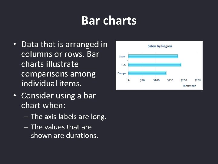
Bar charts • Data that is arranged in columns or rows. Bar charts illustrate comparisons among individual items. • Consider using a bar chart when: – The axis labels are long. – The values that are shown are durations.
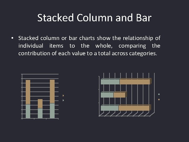
Stacked Column and Bar • Stacked column or bar charts show the relationship of individual items to the whole, comparing the contribution of each value to a total across categories. 100 90 March 80 70 60 50 Google 40 Yahoo February Google 30 January 20 10 0 0 January February March 10 20 30 40 50 60 70 80 90
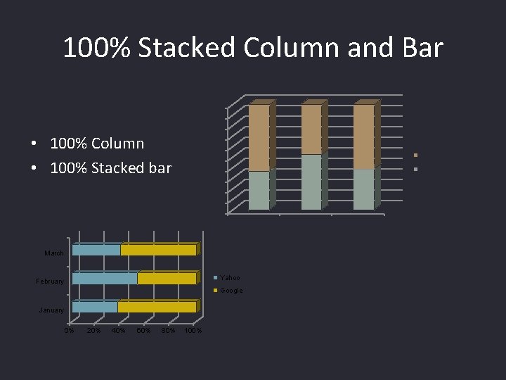
100% Stacked Column and Bar 100% 90% 80% 70% 60% 50% 40% • 100% Column • 100% Stacked bar Google Yahoo 30% 20% 10% 0% January March Yahoo February Google January 0% 20% 40% 60% 80% 100% February March
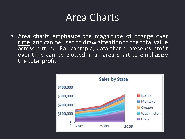
Area Charts • Area charts emphasize the magnitude of change over time, and can be used to draw attention to the total value across a trend. For example, data that represents profit over time can be plotted in an area chart to emphasize the total profit
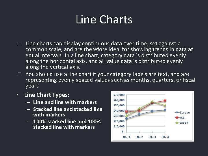
Line Charts Line charts can display continuous data over time, set against a common scale, and are therefore ideal for showing trends in data at equal intervals. In a line chart, category data is distributed evenly along the horizontal axis, and all value data is distributed evenly along the vertical axis. � You should use a line chart if your category labels are text, and are representing evenly spaced values such as months, quarters, or fiscal years � • Line Chart Types: – Line and line with markers – Stacked line and stacked line with markers – 100% stacked line and 100% stacked line with markers
XY (scatter) charts • Shows two values and tries to show relationships, usually independent of time. • This shows the correlation between two or more data series. • This type of chart is useful when the x-values are numeric. • This is used when you need to plot ordered pairs of data to observe the dependence of one value to another. • Consider using a scatter chart when: – – You want to change the scale of the horizontal axis. You want to make that axis a logarithmic scale. Values for horizontal axis are not evenly spaced. There are many data points on the horizontal axis.
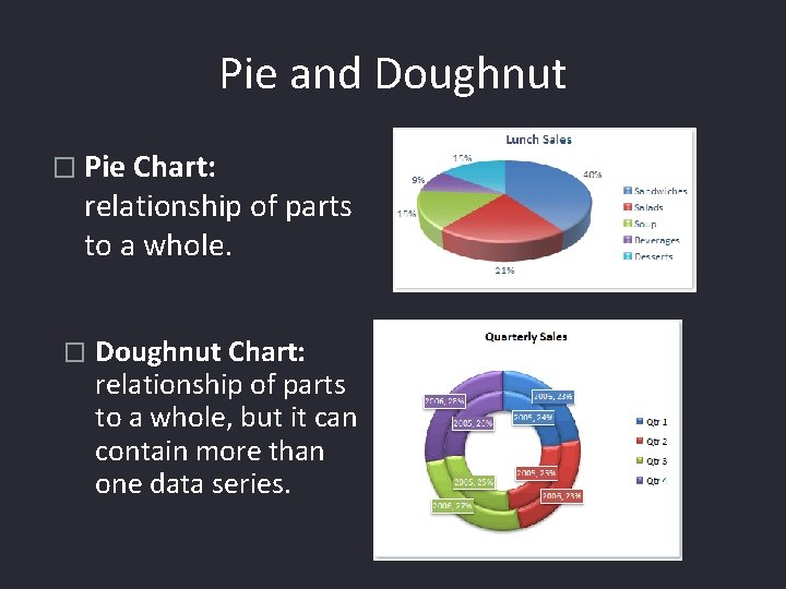
Pie and Doughnut � Pie Chart: relationship of parts to a whole. � Doughnut Chart: relationship of parts to a whole, but it can contain more than one data series.
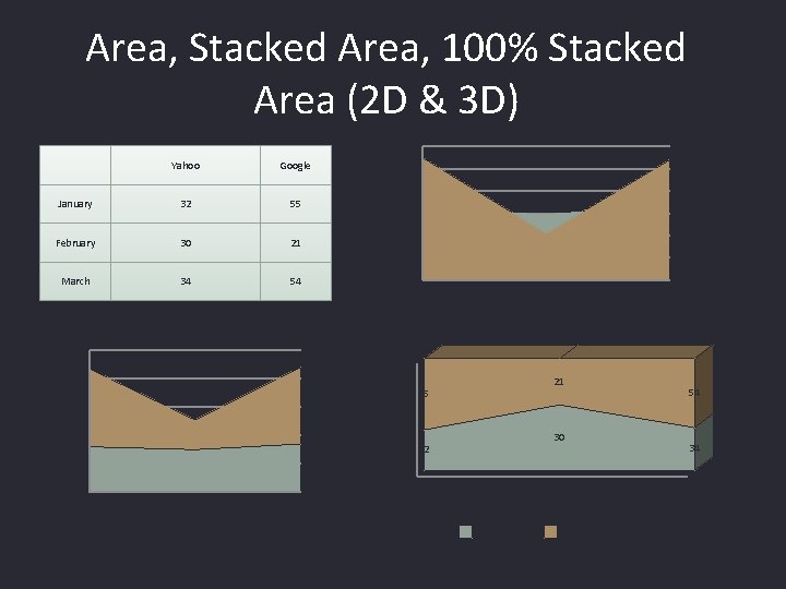
Area, Stacked Area, 100% Stacked Area (2 D & 3 D) Yahoo Google January 32 55 February 30 21 March 34 54 100 60 50 40 30 20 10 0 January 80% 60 60% 40 40% 21 55 30 20% 32 20 January March 100% 80 0 February March 0% January February Yahoo Google 54 34 March
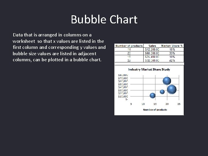
Bubble Chart Data that is arranged in columns on a worksheet so that x values are listed in the first column and corresponding y values and bubble size values are listed in adjacent columns, can be plotted in a bubble chart.
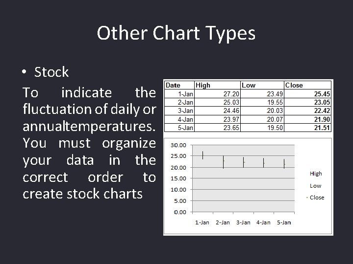
Other Chart Types • Stock To indicate the fluctuation of daily or annualtemperatures. You must organize your data in the correct order to create stock charts

Other Charts • Surface charts � Radar

Common Functions • Common functions – (ABS, AVERAGE, COUNTA, COUNTBLANK, COUNTIF, EXP, FACT, INT, LN, LOG 10, MAX, MEDIAN – PI(), POWER(X, Y), SQRT

Analysis Tool. Pak
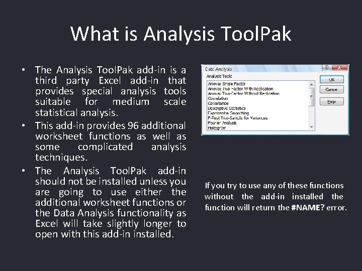
What is Analysis Tool. Pak • The Analysis Tool. Pak add-in is a third party Excel add-in that provides special analysis tools suitable for medium scale statistical analysis. • This add-in provides 96 additional worksheet functions as well as some complicated analysis techniques. • The Analysis Tool. Pak add-in should not be installed unless you are going to use either the additional worksheet functions or the Data Analysis functionality as Excel will take slightly longer to open with this add-in installed. If you try to use any of these functions without the add-in installed the function will return the #NAME? error.
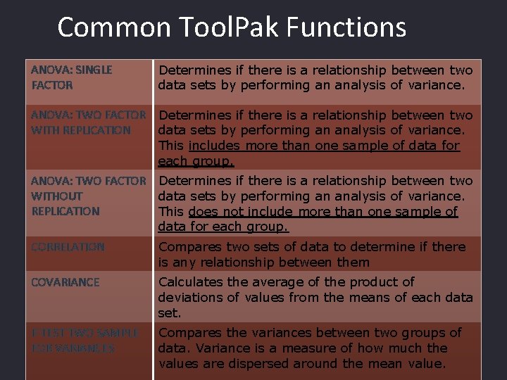
Common Tool. Pak Functions ANOVA: SINGLE FACTOR Determines if there is a relationship between two data sets by performing an analysis of variance. ANOVA: TWO FACTOR WITH REPLICATION Determines if there is a relationship between two data sets by performing an analysis of variance. This includes more than one sample of data for each group. ANOVA: TWO FACTOR WITHOUT REPLICATION Determines if there is a relationship between two data sets by performing an analysis of variance. This does not include more than one sample of data for each group. CORRELATION Compares two sets of data to determine if there is any relationship between them COVARIANCE Calculates the average of the product of deviations of values from the means of each data set. F-TEST TWO SAMPLE FOR VARIANCES Compares the variances between two groups of data. Variance is a measure of how much the values are dispersed around the mean value.
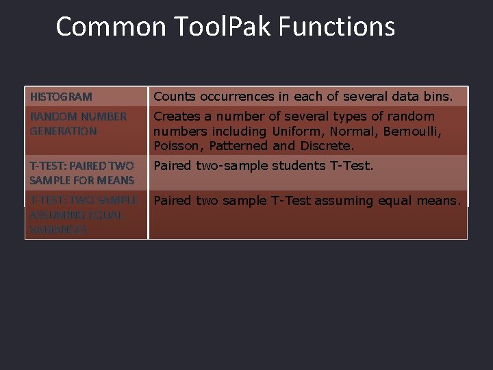
Common Tool. Pak Functions HISTOGRAM Counts occurrences in each of several data bins. RANDOM NUMBER GENERATION Creates a number of several types of random numbers including Uniform, Normal, Bernoulli, Poisson, Patterned and Discrete. T-TEST: PAIRED TWO SAMPLE FOR MEANS Paired two-sample students T-Test. T-TEST: TWO SAMPLE ASSUMING EQUAL VARIANCES Paired two sample T-Test assuming equal means.

Correlation • Correlation is basically whether or not there is any relationship between two sets of data. • The Correlation component will only tell you if there is a correlation. It will not tell you to what extent the two data sets are related • The population correlation calculation returns the covariance of the two data sets divided by the product of their standard deviations. January February March April May June Business Cards 51 42 70 65 49 52 Business Cards Number of Visitors 320 362 485 436 386 414 Business Cards 1 0. 817148378 Number of Visitors 1 A coefficient of 1 denotes a perfect positive correlation
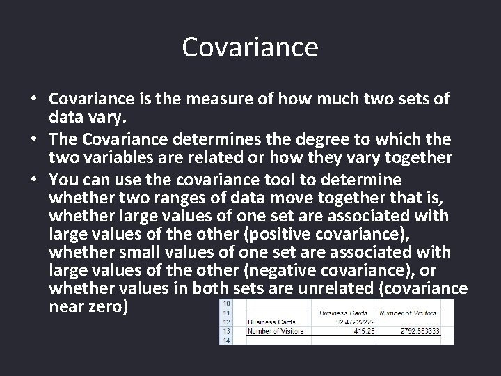
Covariance • Covariance is the measure of how much two sets of data vary. • The Covariance determines the degree to which the two variables are related or how they vary together • You can use the covariance tool to determine whether two ranges of data move together that is, whether large values of one set are associated with large values of the other (positive covariance), whether small values of one set are associated with large values of the other (negative covariance), or whether values in both sets are unrelated (covariance near zero)
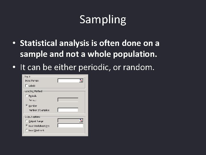
Sampling • Statistical analysis is often done on a sample and not a whole population. • It can be either periodic, or random.
Histogram • A histogram is basically a set of totals for values in particular ranges. • A histogram is a chart (usually a simple column chart) that takes a collection of measurements and plots the number of measurements (called the frequency) that fall within each of several intervals (called bins). • For example, a histogram can show you exactly how the test scores of all students who took a test measure up
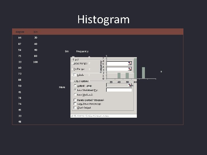
Histogram degree bin 94 20 87 40 59 60 75 80 20 0 33 100 40 2 90 60 2 73 80 7 88 100 4 50 61 78 74 65 33 68 More Histogram Frequency 0 Frequency bin 8 7 6 5 4 3 2 1 0 Frequency 20 40 60 bin 80 100 More

ANOVA (F-Test) (Analysis of Variance) • Analysis of Variances is a method of checking if there is a relationship between two or more data sets. • Sometimes referred to as an F-Test after the British statistician R. A. Fisher. • There actually three different types of ANOVA that are available through the Analysis Tool. Pak – Single Factor - This performs a simple analysis of variances between two data sets. – Two Factor without Replication - This performs an analysis of variances between two or more data sets. This should be used when you only have one sample from each data set. – Two Factor with Replication - This performs an analysis of variances between two or more data sets. This should be used when you have more than one sample from each data set.
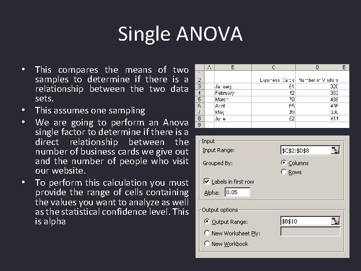
Single ANOVA • This compares the means of two samples to determine if there is a relationship between the two data sets. • This assumes one sampling • We are going to perform an Anova single factor to determine if there is a direct relationship between the number of business cards we give out and the number of people who visit our website. • To perform this calculation you must provide the range of cells containing the values you want to analyze as well as the statistical confidence level. This is alpha

Single ANOVA (Cont…)
T-Test • An ANOVA (or F-Test) and is closely related to the T-Test. • The major difference is that the T-Test measures the difference between the means of two data sets where as the F-Test measures the difference between the means of two or more data sets. • The advantage of using ANOVA rather than multiple T-Tests is that it reduces the probability of an I-type error. Making multiple comparisons increases the likelihood of finding something by chance (i. e. making an I-type error) (false positive) e. g. when we are observing a difference when in truth there is none, thus indicating a test of poor specificity. An example of this would be if a test shows that a woman is pregnant when in reality she is not. . • An ANOVA controls the overall error by testing all the means against each other at the same time.

T-Test • • • There are three types of T test you can use on Excel. Let’s say you wanted to test whether heart rate increased after drinking a cup of hot sauce or whether plant growth would increase after adding fertilizer to pots of soil. In these cases you would be comparing the heart rate of the same people, or the growth of the same pot of plants before and after the treatment. This would require a "paired" or "dependent" T test. Excel calls this a "type 1" test. Let’s look at another situation. Say you want to know whether nursing students consume more coffee than do biology students. You would then have two groups of test subjects rather than taking 2 measurements on each person. Now you would use an "unpaired" or "independent" T-test. Excel calls these "type 2" or "type 3" tests. Now the tricky part is to decide which of these to use. Are the standard deviations about the same for both groups, or are they different? You can test this statistically, but let’s just work with how they seem. If in doubt, go with "type 3" for unequal variances. Now hit "OK" and see what the number is. This is your P-value. Remember that a P-value below 0. 05 is generally considered statistically significant, while one of 0. 05 or greater indicates no difference between the groups.
- Slides: 56