Objectives To identify elements and principles of design
Objectives • To identify elements and principles of design. • To apply the principles and elements in design. • To examine the impact of the elements and principles of design. 2
Chapters • Elements • Principles 3
4
Elements & Principles • Can be defined in any visual design or work of art • Act as the structure of an art work • Can help to create a well balanced piece 5
Elements • Refer to building blocks or ingredients of art • Are the components that make up the design • Create the basic visual material used to make art 6 6
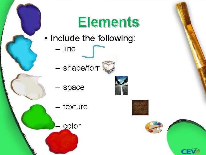
Elements • Include the following: ‒ line ‒ shape/form ‒ space ‒ texture ‒ color 7
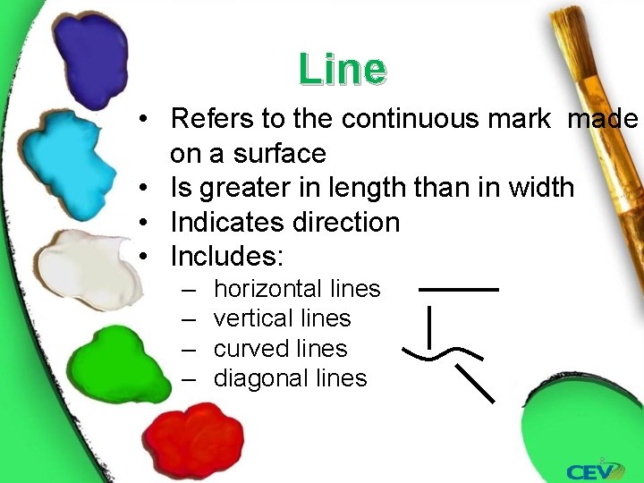
Line • Refers to the continuous mark made on a surface • Is greater in length than in width • Indicates direction • Includes: ‒ ‒ horizontal lines vertical lines curved lines diagonal lines 8
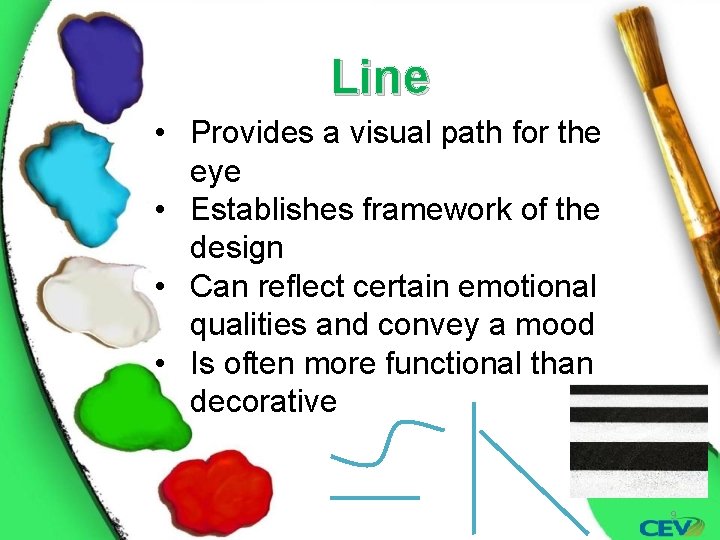
Line • Provides a visual path for the eye • Establishes framework of the design • Can reflect certain emotional qualities and convey a mood • Is often more functional than decorative 9
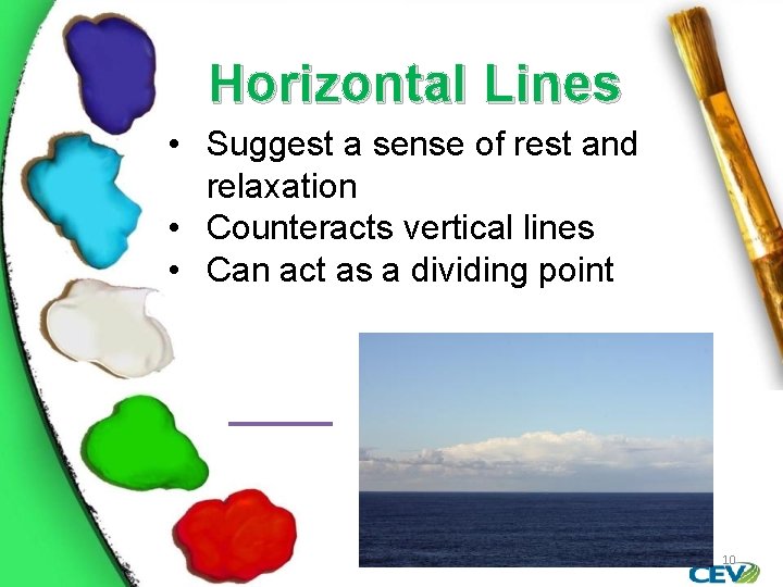
Horizontal Lines • Suggest a sense of rest and relaxation • Counteracts vertical lines • Can act as a dividing point 10
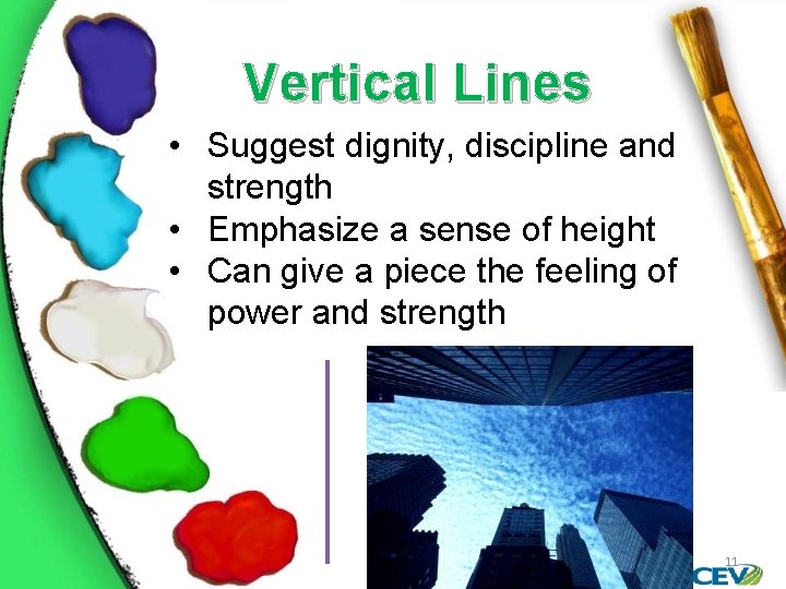
Vertical Lines • Suggest dignity, discipline and strength • Emphasize a sense of height • Can give a piece the feeling of power and strength 11
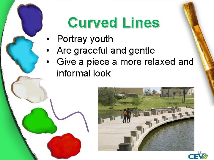
Curved Lines • Portray youth • Are graceful and gentle • Give a piece a more relaxed and informal look 12
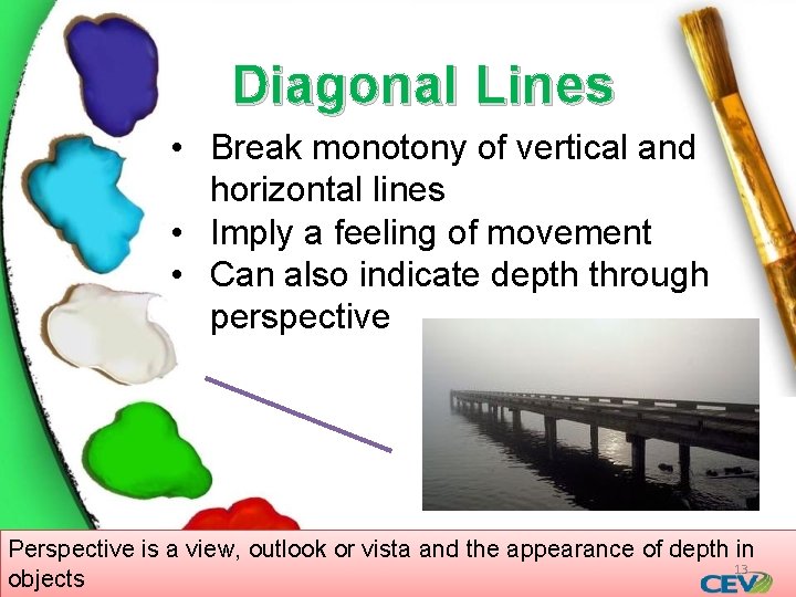
Diagonal Lines • Break monotony of vertical and horizontal lines • Imply a feeling of movement • Can also indicate depth through perspective Perspective is a view, outlook or vista and the appearance of depth in 13 objects
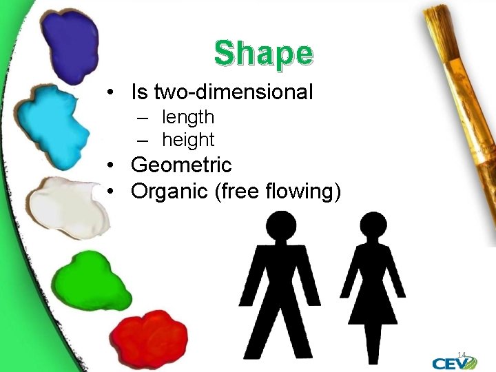
Shape • Is two-dimensional ‒ length ‒ height • Geometric • Organic (free flowing) 14
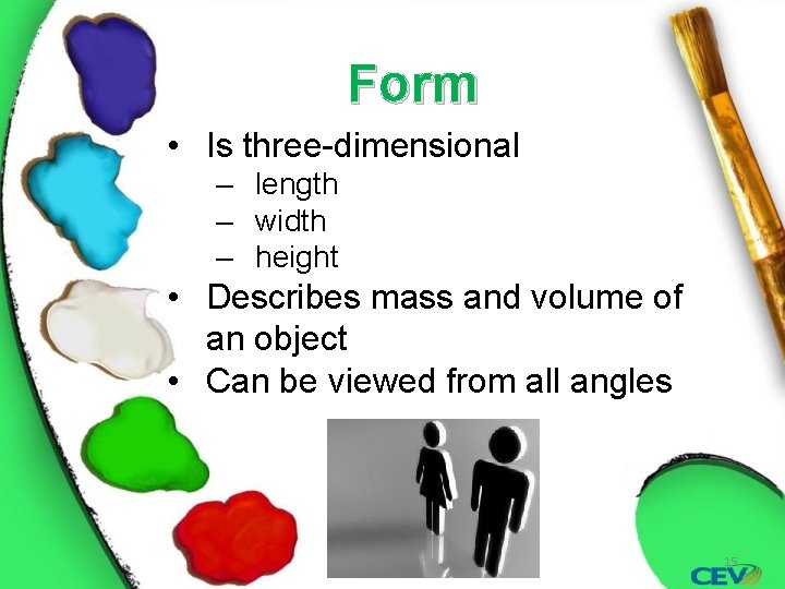
Form • Is three-dimensional ‒ length ‒ width ‒ height • Describes mass and volume of an object • Can be viewed from all angles 15
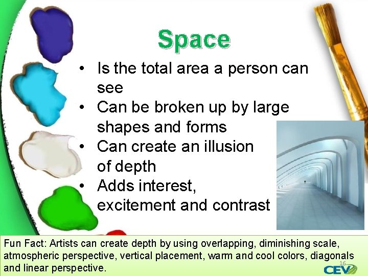
Space • Is the total area a person can see • Can be broken up by large shapes and forms • Can create an illusion of depth • Adds interest, excitement and contrast Fun Fact: Artists can create depth by using overlapping, diminishing scale, atmospheric perspective, vertical placement, warm and cool colors, diagonals 16 and linear perspective.
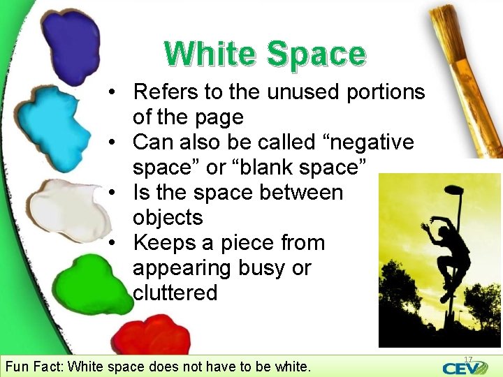
White Space • Refers to the unused portions of the page • Can also be called “negative space” or “blank space” • Is the space between objects • Keeps a piece from appearing busy or cluttered Fun Fact: White space does not have to be white. 17
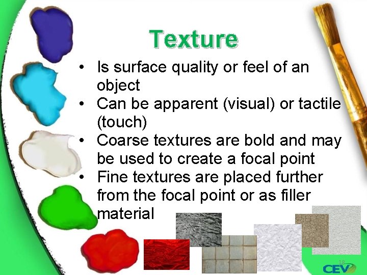
Texture • Is surface quality or feel of an object • Can be apparent (visual) or tactile (touch) • Coarse textures are bold and may be used to create a focal point • Fine textures are placed further from the focal point or as filler material 18
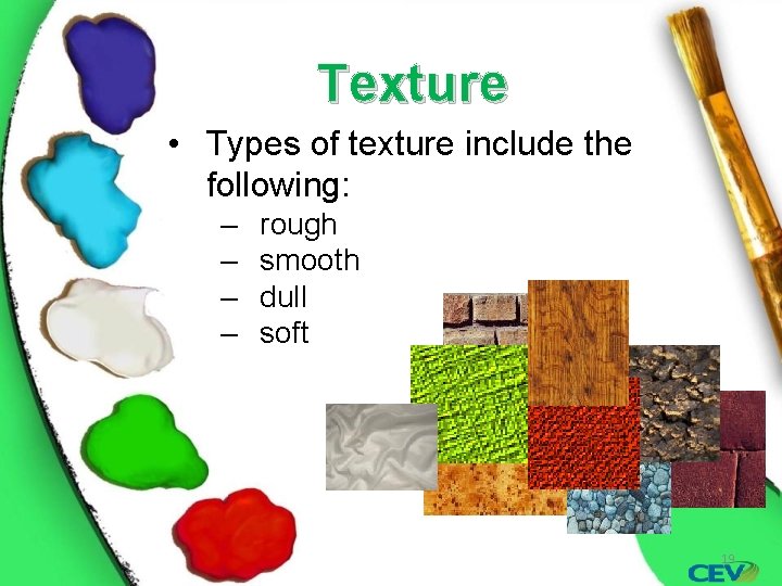
Texture • Types of texture include the following: ‒ ‒ rough smooth dull soft 19
Color • Is defined as light reflected off objects • Can have strong emotional and psychological impact • Includes the following: ‒ hue (name) ‒ value (how light or dark) ‒ intensity (how bright or dull) 20
Hue • Is one of the main properties of color • Allows a color to be classified as red, green, blue, etc. • Refers to the wavelength of visible light 21
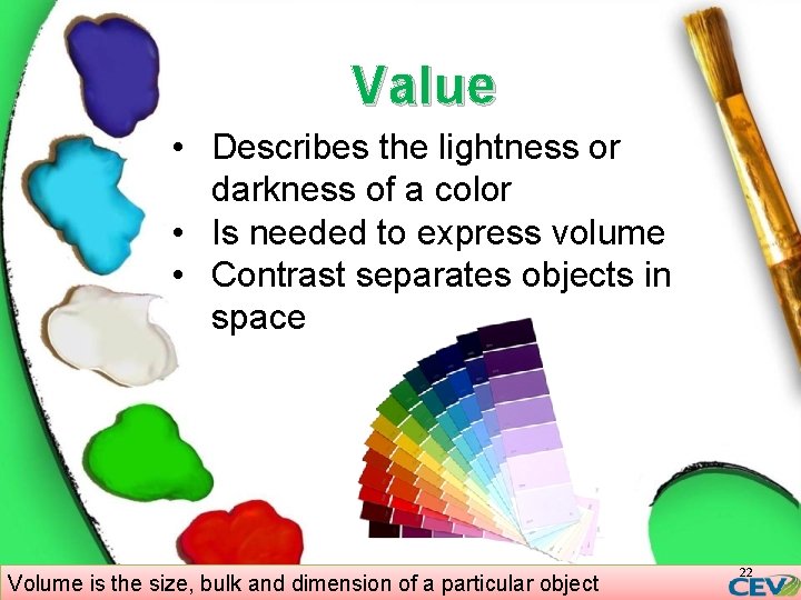
Value • Describes the lightness or darkness of a color • Is needed to express volume • Contrast separates objects in space Volume is the size, bulk and dimension of a particular object 22
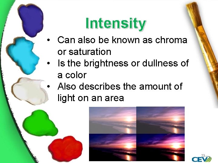
Intensity • Can also be known as chroma or saturation • Is the brightness or dullness of a color • Also describes the amount of light on an area 23
Color • May be used in the foreground or background of a piece • Draws attention • Adds a visual stimuli to the piece • Can have a psychological affect on the viewer 24
Warm Colors • Can evoke the following emotions: ‒ red: energy, power, passion ‒ yellow: joy, happiness, intellect ‒ orange: determination, fascination, encouragement 25
Cool Colors • Can evoke the following emotions: ‒ green: growth, harmony, freshness ‒ blue: calm, relaxed, faith ‒ violet: playfulness, impulsiveness, sophistication 26
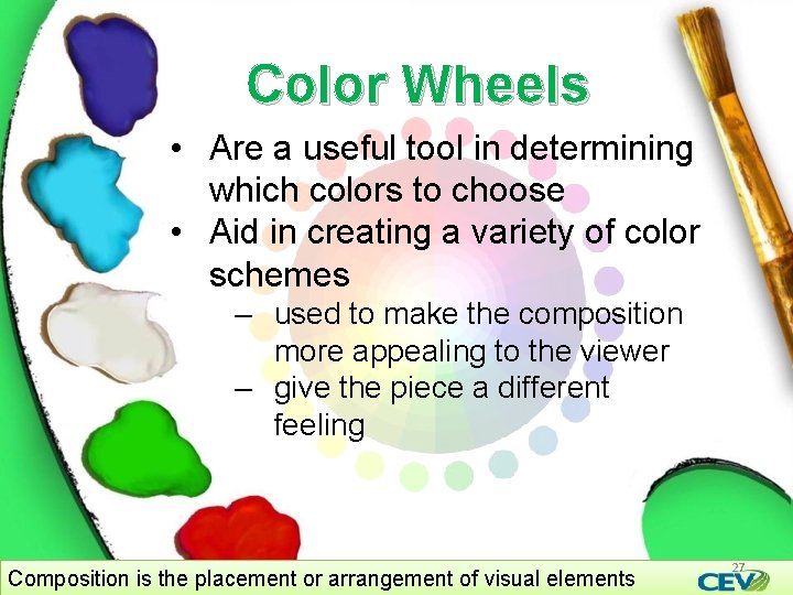
Color Wheels • Are a useful tool in determining which colors to choose • Aid in creating a variety of color schemes ‒ used to make the composition more appealing to the viewer ‒ give the piece a different feeling Composition is the placement or arrangement of visual elements 27
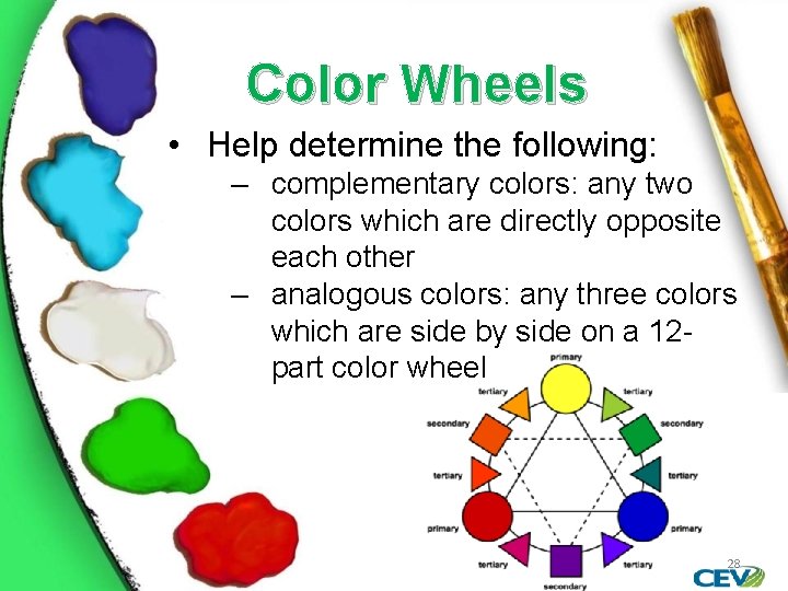
Color Wheels • Help determine the following: ‒ complementary colors: any two colors which are directly opposite each other ‒ analogous colors: any three colors which are side by side on a 12 part color wheel 28
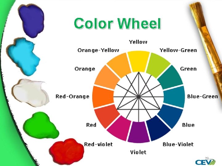
Color Wheel 29
30
Principles • Are ways to work with or arrange elements • Describe the way the elements fit together • Include: ‒ ‒ ‒ rhythm emphasis balance proportion/scale harmony 31
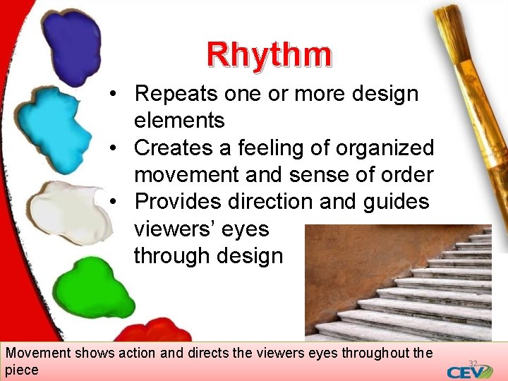
Rhythm • Repeats one or more design elements • Creates a feeling of organized movement and sense of order • Provides direction and guides viewers’ eyes through design Movement shows action and directs the viewers eyes throughout the piece 32
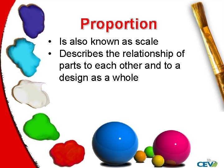
Proportion • Is also known as scale • Describes the relationship of parts to each other and to a design as a whole 33
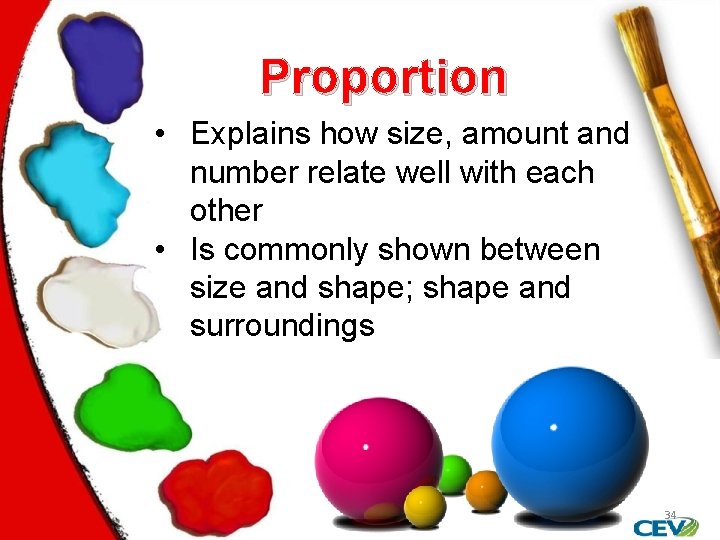
Proportion • Explains how size, amount and number relate well with each other • Is commonly shown between size and shape; shape and surroundings 34
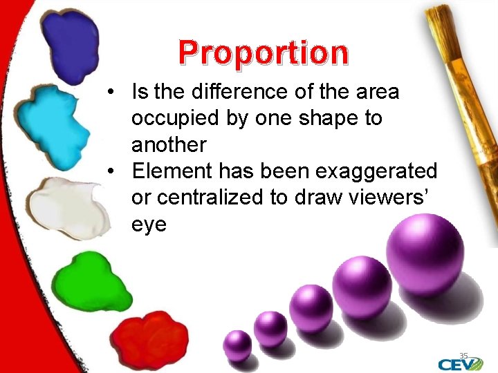
Proportion • Is the difference of the area occupied by one shape to another • Element has been exaggerated or centralized to draw viewers’ eye 35
Repetition • Is the act of duplicating • Refers to the unchanging look and feel across a piece of work or a number of pieces • Can be used for colors, graphics or a style • Should make navigation throughout the piece easier 36
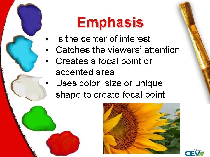
Emphasis • Is the center of interest • Catches the viewers’ attention • Creates a focal point or accented area • Uses color, size or unique shape to create focal point 37
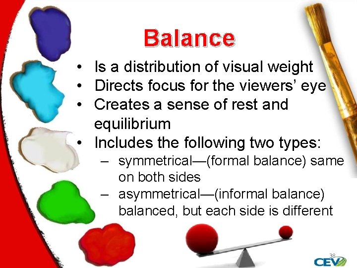
Balance • Is a distribution of visual weight • Directs focus for the viewers’ eye • Creates a sense of rest and equilibrium • Includes the following two types: ‒ symmetrical—(formal balance) same on both sides ‒ asymmetrical—(informal balance) balanced, but each side is different 38
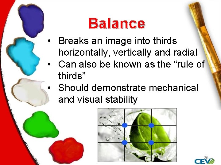
Balance • Breaks an image into thirds horizontally, vertically and radial • Can also be known as the “rule of thirds” • Should demonstrate mechanical and visual stability 39
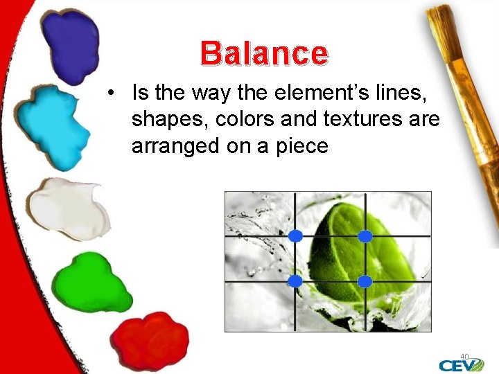
Balance • Is the way the element’s lines, shapes, colors and textures are arranged on a piece 40
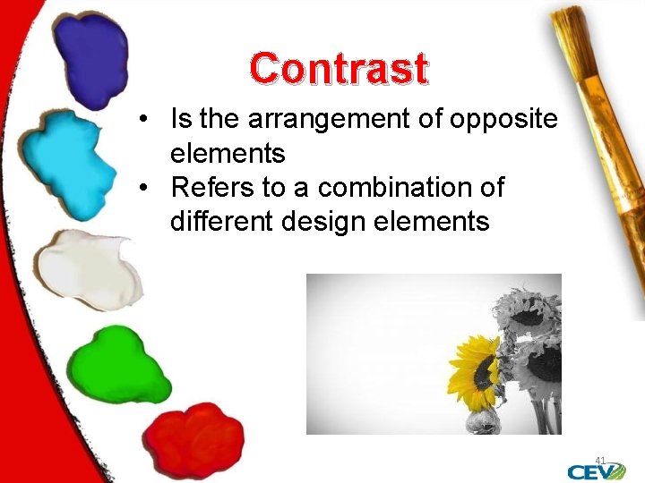
Contrast • Is the arrangement of opposite elements • Refers to a combination of different design elements 41
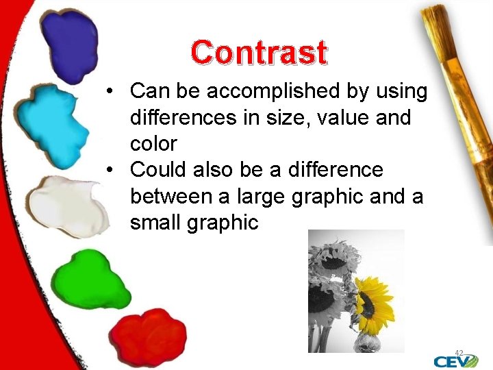
Contrast • Can be accomplished by using differences in size, value and color • Could also be a difference between a large graphic and a small graphic 42

Harmony • Also known as unity • Occurs when everything in the piece works together • Is successful when several elements hold viewers attention 43
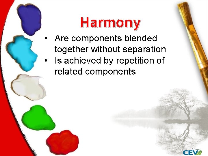
Harmony • Are components blended together without separation • Is achieved by repetition of related components 44
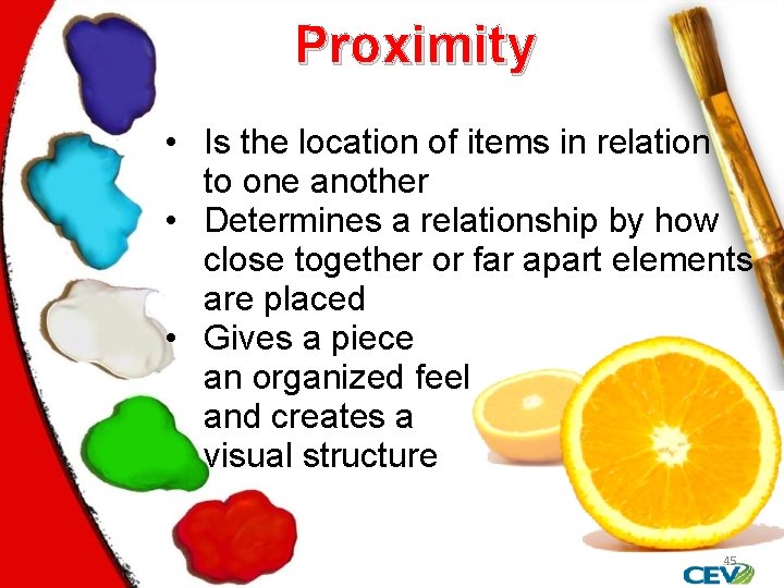
Proximity • Is the location of items in relation to one another • Determines a relationship by how close together or far apart elements are placed • Gives a piece an organized feel and creates a visual structure 45
46
Assessment 1. Why is orange a complementary color of blue? A. Orange is next to blue on a color wheel B. Blue is three spaces away from orange on a color wheel C. Orange is across from blue on a color wheel D. Orange and blue mix well together 2. Three colors side by side on a 12 -part color wheel are known as which of the following? A. Warm colors B. Complementary colors C. Analogous colors D. Color family 47
Assessment 3. Which of the following is the term used to describe the location of an item in relation to another? A. Repetition B. Proximity C. Contrast D. Balance 4. Why would a person choose to use form rather than shape for their design? A. Because the piece appears larger B. Because the pictures appear brighter C. Because the image appears flat D. Because the object can be viewed from all sides 48
Assessment 5. Which of the color properties illustrates why blue can be classified by its formal name? A. Value B. Hue C. Color D. Intensity 6. Which of the following elements is used to separate objects in space? A. Value B. Hue C. Proportion D. White space 49
Assessment 7. Balance in a design can be broken into how many portions? A. Four B. Seven C. Eight D. Three 8. Which of the following explains the effect if a piece did not use the right proximity? A. The piece would look fake B. The piece would lack depth C. The piece would appear flat D. The piece would not be balanced 50
Assessment 9. Which of the following is another name for intensity? A. Negative space B. Volume C. Chroma D. Hue 51
Assessment 10. For his art design class, Aaron has done a drawing. He noticed the visuals on his piece are directly in the center of the page. In his next piece he could use which of the following to make it more appealing? A. Horizontal lines B. Rule of thirds C. Repeat objects D. More lines 52
Sources • Bartel, M. (2010, June 14). Some Ideas About Composition and Design Elements, Principles, and Visual Effects. • Color Theory. ( 1995 -2008). Retrieved October 15, 2010, from Color Matters: http: //www. colormatters. com • Jirousek, C. (1995). Color, Value and Hue. Art Design and Visual Thinking , http: //char. txa. cornell. edu/language/element/co lor/color. htm. 53
Sources • Park, Y. (n. d. ). Design Elements & Principles. University of Texas Austin , http: //www. edb. utexas. edu/minliu/multimedia/ PDFfolder/DESIGN~1. PDF. • Sutterfield, S. (n. d. ). VISUALLY VERBAL: UNDERSTANDING THE ELEMENTS AND PRINCIPLES OF ART. Retrieved October 10, 2010, from Braithwaite Fine Arts Gallery: http: //www. suu. edu/pva/artgallery/documents/ Visually. Verbal. Understandingthe. Elementsof. Ar t. pdf 54
Acknowledgements Production Coordinator Daniel Johnson Collaborator: Jim Johnson, AAF, AIFD, TMF Project Coordinator Olivia Mitchell Graphic Designer Daniel Johnson Technical Writer Jessica Odom V. P. of Brand Management Clayton Franklin © MMXIV CEV Multimedia, Ltd. Executive Producer Gordon W. Davis, Ph. D. 55
- Slides: 55