NUMERICAL DATA QUANTITATIVE CHAPTER 4 Dotplots Dot plots


- Slides: 21

NUMERICAL DATA (QUANTITATIVE) CHAPTER 4

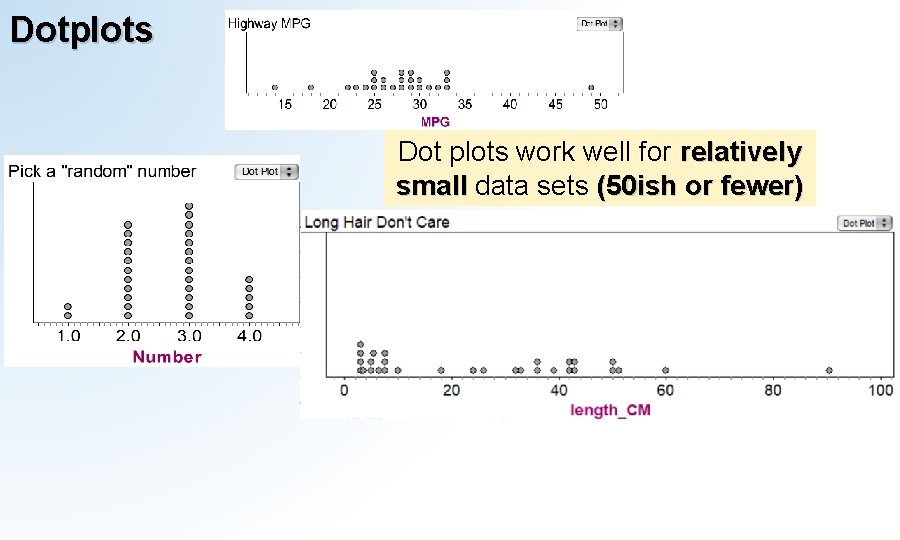
Dotplots Dot plots work well for relatively small data sets (50 ish or fewer)

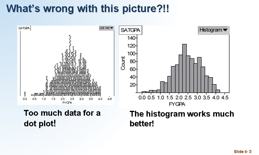
What’s wrong with this picture? !! Too much data for a dot plot! The histogram works much better! Slide 4 - 3

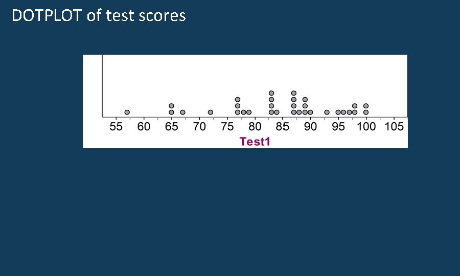
DOTPLOT of test scores

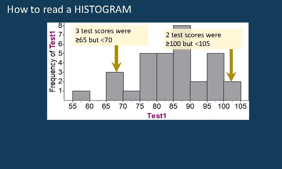
How to read a HISTOGRAM 3 test scores were ≥ 65 but <70 2 test scores were ≥ 100 but <105

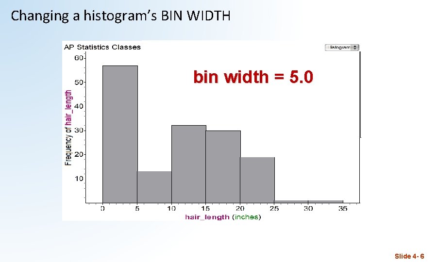
Changing a histogram’s BIN WIDTH 1. 0 bin width = 5. 0 0. 5 2. 0 Slide 4 - 6

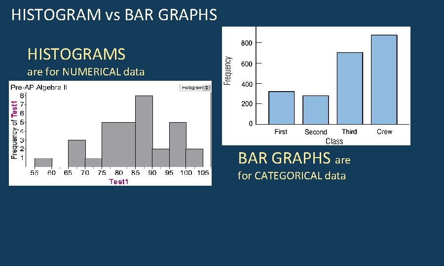
HISTOGRAM vs BAR GRAPHS HISTOGRAMS are for NUMERICAL data BAR GRAPHS are for CATEGORICAL data

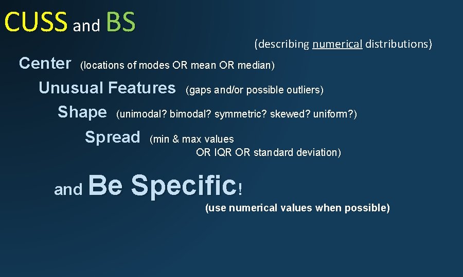
CUSS and BS (describing numerical distributions) Center (locations of modes OR mean OR median) Unusual Features (gaps and/or possible outliers) Shape (unimodal? bimodal? symmetric? skewed? uniform? ) Spread (min & max values OR IQR OR standard deviation) and Be Specific! (use numerical values when possible)

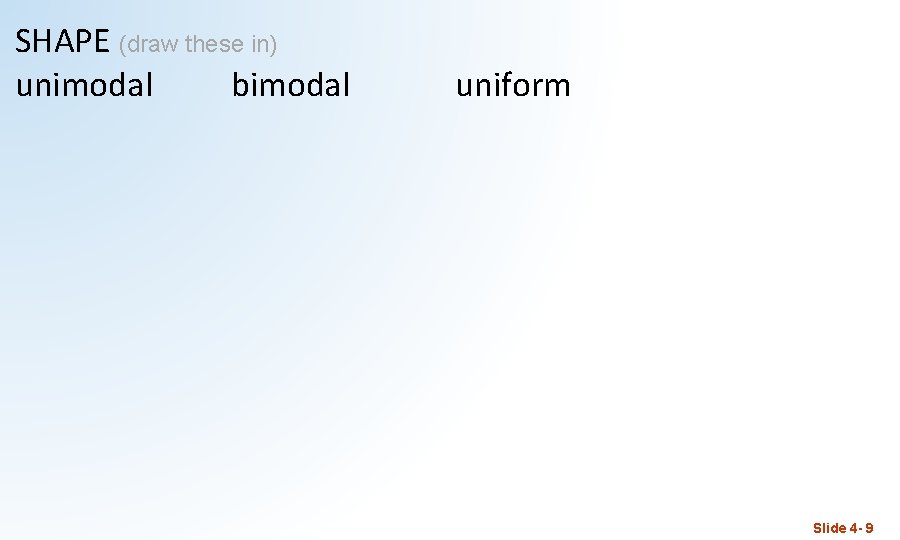
SHAPE (draw these in) unimodal bimodal uniform Slide 4 - 9

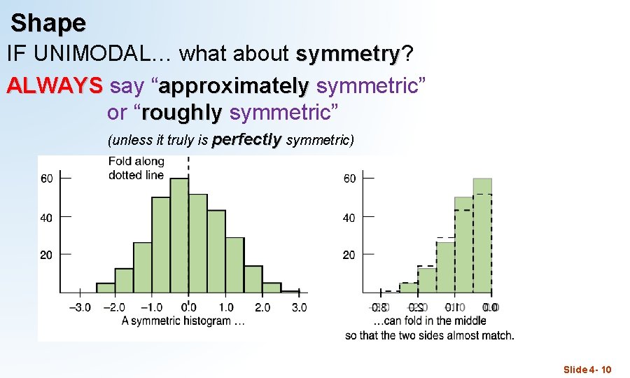
Shape IF UNIMODAL… what about symmetry? symmetry ALWAYS say “approximately symmetric” or “roughly symmetric” (unless it truly is perfectly symmetric) Slide 4 - 10

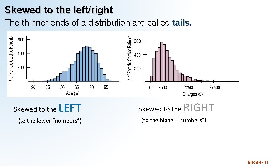
Skewed to the left/right The thinner ends of a distribution are called tails Skewed to the LEFT (to the lower “numbers”) Skewed to the RIGHT (to the higher “numbers”) Slide 4 - 11

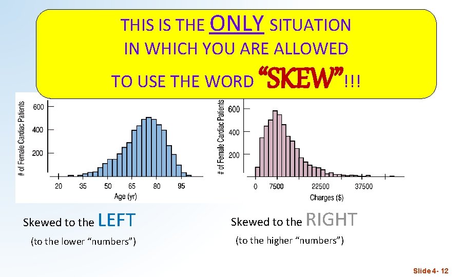
THIS IS THE ONLY SITUATION IN WHICH YOU ARE ALLOWED TO USE THE WORD Skewed to the LEFT (to the lower “numbers”) “SKEW”!!! Skewed to the RIGHT (to the higher “numbers”) Slide 4 - 12

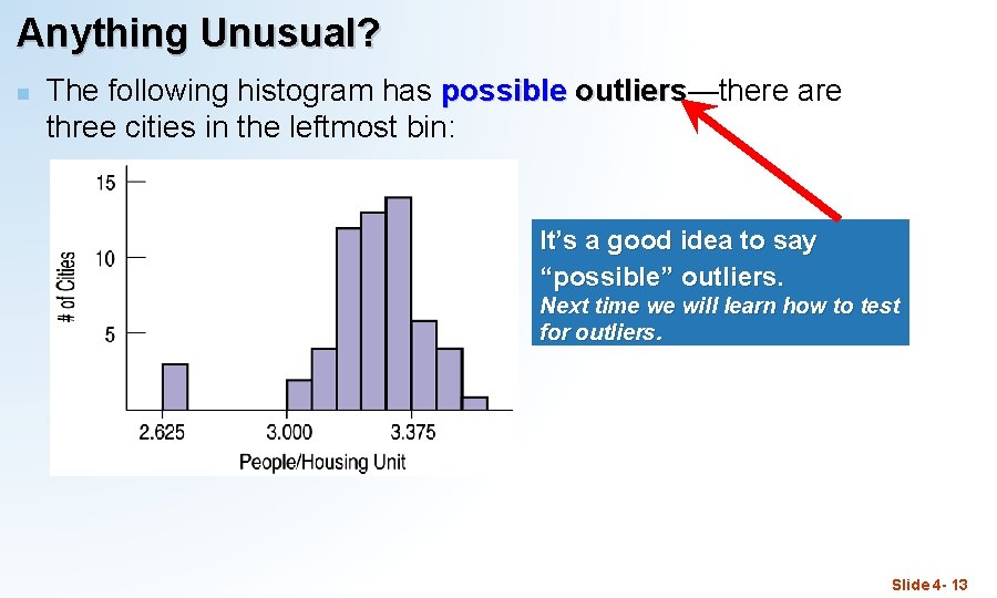
Anything Unusual? n The following histogram has possible outliers—there are outliers three cities in the leftmost bin: It’s a good idea to say “possible” outliers. Next time we will learn how to test for outliers. Slide 4 - 13

CUSS & BS PRACTICE

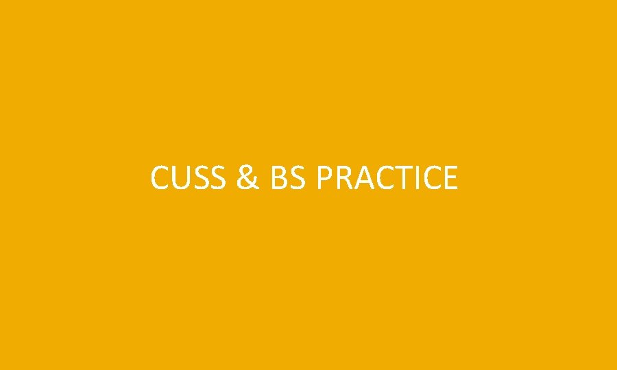
CUSSing & BS-ing practice • Shape: The shape is bimodal. • Center: This distribution of quiz scores appears to have two modes, one at around 55, and another at around 80. • Spread: The spread is from the mid 30’s to the mid-90’s (range of about 60) • Unusual features: There is a gap in the lower 40’s, with a possible outlier in the mid 30’s. Slide 4 - 16

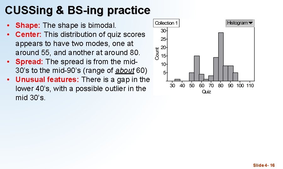
more CUSSing & BS-ing… • Shape: The shape is unimodal and skewed to the left (to the lower grades) • Center: This distribution of grades has a single mode at around 100. • Spread: The spread is from the mid 50’s to about 100 (range of about 45) • Unusual features: There is a gap from the upper 50’s to the upper 60’s, with a possible outlier in the mid 50’s. this does NOT mean that someone had a grade of above 100. (more likely, a lot of 98’s and/or 99’s) Slide 4 - 17

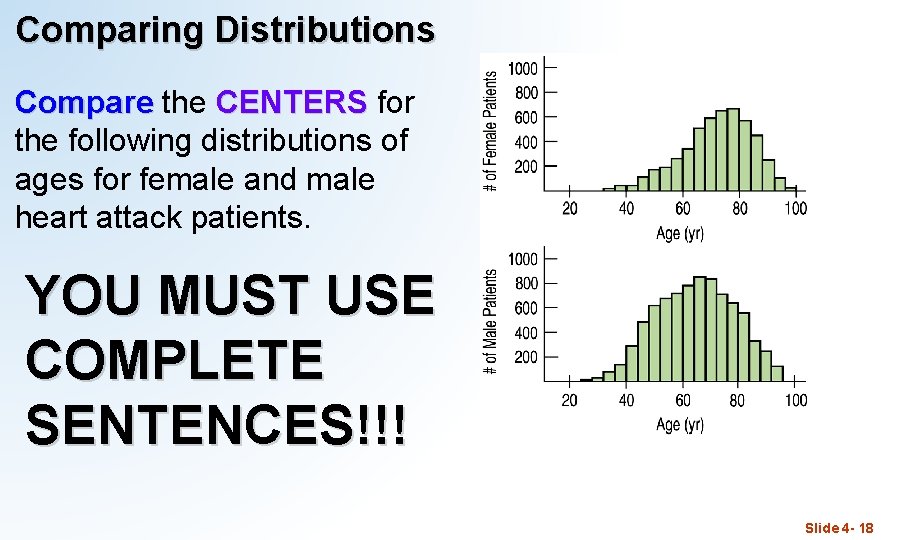
Comparing Distributions Compare the CENTERS for the following distributions of ages for female and male heart attack patients. YOU MUST USE COMPLETE SENTENCES!!! Slide 4 - 18

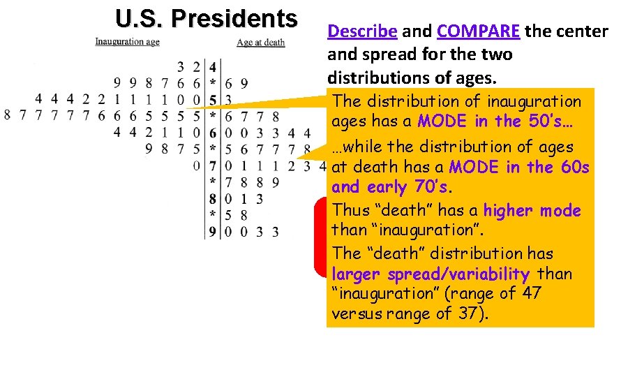
US PRESIDENTS STEMPLOTS (from last time)

U. S. Presidents Describe and COMPARE the center and spread for the two distributions of ages. The distribution of inauguration ages has a MODE in the 50’s… …while the distribution of ages at death has a MODE in the 60 s and early 70’s. Thus “death” has a higher mode THIS NOT ENOUGH TO GET than. IS“inauguration”. CREDIT FOR Adistribution COMPARISON!!! The “death” has larger spread/variability than “inauguration” (range of 47 versus range of 37).

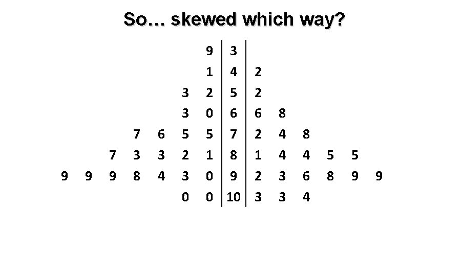
So… skewed which way? 9 9 7 3 8 6 3 4 3 3 5 2 3 0 9 3 1 4 2 5 0 6 5 7 1 8 0 9 0 10 2 2 6 2 1 2 3 8 4 4 3 3 8 4 6 4 5 8 5 9 9

STOP.