Numeracy Quantitative Methods Numeracy for Professional Purposes Interpreting


- Slides: 15

Numeracy & Quantitative Methods: Numeracy for Professional Purposes Interpreting Data: Graphs & Charts (1) Laura Lake

Recap • Types of data • Descriptive statistics • Interpreting data • Presenting data to different audiences.

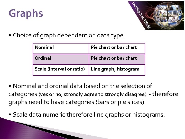
Graphs • Choice of graph dependent on data type. Nominal Pie chart or bar chart Ordinal Pie chart or bar chart Scale (interval or ratio) Line graph, histogram • Nominal and ordinal data based on the selection of categories (yes or no, strongly agree to strongly disagree) - therefore graphs need to have categories (bars or pie slices) • Scale data numeric therefore line graphs or histograms.

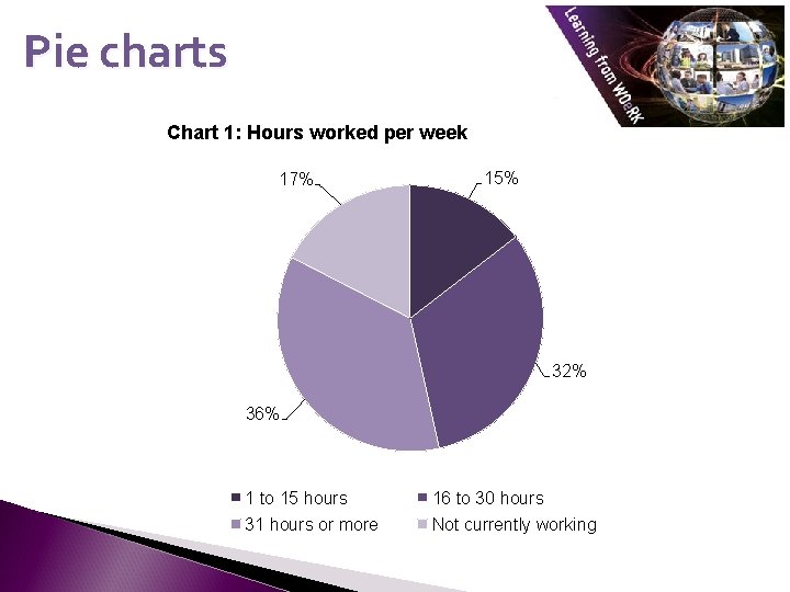
Pie charts • Pie charts use a slice or segment for each category. • Each slice is shown in relation to the whole pie. • It is often used for nominal data. • It can be sometime hard to judge relative size of each slice if there is no real difference in size between them. • It is not particularly useful when there a large number of categories – leads to too many slices of the pie and can look confusing. • Useful to include value labels stating % for each category.

Pie charts Chart 1: Hours worked per week 17% 15% 32% 36% 1 to 15 hours 16 to 30 hours 31 hours or more Not currently working

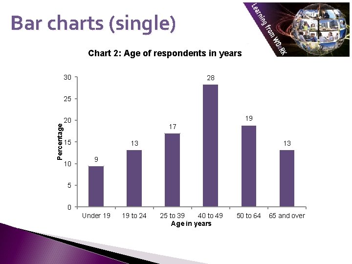
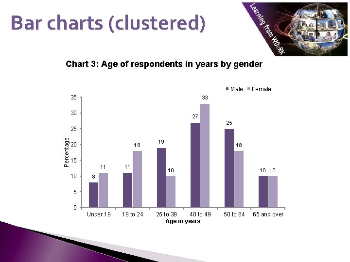
Bar charts • Bar charts use a bar to represent each category. • Size of each bar is clear. • Easy to judge relative size of bars. • Better for ordinal data: shows order of categories. • Useful for comparing categories with clustered bar charts.

Bar charts (single) Chart 2: Age of respondents in years 30 28 Percentage 25 19 20 17 15 10 13 13 9 5 0 Under 19 19 to 24 25 to 39 40 to 49 Age in years 50 to 64 65 and over

Bar charts (clustered) Chart 3: Age of respondents in years by gender Male 35 33 30 27 25 25 Percentage Female 20 18 19 18 15 11 10 10 10 8 5 0 Under 19 19 to 24 25 to 39 40 to 49 Age in years 50 to 64 65 and over

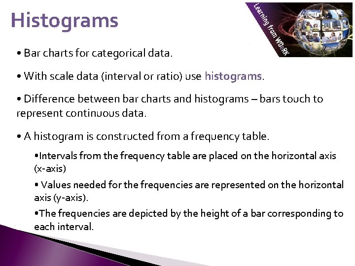
Histograms • Bar charts for categorical data. • With scale data (interval or ratio) use histograms. • Difference between bar charts and histograms – bars touch to represent continuous data. • A histogram is constructed from a frequency table. • Intervals from the frequency table are placed on the horizontal axis (x-axis) • Values needed for the frequencies are represented on the horizontal axis (y-axis). • The frequencies are depicted by the height of a bar corresponding to each interval.

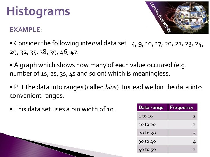
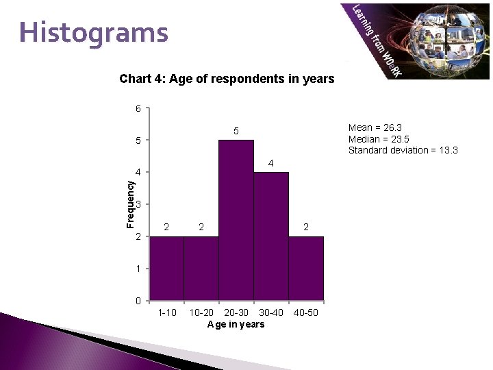
Histograms EXAMPLE: • Consider the following interval data set: 4, 9, 10, 17, 20, 21, 23, 24, 29, 32, 35, 38, 39, 46, 47. • A graph which shows how many of each value occurred (e. g. number of 1 s, 2 s, 3 s, 4 s and so on) which is meaningless. • Put the data into ranges (called bins). Instead we bin the data into convenient ranges. • This data set uses a bin width of 10. Data range Frequency 1 to 10 2 10 to 20 2 20 to 30 5 30 to 40 4 40 to 50 2

Histograms Chart 4: Age of respondents in years 6 5 4 4 Frequency Mean = 26. 3 Median = 23. 5 Standard deviation = 13. 3 5 3 2 2 1 0 1 -10 10 -20 20 -30 30 -40 Age in years 40 -50

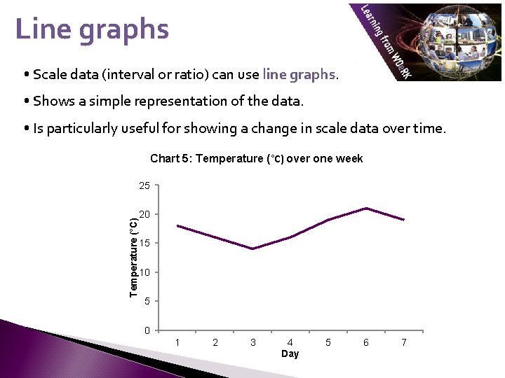
Line graphs • Scale data (interval or ratio) can use line graphs. • Shows a simple representation of the data. • Is particularly useful for showing a change in scale data over time. Chart 5: Temperature (°C) over one week Temperature (°C) 25 20 15 10 5 0 1 2 3 4 Day 5 6 7

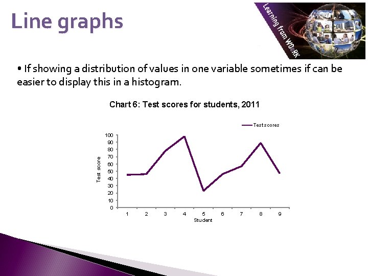
Line graphs • If showing a distribution of values in one variable sometimes if can be easier to display this in a histogram. Chart 6: Test scores for students, 2011 Test scores 100 90 80 70 60 50 40 30 20 10 0 1 2 3 4 5 Student 6 7 8 9

References Bryman, A. (2008) Social Research Methods. 3 rd Ed. Oxford: Oxford University Press. David, M. and Sutton, C. (2011) Social Research : An Introduction. 2 nd ed. London: Sage.

This resource was created by the University of Plymouth, Learning from WOe. Rk project. This project is funded by HEFCE as part of the HEA/JISC OER release programme. This resource is licensed under the terms of the Attribution-Non-Commercial-Share Alike 2. 0 UK: England & Wales license (http: //creativecommons. org/licenses/by-nc-sa/2. 0/uk/). The resource, where specified below, contains other 3 rd party materials under their own licenses. The licenses and attributions are outlined below: 1. The name of the University of Plymouth and its logos are unregistered trade marks of the University. The University reserves all rights to these items beyond their inclusion in these CC resources. 2. The JISC logo, the and the logo of the Higher Education Academy are licensed under the terms of the Creative Commons Attribution non-commercial-No Derivative Works 2. 0 UK England & Wales license. All reproductions must comply with the terms of that license. Author Laura Lake Institute University of Plymouth Title Numeracy & Quantitative Methods Numeracy for Professional Purposes Description Interpreting data: graphs and charts 1 Date Created May 2011 Educational Level 4 Learning from WOe. RK Work Based Learning WBL Continuous Professional Development CPD Research UKOER LFWOER Bar chart, pie chart, histogram Keywords ©University of Plymouth, 2010, some rights reserved Back page originally developed by the OER phase 1 C-Change project