
Notes Eske Kath negative Line color balance shape
Notes • Eske Kath (negative) • Line color balance shape/ symbolism, motion (weather/ climate change) • Political/ awareness • Contempory opinion • Paul Klee (positive) • Rhythm/ color, line, shape/ symbolism • Children's lines and shapes/ form of minimalist/ dominant red • Expression/ refer to chair cartoon/ statement design wise • Anish Kapoor (negative) • Interaction with audience/ 2 D/ color, symbolism (emptiness), void/ intention/ ownership of color (war) pushing boundaries/ express void (function) • Circular/space/ sun/ stars/ light reaction/ loneliness • Venn diagram/ Mc. Phee model • Clean colors • Simplistic • Commentary on social life • Jacob holt
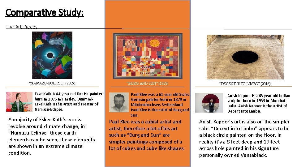
Comparative Study: The Art Pieces “NAMAZU-ECLIPSE” (2009) Eske Kath is 44 year old Danish painter born in 1975 in Harslev, Denmark. Eske Kath is the artist and creator of Namazu-Eclipse. A majority of Esker Kath’s works revolve around climate change, in “Namazu-Eclipse” these earth elements can be seen, these elements are shown in an extreme climate condition. “BURG AND SUN” (1928) Paul Klee was a 61 year old Swiss. German painter born in 1879 in Müchenbuchsee, Switzerland. Paul Klee is the artist of Burg and Sun. Paul Klee was a cubist artist and artist, therefore a lot of his art such as “Burg and Sun” are simpler paintings composed of a lot of cubes and cube like shapes. “DECENT INTO LIMBO” (2016) Anish Kapoor is a 65 year old Indian sculptor born in 1959 in Mumbai India. Anish Kapoor is the artist of Decent Into Limbo. Anish Kapoor’s art is also on the simpler side. “Decent into Limbo” appears to be a black circle painted on the floor, in reality it’s a 8 feet deep and 10 feet across hole painted in his signature personally owned Vantablack.
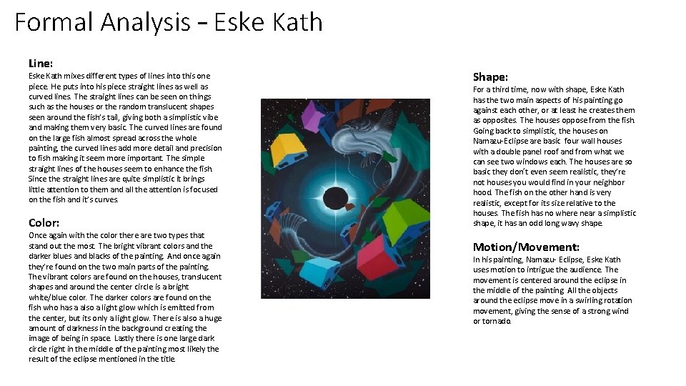
Formal Analysis – Eske Kath Line: Eske Kath mixes different types of lines into this one piece. He puts into his piece straight lines as well as curved lines. The straight lines can be seen on things such as the houses or the random translucent shapes seen around the fish’s tail, giving both a simplistic vibe and making them very basic. The curved lines are found on the large fish almost spread across the whole painting, the curved lines add more detail and precision to fish making it seem more important. The simple straight lines of the houses seem to enhance the fish. Since the straight lines are quite simplistic it brings little attention to them and all the attention is focused on the fish and it’s curves. Color: Once again with the color there are two types that stand out the most. The bright vibrant colors and the darker blues and blacks of the painting. And once again they’re found on the two main parts of the painting. The vibrant colors are found on the houses, translucent shapes and around the center circle is a bright white/blue color. The darker colors are found on the fish who has a also a light glow which is emitted from the center, but its only a light glow. There is also a huge amount of darkness in the background creating the image of being in space. Lastly there is one large dark circle right in the middle of the painting most likely the result of the eclipse mentioned in the title. Shape: For a third time, now with shape, Eske Kath has the two main aspects of his painting go against each other, or at least he creates them as opposites. The houses oppose from the fish. Going back to simplistic, the houses on Namazu-Eclipse are basic four wall houses with a double panel roof and from what we can see two windows each. The houses are so basic they don’t even seem realistic, they’re not houses you would find in your neighbor hood. The fish on the other hand is very realistic, except for its size relative to the houses. The fish has no where near a simplistic shape, it has an odd long wavy shape. Motion/Movement: In his painting, Namazu- Eclipse, Eske Kath uses motion to intrigue the audience. The movement is centered around the eclipse in the middle of the painting. All the objects around the eclipse move in a swirling rotation movement, giving the sense of a strong wind or tornado.
Cultural Significance – Eske Kath Audience’s World Audience Artwork Artist’s world
Function and Purpose – Eske Kath
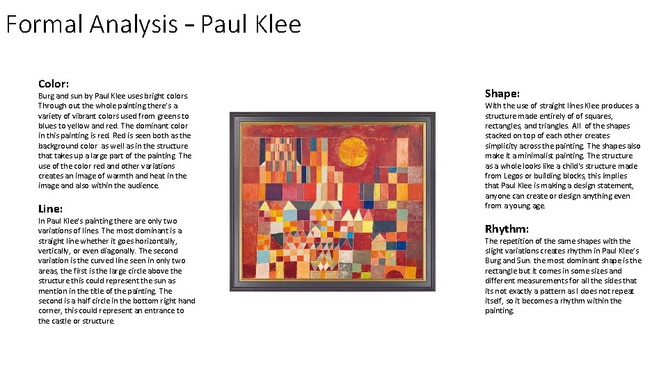
Formal Analysis – Paul Klee Color: Burg and sun by Paul Klee uses bright colors. Through out the whole painting there’s a variety of vibrant colors used from greens to blues to yellow and red. The dominant color in this painting is red. Red is seen both as the background color as well as in the structure that takes up a large part of the painting. The use of the color red and other variations creates an image of warmth and heat in the image and also within the audience. Line: In Paul Klee's painting there are only two variations of lines. The most dominant is a straight line whether it goes horizontally, vertically, or even diagonally. The second variation is the curved line seen in only two areas, the first is the large circle above the structure this could represent the sun as mention in the title of the painting. The second is a half circle in the bottom right hand corner, this could represent an entrance to the castle or structure. Shape: With the use of straight lines Klee produces a structure made entirely of of squares, rectangles, and triangles. All of the shapes stacked on top of each other creates simplicity across the painting. The shapes also make it a minimalist painting. The structure as a whole looks like a child's structure made from Legos or building blocks, this implies that Paul Klee is making a design statement, anyone can create or design anything even from a young age. Rhythm: The repetition of the same shapes with the slight variations creates rhythm in Paul Klee’s Burg and Sun. the most dominant shape is the rectangle but it comes in some sizes and different measurements for all the sides that its not exactly a pattern as I does not repeat itself, so it becomes a rhythm within the painting.
Cultural Significance – Paul Klee Audience’s World Audience Artwork v Artist’s world

Function and Purpose – Paul Klee
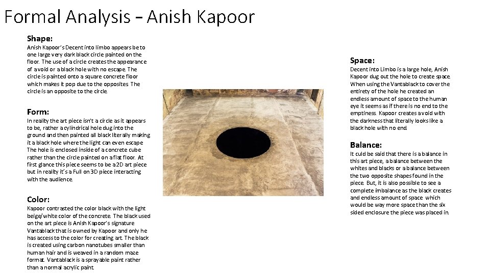
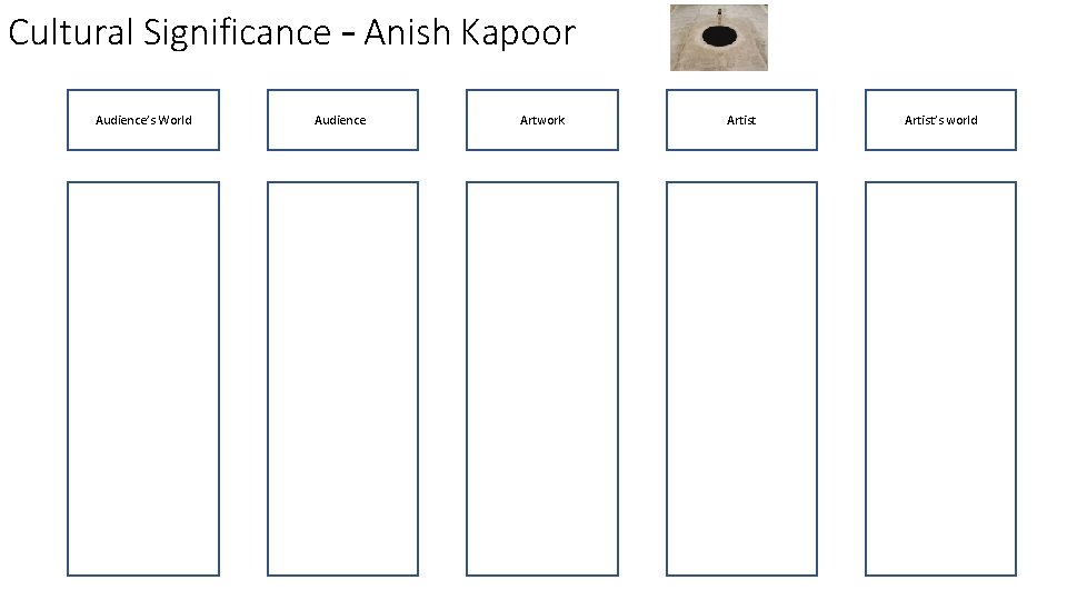
Formal Analysis – Anish Kapoor Shape: Anish Kapoor’s Decent into limbo appears be to one large very dark black circle painted on the floor. The use of a circle creates the appearance of a void or a black hole with no escape. The circle is painted onto a square concrete floor which makes it pop due to the opposites. The circle is an opposite to the circle. Form: In reality the art piece isn’t a circle as it appears to be, rather a cylindrical hole dug into the ground and then painted all black literally making it a black hole where the light can even escape. The hole is enclosed inside of a concrete cube rather than the circle painted on a flat floor. At first glance this piece seems to be a 2 D art piece but in reality it’s a Full on 3 D piece interacting with the audience. Color: Kapoor contrasted the color black with the light beige/white color of the concrete. The black used on the art piece is Anish Kapoor’s signature Vantablack that is owned by Kapoor and only he has access to the color for creating art. The black is created using carbon nanotubes smaller than human hair and is weaved in a random maze format. Vantablack is a sprayable paint rather than a normal acrylic paint. Space: Decent into Limbo is a large hole, Anish Kapoor dug out the hole to create space. When using the Vantablack to cover the entirety of the hole he created an endless amount of space to the human eye it seems as if there is no end to the emptiness. Kapoor creates a void with the darkness that literally looks like a black hole with no end. Balance: It culd be said that there is a balance in this art piece, a balance between the whites and blacks or a balance between the two opposite shapes found in the piece. But, it is also possible to see a complete imbalance as the black creates and endless amount of space which would be way more space than the six sided enclosure the piece was placed in.
Cultural Significance – Anish Kapoor Audience’s World Audience Artwork v Artist’s world

Function And Purpose – Anish Kapoor
Making Connections Between Works
Presentation and Subject Specific Language
- Slides: 13