NOTES 9 CREATING DOT PLOTS READING FREQUENCY TABLES
NOTES #9 CREATING DOT PLOTS & READING FREQUENCY TABLES
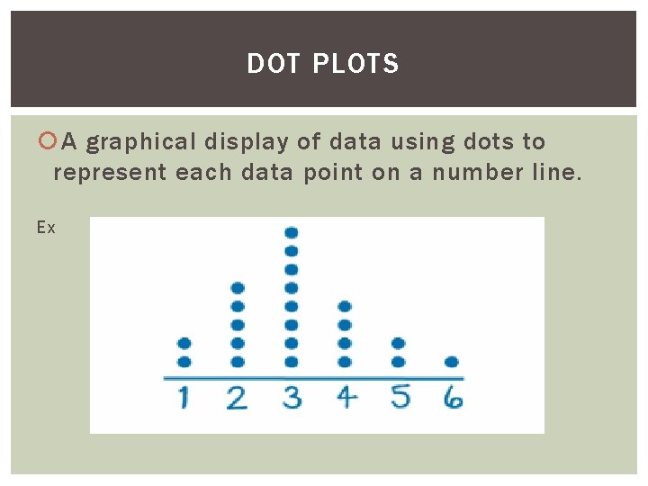
DOT PLOTS A graphical display of data using dots to represent each data point on a number line. Ex
SAMPLE PROBLEM Ms. Ng asked a class of 30 students, “How many minutes did you take to eat breakfast this morning? ” Use a Dot plot to represent the results.
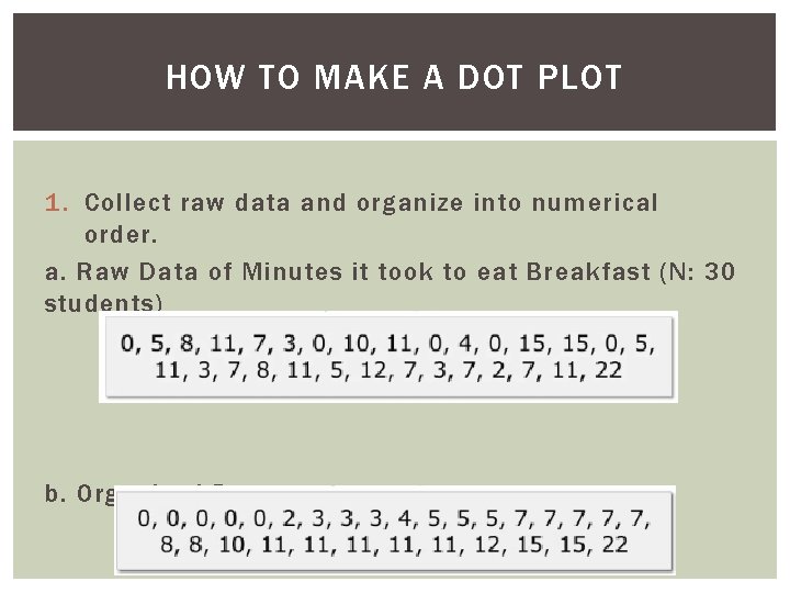
HOW TO MAKE A DOT PLOT 1. Collect raw data and organize into numerical order. a. Raw Data of Minutes it took to eat Breakfast (N: 30 students) b. Organized Data:
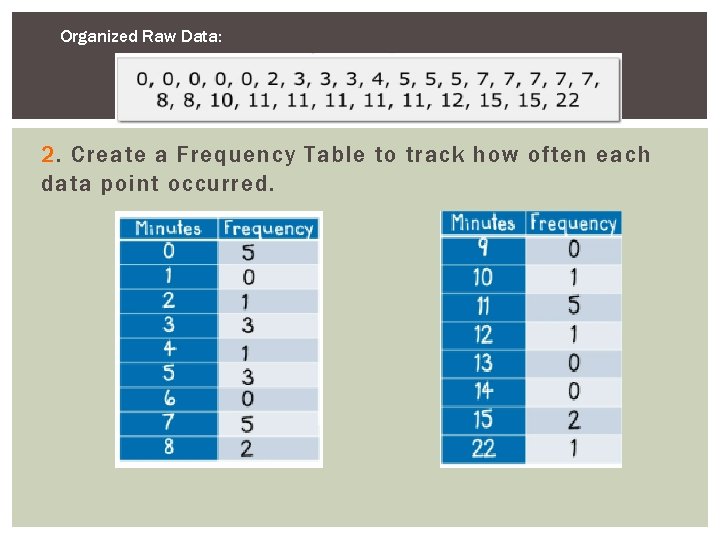
Organized Raw Data: 2. Create a Frequency Table to track how often each data point occurred.
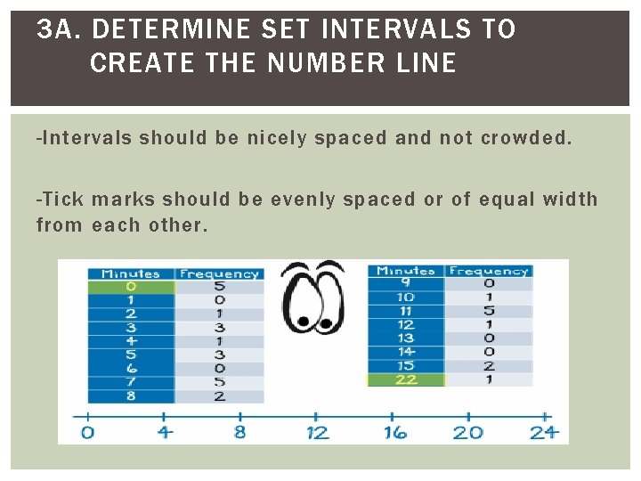
3 A. DETERMINE SET INTERVALS TO CREATE THE NUMBER LINE -Intervals should be nicely spaced and not crowded. -Tick marks should be evenly spaced or of equal width from each other.
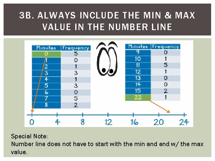
3 B. ALWAYS INCLUDE THE MIN & MAX VALUE IN THE NUMBER LINE Special Note: Number line does not have to start with the min and end w/ the max value.
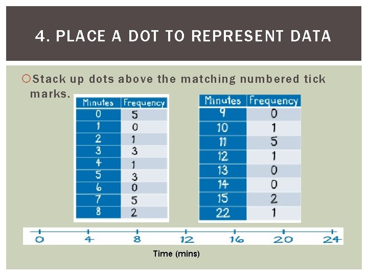
4. PLACE A DOT TO REPRESENT DATA Stack up dots above the matching numbered tick marks. Time (mins)
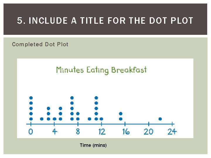
5. INCLUDE A TITLE FOR THE DOT PLOT Completed Dot Plot Time (mins)
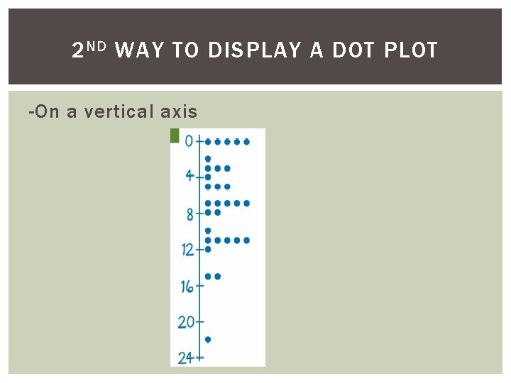
2 ND WAY TO DISPLAY A DOT PLOT -On a vertical axis
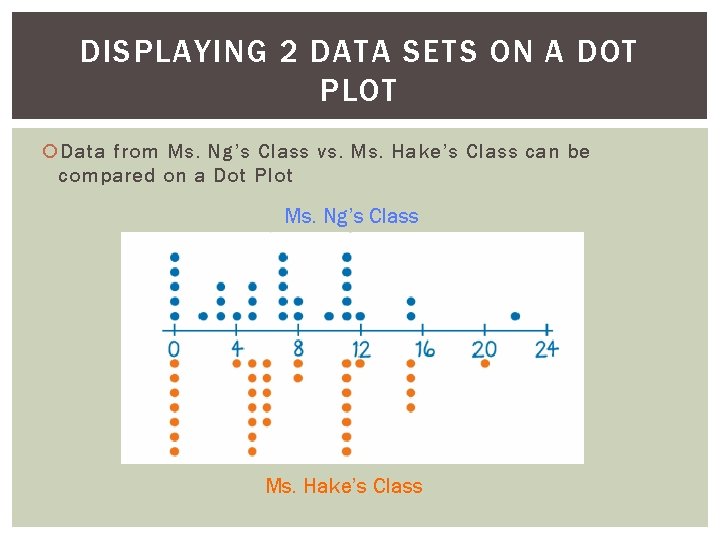
DISPLAYING 2 DATA SETS ON A DOT PLOT Data from Ms. Ng’s Class vs. Ms. Hake’s Class can be compared on a Dot Plot Ms. Ng’s Class Ms. Hake’s Class
Purpose of Frequency Distribution (or Frequency Table) Shows how a data set is divided among of several categories (or classes)
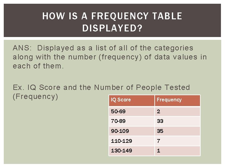
HOW IS A FREQUENCY TABLE DISPLAYED? ANS: Displayed as a list of all of the categories along with the number (frequency) of data values in each of them. Ex. IQ Score and the Number of People Tested (Frequency) IQ Score Frequency 50 -69 2 70 -89 33 90 -109 35 110 -129 7 130 -149 1
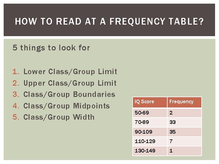
HOW TO READ AT A FREQUENCY TABLE? 5 things to look for 1. 2. 3. 4. 5. Lower Class/Group Limit Upper Class/Group Limit Class/Group Boundaries Class/Group Midpoints Class/Group Width IQ Score Frequency 50 -69 2 70 -89 33 90 -109 35 110 -129 7 130 -149 1
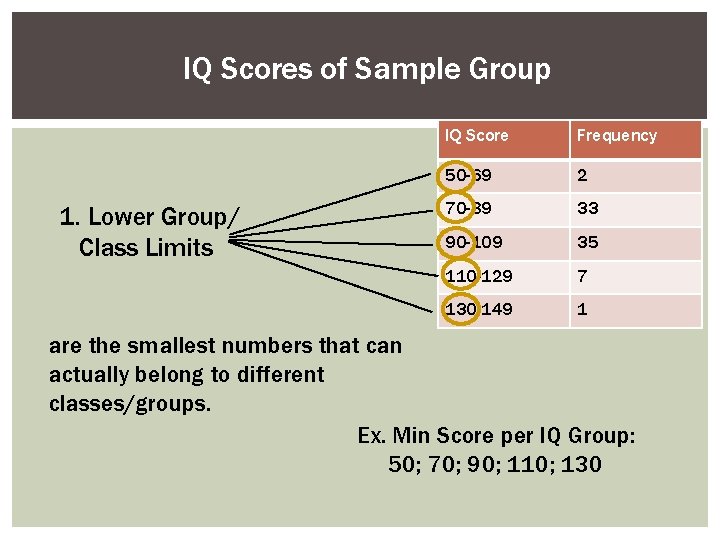
IQ Scores of Sample Group 1. Lower Group/ Class Limits IQ Score Frequency 50 -69 2 70 -89 33 90 -109 35 110 -129 7 130 -149 1 are the smallest numbers that can actually belong to different classes/groups. Ex. Min Score per IQ Group: 50; 70; 90; 110; 130
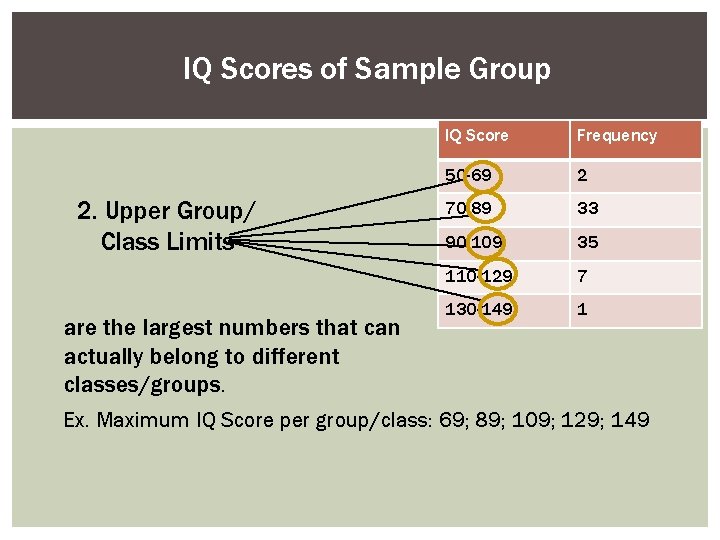
IQ Scores of Sample Group 2. Upper Group/ Class Limits are the largest numbers that can actually belong to different classes/groups. IQ Score Frequency 50 -69 2 70 -89 33 90 -109 35 110 -129 7 130 -149 1 Ex. Maximum IQ Score per group/class: 69; 89; 109; 129; 149
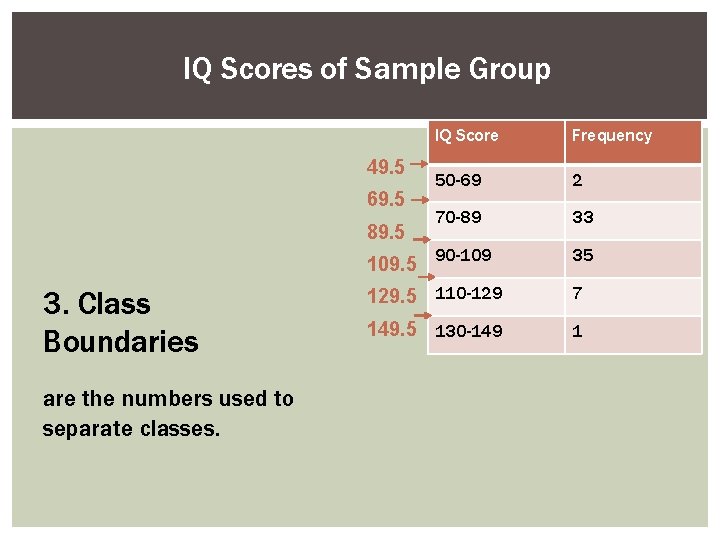
IQ Scores of Sample Group 49. 5 69. 5 89. 5 3. Class Boundaries are the numbers used to separate classes. IQ Score Frequency 50 -69 2 70 -89 33 109. 5 90 -109 35 129. 5 110 -129 7 149. 5 130 -149 1
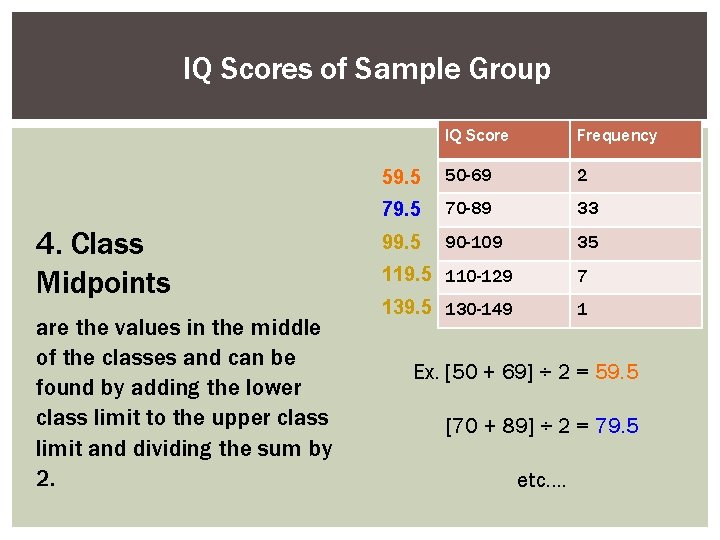
IQ Scores of Sample Group 4. Class Midpoints are the values in the middle of the classes and can be found by adding the lower class limit to the upper class limit and dividing the sum by 2. IQ Score Frequency 59. 5 50 -69 2 79. 5 70 -89 33 99. 5 90 -109 35 119. 5 110 -129 7 139. 5 130 -149 1 Ex. [50 + 69] ÷ 2 = 59. 5 [70 + 89] ÷ 2 = 79. 5 etc….
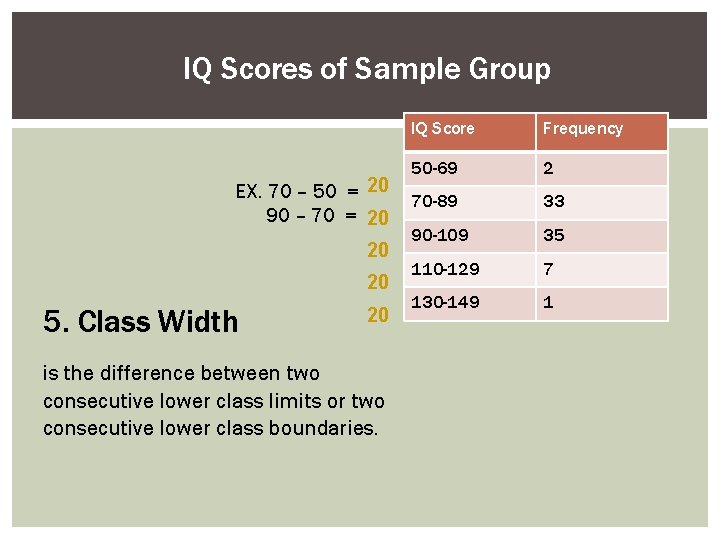
IQ Scores of Sample Group EX. 70 – 50 = 20 90 – 70 = 20 20 20 5. Class Width 20 is the difference between two consecutive lower class limits or two consecutive lower class boundaries. IQ Score Frequency 50 -69 2 70 -89 33 90 -109 35 110 -129 7 130 -149 1
NOTES # 10 HOW TO ANALYZE DOT PLOTS?
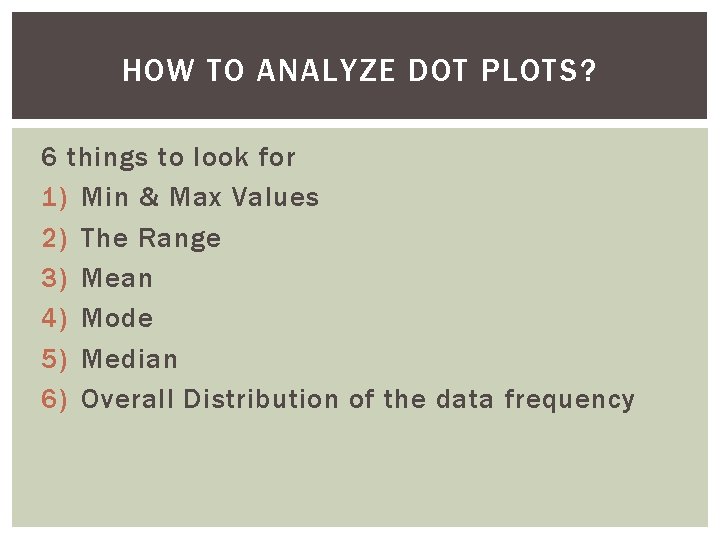
HOW TO ANALYZE DOT PLOTS? 6 things to look for 1) Min & Max Values 2) The Range 3) Mean 4) Mode 5) Median 6) Overall Distribution of the data frequency
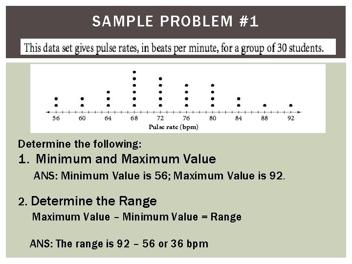
SAMPLE PROBLEM #1 Determine the following: 1. Minimum and Maximum Value ANS: Minimum Value is 56; Maximum Value is 92. 2. Determine the Range Maximum Value – Minimum Value = Range ANS: The range is 92 – 56 or 36 bpm
![3. Determine the Mean [Average Beats per Minute (bpm)] Mean = Sum of Data 3. Determine the Mean [Average Beats per Minute (bpm)] Mean = Sum of Data](http://slidetodoc.com/presentation_image_h2/c61f7200273359db1a2eac1819dc5f66/image-23.jpg)
3. Determine the Mean [Average Beats per Minute (bpm)] Mean = Sum of Data Values ÷ Number of Data Values [2(56) + 2(60) + 3(64) + 6(68) + 5(72) + 4(76) + 4(80) + 2(84) + 88 + 92] 30 = 2164 ÷ 30 = 72. 13 or approximately 72 bpm
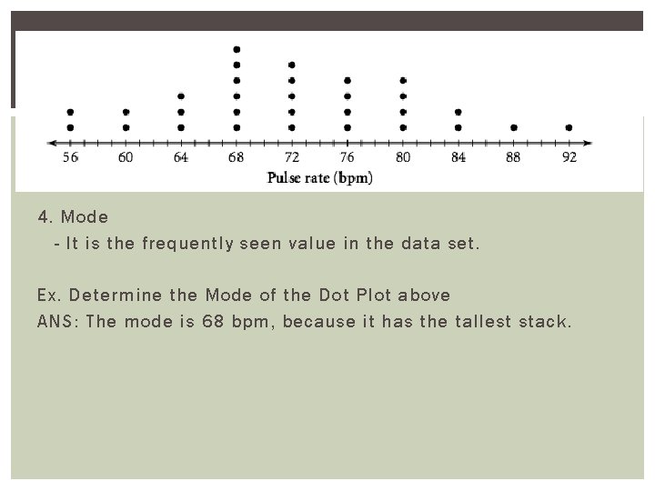
4. Mode - It is the frequently seen value in the data set. Ex. Determine the Mode of the Dot Plot above ANS: The mode is 68 bpm, because it has the tallest stack.
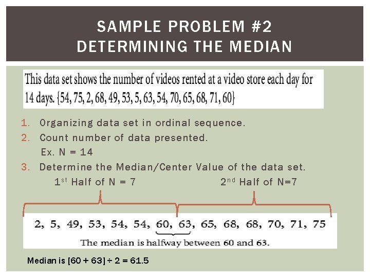
SAMPLE PROBLEM #2 DETERMINING THE MEDIAN 1. Organizing data set in ordinal sequence. 2. Count number of data presented. Ex. N = 14 3. Determine the Median/Center Value of the data set. 1 s t Half of N = 7 2 n d Half of N=7 Median is [60 + 63] ÷ 2 = 61. 5
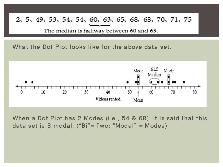
What the Dot Plot looks like for the above data set. When a Dot Plot has 2 Modes (i. e. , 54 & 68), it is said that this data set is Bimodal. (“Bi”= Two; “Modal” = Modes)
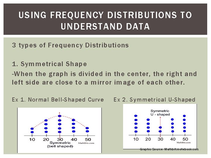
USING FREQUENCY DISTRIBUTIONS TO UNDERSTAND DATA 3 types of Frequency Distributions 1. Symmetrical Shape -When the graph is divided in the center, the right and left side are close to a mirror image of each other. Ex 1. Normal Bell-Shaped Curve Ex 2. Symmetrical U-Shaped Graphic Source: Mathbitsnotebook. com
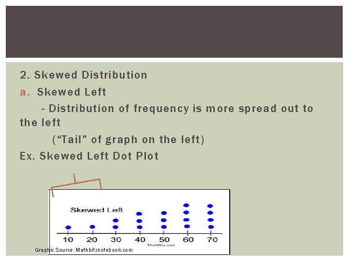
2. Skewed Distribution a. Skewed Left - Distribution of frequency is more spread out to the left (“Tail” of graph on the left) Ex. Skewed Left Dot Plot Graphic Source: Mathbitsnotebook. com
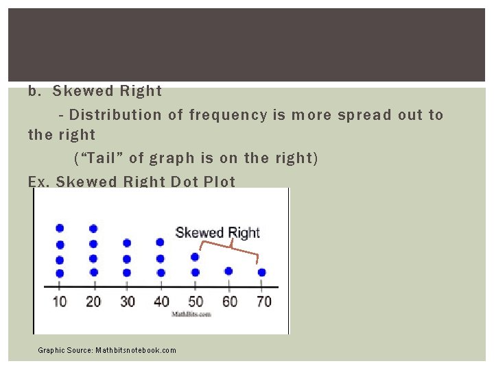
b. Skewed Right - Distribution of frequency is more spread out to the right (“Tail” of graph is on the right) Ex. Skewed Right Dot Plot Graphic Source: Mathbitsnotebook. com
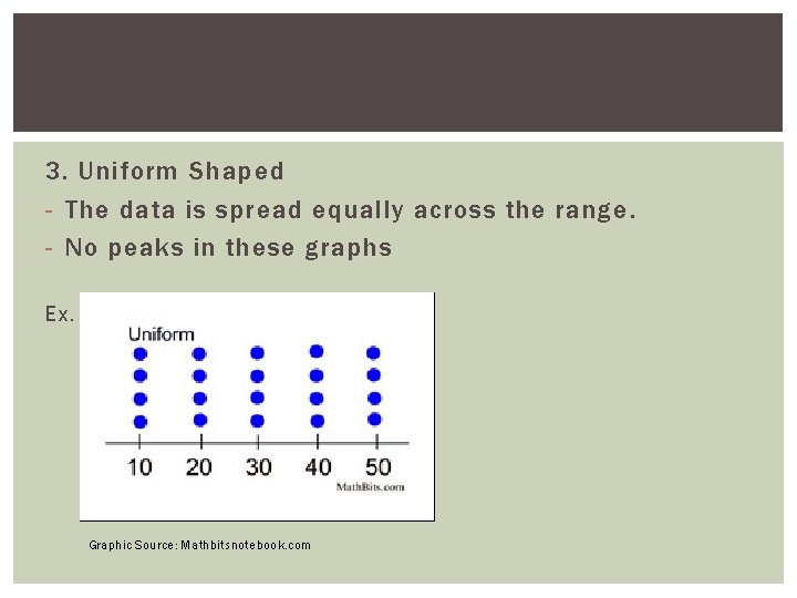
3. Uniform Shaped - The data is spread equally across the range. - No peaks in these graphs Ex. Graphic Source: Mathbitsnotebook. com
WHAT MEAN & MEDIAN TELLS US? The mean and the median of the distribution are numerical summaries of the center of a data distribution.
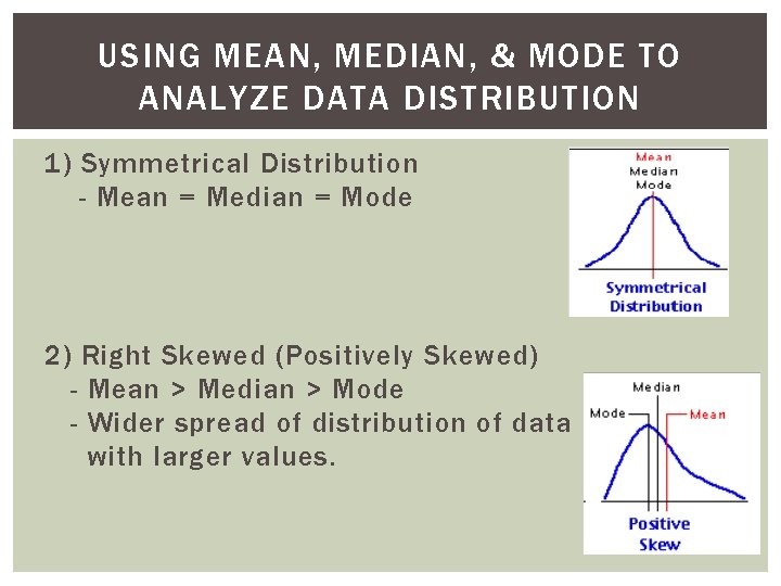
USING MEAN, MEDIAN, & MODE TO ANALYZE DATA DISTRIBUTION 1) Symmetrical Distribution - Mean = Median = Mode 2) Right Skewed (Positively Skewed) - Mean > Median > Mode - Wider spread of distribution of data with larger values.
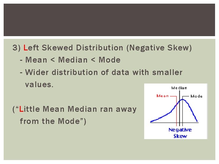
3) Left Skewed Distribution (Negative Skew) - Mean < Median < Mode - Wider distribution of data with smaller values. (“Little Mean Median ran away from the Mode”)
DOTPLOT REVIEW Log on to
- Slides: 34