Notes 15 Scatter Plots What are Scatter Plots

- Slides: 21

Notes #15 Scatter Plots

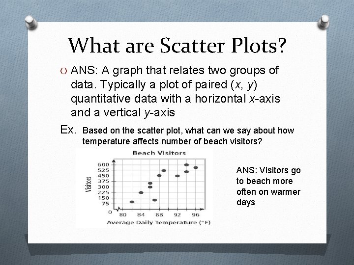
What are Scatter Plots? O ANS: A graph that relates two groups of data. Typically a plot of paired (x, y) quantitative data with a horizontal x-axis and a vertical y-axis Ex. Based on the scatter plot, what can we say about how temperature affects number of beach visitors? ANS: Visitors go to beach more often on warmer days

What do Scatter Plots Determine? O ANS: To determine whethere is a relationship between the bivariate data (aka. two quantitative variables)

What does Bivariate Mean? ANS: “Bi” means two, “Variate” means variables. Variables are broken down into 2 types: 1. Dependent Variable (y-axis) 2. Independent Variable (x-axis)

Recap on the 2 types of Variables 1. Dependent Variable (on y-axis) -It is what you measure and what is affected during the experiment/study. -It is called dependent because it "depends" on the independent variable. Ex. Student Test Scores 2. Independent Variable (on x-axis) -It is the one that is changed by the scientist to see how it affects the dependent variable Ex. Amount of Time Spent Studying

Experimental Question O Do you think the amount of time/days spent studying would affect student test scores?

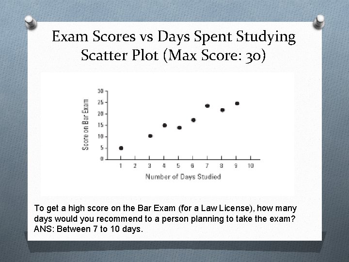
Exam Scores vs Days Spent Studying Scatter Plot (Max Score: 30) To get a high score on the Bar Exam (for a Law License), how many days would you recommend to a person planning to take the exam? ANS: Between 7 to 10 days.

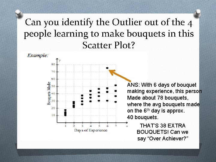
Types of Scatter Plot Distributions 2 Types 1. Clustering – data values occurring close together. 2. Outlier – a data point with a value that is very different from the other data points in the set.

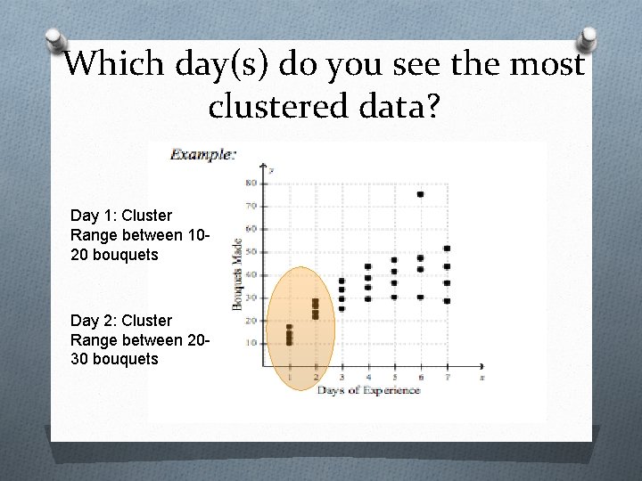
Which day(s) do you see the most clustered data? Day 1: Cluster Range between 1020 bouquets Day 2: Cluster Range between 2030 bouquets

Can you identify the Outlier out of the 4 people learning to make bouquets in this Scatter Plot? ANS: With 6 days of bouquet making experience, this person Made about 78 bouquets, where the avg bouquets made on the 6 th day is approx. 40 bouquets. THAT’S 38 EXTRA BOUQUETS! Can we say “Over Achiever? ”

Analyzing Scatter Plots with Statistical Correlation - Understanding the relationship between two variables that are statistically dependent.

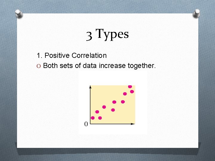
3 Types 1. Positive Correlation O Both sets of data increase together.

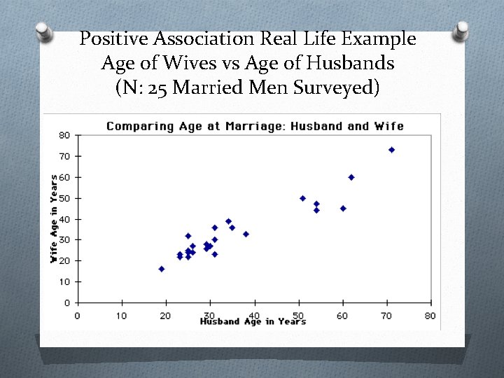
Positive Association Real Life Example Age of Wives vs Age of Husbands (N: 25 Married Men Surveyed)

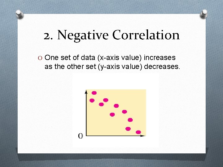
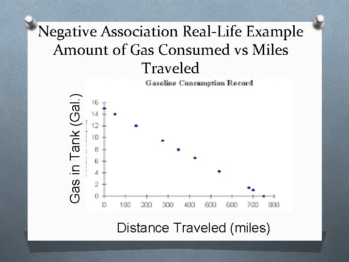
2. Negative Correlation O One set of data (x-axis value) increases as the other set (y-axis value) decreases.

Gas in Tank (Gal. ) Negative Association Real-Life Example Amount of Gas Consumed vs Miles Traveled Distance Traveled (miles)

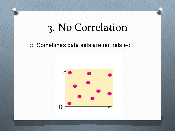
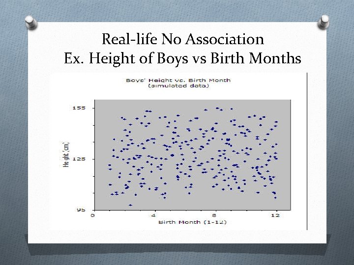
3. No Correlation O Sometimes data sets are not related

Real-life No Association Ex. Height of Boys vs Birth Months

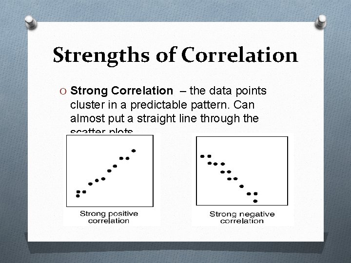
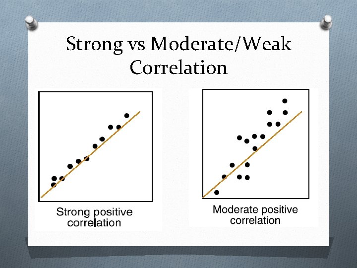
Strengths of Correlation O Strong Correlation – the data points cluster in a predictable pattern. Can almost put a straight line through the scatter plots.

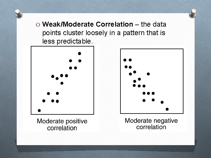
O Weak/Moderate Correlation – the data points cluster loosely in a pattern that is less predictable.

Strong vs Moderate/Weak Correlation

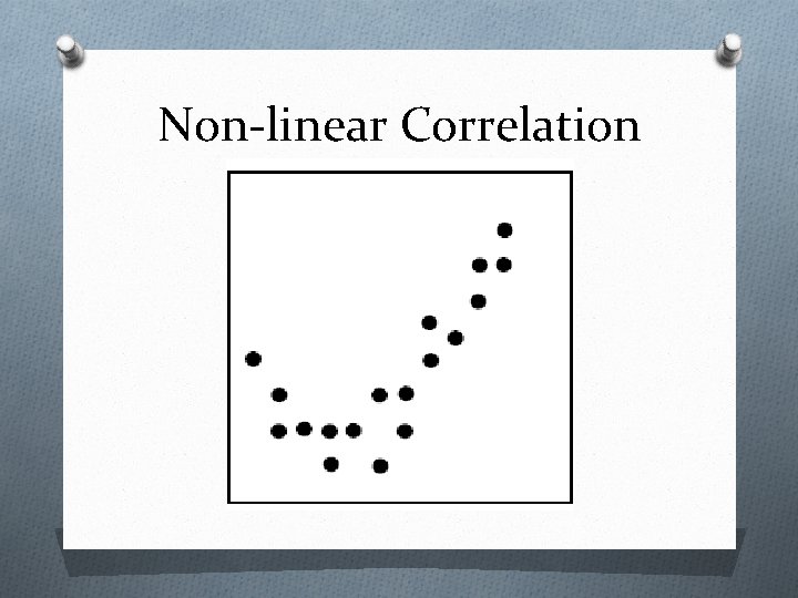
Non-linear Correlation