Normal Plots Notice that both of the normal

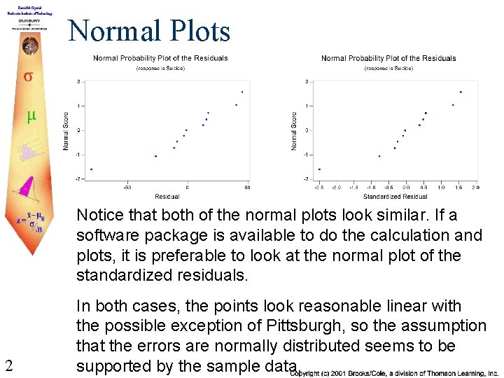
Normal Plots Notice that both of the normal plots look similar. If a software package is available to do the calculation and plots, it is preferable to look at the normal plot of the standardized residuals. 2 In both cases, the points look reasonable linear with the possible exception of Pittsburgh, so the assumption that the errors are normally distributed seems to be supported by the sample data.
More Comments The fact that Pittsburgh has a large standardized residual makes it worthwhile to look at that city carefully to make sure the figures were reported correctly. One might also look to see if there are some reasons that Pittsburgh should be looked at separately because some other characteristic distinguishes it from all of the other cities. Pittsburgh does have a large effect on model. 3

Visual Interpretation of Standardized Residuals 4 This plot is an example of a satisfactory plot that indicates that the model assumptions are reasonable.
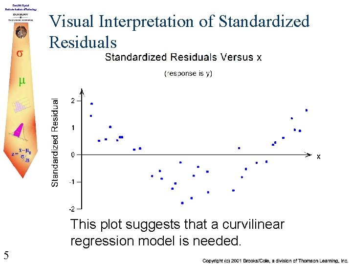
Visual Interpretation of Standardized Residuals This plot suggests that a curvilinear regression model is needed. 5

Visual Interpretation of Standardized Residuals This plot suggests a non-constant variance. The assumptions of the model are not correct. 6
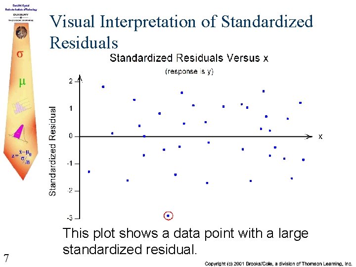
Visual Interpretation of Standardized Residuals 7 This plot shows a data point with a large standardized residual.
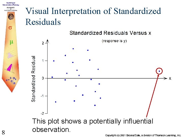
Visual Interpretation of Standardized Residuals 8 This plot shows a potentially influential observation.
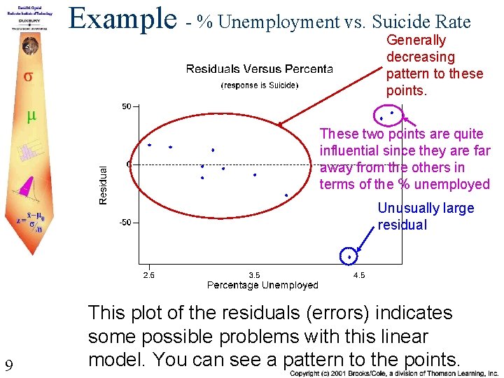
Example - % Unemployment vs. Suicide Rate Generally decreasing pattern to these points. These two points are quite influential since they are far away from the others in terms of the % unemployed Unusually large residual 9 This plot of the residuals (errors) indicates some possible problems with this linear model. You can see a pattern to the points.
Properties of the Sampling Distribution of a + bx for a Fixed x Value Let x* denote a particular value of the independent variable x. When the four basic assumptions of the simple linear regression model are satisfied, the sampling distribution of the statistic a + bx* has the following properties: 1. The mean value of a + bx* is a + bx*, so a + bx* is an unbiased statistic for estimating the average y value when x = x* 10
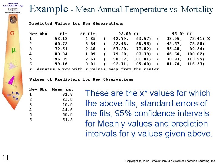
Example - Mean Annual Temperature vs. Mortality Predicted Values for New Observations New Obs Fit SE Fit 95. 0% 1 53. 18 4. 85 ( 42. 79, 2 60. 72 3. 84 ( 52. 48, 3 72. 51 2. 48 ( 67. 20, 4 83. 34 1. 89 ( 79. 30, 5 96. 09 2. 67 ( 90. 37, 6 99. 16 3. 01 ( 92. 71, X denotes a row with X values away from CI 63. 57) ( 68. 96) ( 77. 82) ( 87. 39) ( 101. 81) ( 105. 60) ( the center 95. 0% 33. 95, 42. 57, 55. 48, 66. 66, 78. 93, 81. 74, PI 72. 41) X 78. 88) 89. 54) 100. 02) 113. 25) 116. 57) Values of Predictors for New Observations New Obs 1 2 3 4 5 6 11 Mean ann 31. 8 35. 0 40. 0 44. 6 50. 0 51. 3 These are the x* values for which the above fits, standard errors of the fits, 95% confidence intervals for Mean y values and prediction intervals for y values given above.
- Slides: 11