New Form Input Types The input Form Element
- Slides: 13

New Form Input Types

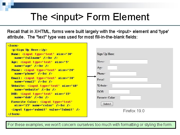
The <input> Form Element Recall that in XHTML, forms were built largely with the <input> element and 'type' attribute. The "text" type was used for most fill-in-the-blank fields: <form> <p>Sign Up Here: </p> Name: <input type="text" size="30" name="fullname" /> Age: <input type="text" size="5" name="age" /> Phone: <input type="text" size="20" name="phone" /> Email: <input type="text" size="30" name="email" /> Website: <input type="text" size="40" name="website" /> DOB: <input type="text" size="15" name="dob" /> Favorite Color: <input type="text" size="15" name="color" /> <input type="submit" value="Submit" /> </form> Firefox 19. 0 For these examples, we won't concern ourselves too much with formatting or styling the form.

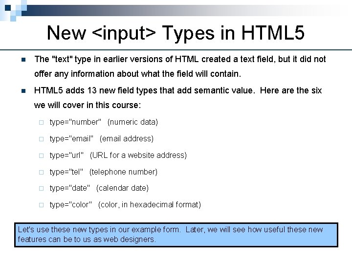
New <input> Types in HTML 5 n The "text" type in earlier versions of HTML created a text field, but it did not offer any information about what the field will contain. n HTML 5 adds 13 new field types that add semantic value. Here are the six we will cover in this course: ¨ type="number" (numeric data) ¨ type="email" (email address) ¨ type="url" (URL for a website address) ¨ type="tel" (telephone number) ¨ type="date" (calendar date) ¨ type="color" (color, in hexadecimal format) Let's use these new types in our example form. Later, we will see how useful these new features can be to us as web designers.

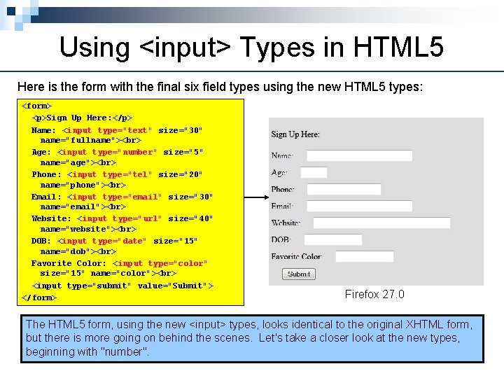
Using <input> Types in HTML 5 Here is the form with the final six field types using the new HTML 5 types: <form> <p>Sign Up Here: </p> Name: <input type="text" size="30" name="fullname"> Age: <input type="number" size="5" name="age"> Phone: <input type="tel" size="20" name="phone"> Email: <input type="email" size="30" name="email"> Website: <input type="url" size="40" name="website"> DOB: <input type="date" size="15" name="dob"> Favorite Color: <input type="color" size="15" name="color"> <input type="submit" value="Submit"> </form> Firefox 27. 0 The HTML 5 form, using the new <input> types, looks identical to the original XHTML form, but there is more going on behind the scenes. Let's take a closer look at the new types, beginning with "number".

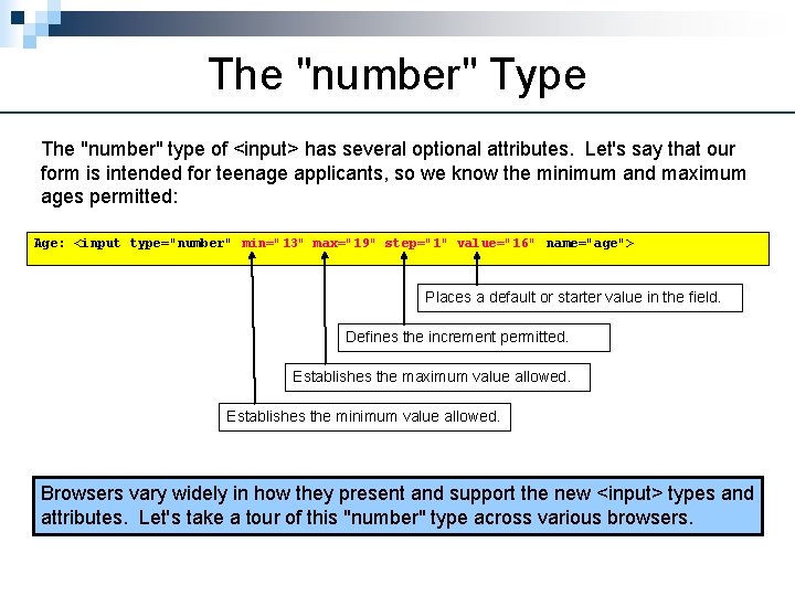
The "number" Type The "number" type of <input> has several optional attributes. Let's say that our form is intended for teenage applicants, so we know the minimum and maximum ages permitted: Age: <input type="number" min="13" max="19" step="1" value="16" name="age"> Places a default or starter value in the field. Defines the increment permitted. Establishes the maximum value allowed. Establishes the minimum value allowed. Browsers vary widely in how they present and support the new <input> types and attributes. Let's take a tour of this "number" type across various browsers.

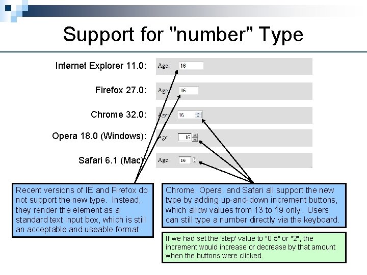
Support for "number" Type Internet Explorer 11. 0: Firefox 27. 0: Chrome 32. 0: Opera 18. 0 (Windows): Safari 6. 1 (Mac): Recent versions of IE and Firefox do not support the new type. Instead, they render the element as a standard text input box, which is still an acceptable and useable format. Chrome, Opera, and Safari all support the new type by adding up-and-down increment buttons, which allow values from 13 to 19 only. Users can still type a number directly via the keyboard. If we had set the 'step' value to "0. 5" or "2", the increment would increase or decrease by that amount when the buttons were clicked.

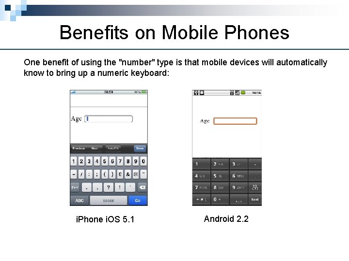
Benefits on Mobile Phones One benefit of using the "number" type is that mobile devices will automatically know to bring up a numeric keyboard: i. Phone i. OS 5. 1 Android 2. 2

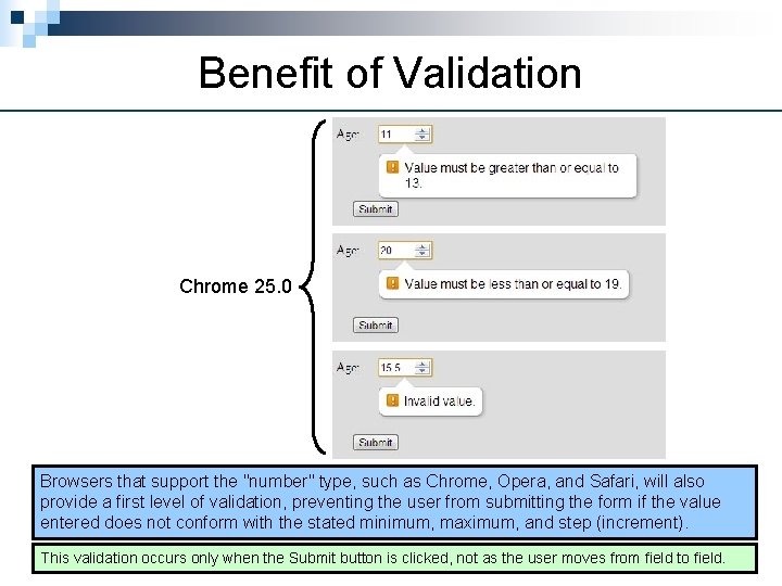
Benefit of Validation Chrome 25. 0 Browsers that support the "number" type, such as Chrome, Opera, and Safari, will also provide a first level of validation, preventing the user from submitting the form if the value entered does not conform with the stated minimum, maximum, and step (increment). This validation occurs only when the Submit button is clicked, not as the user moves from field to field.

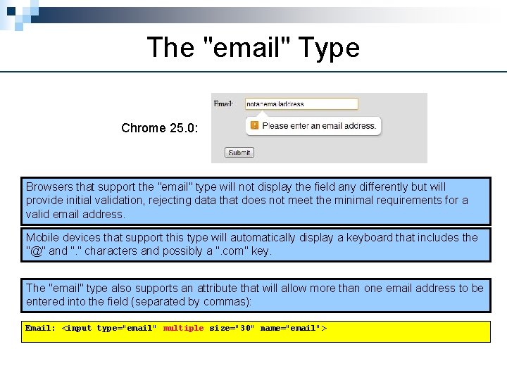
The "email" Type Chrome 25. 0: Browsers that support the "email" type will not display the field any differently but will provide initial validation, rejecting data that does not meet the minimal requirements for a valid email address. Mobile devices that support this type will automatically display a keyboard that includes the "@" and ". " characters and possibly a ". com" key. The "email" type also supports an attribute that will allow more than one email address to be entered into the field (separated by commas): Email: <input type="email" multiple size="30" name="email">

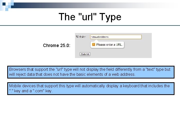
The "url" Type Chrome 25. 0: Browsers that support the "url" type will not display the field differently from a "text" type but will reject data that does not have the basic elements of a web address. Mobile devices that support this type will automatically display a keyboard that includes the ". " key and a ". com" key.

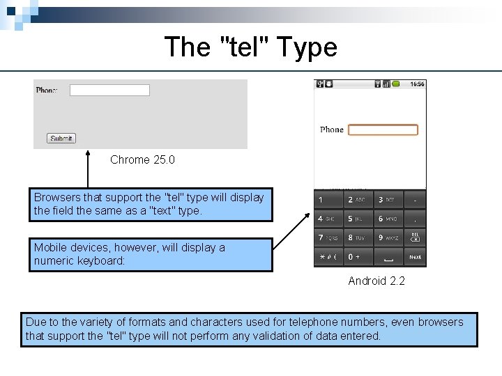
The "tel" Type Chrome 25. 0 Browsers that support the "tel" type will display the field the same as a "text" type. Mobile devices, however, will display a numeric keyboard: Android 2. 2 Due to the variety of formats and characters used for telephone numbers, even browsers that support the "tel" type will not perform any validation of data entered.

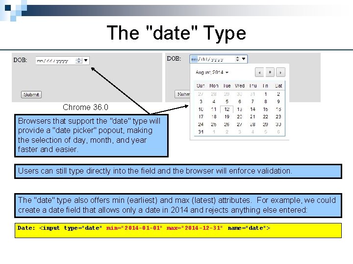
The "date" Type Chrome 36. 0 Browsers that support the "date" type will provide a "date picker" popout, making the selection of day, month, and year faster and easier. Users can still type directly into the field and the browser will enforce validation. The "date" type also offers min (earliest) and max (latest) attributes. For example, we could create a date field that allows only a date in 2014 and rejects anything else entered: Date: <input type="date" min="2014 -01 -01" max="2014 -12 -31" name="date">

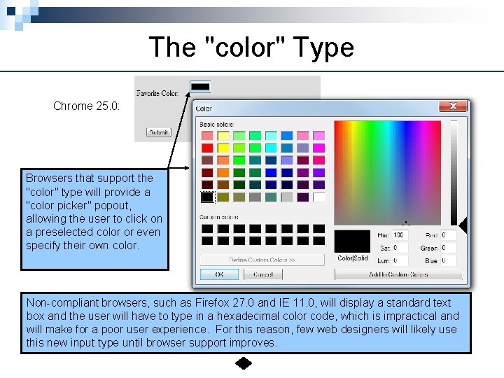
The "color" Type Chrome 25. 0: Browsers that support the "color" type will provide a "color picker" popout, allowing the user to click on a preselected color or even specify their own color. Non-compliant browsers, such as Firefox 27. 0 and IE 11. 0, will display a standard text box and the user will have to type in a hexadecimal color code, which is impractical and will make for a poor user experience. For this reason, few web designers will likely use this new input type until browser support improves.