My dear students Let me welcome u Welcome


- Slides: 20
My dear students Let me welcome u. Welcome!
Teacher’s Introduction Kamrul Hassan English Teacher Basurhat AHC Govt. High School Companigonj, Noakhali Mobile: 01819 36 50 64
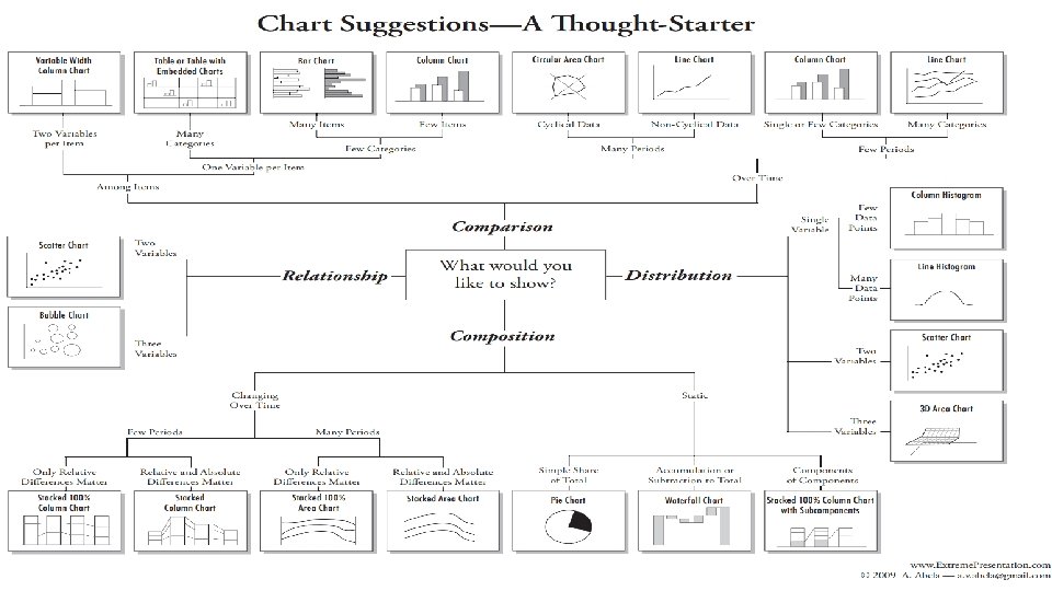
Today we’ll discuss about The Kinds of Graph & Chart Let’s discuss …. .
Objectives The students will be able to……… * Know the kinds of graph & chart * Identify the different graphs & chart * Describe
Line Graph Line charts, or line graphs, are powerful visual tools that illustrate trends in data over a period of time or a particular correlation. For example, one axis of the graph might represent a variable value, while the other axis often displays a timeline. Each value is plotted on the chart, then the points are connected to display a trend over the compared time span. Multiple trends can be compared by plotting lines of various colors or patterns. For example, the popularity of various social-media networks over the course of a year can be visually compared with ease through the use of a line graph. Simply plot each company’s user base for each month of the 12 -month span, then connect the dots with a line of a designated color.
Pie Chart Pie charts are the simplest and most efficient visual tool for comparing parts of a whole. For example, a pie chart can quickly and effectively compare various budget allocations, population segments or market-research question responses. Marketing content designers frequently rely on pie charts to compare the size of market segments. For example, a simple pie graph can clearly illustrate how the most popular mobile-phone manufacturers compare based on the sizes of their user-bases. Audiences can quickly understand that Apple and Samsung hold almost 75 -percent of the mobile-communication market, with Apple slightly ahead. That message can be sent without printing a single numerical digit.
Mosaic or Mekko Charts Basic line, bar and pie charts are excellent tools for comparing one or two variables in few categories, but what happens when you need to compare multiple variables or multiple categories at the same time? What if all those variables aren’t numeric even? A mosaic -- or Mekko -- chart plot might be the better choice. Perhaps a market analyst, for example, wants to compare more than the size of various mobile-phone markets. What if, instead, he or she needs to compare the size of the user bases, as well as the age groups within each group? A mosaic chart would allow said marketer to illustrate all the variables in a clear and straightforward manner. In the above example, one axis of the chart represents the categories being compared -- mobile phone manufacturers -- while the other axis lists various age ranges. The size and color of each cross-section of the chart corresponds with the market segment it
Population Pyramids Market segments are often divided based on age and gender, and a population pyramid is an ideal visual representation of the two groups. The graph classically takes on the shape of a pyramid when a population is healthy and growing -- the largest groups are the youngest, and each gender dwindles somewhat equally as the population ages, leaving the smallest groups at the top of the graph. A population pyramid that veers away from its classic shape might indicate an irregularity in a population during a particular period, such as a famine or an economic boom that led to an increase in deaths or births.
Function Plots Mathematicians, engineers and statisticians often need to determine the value of an equation by graphing its result. The graph of a function is the set of all points whose coordinates satisfy the equation. Therefore, the function of an equation with variables of x and y would be drawn on a graph with an x and y axis. Likewise, an equation that also included a variable of z would need to be drawn on a three-dimensional graph with a third axis. Function graphs of common shapes are visually associated with their corresponding algebraic formulas.
Multi Level Pie Chart All too often a designer finds him or herself with more sets of data than can be presented in a single standard graph. Fortunately, in the case of a pie chart, multiple layers of data can be presented without the need for multiple images or a trellis design. A multi-level pie chart, for example, consists of tiers, each layer representing a separate set of data. So while it would take three traditional pie graphs to illustrate the various sources of recorded words for three different decades, a multi-level pie graph can not only take the place of all three, but it also offers a clearer visual comparison of each year’s results.
Hierarchy Chart Similar in appearance to a flow chart, a hierarchical diagram, also known as an organizational chart or an organigram, illustrates the structure of an organization, as well as the relationships within it. A typical company organigram, for example, lists the CEO at the top, followed by presidents, vice presidents, managers and so on. An organizational chart can illustrate the chain of command from any employee all the way to the top. Hierarchy diagrams are similarly used to represent pedigrees, scientific classifications, demographics and any data set with a similar breakdown.
Bar Graphs Histogram Bar graphs aren’t useful only in illustrating parts of of a whole. They can also be used to display additional variables. While a basic bar graph could represent what portion of a population is classified as overweight over a designated time period, a stacked bar graph can also track how much of the total is obese.
Flow Charts Following the proper process is probably more important in medicine than in any other field. After all, if the surgeon forgets a step, you might very well bleed to death while you sleep. Flow charts are frequently used by hospitals, clinics and other medical facilities to ensure proper procedures are uniformly followed.
Pictographs In a pictograph, or pictogram, images and symbols are used to illustrate data. For example, a basic pictograph might use an image of the sun to signify each fair-weather day in a month and a rain cloud to symbolize each stormy day. Because images are known to hold more emotional power than raw data, pictograms are often used to present medical data. An illustration that shades five of 20 person symbols to represent a 20 -percent death rate carries a more powerful message, for example, than a bar, line or pie that illustrates the same data.
Multi-Pie Chart Just as in the cases of multilevel pie graphs, stacked bar graphs and trellis plots, multipie graphs paint a more detailed portrait of the data set it illustrates. While a single pie chart can display what portion of the total population has a particular condition, a multi-pie graph can break those statistics down to illustrate not only the portion of men and the portion of women, but also how the two groups compare to one another.
Tree Diagram A form of hierarchical diagram, a genealogical tree illustrates the structure of a family. It can either begin with an ancestor, then diagram his or her descendants, their siblings, marriages and children, and so on. A pedigree chart, on the other hand, begins with an individual and charts their ancestry, from parents to grandparents and so on.
Review of Today’s Class
How many Charts & Graphs can you remember? • Line Graph • Pie Chart • Mosaic or Mekko Charts • Population Pyramids • Function Plots • Multi-Level Pie Chart • Hierarchy Chart • Bar Graphs • Histograms • Flow Chart • Pictographs • Multi Pie Charts • Tree Diagram • Bubble Diagram
HOW TO DESCRIBE TRENDS • remain steady • fluctuate • increase slightly • decrease dramatically • decrease slightly • increase rapidly • rise dramatically • plunge • drop suddenly • stay the same • go up a little • go down slightly