Music magazine research SHANIE YOUNG Music magazine market


- Slides: 14

Music magazine research SHANIE YOUNG

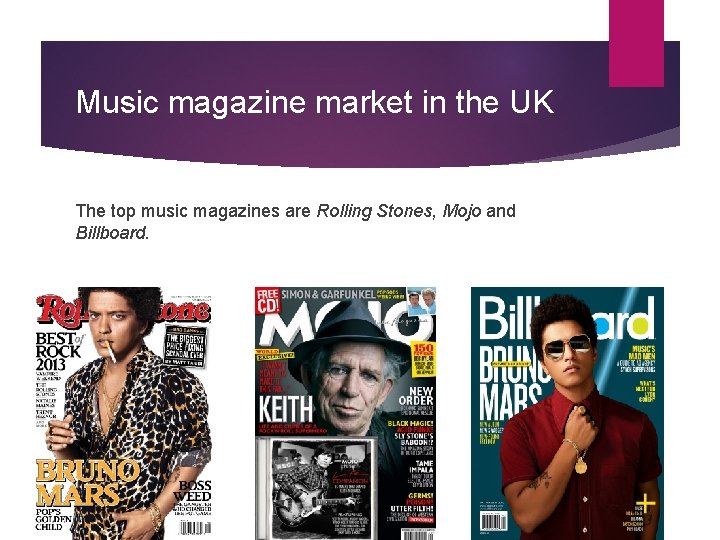
Music magazine market in the UK The top music magazines are Rolling Stones, Mojo and Billboard.

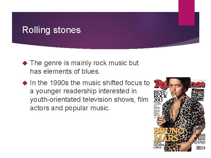
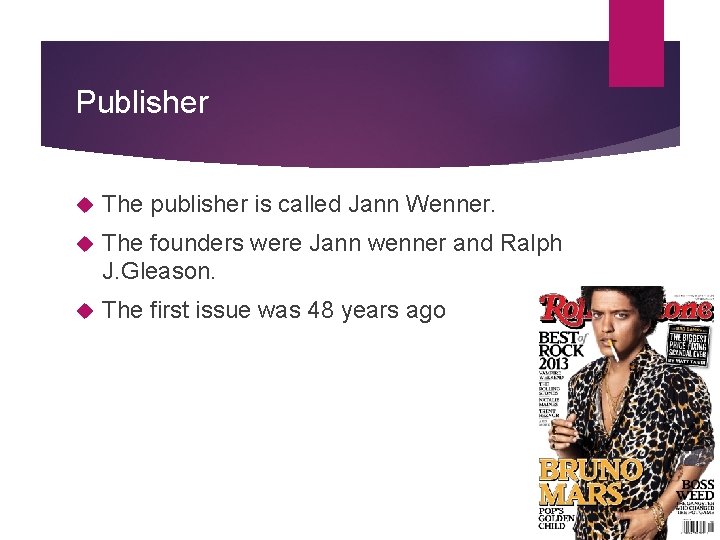
Rolling stones The genre is mainly rock music but has elements of blues. In the 1990 s the music shifted focus to a younger readership interested in youth-orientated television shows, film actors and popular music.

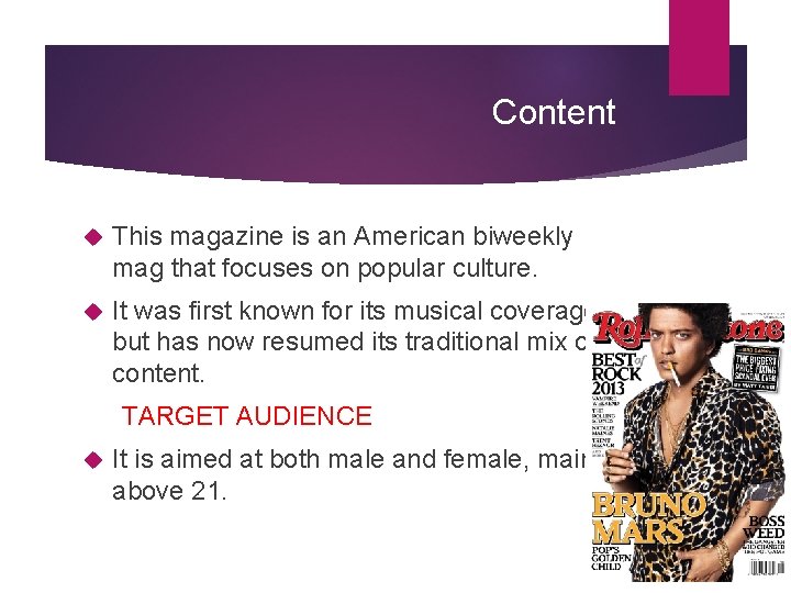
Content This magazine is an American biweekly mag that focuses on popular culture. It was first known for its musical coverage but has now resumed its traditional mix of content. TARGET AUDIENCE It is aimed at both male and female, mainly above 21.

Publisher The publisher is called Jann Wenner. The founders were Jann wenner and Ralph J. Gleason. The first issue was 48 years ago

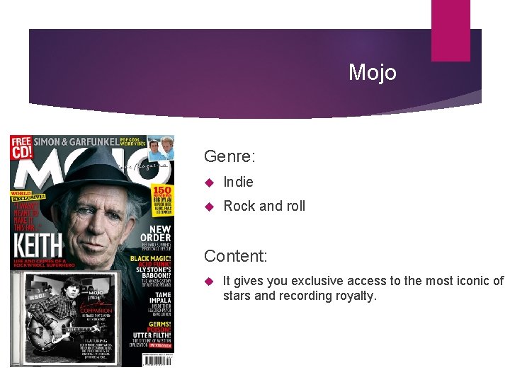
Mojo Genre: Indie Rock and roll Content: It gives you exclusive access to the most iconic of stars and recording royalty.

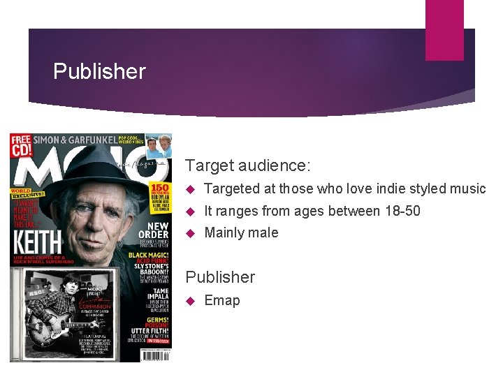
Publisher Target audience: Targeted at those who love indie styled music It ranges from ages between 18 -50 Mainly male Publisher Emap

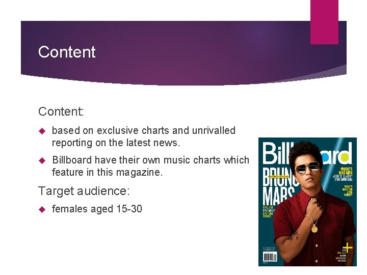
Billboard Genre: mainly R&B and Hip Hop but also includes Pop, Dance and Electronic Publisher: Lynne Segall

Content: based on exclusive charts and unrivalled reporting on the latest news. Billboard have their own music charts which feature in this magazine. Target audience: females aged 15 -30

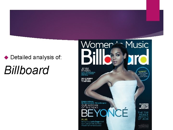
Detailed analysis of: Billboard

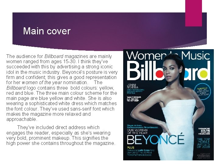
Main cover The audience for Billboard magazines are mainly women ranged from ages 15 -30. I think they’ve succeeded with this by advertising a strong iconic idol in the music industry. Beyoncé’s posture is very firm and confident; this gives a good representation for her women of the year nomination. The Billboard logo contains three bold colours: yellow, red and blue. The three main colour scheme for the main page are blue yellow and white. She is also wearing a sophisticated white dress which matches the font colour. They’ve used sans-serif font which makes the magazine more relaxed and approachable. They’ve included direct address which engages the reader, especially as she’s wearing very bold, prominent makeup. This signifies the high power she contains throughout the magazine.

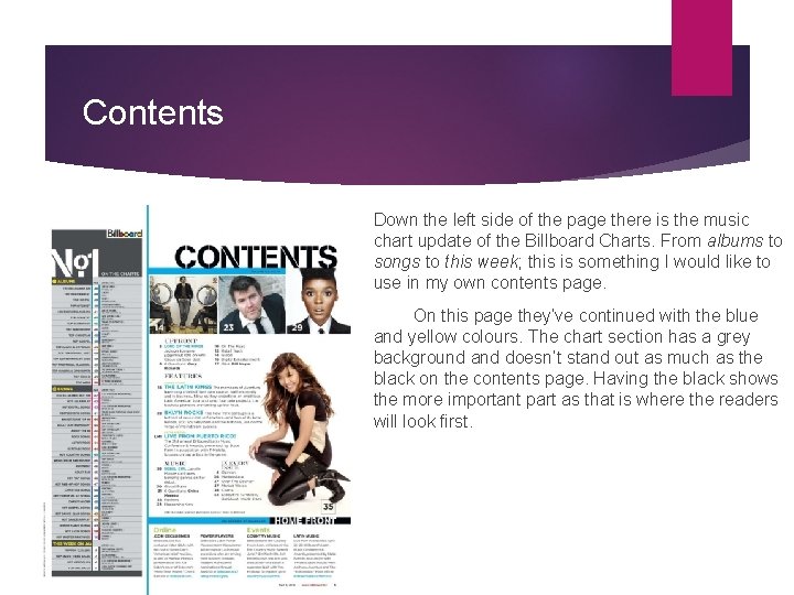
Contents Down the left side of the page there is the music chart update of the Billboard Charts. From albums to songs to this week; this is something I would like to use in my own contents page. On this page they’ve continued with the blue and yellow colours. The chart section has a grey background and doesn’t stand out as much as the black on the contents page. Having the black shows the more important part as that is where the readers will look first.

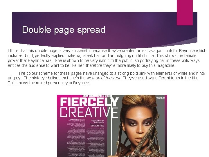
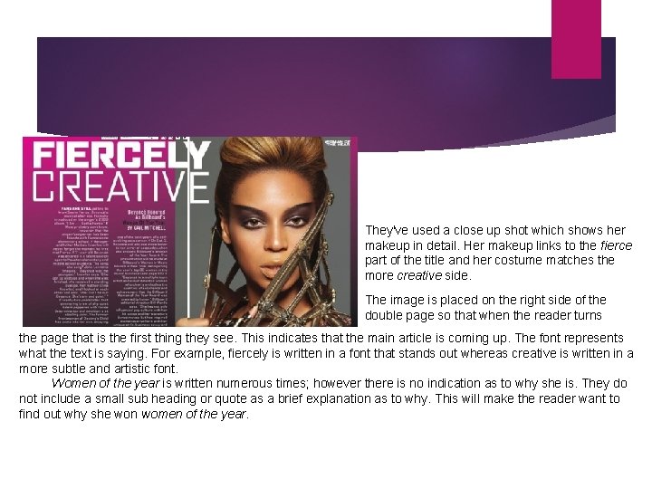
Double page spread I think that this double page is very successful because they’ve created an extravagant look for Beyoncé which includes: bold, perfectly applied makeup; sleek hair and an outgoing outfit choice. This shows the female power that Beyoncé has. She is shown to be very iconic to the public, so portraying her in these bold ways entices the audience to want to be like her; therefore they’re more likely to buy this magazine. The colour scheme for these pages have changed to a strong bold pink with elements of white and hints of grey. The pink symbolises that she’s the woman of the year. They’ve used two different fonts in the title. This shows the mixed personality of Beyoncé.

They've used a close up shot which shows her makeup in detail. Her makeup links to the fierce part of the title and her costume matches the more creative side. The image is placed on the right side of the double page so that when the reader turns the page that is the first thing they see. This indicates that the main article is coming up. The font represents what the text is saying. For example, fiercely is written in a font that stands out whereas creative is written in a more subtle and artistic font. Women of the year is written numerous times; however there is no indication as to why she is. They do not include a small sub heading or quote as a brief explanation as to why. This will make the reader want to find out why she won women of the year.
 Online music portfolio
 Leader challenger follower
 Targeting segmentation positioning
 Is rap music more popular among young
 What is the purpose of magazine cover
 Romantic vs classical music
 Elements of music in art appreciation
 What music that employs electronic music?
 Texture of pamulinawen
 Teaching market structures with a competitive gum market
 Market form meat
 Primary target market and secondary target market
 A model of business buyer behavior
 Space market real estate
 Money market capital market
