Music magazine case study Acoustic Magazine The slogan
- Slides: 8

Music magazine case study Acoustic Magazine

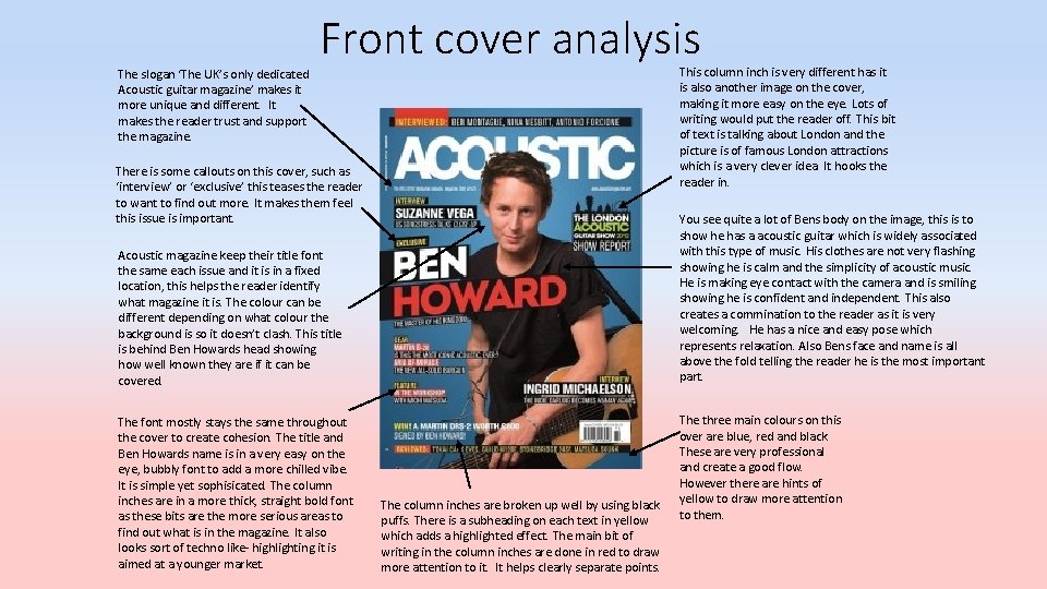
The slogan ‘The UK’s only dedicated Acoustic guitar magazine’ makes it more unique and different. It makes the reader trust and support the magazine. Front cover analysis This column inch is very different has it is also another image on the cover, making it more easy on the eye. Lots of writing would put the reader off. This bit of text is talking about London and the picture is of famous London attractions which is a very clever idea. It hooks the reader in. There is some callouts on this cover, such as ‘interview’ or ‘exclusive’ this teases the reader to want to find out more. It makes them feel this issue is important. You see quite a lot of Bens body on the image, this is to show he has a acoustic guitar which is widely associated with this type of music. His clothes are not very flashing showing he is calm and the simplicity of acoustic music. He is making eye contact with the camera and is smiling showing he is confident and independent. This also creates a commination to the reader as it is very welcoming. He has a nice and easy pose which represents relaxation. Also Bens face and name is all above the fold telling the reader he is the most important part. Acoustic magazine keep their title font the same each issue and it is in a fixed location, this helps the reader identify what magazine it is. The colour can be different depending on what colour the background is so it doesn’t clash. This title is behind Ben Howards head showing how well known they are if it can be covered. The font mostly stays the same throughout the cover to create cohesion. The title and Ben Howards name is in a very easy on the eye, bubbly font to add a more chilled vibe. It is simple yet sophisicated. The column inches are in a more thick, straight bold font as these bits are the more serious areas to find out what is in the magazine. It also looks sort of techno like- highlighting it is aimed at a younger market. The column inches are broken up well by using black puffs. There is a subheading on each text in yellow which adds a highlighted effect. The main bit of writing in the column inches are done in red to draw more attention to it. It helps clearly separate points. The three main colours on this over are blue, red and black. These are very professional and create a good flow. However there are hints of yellow to draw more attention to them.

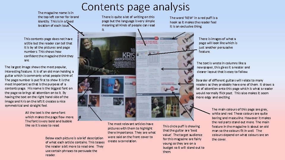
The magazine name is in the top left corner for brand identity. This is in a fixed location of each issue. Contents page analysis There is quite a lot of writing on this page but the language is very simple meaning all kinds of people can read it. This contents page does not have a title but the reader can tell that it is by all the pictures and page numbers. This shows how confident the magazine think they are. The largest image shows the most popular, interesting feature. It is of an old man holding a guitar which is commonly what people think of. The page number is put first to show it is the most important as that is the purpose of a contents page. His name is the biggest font on the page so brings all attention on to it. By having the text on the right hand side of the image and Kris on the left it creates a nice symmetrical and straight feel. All the text is the same font which makes the page flow more. The font is very bold and bubble like so it is easy to read. The most relevant articles have pictures with them to highlight there importance. They are what Below each picture is a brief description were said on the front cover to of what each article contains. This teases create a correlation. the reader a bit more to read one. They use certain phrases to persuade the reader. The word ‘NEW’ in a red puff is a hook as it makes the reader feel it is an exclusive thing. There is images of what a page will look like which is just another persuasive feature. The text is wrote in columns like a newspaper, this gives it a neater and clearer layout that is easy to follow. Boarder of different guitars will relate to many readers as they probably have one of them. It draws a lot of attention onto this page which is what a reader would normally flick past. This also makes it seem more edgy and exciting. This circle puff is showing that the guitar are ‘best value’. The target audience for this magazine are fairly young so they are on a budget so it will stand out to them. The main colours of this page are grey, white and red. These colours are quite boring and masculine. However it makes the red parts stand out more. The main feature in the magazine is about an old man so the colours fit in well. The colours depend on what colours are on the cover.

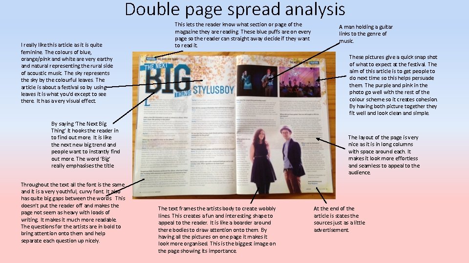
Double page spread analysis I really like this article as it is quite feminine. The colours of blue, orange/pink and white are very earthy and natural representing the rural side of acoustic music. The sky represents the sky by the colourful leaves. The article is about a festival so by using leaves it is what you'd except to see there. It has a very visual effect. This lets the reader know what section or page of the magazine they are reading. These blue puffs are on every page so the reader can straight away decide if they want to read it. These pictures give a quick snap shot of what to expect at the festival. The aim of this article is to get people to do next time so this helps persuade them. The purple and pink in the photo go well with the rest of the colour scheme so it creates cohesion. By having both picture together they fit well and look clean and simple. By saying ‘The Next Big Thing’ it hooks the reader in to find out more. It is like the next new big trend and people want to instantly find out more. The word ‘Big’ really emphasises the title. Throughout the text all the font is the same and it is a very youthful, curvy font. It also has quite big gaps between the words. This doesn’t put the reader off and makes the page not seem as heavy with loads of writing. It makes it much more readable. The questions for the artists are in bold to bring attention onto them and help separate each question up nicely. A man holding a guitar links to the genre of music. The layout of the page is very nice as it is in long columns with space around each. It makes it look more effortless and seamless to appeal to the audience. The text frames the artists body to create wobbly lines. This creates a fun and interesting shape to appeal to the reader. It is like a boarder around there bodies to draw attention onto them. By having all the pictures on one page it makes it look more organised. This is the biggest image on the page showing its importance. At the end of the article is states the sources just as a little advertisement.

Mode of address • Acoustic magazine uses colloquial and quirky linguistic techniques as it is quite simple language so all sorts of people can read it (you don’t have to be well educated). It is very conversational to make the reader feel laid back when they are reading and the magazines comes off as more friendly. It is not to chatty so that it is informal, it is just right. • In interviews the journalists ask very easy, not to serious questions to create a more chilled vibe. They use first person so the reader can identify when it is an opinion or fact. The articles are onesided to show views but they are not harsh on any artists. • Articles are in present tense (they may refer to past events) so reader feels up to date with all the music trends. • Rock/heavy metal magazines can be known to use taboo in their magazines. Acoustic magazine has no taboo language and has a very calm and relaxed feel. They do this so the readers feel more welcomed and are not offended. They have a very nice way of communicating with their readers as it is more like talking to family than friends. It creates the effect of the magazine having their own community.

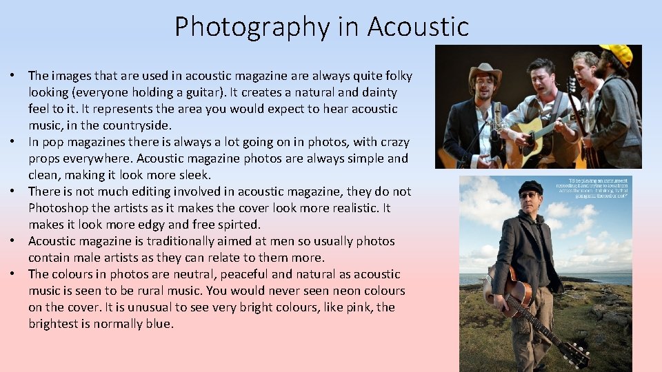
Photography in Acoustic • The images that are used in acoustic magazine are always quite folky looking (everyone holding a guitar). It creates a natural and dainty feel to it. It represents the area you would expect to hear acoustic music, in the countryside. • In pop magazines there is always a lot going on in photos, with crazy props everywhere. Acoustic magazine photos are always simple and clean, making it look more sleek. • There is not much editing involved in acoustic magazine, they do not Photoshop the artists as it makes the cover look more realistic. It makes it look more edgy and free spirted. • Acoustic magazine is traditionally aimed at men so usually photos contain male artists as they can relate to them more. • The colours in photos are neutral, peaceful and natural as acoustic music is seen to be rural music. You would never seen neon colours on the cover. It is unusual to see very bright colours, like pink, the brightest is normally blue.

Design and layout • Unlike other music magazines, acoustic has a very simple and sleek layout yet it is full of information. It is not to complicated. • It treats everyone the same, on pop magazines woman would be either seen as innocent or made to look more sexually appealing. Also men would be made to look strong. Whereas this magazine just portrays artists equally and doesn’t make them seem like a different person than they are. • Acoustic magazine is a very informative magazine. It tells readers what festivals to go to and gives detailed reviews. This is why it is very successful as people buy it for entertainment yet also to find out about the music. • They do have quite a few advertisements but they are done in a clever way. Near the end of the magazine they have a few pages of more poster like advertisements ( poster of a up coming festival). This means they are not on random pages and the reader has all of them in one place making it easier for them.

Background research • It is owned by the company Blaze Publishing Ltd. They also own some lifestyle magazines(HAIR fashion), sport magazines (sea fishing and modern gamekeeping) and other music magazines (i. Drum). • Acoustic magazine come out every four weeks. • Full of latest product reviews and tests, leading interviews with world-class artists of every genre, instructional features and columns written by ‘name’ international musicians and artists, as well as technique analysis, industry news and music reviews. • It is aimed at young – middle aged men.