Music Magazine Analysis Writing Style The magazine has
- Slides: 7

Music Magazine Analysis

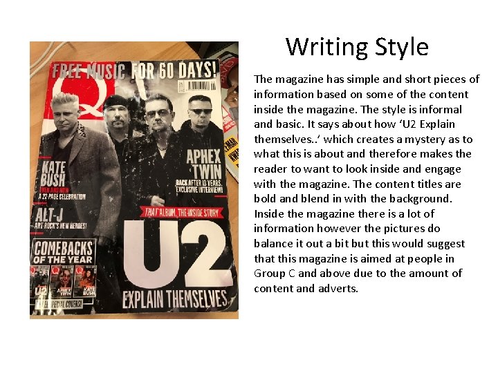
Writing Style The magazine has simple and short pieces of information based on some of the content inside the magazine. The style is informal and basic. It says about how ‘U 2 Explain themselves. . ’ which creates a mystery as to what this is about and therefore makes the reader to want to look inside and engage with the magazine. The content titles are bold and blend in with the background. Inside the magazine there is a lot of information however the pictures do balance it out a bit but this would suggest that this magazine is aimed at people in Group C and above due to the amount of content and adverts.

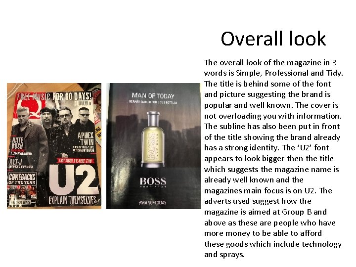
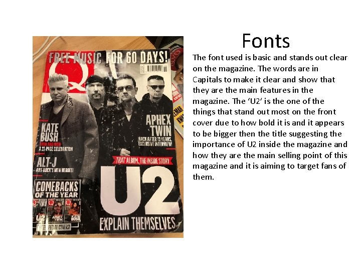
Overall look The overall look of the magazine in 3 words is Simple, Professional and Tidy. The title is behind some of the font and picture suggesting the brand is popular and well known. The cover is not overloading you with information. The subline has also been put in front of the title showing the brand already has a strong identity. The ‘U 2’ font appears to look bigger then the title which suggests the magazine name is already well known and the magazines main focus is on U 2. The adverts used suggest how the magazine is aimed at Group B and above as these are people who have more money to be able to afford these goods which include technology and sprays.

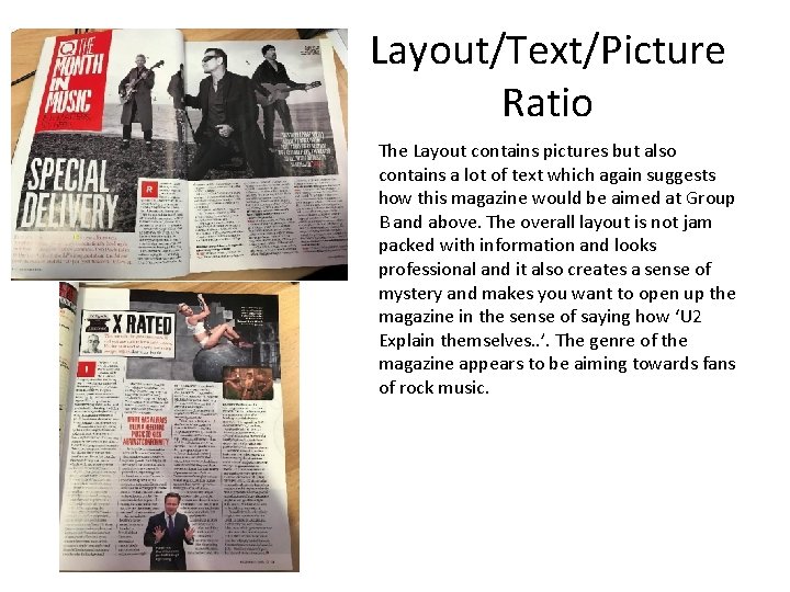
Layout/Text/Picture Ratio The Layout contains pictures but also contains a lot of text which again suggests how this magazine would be aimed at Group B and above. The overall layout is not jam packed with information and looks professional and it also creates a sense of mystery and makes you want to open up the magazine in the sense of saying how ‘U 2 Explain themselves. . ’. The genre of the magazine appears to be aiming towards fans of rock music.

Fonts The font used is basic and stands out clear on the magazine. The words are in Capitals to make it clear and show that they are the main features in the magazine. The ‘U 2’ is the one of the things that stand out most on the front cover due to how bold it is and it appears to be bigger then the title suggesting the importance of U 2 inside the magazine and how they are the main selling point of this magazine and it is aiming to target fans of them.

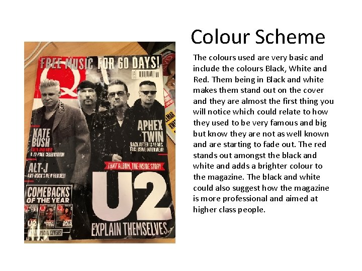
Colour Scheme The colours used are very basic and include the colours Black, White and Red. Them being in Black and white makes them stand out on the cover and they are almost the first thing you will notice which could relate to how they used to be very famous and big but know they are not as well known and are starting to fade out. The red stands out amongst the black and white and adds a brighter colour to the magazine. The black and white could also suggest how the magazine is more professional and aimed at higher class people.

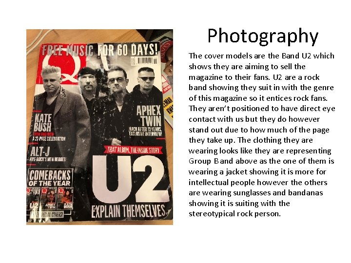
Photography The cover models are the Band U 2 which shows they are aiming to sell the magazine to their fans. U 2 are a rock band showing they suit in with the genre of this magazine so it entices rock fans. They aren’t positioned to have direct eye contact with us but they do however stand out due to how much of the page they take up. The clothing they are wearing looks like they are representing Group B and above as the one of them is wearing a jacket showing it is more for intellectual people however the others are wearing sunglasses and bandanas showing it is suiting with the stereotypical rock person.