Multivariate statistics in Lecture 2 Working in RStudio

- Slides: 33

Multivariate statistics in Lecture 2 Working in RStudio Data Visualization

Plans for today 1. 2. 3. 4. 5. Quick practical announcements Check homework assignments Working in RStudio tutorial Data analysis workflow Data visualization and exploration

Quick comments about the syllabus ● ● Exact dates are now in the syllabus The material got a bit slimmer The midterm exam will be on Nov 17 th, usual time and place If you have questions or need additional consultation, let me know. I also have a weekly consultation on Tuesday mornings (10: 30 -12) ● There is an optional class on 22 th of December, that we can use entirely for consultation ● Final exam will be decided later, but there will be options for January

Working in RStudio

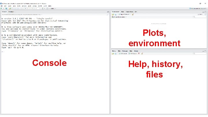
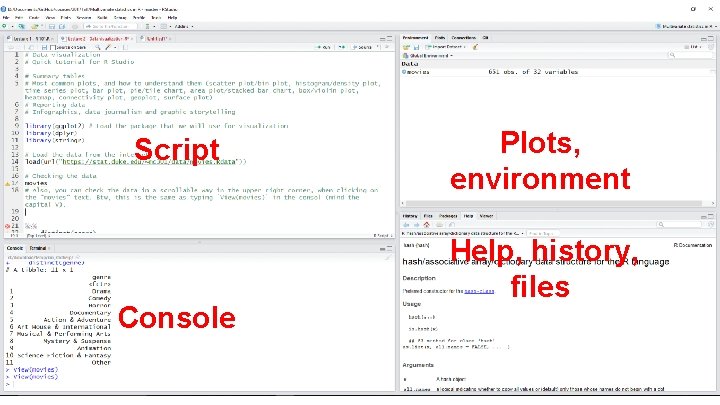
Plots, environment Console Help, history, files

Script Console Plots, environment Help, history, files

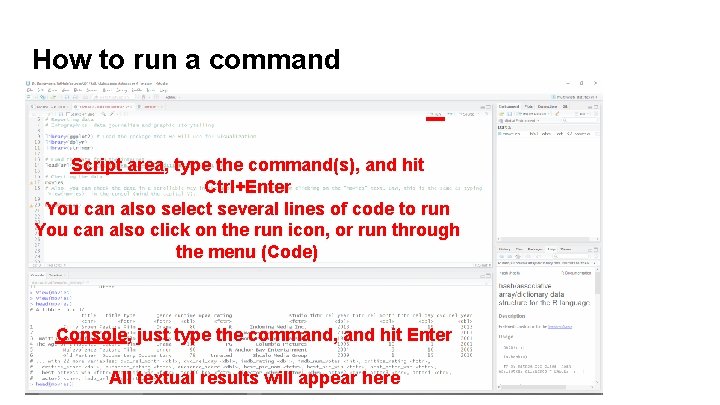
How to run a command Script area, type the command(s), and hit Ctrl+Enter You can also select several lines of code to run You can also click on the run icon, or run through the menu (Code) Console, just type the command, and hit Enter All textual results will appear here

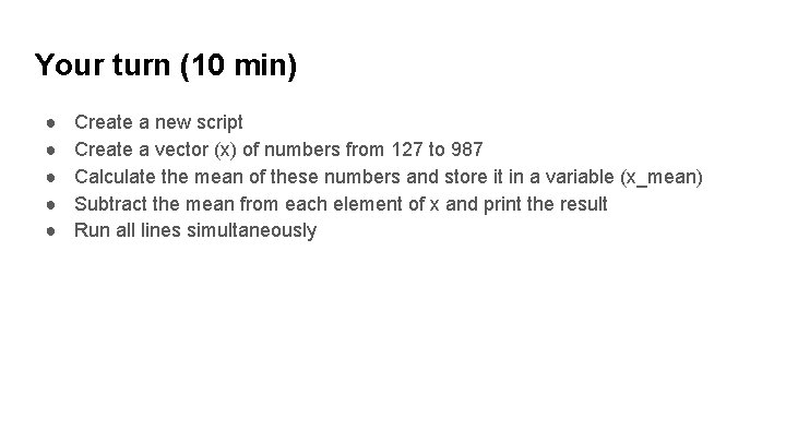
Your turn (10 min) ● ● ● Create a new script Create a vector (x) of numbers from 127 to 987 Calculate the mean of these numbers and store it in a variable (x_mean) Subtract the mean from each element of x and print the result Run all lines simultaneously

Making sense of data

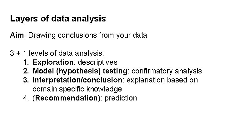
Layers of data analysis Aim: Drawing conclusions from your data 3 + 1 levels of data analysis: 1. Exploration: descriptives 2. Model (hypothesis) testing: confirmatory analysis 3. Interpretation/conclusion: explanation based on domain specific knowledge 4. (Recommendation): prediction

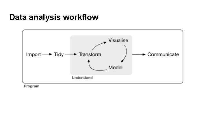
Data analysis workflow

Data visualization (Data viz)

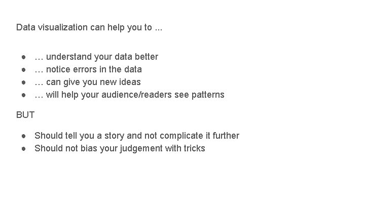
Data visualization can help you to. . . ● ● … understand your data better … notice errors in the data … can give you new ideas … will help your audience/readers see patterns BUT ● Should tell you a story and not complicate it further ● Should not bias your judgement with tricks

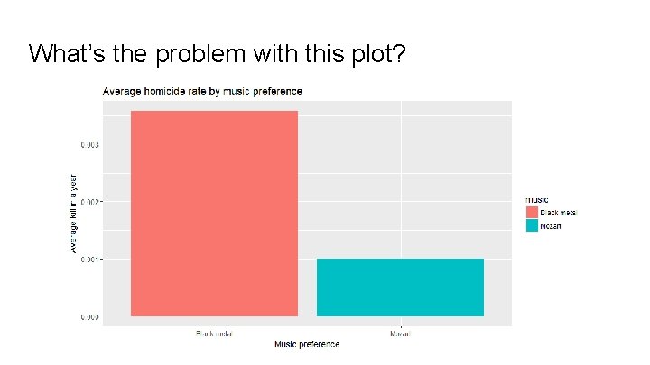
What’s the problem with this plot?

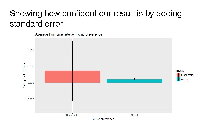
Showing how confident our result is by adding standard error

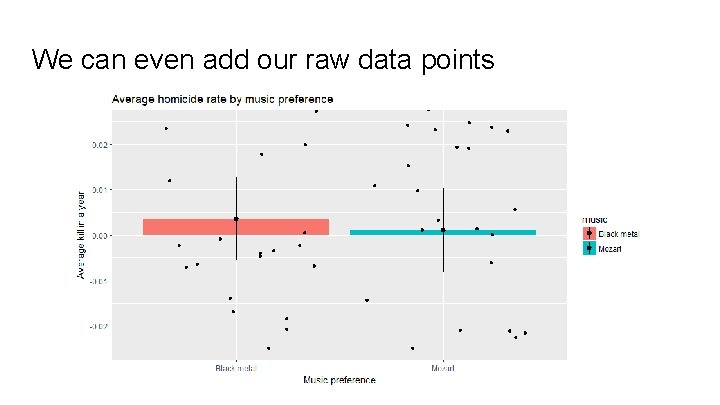
We can even add our raw data points

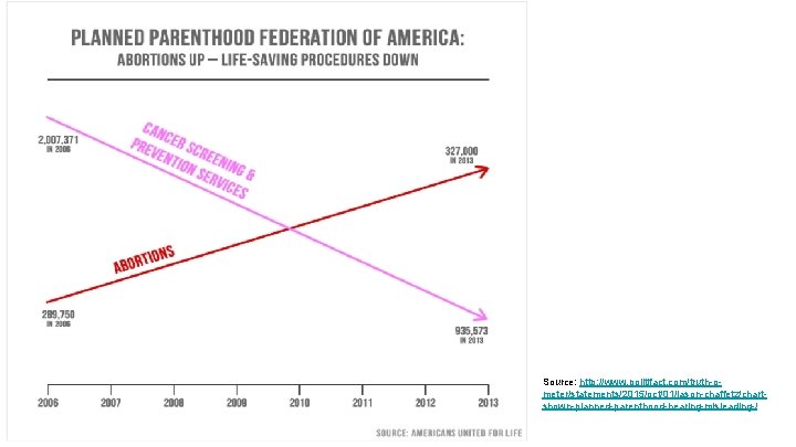
What’s wrong with the following plot?

Source: http: //www. politifact. com/truth-ometer/statements/2015/oct/01/jason-chaffetz/chartshown-planned-parenthood-hearing-misleading-/

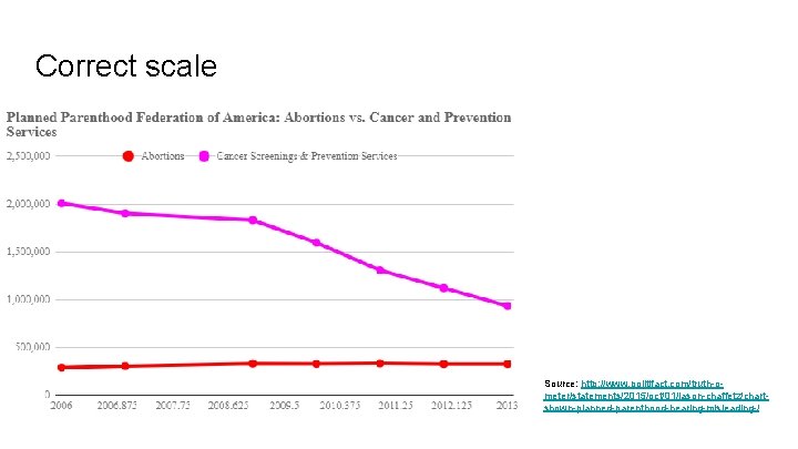
Correct scale Source: http: //www. politifact. com/truth-ometer/statements/2015/oct/01/jason-chaffetz/chartshown-planned-parenthood-hearing-misleading-/

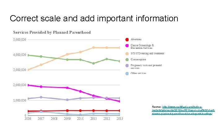
Correct scale and add important information Source: http: //www. politifact. com/truth-ometer/statements/2015/oct/01/jason-chaffetz/chartshown-planned-parenthood-hearing-misleading-/

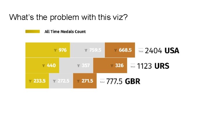
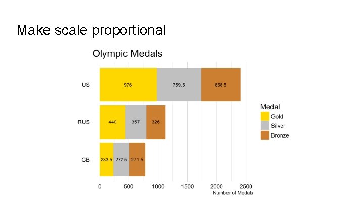
What’s the problem with this viz?

Make scale proportional

Exploring the movies dataset ● Download the data from OSF (datasets folder) ● Access the data from the internet directly from R: load(url("https: //stat. duke. edu/~mc 301/data/movies. Rdata")) ● Question to explore together: How much do the critics and the audience agree on movie ratings?

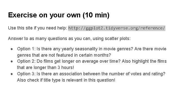
Exercise on your own (10 min) Use this site if you need help: http: //ggplot 2. tidyverse. org/reference/ Answer to as many questions as you can, using scatter plots: ● Option 1: Is there any yearly seasonality in movie genres? Are there movie genres that are not featured in certain months? ● Option 2: Do films get longer on average over time? Also highlight the films that are longer than 3 hours! ● Option 3: Is there an association between the number of votes and rating? Also check if title type is relevant in this question!

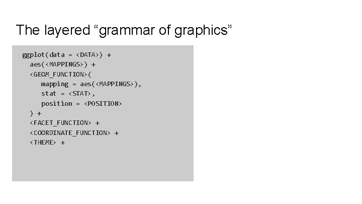
The layered “grammar of graphics” ggplot(data = <DATA>) + aes(<MAPPINGS>) + <GEOM_FUNCTION>( mapping = aes(<MAPPINGS>), stat = <STAT>, position = <POSITION> ) + <FACET_FUNCTION> + <COORDINATE_FUNCTION> + <THEME> +

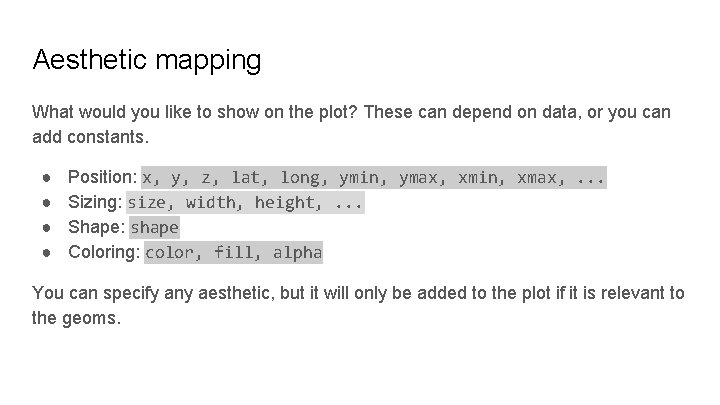
Aesthetic mapping What would you like to show on the plot? These can depend on data, or you can add constants. ● ● Position: x, y, z, lat, long, ymin, ymax, xmin, xmax, . . . Sizing: size, width, height, . . . Shape: shape Coloring: color, fill, alpha You can specify any aesthetic, but it will only be added to the plot if it is relevant to the geoms.

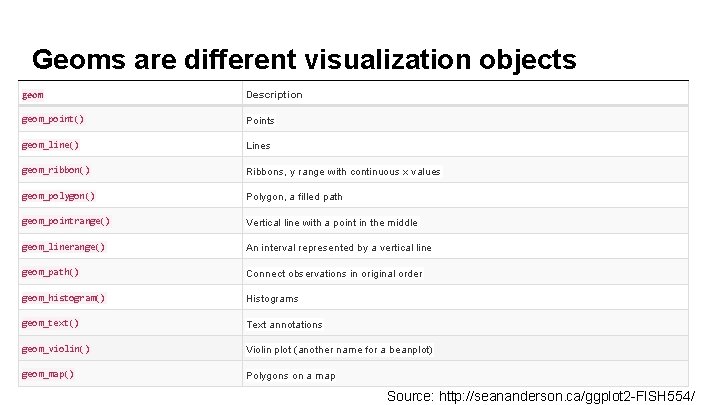
Geoms are different visualization objects geom Description geom_point() Points geom_line() Lines geom_ribbon() Ribbons, y range with continuous x values geom_polygon() Polygon, a filled path geom_pointrange() Vertical line with a point in the middle geom_linerange() An interval represented by a vertical line geom_path() Connect observations in original order geom_histogram() Histograms geom_text() Text annotations geom_violin() Violin plot (another name for a beanplot) geom_map() Polygons on a map Source: http: //seananderson. ca/ggplot 2 -FISH 554/

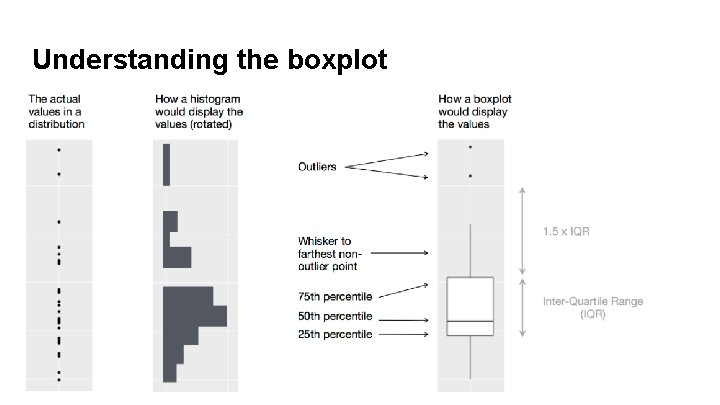
Understanding the boxplot

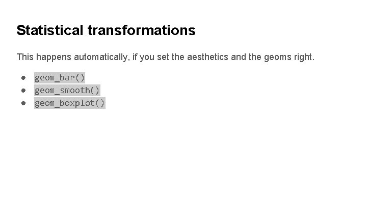
Statistical transformations This happens automatically, if you set the aesthetics and the geoms right. ● geom_bar() ● geom_smooth() ● geom_boxplot()

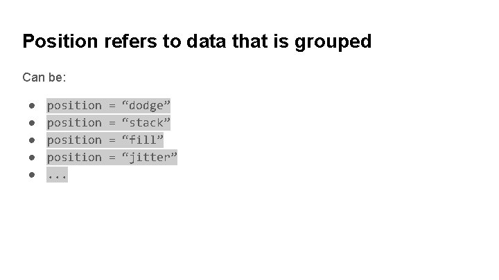
Position refers to data that is grouped Can be: ● ● ● position. . . = = “dodge” “stack” “fill” “jitter”

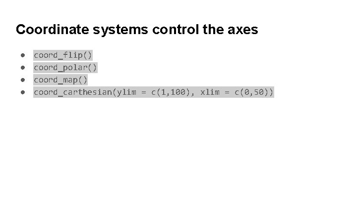
Coordinate systems control the axes ● ● coord_flip() coord_polar() coord_map() coord_carthesian(ylim = c(1, 100), xlim = c(0, 50))

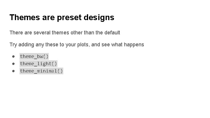
Themes are preset designs There are several themes other than the default Try adding any these to your plots, and see what happens ● theme_bw() ● theme_light() ● theme_minimal()

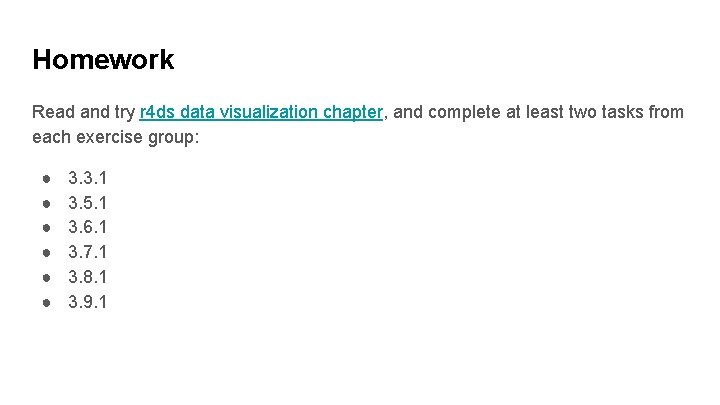
Homework Read and try r 4 ds data visualization chapter, and complete at least two tasks from each exercise group: ● ● ● 3. 3. 1 3. 5. 1 3. 6. 1 3. 7. 1 3. 8. 1 3. 9. 1