MULTIMODAL ANALYSIS AN ANALYSIS OF WOMENS LIFESTYLE MAGAZINE

- Slides: 6

MULTIMODAL ANALYSIS AN ANALYSIS OF WOMEN'S LIFESTYLE MAGAZINE COVERS

COMPARING WOMEN'S LIFESTYLE MAGAZINE COVERS • For this assignment I’m going to be using three women/lifestyle magazine covers to analyze as examples of multimodal texts. • In order to sell a magazine the company has to consider how they are going to persuade the customer into buying it. By using persuasion with text and design this creates a choice for the customer as to whether or not they’re going to buy the magazine. The rhetorical situation is what the author has taken into consideration to create a text. • The magazine covers that I have chosen to use are Seventeen, Vogue, and Cosmopolitan - all three covers are the February 2016 issue.

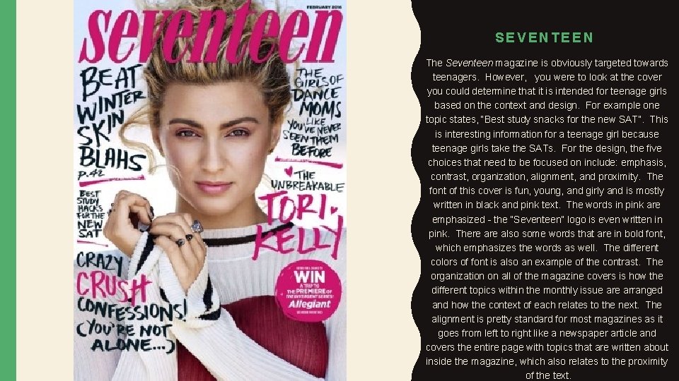
SEVENTEEN The Seventeen magazine is obviously targeted towards teenagers. However, you were to look at the cover you could determine that it is intended for teenage girls based on the context and design. For example one topic states, “Best study snacks for the new SAT”. This is interesting information for a teenage girl because teenage girls take the SATs. For the design, the five choices that need to be focused on include: emphasis, contrast, organization, alignment, and proximity. The font of this cover is fun, young, and girly and is mostly written in black and pink text. The words in pink are emphasized - the “Seventeen” logo is even written in pink. There also some words that are in bold font, which emphasizes the words as well. The different colors of font is also an example of the contrast. The organization on all of the magazine covers is how the different topics within the monthly issue arranged and how the context of each relates to the next. The alignment is pretty standard for most magazines as it goes from left to right like a newspaper article and covers the entire page with topics that are written about inside the magazine, which also relates to the proximity of the text.

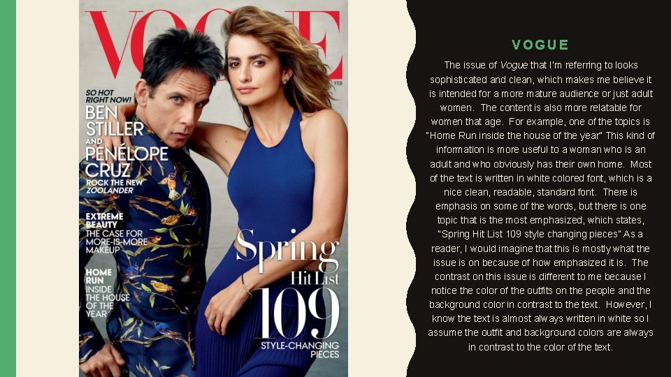
VOGUE The issue of Vogue that I’m referring to looks sophisticated and clean, which makes me believe it is intended for a more mature audience or just adult women. The content is also more relatable for women that age. For example, one of the topics is “Home Run inside the house of the year” This kind of information is more useful to a woman who is an adult and who obviously has their own home. Most of the text is written in white colored font, which is a nice clean, readable, standard font. There is emphasis on some of the words, but there is one topic that is the most emphasized, which states, “Spring Hit List 109 style changing pieces” As a reader, I would imagine that this is mostly what the issue is on because of how emphasized it is. The contrast on this issue is different to me because I notice the color of the outfits on the people and the background color in contrast to the text. However, I know the text is almost always written in white so I assume the outfit and background colors are always in contrast to the color of the text.

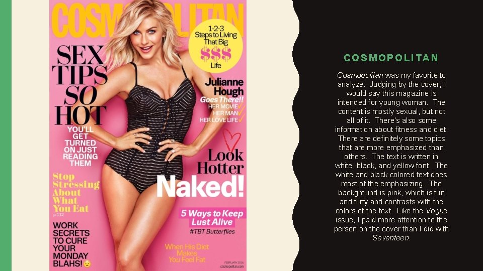
COSMOPOLITAN Cosmopolitan was my favorite to analyze. Judging by the cover, I would say this magazine is intended for young woman. The content is mostly sexual, but not all of it. There’s also some information about fitness and diet. There are definitely some topics that are more emphasized than others. The text is written in white, black, and yellow font. The white and black colored text does most of the emphasizing. The background is pink, which is fun and flirty and contrasts with the colors of the text. Like the Vogue issue, I paid more attention to the person on the cover than I did with Seventeen.

CONCLUSION For magazine covers, the context and person being featured on the magazine, (who is almost always on the cover) are big selling points for the magazine. As far as design goes, I would say it is generally the same within each genre. The companies have to focus on the colors and font that are being used in terms of emphasis and contrast. The organization varies from cover to cover as it focuses on new topics each month and the alignment, and proximity are generally very similar on magazine covers.