MTH 161 Introduction To Statistics Lecture 06 Dr

- Slides: 25

MTH 161: Introduction To Statistics Lecture 06 Dr. MUMTAZ AHMED

Review of Previous Lecture � Introduction to MS-Excel �Basic Overview of MS-Excel �Entering a sequence of numbers using Auto List �Using Cell References (Absolute and relative Cell References) �Built-in Excel Functions �Sum, Min, Max functions � Constructing Frequency Tables in MS-Excel �Frequency Distribution for Quantitative Data �Discrete Frequency Distribution �Continuous or Grouped Frequency Distribution �Frequency Distribution for Qualitative Data 2

Objectives In this lecture, we will study: � Recap: An overview of MS-Excel � Creating Charts in MS-Excel �Graphs for Qualitative Data �Bar Chart � Simple Bar Chart � Multiple Bar Chart � Component Bar Chart �Pie Chart 3

Objectives In this lecture, we will study: � Graphs for Quantitative Data � Scatter Plot � Constructing Histogram 4

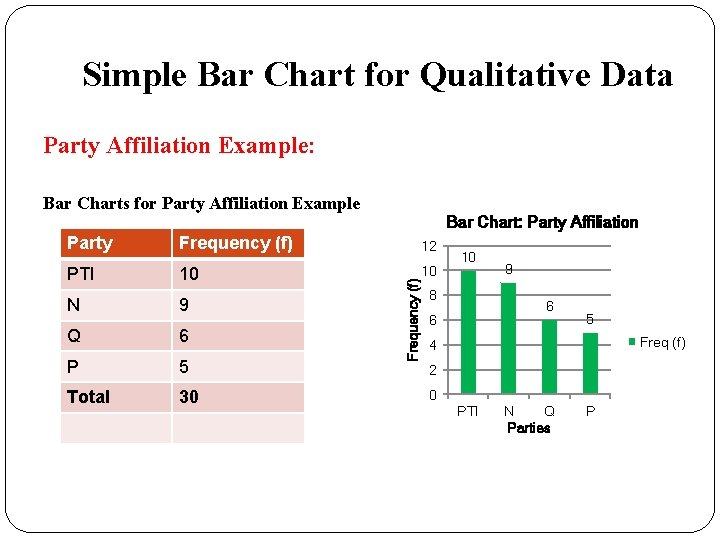
Simple Bar Chart for Qualitative Data Party Affiliation Example: Bar Charts for Party Affiliation Example Frequency (f) 12 PTI 10 10 N 9 Q 6 P 5 Total 30 Frequency (f) Party Bar Chart: Party Affiliation 10 8 9 6 6 5 Freq (f) 4 2 0 PTI N Q Parties P

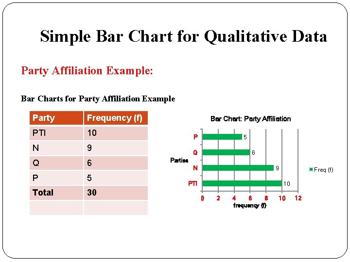
Simple Bar Chart for Qualitative Data Party Affiliation Example: Bar Charts for Party Affiliation Example Party Frequency (f) PTI 10 N 9 Q 6 P 5 Total 30 Bar Chart: Party Affiliation P 5 Q 6 Parties N 9 PTI Freq (f) 10 0 2 4 6 8 frequency (f) 10 12

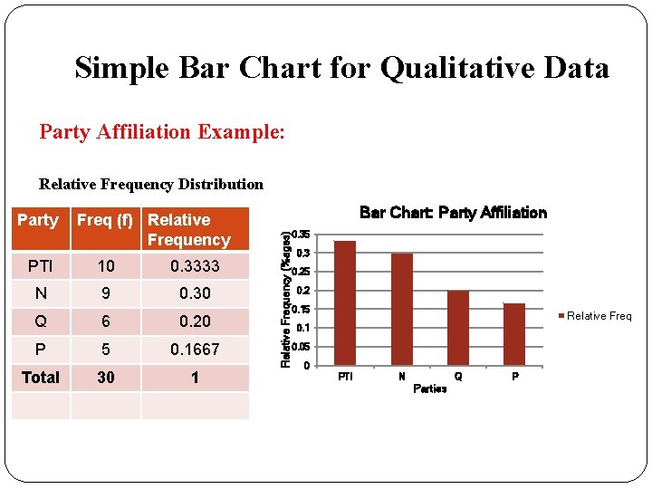
Simple Bar Chart for Qualitative Data Party Affiliation Example: Relative Frequency Distribution Freq (f) Relative Frequency PTI 10 0. 3333 N 9 0. 30 Q 6 0. 20 P 5 0. 1667 Total 30 1 Bar Chart: Party Affiliation Relative Frequency (%ages) Party 0. 35 0. 3 0. 25 0. 2 0. 15 Relative Freq 0. 1 0. 05 0 PTI N Q Parties P

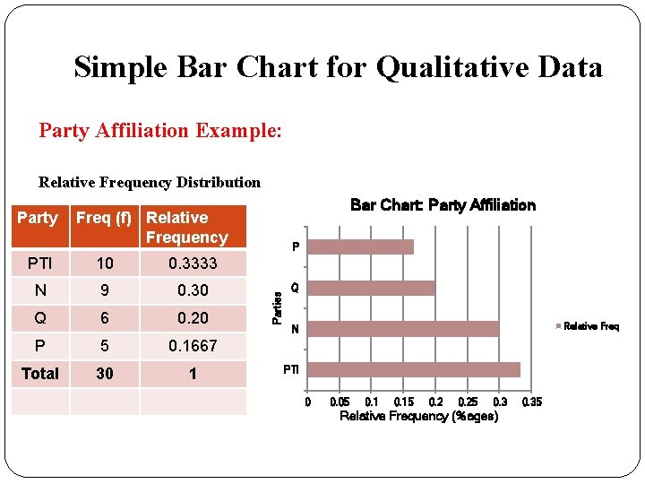
Simple Bar Chart for Qualitative Data Party Affiliation Example: Relative Frequency Distribution Freq (f) Relative Frequency PTI 10 0. 3333 N 9 0. 30 Q 6 0. 20 P 5 0. 1667 Total 30 1 P Parties Party Bar Chart: Party Affiliation Q Relative Freq N PTI 0 0. 05 0. 15 0. 25 0. 3 Relative Frequency (%ages) 0. 35

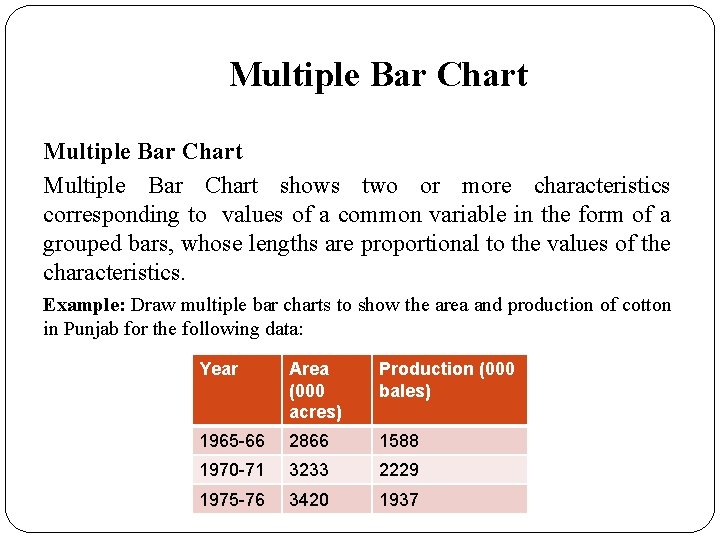
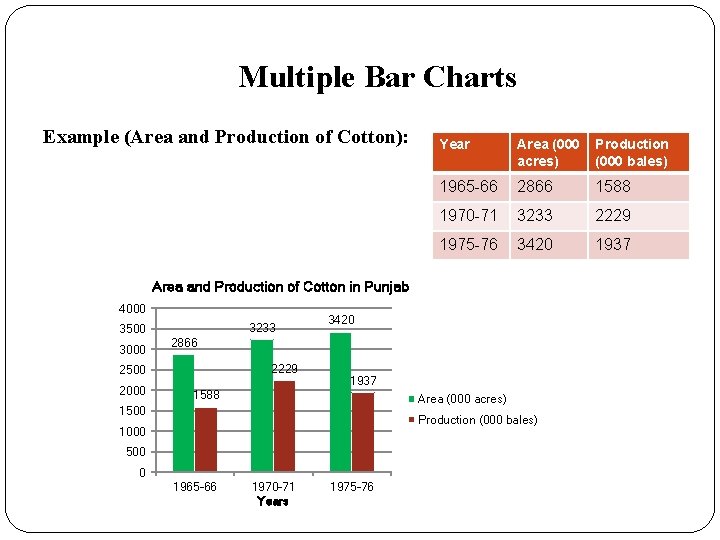
Multiple Bar Chart shows two or more characteristics corresponding to values of a common variable in the form of a grouped bars, whose lengths are proportional to the values of the characteristics. Example: Draw multiple bar charts to show the area and production of cotton in Punjab for the following data: Year Area (000 acres) Production (000 bales) 1965 -66 2866 1588 1970 -71 3233 2229 1975 -76 3420 1937

Multiple Bar Charts Example (Area and Production of Cotton): Year Area (000 acres) Production (000 bales) 1965 -66 2866 1588 1970 -71 3233 2229 1975 -76 3420 1937 Area and Production of Cotton in Punjab 4000 3500 3000 3233 2866 2229 2500 2000 3420 1937 1588 Area (000 acres) 1500 Production (000 bales) 1000 500 0 1965 -66 1970 -71 Years 1975 -76

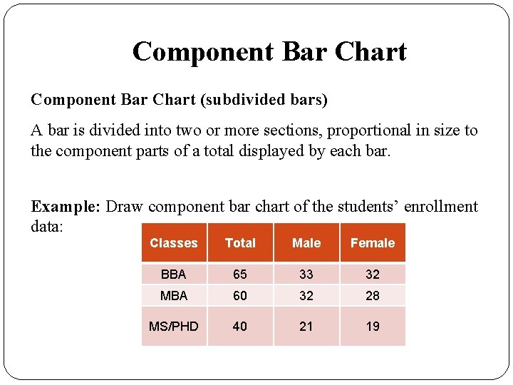
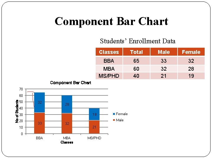
Component Bar Chart (subdivided bars) A bar is divided into two or more sections, proportional in size to the component parts of a total displayed by each bar. Example: Draw component bar chart of the students’ enrollment data: Classes Total Male Female BBA 65 33 32 MBA 60 32 28 MS/PHD 40 21 19

Component Bar Chart Students’ Enrollment Data Students’ Enrollment Classes Total Male Female BBA 65 33 32 MBA MS/PHD 60 40 32 21 28 19 Component Bar Chart 70 No of Students 60 50 32 40 28 19 30 20 33 32 BBA MBA Classes 10 Female Male 21 0 MS/PHD

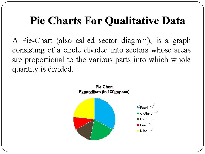
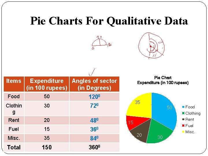
Pie Charts For Qualitative Data A Pie-Chart (also called sector diagram), is a graph consisting of a circle divided into sectors whose areas are proportional to the various parts into which whole quantity is divided. Pie Chart Expenditure (in 100 rupees) Food Clothing Rent Fuel Misc.

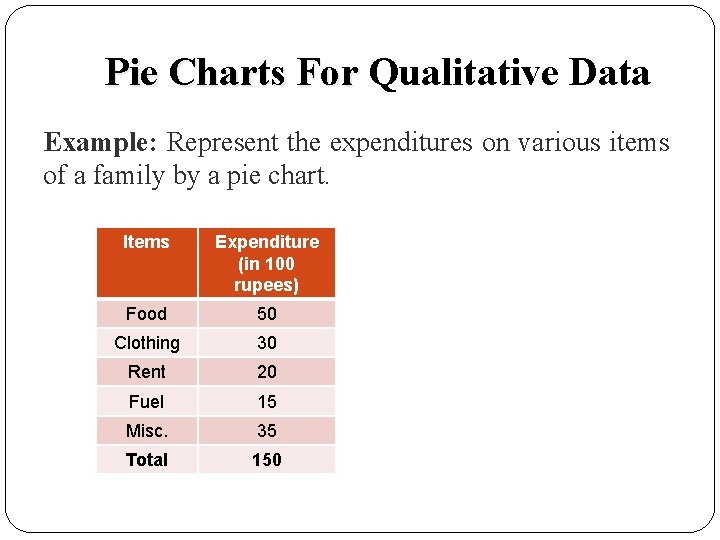
Pie Charts For Qualitative Data Example: Represent the expenditures on various items of a family by a pie chart. Items Expenditure (in 100 rupees) Food 50 Clothing 30 Rent 20 Fuel 15 Misc. 35 Total 150

Pie Charts For Qualitative Data Items Pie Chart Expenditure (in 100 rupees) Expenditure Angles of sector (in 100 rupees) (in Degrees) Food 50 1200 Clothin g 30 720 Rent 20 480 Fuel 15 360 35 50 Food Clothing Misc. 35 840 Total 150 3600 Rent 15 Fuel 20 Misc. 30

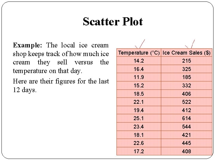
Scatter Plot Example: The local ice cream shop keeps track of how much ice cream they sell versus the temperature on that day.

Scatter Plot Example: The local ice cream shop keeps track of how much ice cream they sell versus the temperature on that day. Here are their figures for the last 12 days.

Scatter Plot Example: The local ice cream shop keeps track of how much ice cream they sell versus the temperature on that day. Here are their figures for the last 12 days. Temperature (°C) Ice Cream Sales ($) 14. 2 215 16. 4 325 11. 9 185 15. 2 332 18. 5 406 22. 1 522 19. 4 412 25. 1 614 23. 4 544 18. 1 421 22. 6 445 17. 2 408

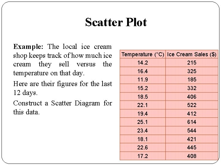
Scatter Plot Example: The local ice cream shop keeps track of how much ice cream they sell versus the temperature on that day. Here are their figures for the last 12 days. Construct a Scatter Diagram for this data. Temperature (°C) Ice Cream Sales ($) 14. 2 215 16. 4 325 11. 9 185 15. 2 332 18. 5 406 22. 1 522 19. 4 412 25. 1 614 23. 4 544 18. 1 421 22. 6 445 17. 2 408

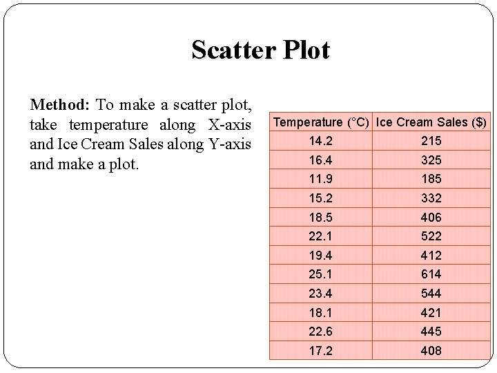
Scatter Plot Method: To make a scatter plot, take temperature along X-axis and Ice Cream Sales along Y-axis and make a plot. Temperature (°C) Ice Cream Sales ($) 14. 2 215 16. 4 325 11. 9 185 15. 2 332 18. 5 406 22. 1 522 19. 4 412 25. 1 614 23. 4 544 18. 1 421 22. 6 445 17. 2 408

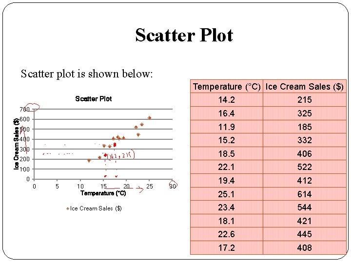
Scatter Plot Scatter plot is shown below: Temperature (°C) Ice Cream Sales ($) Scatter Plot 14. 2 215 16. 4 325 500 11. 9 185 400 15. 2 332 300 18. 5 406 22. 1 522 19. 4 412 25. 1 614 23. 4 544 18. 1 421 22. 6 445 17. 2 408 Ice Cream Sales ($) 700 600 200 100 0 0 5 10 15 20 Temperature (°C) Ice Cream Sales ($) 25 30

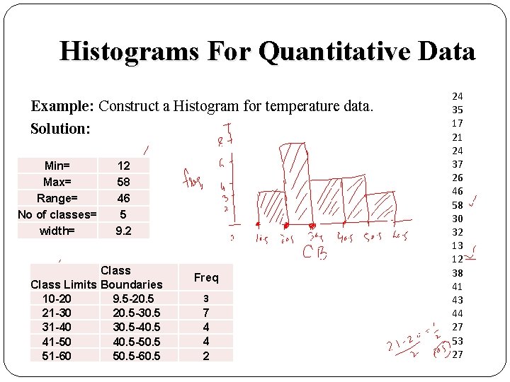
Histograms For Quantitative Data Example: Construct a Histogram for temperature data. Solution: Min= Max= Range= No of classes= width= 12 58 46 5 9. 2 Class Limits Boundaries 10 -20 9. 5 -20. 5 21 -30 20. 5 -30. 5 31 -40 30. 5 -40. 5 41 -50 40. 5 -50. 5 51 -60 50. 5 -60. 5 Freq 3 7 4 4 2 24 35 17 21 24 37 26 46 58 30 32 13 12 38 41 43 44 27 53 27

Excel Add-ins ADD-IN: An Add-in is a software program that extends the capabilities of larger programs. There are many Excel add-ins designed to complement the basic functionality offered by Excel. Common Add-in for performing basic statistical functions in Excel is: ‘Analysis Tool Pack’. Before using, we have to activate the add-in (if it is not already active). 23

Review Let’s review the main concepts: � Recap: An overview of MS-Excel � Creating Charts in MS-Excel �Graphs for Qualitative Data � Bar Chart � Simple Bar Chart � Multiple Bar Chart � Component Bar Chart � Pie Chart � Graphs for Quantitative Data � Scatter Plot � Histogram 24

Next Lecture In next lecture, we will study: � Use of Excel Add-ins �Activating Excel Add-ins �Introduction to Analysis Tool Pack Excel Add-in � Calculating Basic Summary Statistics using Data Analysis Tool Pack � Constructing Histogram using Data Analysis Tool pack Measures of Central Tendency � Characteristics of a good Average � Arithmetic Mean (or simply Mean) �Mean for ungrouped Data �Mean for grouped Data �Related Examples 25