MOVIE POSTER ANALYSIS CALI GOUGH In this film
- Slides: 3

MOVIE POSTER ANALYSIS CALI GOUGH

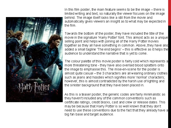
In this film poster, the main feature seems to be the image – there is limited writing and text, so naturally the viewer focuses on the image behind. The image itself looks like a still from the movie and automatically gives viewers an insight as to what may be expected in the film. Towards the bottom of the poster, they have included the title of the movie in the signature ‘Harry Potter’ font. This almost acts as a unique selling point and helps with joining all of the Harry Potter movies together as they all have something in common. Above, they have also added a small tagline ‘The end begins’ – this is effective as it helps the audience to understand the narrative that is yet to come. The colour palette of this movie poster is fairly cold which represents a more threatening tone - they have also overlaid blood splatters onto the image to emphasise this. The mise-en-scene for the poster is almost quite casual – the 3 characters are all wearing ordinary clothes such as jeans and hoodies which signifies more ‘normal’ characters; however, this is almost contradicted by the harsh use of lighting and the sinister background that they have been placed in. As this is a teaser poster, the generic codes are fairly minimalistic as they haven’t included any of the common conventions such as certificate ratings, credit blocks, cast and crew or release dates. This may be because that Harry Potter is so well known that they don’t need to use these conventions due to the fact that they already have a big fan base and target audience.

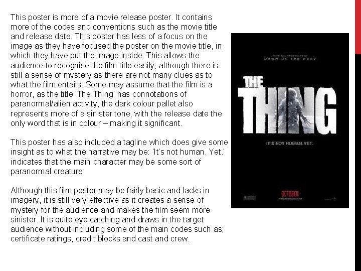
This poster is more of a movie release poster. It contains more of the codes and conventions such as the movie title and release date. This poster has less of a focus on the image as they have focused the poster on the movie title, in which they have put the image inside. This allows the audience to recognise the film title easily, although there is still a sense of mystery as there are not many clues as to what the film entails. Some may assume that the film is a horror, as the title ‘The Thing’ has connotations of paranormal/alien activity, the dark colour pallet also represents more of a sinister tone, with the release date the only word that is in colour – making it significant. This poster has also included a tagline which does give some insight as to what the narrative may be: ‘It’s not human. Yet. ’ indicates that the main character may be some sort of paranormal creature. Although this film poster may be fairly basic and lacks in imagery, it is still very effective as it creates a sense of mystery for the audience and makes the film seem more sinister. It is quite eye catching and draws in the target audience without including some of the main codes such as; certificate ratings, credit blocks and cast and crew.