More Weather Stats Use the same data from
- Slides: 33

More Weather Stats

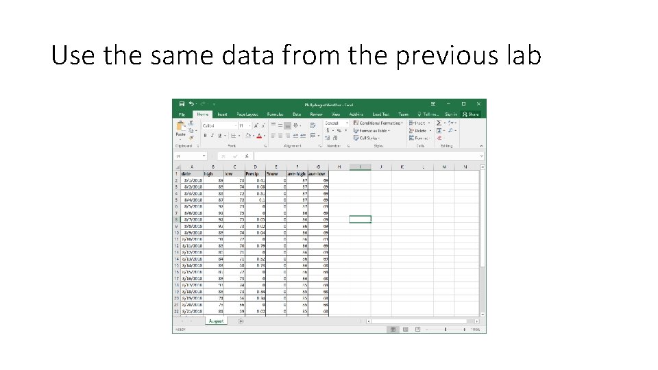
Use the same data from the previous lab

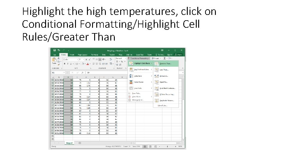
Highlight the high temperatures, click on Conditional Formatting/Highlight Cell Rules/Greater Than

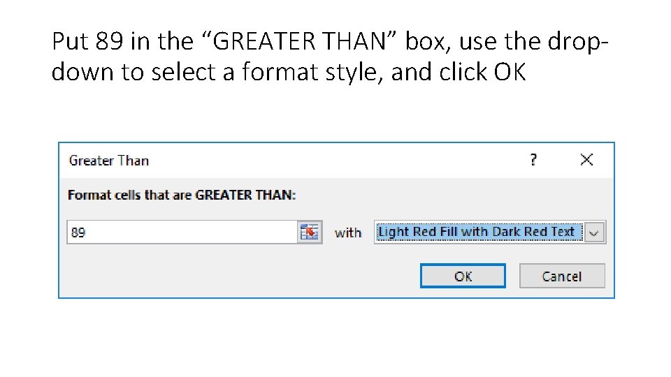
Put 89 in the “GREATER THAN” box, use the dropdown to select a format style, and click OK

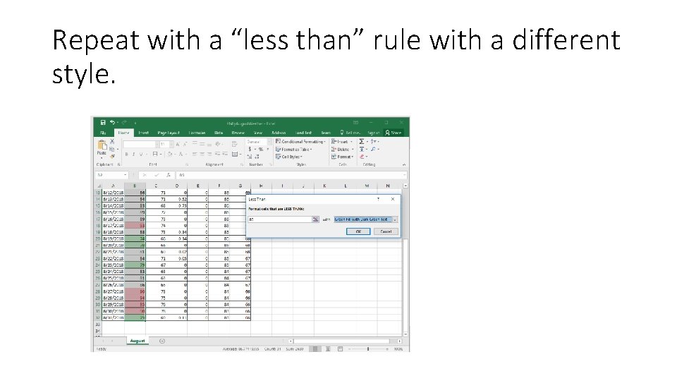
Repeat with a “less than” rule with a different style.

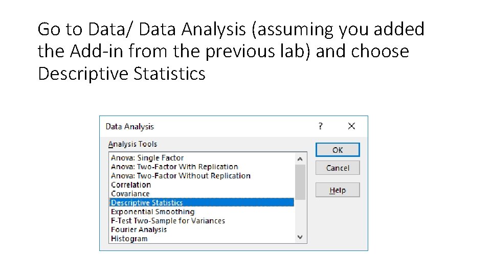
Go to Data/ Data Analysis (assuming you added the Add-in from the previous lab) and choose Descriptive Statistics

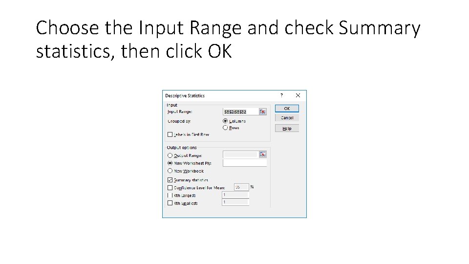
Choose the Input Range and check Summary statistics, then click OK

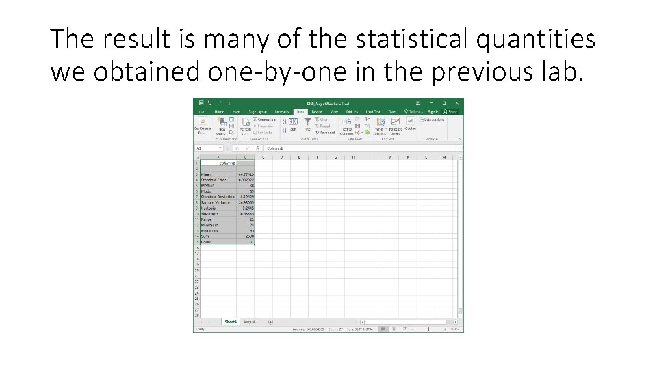
The result is many of the statistical quantities we obtained one-by-one in the previous lab.

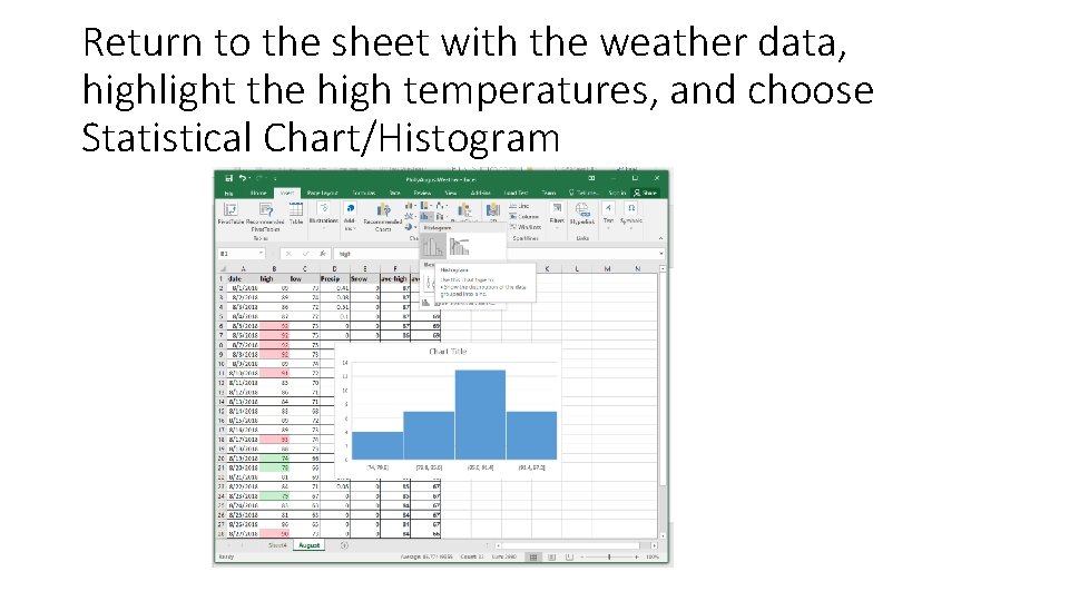
Return to the sheet with the weather data, highlight the high temperatures, and choose Statistical Chart/Histogram

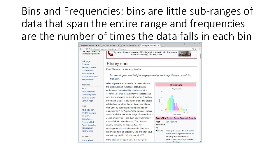
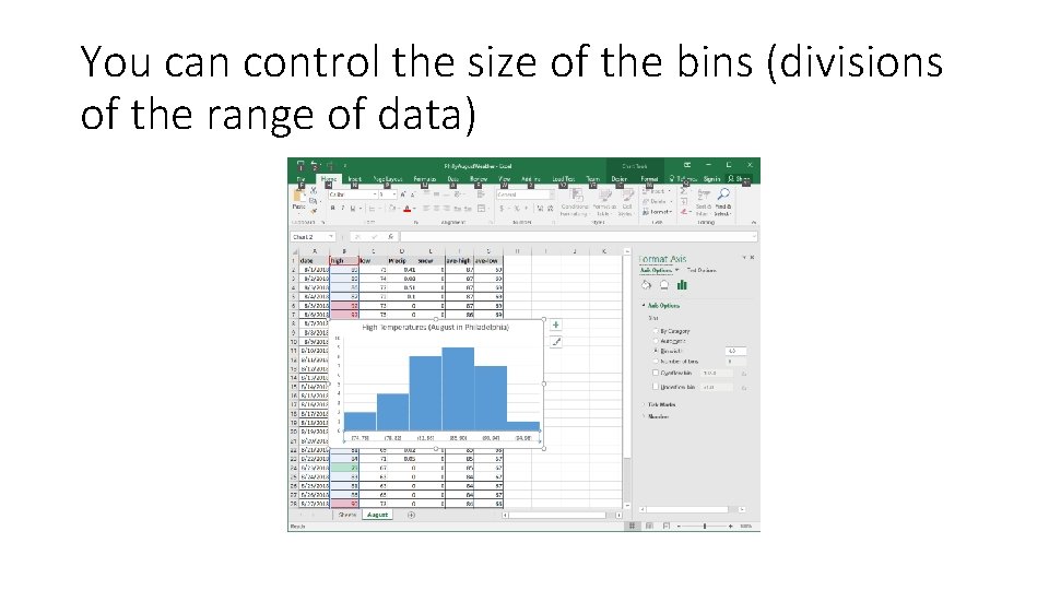
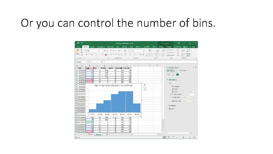
Bins and Frequencies: bins are little sub-ranges of data that span the entire range and frequencies are the number of times the data falls in each bin

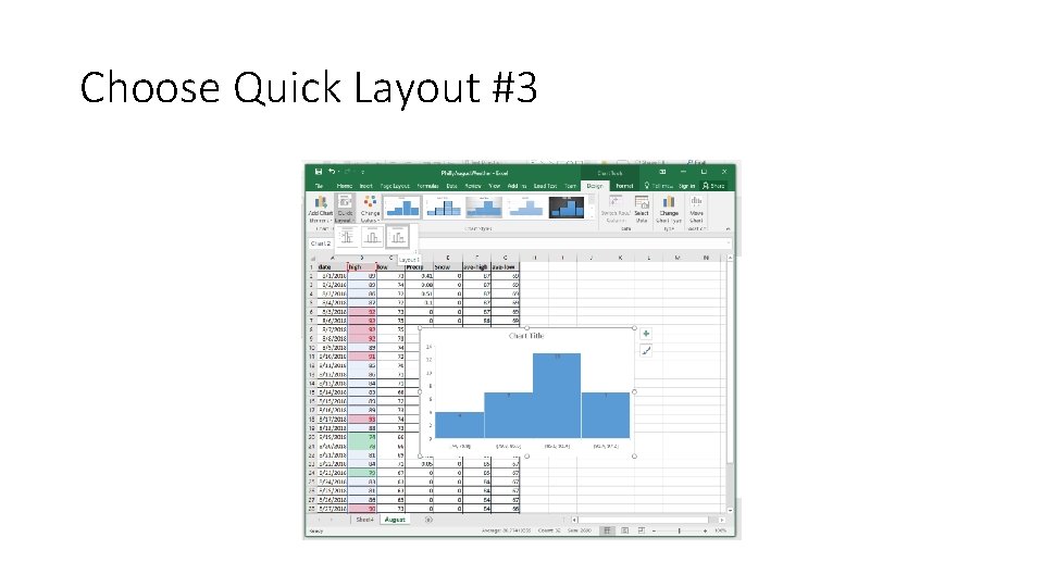
Choose Quick Layout #3

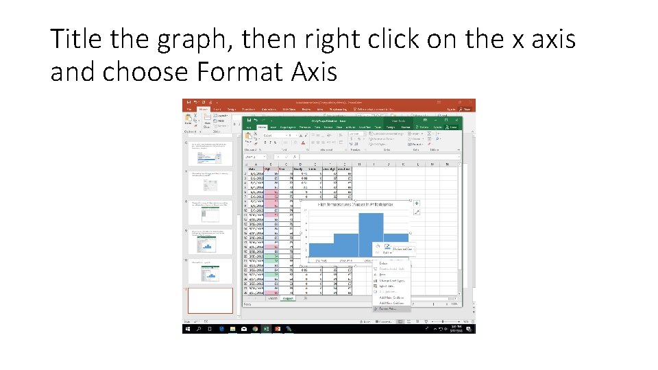
Title the graph, then right click on the x axis and choose Format Axis

You can control the size of the bins (divisions of the range of data)

Or you can control the number of bins.

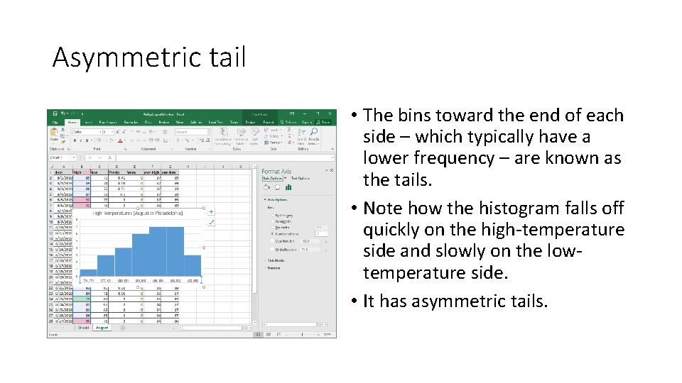
Asymmetric tail • The bins toward the end of each side – which typically have a lower frequency – are known as the tails. • Note how the histogram falls off quickly on the high-temperature side and slowly on the lowtemperature side. • It has asymmetric tails.

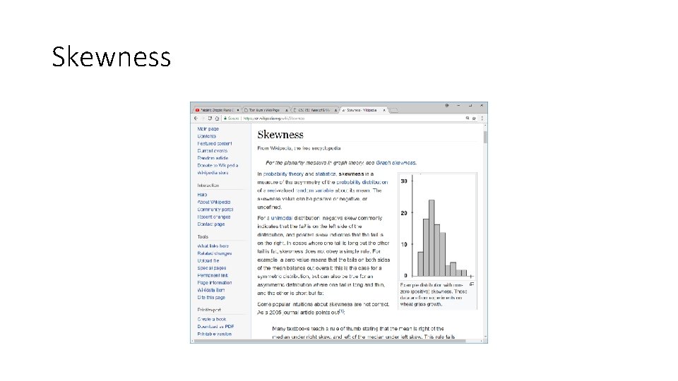
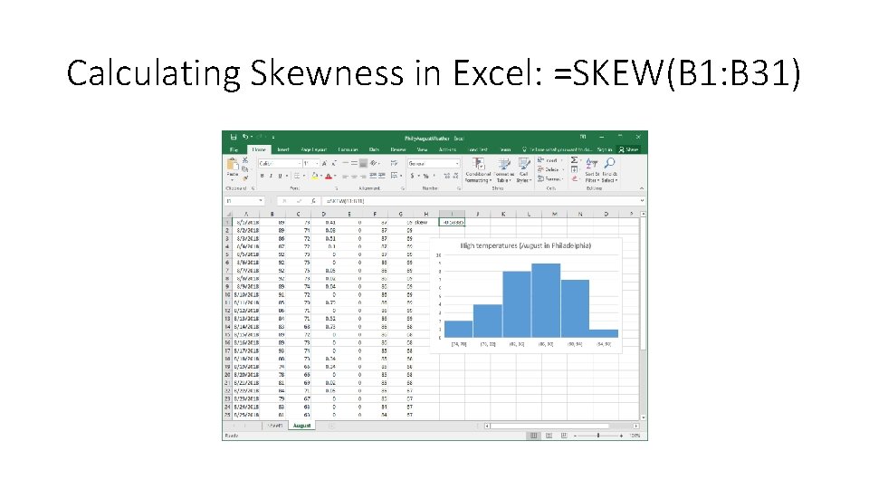
Skewness

Calculating Skewness in Excel: =SKEW(B 1: B 31)

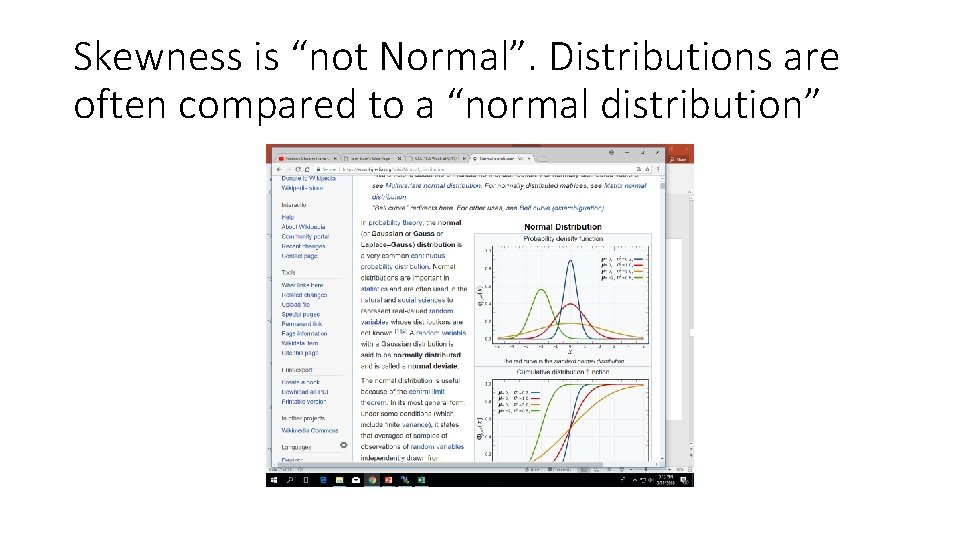
Skewness is “not Normal”. Distributions are often compared to a “normal distribution”

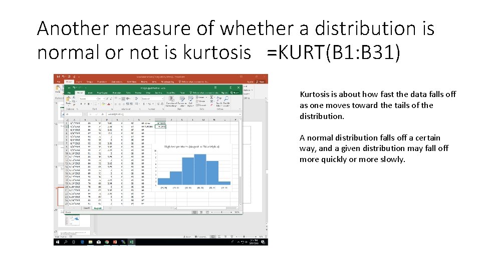
Another measure of whether a distribution is normal or not is kurtosis =KURT(B 1: B 31) Kurtosis is about how fast the data falls off as one moves toward the tails of the distribution. A normal distribution falls off a certain way, and a given distribution may fall off more quickly or more slowly.

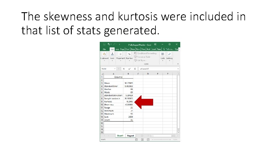
The skewness and kurtosis were included in that list of stats generated.

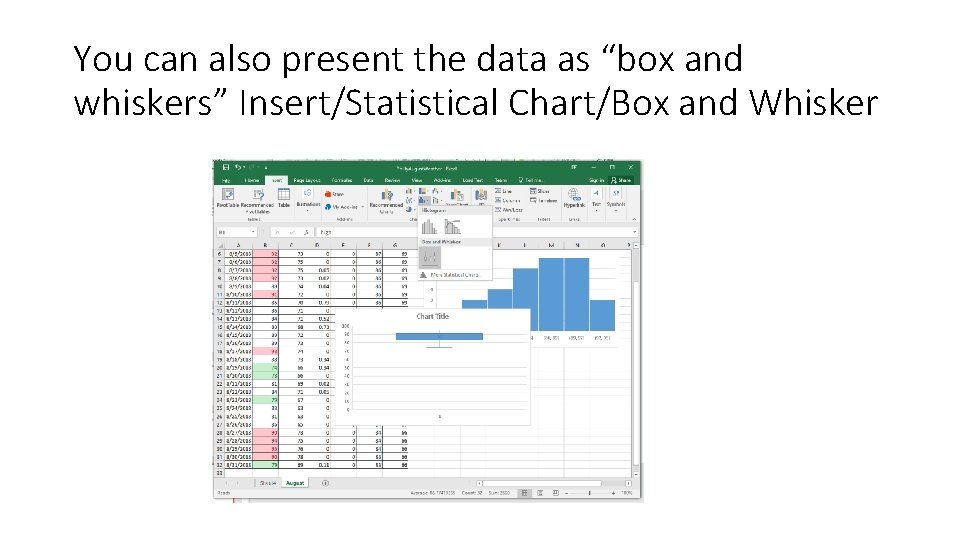
You can also present the data as “box and whiskers” Insert/Statistical Chart/Box and Whisker

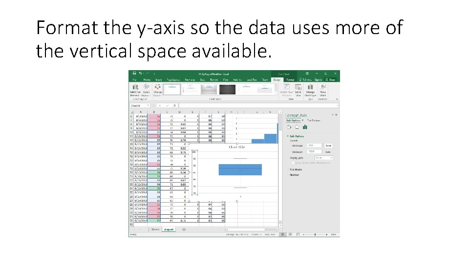
Format the y-axis so the data uses more of the vertical space available.

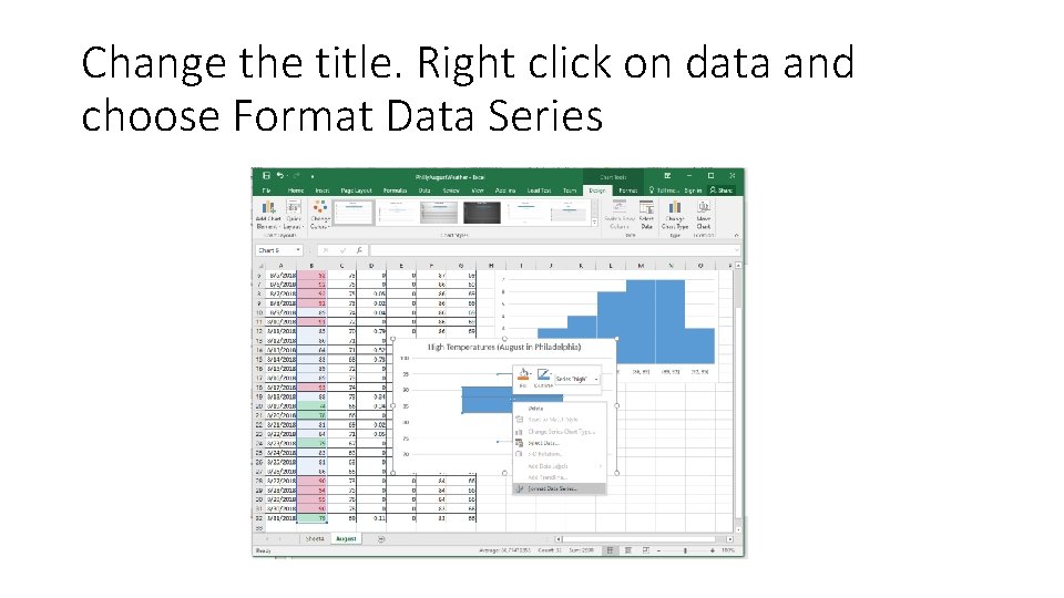
Change the title. Right click on data and choose Format Data Series

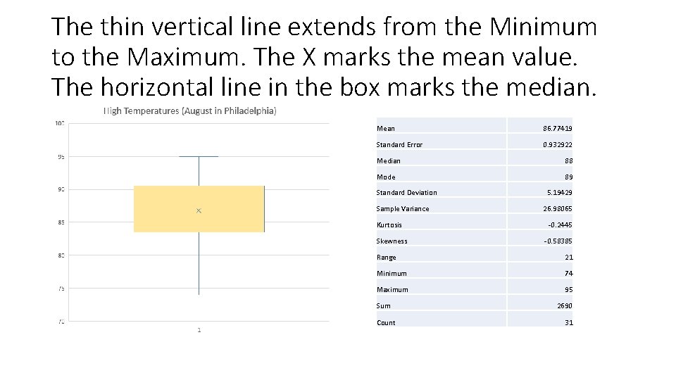
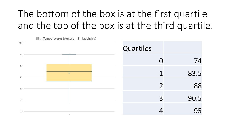
The thin vertical line extends from the Minimum to the Maximum. The X marks the mean value. The horizontal line in the box marks the median. Mean 86. 77419 Standard Error 0. 932922 Median 88 Mode 89 Standard Deviation Sample Variance Kurtosis Skewness 5. 19429 26. 98065 -0. 2445 -0. 58385 Range 21 Minimum 74 Maximum 95 Sum Count 2690 31

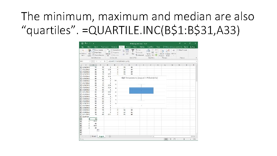
The minimum, maximum and median are also “quartiles”. =QUARTILE. INC(B$1: B$31, A 33)

The bottom of the box is at the first quartile and the top of the box is at the third quartile. Quartiles 0 74 1 83. 5 2 88 3 90. 5 4 95

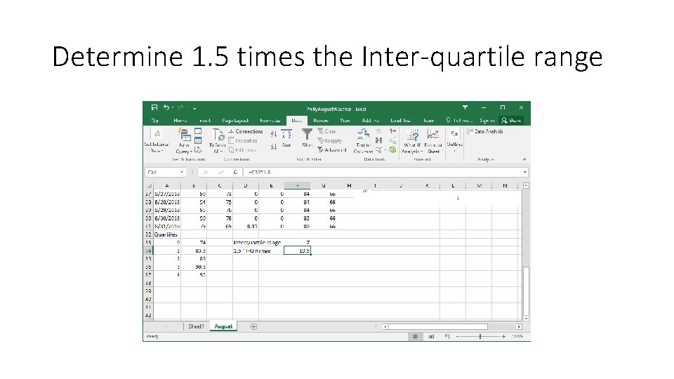
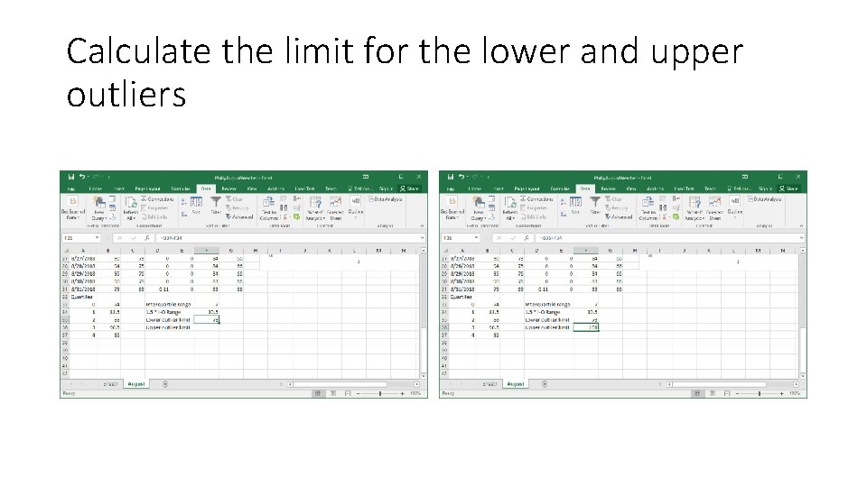
Common definition of “Outlier” • A convenient definition of a outlier is a point which falls more than 1. 5 times the interquartile range above third quartile or below the first quartile. • http: //mathworld. wolfram. com/Outlier. html • Interquartile range is the difference (subtraction) between the third and first quartiles.

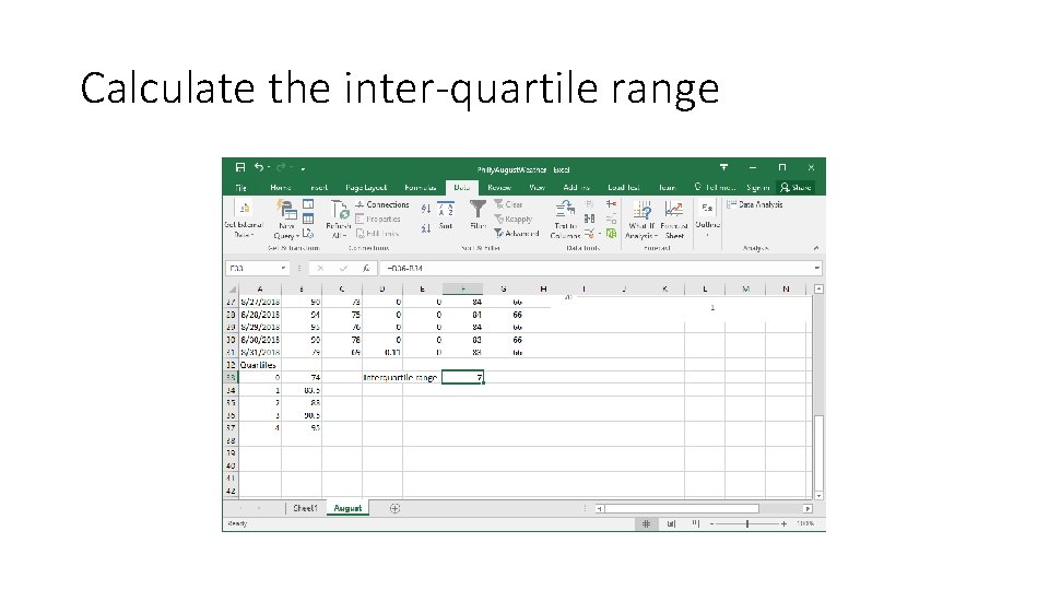
Calculate the inter-quartile range

Determine 1. 5 times the Inter-quartile range

Calculate the limit for the lower and upper outliers

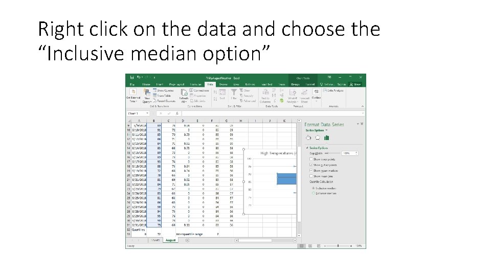
Right click on the data and choose the “Inclusive median option”

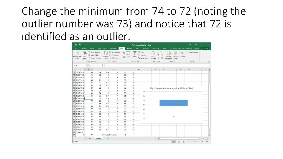
Change the minimum from 74 to 72 (noting the outlier number was 73) and notice that 72 is identified as an outlier.

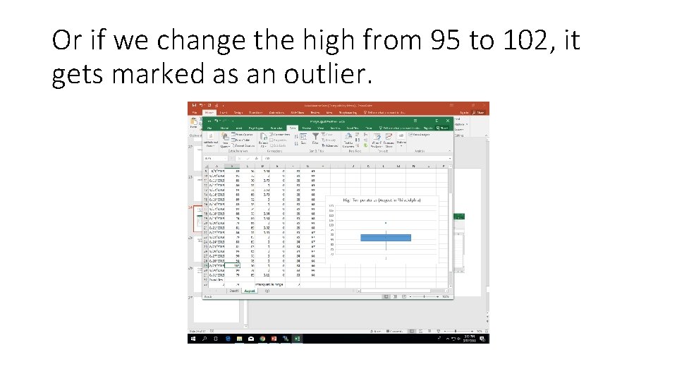
Or if we change the high from 95 to 102, it gets marked as an outlier.