Mood board for charity advert By Mia Jones

Mood board for charity advert By Mia Jones Unit 4 LO 1. 3, 2. 2
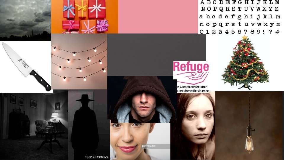

The Man This is what I want the man in my advert to look like. I wasn’t him to be faceless but to look menacing. I want him to be of a strong build and to look very intimidating to a small woman. I want him to be a black figure in the background but the audience will be able to clearly see that he is a man and that he is trying to hurt/has hurt the woman in the advert. However, I do not want him to be wearing a hat like in the image provided. I want him to be in normal clothes. I also want him to be holding a knife up like he is going to stab someone. I want the knife to look like the one provided, the knife will also be a shadow like the man but it will be clear to the audience what it is.

The Woman These images are what inspired my woman for the advert. I want there to be a close up shot of the woman but I want her off centre so you can see the background behind her like shown in the top image. I want her to be looking sad too I want it to look like she is scared and sad. I chose these images as examples because I thought the top image was similar to what I want my shot to be, and my bottom image because I think the woman looks scared but not comically scared.

The Background These images show I would like my background to look. I want my living room to be dark and dim lit. I want it to not look like it’s the nicest living room and I want it to look rather empty, with not too much furniture in the room. The Christmas tree, lights, and presents are the representation of Christmas in this advert seeing as I am creating a Christmas poster. I want the tree to be in the far back with a few presents in the room. I like how the tree looks in this image and the presents, I chose these images because they makes the audience think that there is no indications of abuse in the household and how easy it can be covered up. The tree will be decorated really well and there will be a few presents under the tree. There will be lights around the house, I liked these lights because they are not too colourful and I do not want my poster to be very colourful.

The Lighting I want this advert to be dimly lit. This will make the advert feel colder and darker and I want the audience to feel that. I chose the overcast image because that’s the effect I want the advert to have I want it to look like it was been washed over with grey paint and is in a dark room and I feel like overcast shows that perfectly. I chose this image because it shows some dim lighting. I like this because the lightbulb is not giving off too much light and that’s how I want my advert image to be. Lastly I chose this grey, similar to the overcast image, because I want my image to look like it has been washed over with grey. Not a too dark or light grey and I feel like this is the prefect shade.

The Text I chose the top image to show what kind of font I want. I chose this font because it is clear and easy to read, I also think it looks clean and very straight to the point. I think it looks like typewriter font and that’s what I really like about it. I couldn’t decide if I wanted pink or white text for my advert so I decided to put the colours I was indecisive on in my mood board. I like the pink because it also represents the Refuge colours and it will be a nice contrast from the dark image and it could appeal to women more. However, I really like the white and I feel like It will stand out well on the image seeing as its bright. Lastly I'm going to have the Refuge logo on the image. This is obvious because it’s the charity I am advertising and I want people to know about it. I chose this image because it is the logo and I'm going to put it on my advertisement.
- Slides: 7