Module 1 Visual Design Theory Dr ChengYuan Corey


- Slides: 29
Module 1: Visual Design Theory Dr. Cheng-Yuan “Corey” Lee CCU-Computer Assisted Language Learning
Assignment: After reading through this module, you should have a foundational understanding of visual design principles. Find a Power. Point file you previously created and redesign the first five slides to make them compliant with the CRAP principles. In your submission, describe the changes you made and attach both presentation files.
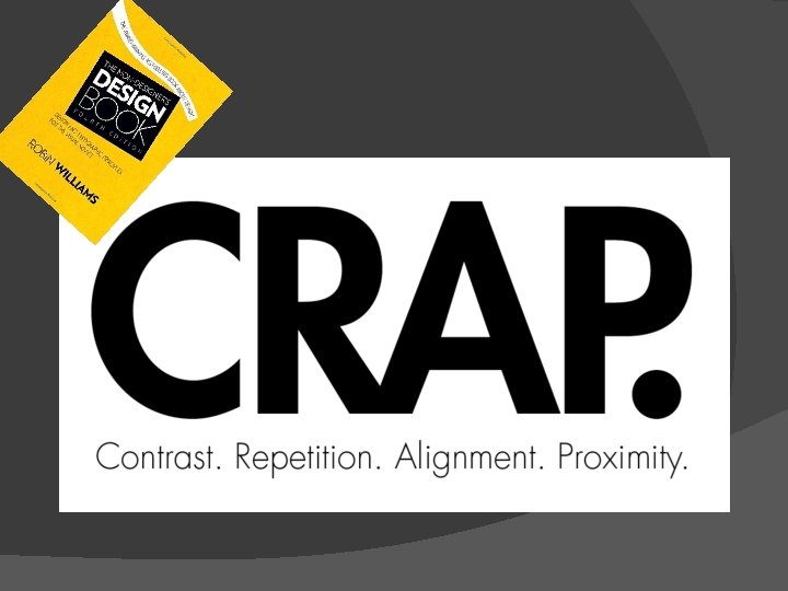
The Non. Designer's Design Book Robin Williams
Contrast
Contrast makes a page more interesting and readable Key idea: If two items are not exactly the same, make them different, really different. Shape, font face, size, weight, texture, line, spacing, color, etc.
Contrast Example
Contrast Example Less effective More effective
Repetition Key idea: REPEAT some aspect of the design throughout the entire piece. Repetition of visual elements throughout the design unifies and strengthens it by tying together otherwise separate parts.
Repetition Example LESS effective MORE effective
Alignment Key idea: Nothing should be placed on the page arbitrarily. Every item should have a visual connection with something else on the page. Strong alignment helps guide the user's eye, making the page easier to browse and drawing the eye to the most important parts of the page.
Alignment Example
Alignment Example
Proximity Key idea: Group related items together. Proximity helps the user identify which items go together Close proximity implies a relationship Use placement, size, and color to group items that go together Don’t be afraid of empty space! – Less is MORE
Proximity Example
BEFORE
AFTER
CRAP Makeover
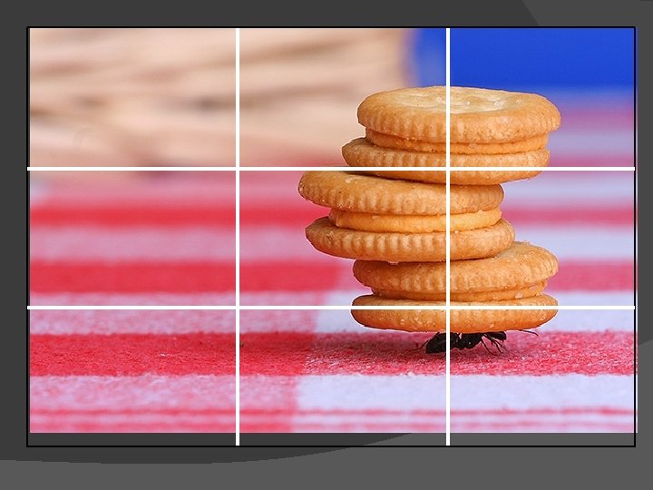
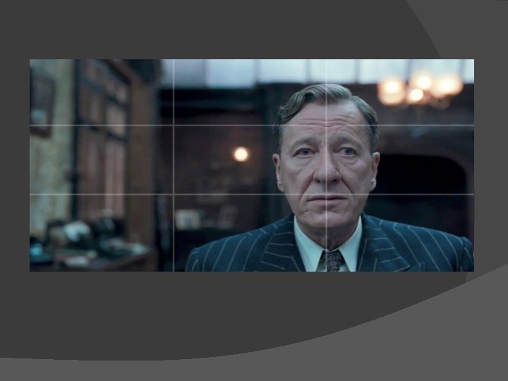
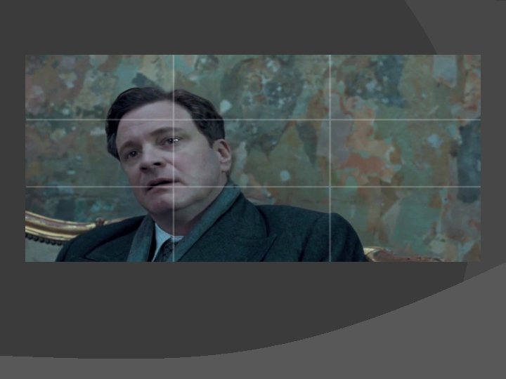
The Rule of Thirds is a principle of composition used for centuries by painters, photographers and other artists. When using the Rule of Thirds, the main subject is placed off center, away from the middle of the frame. As a result, photos often look more dynamic and interesting.
Video q http: //www. youtube. com/watch? v=ENHKj b 8 lt. AM
Assignment: After reading through this module, you should have a foundational understanding of visual design principles. Find a Power. Point file you previously created and redesign the first five slides to make them compliant with the CRAP principles. In your submission, describe the changes you made and attach both presentation files.