Modeling Periodic Data This table shows the average
Modeling Periodic Data
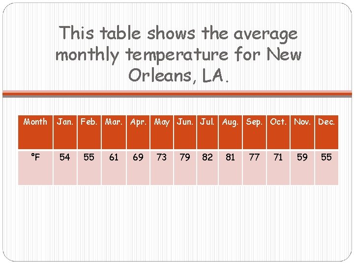
This table shows the average monthly temperature for New Orleans, LA. Month °F Jan. Feb. Mar. Apr. May Jun. Jul. Aug. Sep. Oct. Nov. Dec. 54 55 61 69 73 79 82 81 77 71 59 55
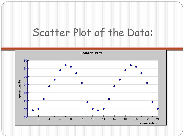
Scatter Plot of the Data:
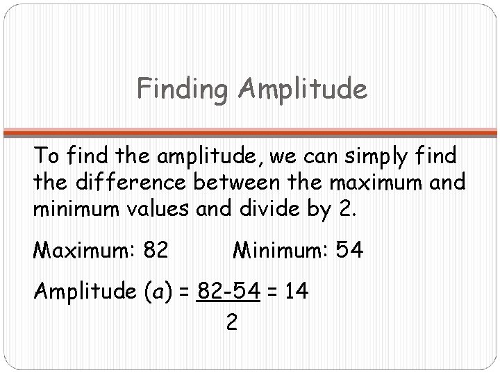
Finding Amplitude To find the amplitude, we can simply find the difference between the maximum and minimum values and divide by 2. Maximum: 82 Minimum: 54 Amplitude (a) = 82 -54 = 14 2
Finding Vertical Shift The average of the maximum and minimum temperatures turns out to be a good choice for d, the vertical shift. Vertical Shift (d) = 82+54 = 68 2 This tells us how far up we need to shift our graph from the x-axis.
Finding Period These average temperatures repeat every 12 months, so 12 months is the period of the graph. Period = Cross multiply to get
Finding Phase Shift Finding the phase shift is a little tricky. Remember that for the graph of y = sinx, the maximum is at π/2, which is ¼ of the period. If the period is 12, instead of 2π, the maximum would be at 3 (¼ of 12). The maximum average temperature in our data set occurs in July, which corresponds to x = 7. How much of a horizontal shift would shift the maximum point of our graph from x = 3 to x = 7? 4 units to the right, so c ≈ -4.

Finding the Equation Now we have all the pieces we need to create an equation of the form y = a sin b(x-c) + d When we plug in all the variables, we get:
Finding a Better Approximation If you plot the equation from the previous slide on the same graph with your scatter plot, you will see that it is a little off. Why do you think this is? Remember that when we estimated the phase shift, we used July (x = 7) as the maximum temperature. If you look at the table, you will see that the temperatures in the months following July are higher than the temperatures in the months preceding July. This means that we need to increase our value of c just slightly to reflect this data.
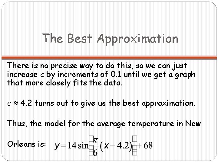
The Best Approximation There is no precise way to do this, so we can just increase c by increments of 0. 1 until we get a graph that more closely fits the data. c ≈ 4. 2 turns out to give us the best approximation. Thus, the model for the average temperature in New Orleans is:
- Slides: 10