Mixed Cost Analysis Fixed And Variable Costs Cost

Mixed Cost Analysis

Fixed And Variable Costs Cost Behavior – Mixed Costs y Cost y=a a Activity level x Fixed cost y = a + bx since b = 0 y=a y y x b = Activity level a = y Cost y x b + a x Variable cost y = a + bx since a = 0 y = bx Activity level x Mixed cost y = a + bx 3

Methods of Analysis p Visual fit of a scatter diagram p High-low method p Linear regression analysis 4
")
Scatter Graph Method Plot the data points on a graph (total cost vs. activity) Total Cost in 1, 000’s of Dollars Y 20 10 0 * * ** X 0 1 2 3 4 Activity, 1, 000’s of Units Produced

Quick-and-Dirty Method Draw a line through the data points with about an equal numbers of points above and below the line. Total Cost in 1, 000’s of Dollars Y 20 10 * ** * * Intercept is the estimated fixed cost = $10, 000 0 X 0 1 2 3 4 Activity, 1, 000’s of Units Produced

Advantages p One of the principal advantages of this method is that it lets us “see” the data. p What data? are the advantages of “seeing” the

Nonlinear Relationship Activity Cost * * * 0 Activity Output

Upward Shift in Cost Relationship Activity Cost * * * 0 * * * Activity Output

Presence of Outliers Activity Cost * * * 0 * Activity Output

Scatter Graph Example The sales manager for Hinds Wholesale Supply Company needs to estimate the expected delivery vehicle operating cost (maintenance) for 2005.

Scatter Graph Example Truck Number 202 204 205 301 422 460 520 Miles Packages Maintenance Driven Delivered Cost 15, 000 1, 200 $2, 000 11, 000 $1, 600 24, 000 1, 500 $2, 200 30, 000 1, 500 $2, 400 31, 000 500 $2, 600 26, 000 1, 000 $2, 200 20, 000 2, 000 $2, 000

Scatter Graph Example Estimated Line
")
Scatter Graph Example Y = a + bx $15, 000= ($1, 100 x 7) + bx Total Miles Driven (x) = 157, 000 b = $7, 300 / 157, 000 = $0. 0465 or 4. 7 cents per mile
 = $1, 100 (a) + $0. 047")
Scatter Graph Example Vehicle maintenance cost (y) = $1, 100 (a) + $0. 047 (b) per mile driven (x) What is the estimated maintenance cost for a truck that will be driven 28, 000 miles? $1, 100 + ($0. 047 × 28, 000) = $2, 416

High Low Method p The high-low method involves taking the two observations with the highest and lowest level of activity to calculate the cost function 16

High-low method ~ step 1 Cost Identify the highest and lowest activity levels. Volume of Activity 17

High-low Method ~ step 2 Cost Determine the differences between the high and low points coordinates. Volume of Activity 18

High-low method ~ step 3 Cost Variable cost per unit = slope of the line between the two points (which reflect total mixed costs). Rise Run = Variable Cost per Unit Volume of Activity 19

High-low method ~ step 4 Cost To find fixed costs, use slope and coordinates of one point in y = bx + a Rise Variable Cost = in units per Unit in cost Run Volume of Activity 20

High-low method ~ step 5 Select one of the two point p Substitute into y = bx + a, where p n n n p y = y coordinate of point x = x coordinate of point b = step 4 calculations Find a, ie total fixed costs 21

High-Low Method Example Truck Number 202 204 205 301 422 460 520 Miles Packages Maintenance Driven Delivered Cost 15, 000 1, 200 $2, 000 11, 000 $1, 600 24, 000 1, 500 $2, 200 30, 000 1, 500 $2, 400 31, 000 500 $2, 600 26, 000 1, 000 $2, 200 20, 000 2, 000 $2, 000
 $1, 000 = = $0. 05")
High-Low Method Example ($2, 600 – $1, 600) $1, 000 = = $0. 05 (31, 000 – 11, 000) 20, 000 What is the fixed cost element?
")
High-Low Method Example $2, 600 = Fixed cost + (31, 000 × $0. 05) Fixed cost = $2, 600 – $1, 550 = $1, 050 is the fixed cost element.
")
High-Low Method Example $1, 600 = Fixed cost + (11, 000 × $0. 05) Fixed cost = $1, 600 – $550 = $1, 050 What is the estimated maintenance cost for a truck to be driven 28, 000 miles? $1, 050 + (28, 000 × $0. 05) = $2, 450

Some Important Considerations p We have used historical cost to arrive at the cost equation. p Therefore, we have to be careful in how we use the formula. p Never forget the relevant range.
")
$ Relevant Range Volume (Activity Base)

Strengths of High-Low Method p Simple p Easy to use to understand

Weaknesses of High-Low p Only two data points are used in the analysis. p Can be problematic if either (or both) high or low are extreme (i. e. , Outliers). p Other months may not yield the same formula.

Extreme values not necessarily representative . . . . Representative High/Low Values

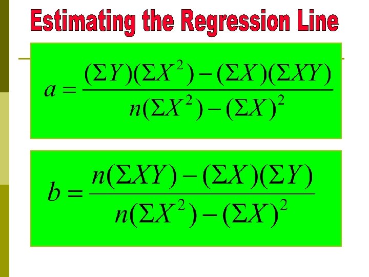
Regression Analysis p. A statistical technique used to separate mixed costs into fixed and variable components. p All observations are used to fit a regression line which represents the average of all data points.

Regression Analysis p Requires the simultaneous solution of two linear equations p So that the squared deviations from the regression line of each of the plotted points cancel out (are equal to zero).
 VC Per Unit")
Simple Regression with one Independent Variable Total Costs Fixed Cost (Intercept) VC Per Unit (Slope) Level of Activity
 VC Per Unit")
Simple Regression with one Independent Variable Dependent Variable Fixed Cost (Intercept) VC Per Unit (Slope) Independent Variable

Regression Analysis p With data. p Two this equation and given a set of simultaneous linear equations can be developed that will fit a regression line to the data.

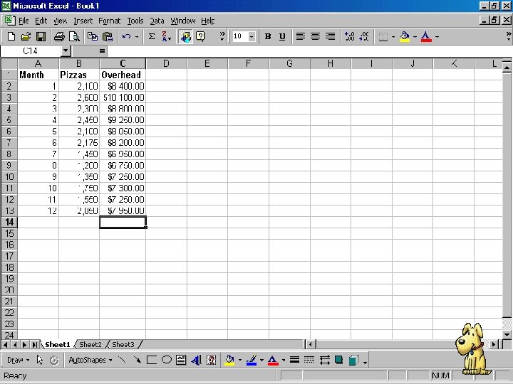
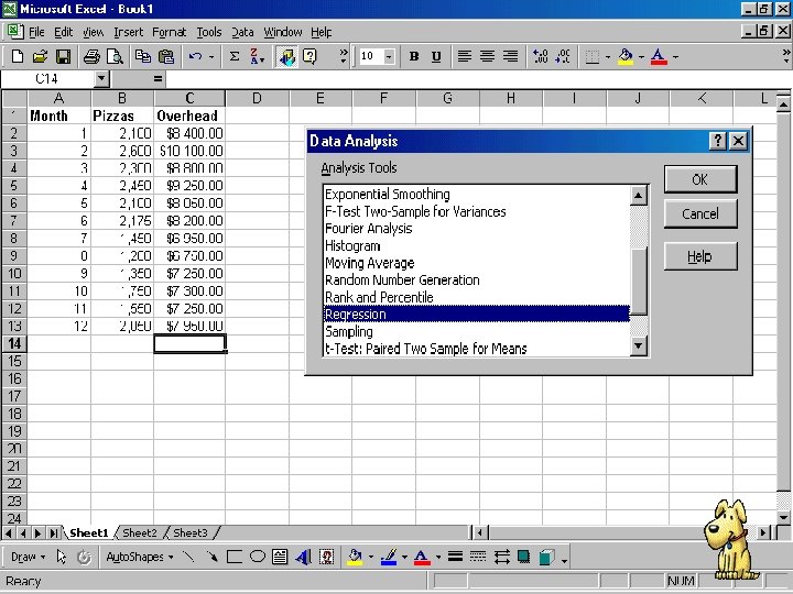
Excel and Regression Analysis An Illustration of Regression Analysis Using Microsoft Excel

Dependent variable Independent variable

Prediction equation Variable Cost per Unit y = $3, 998. 25 + 2. 09 x Fixed Cost Number of Units

Slope of regression line $3, 998. 25 Fixed Cost
 is a measure")
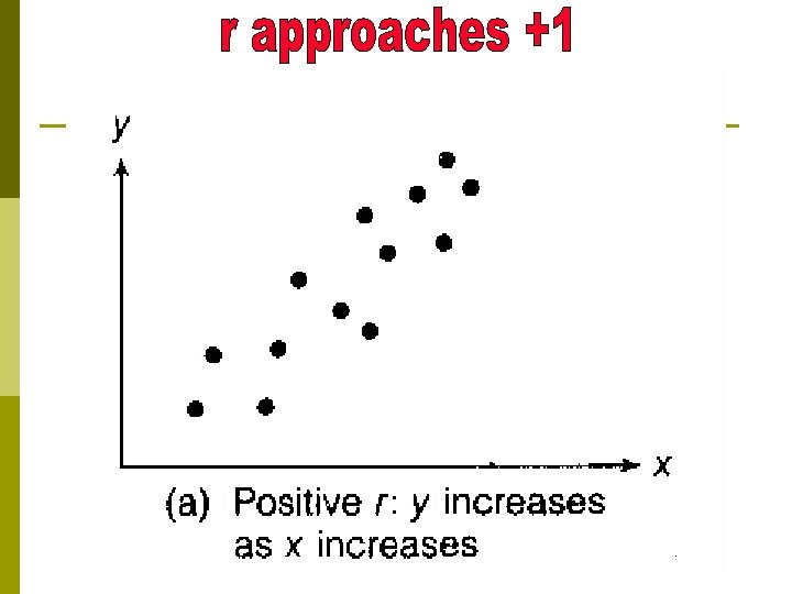
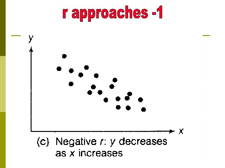
Coefficient of Correlation The multiple R (called the coefficient of correlation) is a measure of the proximity of the data points to the regression line. Can range from 0 (no relationship) to 1 or -1 (Perfect Relationship). Positive correlation means the variables move together. Negative correlation means they move in opposite directions. In this case, there is a positive correlation between the number of pizzas produced (independent variable) and the total overhead costs (dependent variable).

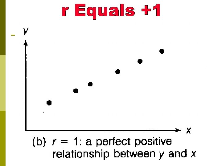
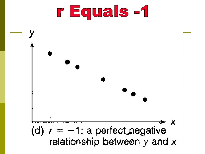
A coefficient of correlation of 1 would indicate that all data observations fall on the regression line.
 called the Coefficient of Determination is")
Coefficient of Determination The R Square (R 2) called the Coefficient of Determination is a measure of goodness of fit (how well the regression line “fits” the data). R 2 can be interpreted as the proportion of variation in the dependent variable (overhead costs) that is explained by changes in the independent variable (the number of pizzas). The R 2 may range from 0 to 1. An R 2 of less than one indicates that other independent variable might have an impact on the dependent variable.

Machine Hours Utility Costs

Hours of Safety Training Industrial Accidents

Hair Length 202 Grade
- Slides: 52