Misleading Maps Statistics How we mislead with maps


- Slides: 34
Misleading Maps & Statistics How we mislead with maps and statistics that have far reaching consequence for our customers.
Introduction • Maps by their very nature mislead even without intent. – Scales and projections. – Symbols and Legends – Geocodes • Data also can mislead through use of descriptive statistics. – Mean, Median and Mode and when we use them. – Lack of understanding between N and n. – Data collection.
WHERE MAPS DECEIVE I TOLD you to stop for directions! The map says the road should be here!!!
Problem with Maps: Projections • Projections are designed for a specific purpose. – Problem of having a 3 D surface on a 2 D model; everything is a compromise! – Each different projection is designed to minimize distortion in one or two areas, but not all areas: • • Area. Distance. Direction. Scale – No one map projection minimizes ALL distortions. • The Winkel-Tripel does a good job for small scale maps. • Large scale maps it depends on what is needed – Area or Distance.
How Different Projections Distort Shape But the distortion in the outlying states is more severe Not so good for Publix of Haggens Notice Kansas is fairly consistent between all projections. Good For Snucks!
Mercator Projection of the World Note Exaggerated Size of Russia and Greenland Note: undersize of South America and India
Peters Equal Area Projection Note: More Accurate size of South America, Africa, and Inda
Problem with Maps: Scale • The larger the scale the less pronounced the distortion. – Smaller Scale maps are usually over 1: 1, 000 • Show more of larger areas such as States, Countries and Continents. They show less details – Larger Scales maps are usually under 1: 24, 000 • Show local areas such as counties, cities and neighborhoods. These maps show more details • Errors are minimized to the middle of the map and enhanced towards the edges.
Small Scale Map • Usually show large land or water masses. • Detail is minimized. • Usually the central meridian is well defined on the map.
Large Scale Map • Note this map shows New York with the center of the map around 34 th Street and 6 th Ave. • Distances from the center to the extremes will be accurate (i. e. 34 th and 6 th to Central Park or East River Park. • Distances from extremes will have the most error (say East River Park to Battery Park).
Problem with Maps: Legends • Legends really tell us what the map is about. – What do the symbols mean. • In a dot density what does one dot represent? • What are the major highways? • What is symbol for churches and schools in the area? • One could argue that the symbols MAKE the map, and the legend is the key for the map.
Problem with Maps: Symbols • Symbols show RELATIVE importance, not actual importance (such as roadways). • Some Symbols can show actual importance (i. e. a graduated circle). • Some symbols show affiliation to a group not relative size of building or other characteristics.
Problem with Maps: Thematic • A thematic map is designed to emphasize a particular theme about a geographic area. • In contrast to a general map, on which a variety of phenomena appear together. • General reference maps show where something is in space, thematic maps tell a story about that place observed from spatial patterns. • Thematic maps serve three primary purposes: – To provide specific information about particular locations. – To provide general information about spatial patterns. – To compare patterns on two or more maps.
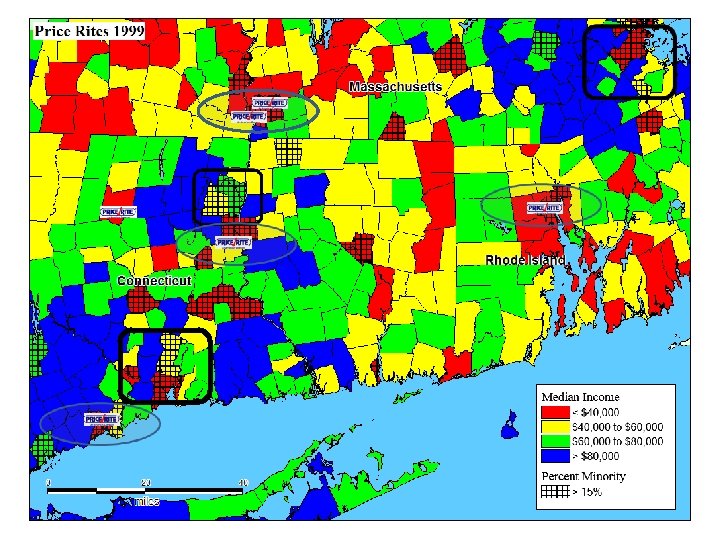
Price Rites States
New Price Rite’s
How this map is “misleading” • Doesn’t show population density. • Doesn’t show competition. • Doesn’t account for other formats within the same company. • Impacts on other formats • Cannibalization on sister stores • Doesn’t replace actual location research. • Won’t estimate sales
Problem with Maps: Geocoding • GIS systems have made the process of assigning a geographic coordinate to a street address a relatively simple action. – Geographic Interpolation included the percent along the street segment's address range. – Point Level geocoding is assigning the coordinate to the parcel centroid – Of the two methods Point Level is more accurate.
Problem with Maps: Geocoding • Where does Interpolative process fail? • Interpolation needs an accurate dataset with the correct address information. • How many times have you ended up at the wrong location because the address was incorrect or not in the database? • Or the address was on a curved street? • Or there were multiple streets with the same name? • The geocoding process used for U. S. Census TIGER datasets, 5 -7. 5% of the addresses may be allocated to a different census tract.
Problem with Maps: Geocoding • Point level geocoding is more accurate, but needs a household level dataset. • Was used extensively for 911, Insurance Underwriting and Utilities. • Since 2010 the overwhelming majority of the country was covered over 90% of the population and 79% of the area. • Still it is a struggle to keep up with fast growing areas for the vendors if they do not get assistance from the local government offices. • Geocoding is getting better but as with everything else it still is not 100%.
Lies, Damn Lies, and Statistics THE PROBLEM OF DISTILLING DATA INTO MEASURES OF CENTRAL TENDENCY
Descriptive Statistics and the Measure of Central Tendency • Mean, Median and Mode are all measures of central tendency but when they are misused they do more harm than good. – Mean is the arithmetic or geometric average of the data. – Median is the middle point of the data (50% higher and 50% lower) – Mode is the most common value. – In a perfect normal distribution the Mean and the Median will be the same value – Standard Deviation measure the variation of the data from the Mean.
Descriptive Statistics and the Measure of Central Tendency • Misuse of Mean, Median and Mode happens all the time! – Lets look at this example: • Our data has Incomes with Mean being $100, 000 and the Median being $70, 000 and the Mode being $35, 000? – Mean looks good but two households in the area making $2, 000 per year and the rest could be making are averaging $60, 000 – Median Income looks better because with $70, 000 we know 50% of the households are higher, and 50% are lower than the median. – Mode is misleading because there could be 100 households in the sample and the income with the highest responses could have only 5 households making the low $35, 000 but it would still be the most frequent! • Knowing what statistic to use and for what type of data is critical when telling your story.
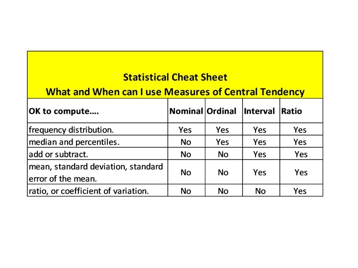
When to Use What and Where • What statistic to use really depends upon the Data scale used. • There are 4 basic Scales with regard to social research: – Nominal – Ordinal – Interval – Ratio. • Each scale has its own particular means of conveying data to the researcher or the reader of a report.
Nominal Scales • Nominal Scale – Usually a data type that identifies or classifies data and are mutually exclusive examples – It can be dichotomous scale or multi variable responses are allowed: » » » Yes or No, Male or Female, Red or Blue State Republican, Democrat, Libertarian, or GDI Hair Color – Brown, Black, Blonde, Gray, Sexy Silver – Usually measures of central tendency will not give reliable results, best data statistic to use here are frequency distributions which work well in this situation.
Ordinal Scales • Ordinal Scales - Usually a data type that identifies a non quantitative concepts like happiness or satisfaction surveys are good examples. – Likert Scales are good example of ordinal scales. – Usually a ranking of 5 or more variables that are ordered from 1 to n. – Thing to remember about these scales is they show order not how much better it is (i. e. 3 may be better than 4 but not 25% better). – We use these all the time! – What is a rating of Merchandise? – What is the operational rating for the store? – Best descriptive statistic and measure of central tendency is Median and Mode but never Mean!
Interval Scales • Interval Scales – These scales are quantitative in nature and not only do we know the order but the exact differences between the values BUT cannot calculate ratio’s because there is no true zero. – Temperature is a good example with each interval being consistent, known and measurable. • Example, in Miami winter temps have been recorded at 70 to 80 in degrees the same day temps in New York range between 0 -10; both have a difference of 10 degrees, but I would rather be in Miami. • But there is not a true zero (there maybe zero degrees but not a true zero) – Interval Data is the first of the four scales that we can start using most of the measures of central tendency: Mean, Median, Mode, and Standard Deviation.
Ratio Scales • Ratio Scales- This is a quantitative measurement WITH order, exact value between units of measure, and absolute zero value. Examples of Ratio Scales: • Height and Weight are the most common examples. Both have an absolute zero value. • Sales Volumes and Store Sizes • Money!!!! – This is the ultimate in the statistical realm with all sorts of descriptive and inferential analysis can be applied. Mean, Median and Mode along with measures of dispersion can be used (Standard Deviation and Coefficient of Variation).
Working with Data • There is always a compromise when determining the sample size of a customer origin survey or a market survey. – This is the case when we use frequent shopper databases to determine customer origin. – Do we use 100% of our database (capturing an estimated at 80% of customer spending at our stores). – Or use a stratified sample of the database (1000 records per store? ) – How do we select them? What is truly random – What about the non-geocoded records? – Do we have enough confidence to run a correlation to the customer origin survey?
Universe vs Sample • N is the letter symbol used for the universe population. • n is the letter symbol for number in the sample (i. e. number of records) ALWAYS a subset of N. • This is important to set n at the right number of records to get an adequate representation of N. • And when making inferences on data it is also important to know the size of the sample. • “Nine out of Ten Dentist Prefer Crest”. – What is wrong with this statement? – Were there only 10 dentist (or if they are from Chicago one could be dead – he is still a registered voter!)? – And what were their other choices – tree bark?
Random Sample vs Stratified Sample Random Sample n=500 Top 500 Customers
Higher Number Brings Stratified Closer to Random Sample n=5, 000 Top 5, 000 Customers
Summary • All cartography seeks to portray the three dimensional world on a flat sheet of paper. • Although immensely valuable, maps lie. In fact, they must. • Statistics of any kind can be manipulated. • Despite its mathematical base, statistics is as much an art as it is a science. • Knowledge of these factors is necessary when utilizing more complex models such as Sites. Plus.