Ministry of Higher Education and Scientific Research AlMustansiriyah

- Slides: 4

Ministry of Higher Education and Scientific Research Al-Mustansiriyah University Faculty of Engineering Computer Engineering Department ﻭﺯﺍﺭةﺎﻟﺘﻌﻠﻴﻢ ﺍﻟﻌﺎﻟﻲ ﻭﺍﻟﺒﺤﺚ ﺍﻟﻌﻠﻤﻲ ﺍﻟﺠﺎﻣﻌﺔ ﺍﻟﻤﺴﺘﻨﺼﺮﻳﺔ ﻛﻠﻴﺔ ﺍﻟﻬﻨﺪﺳﺔ ﻗﺴﻢ ﻫﻨﺪﺳﺔ ﺍﻟﺤﺎﺳﻮﺏ Computer Skills Lab. Prepared By Dr. Hesham Adnan & Assistant Lecturer Hazim alkargole 2017 20189

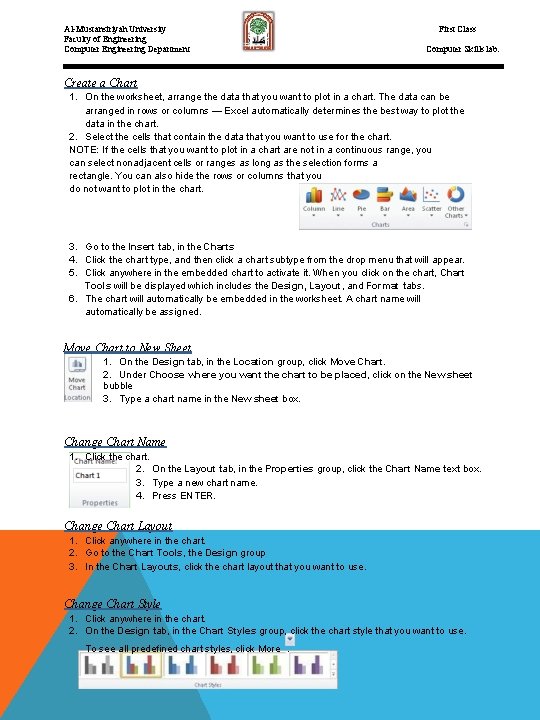
First Class Al-Mustansiriyah University Faculty of Engineering Computer Engineering Department Computer Skills lab. Create a Chart 1. On the worksheet, arrange the data that you want to plot in a chart. The data can be arranged in rows or columns — Excel automatically determines the best way to plot the data in the chart. 2. Select the cells that contain the data that you want to use for the chart. NOTE: If the cells that you want to plot in a chart are not in a continuous range, you can select nonadjacent cells or ranges as long as the selection forms a rectangle. You can also hide the rows or columns that you do not want to plot in the chart. 3. Go to the Insert tab, in the Charts 4. Click the chart type, and then click a chart subtype from the drop menu that will appear. 5. Click anywhere in the embedded chart to activate it. When you click on the chart, Chart Tools will be displayed which includes the Design, Layout, and Format tabs. 6. The chart will automatically be embedded in the worksheet. A chart name will automatically be assigned. Move Chart to New Sheet 1. On the Design tab, in the Location group, click Move Chart. 2. Under Choose where you want the chart to be placed, click on the New sheet bubble 3. Type a chart name in the New sheet box. Change Chart Name 1. Click the chart. 2. On the Layout tab, in the Properties group, click the Chart Name text box. 3. Type a new chart name. 4. Press ENTER. Change Chart Layout 1. Click anywhere in the chart. 2. Go to the Chart Tools, the Design group 3. In the Chart Layouts, click the chart layout that you want to use. Change Chart Style 1. Click anywhere in the chart. 2. On the Design tab, in the Chart Styles group, click the chart style that you want to use. To see all predefined chart styles, click More. 44

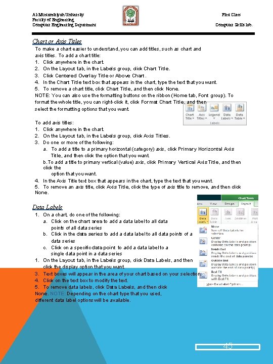
Al-Mustansiriyah University Faculty of Engineering Computer Engineering Department First Class Computer Skills lab. Chart or Axis Titles To make a chart easier to understand, you can add titles, such as chart and axis titles. To add a chart title: 1. Click anywhere in the chart. 2. On the Layout tab, in the Labels group, click Chart Title. 3. Click Centered Overlay Title or Above Chart. 4. In the Chart Title text box that appears in the chart, type the text that you want. 5. To remove a chart title, click Chart Title, and then click None. NOTE: You can also use the formatting buttons on the ribbon (Home tab, Font group). To format the whole title, you can right-click it, click Format Chart Title, and then select the formatting options that you want. To add axis titles: 1. Click anywhere in the chart. 2. On the Layout tab, in the Labels group, click Axis Titles. 3. Do one or more of the following: a. To add a title to a primary horizontal (category) axis, click Primary Horizontal Axis Title, and then click the option that you want. b. To add a title to primary vertical (value) axis, click Primary Vertical Axis Title, and then click the option that you want. 4. In the Axis Title text box that appears in the chart, type the text that you want. 5. To remove an axis title, click Axis Title, click the type of axis title to remove, and then click None. Data Labels 1. On a chart, do one of the following: a. Click on the chart area to add a data label to all data points of all data series b. Click in the data series to add a data label to all data points of a data series c. Click on a specific data point to add a data label to a single data point in a data series 1. On the Layout tab, in the Labels group, click Data Labels, and then click the display option that you want. 3. Text boxes will appear in the area of your chart based on your selection. 4. Click on the text box to modify the text. 5. To remove data labels, click Data Labels, and then click None. NOTE: Depending on the chart type that you used, different data label options will be available. 45

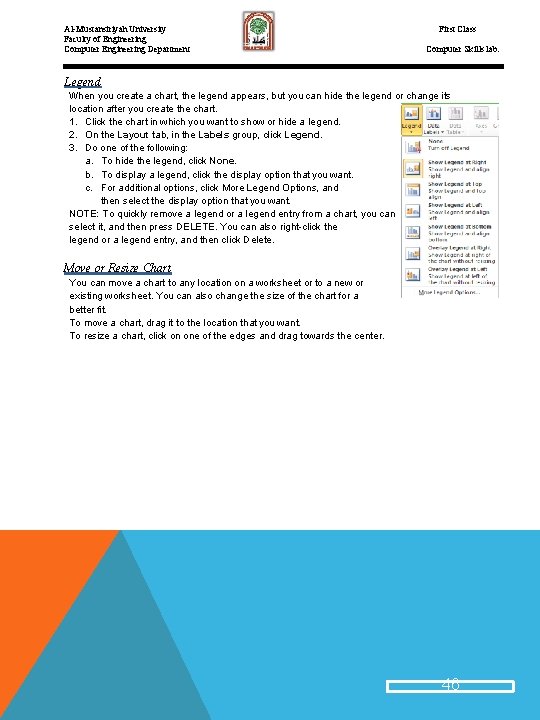
Al-Mustansiriyah University Faculty of Engineering Computer Engineering Department First Class Computer Skills lab. Legend When you create a chart, the legend appears, but you can hide the legend or change its location after you create the chart. 1. Click the chart in which you want to show or hide a legend. 2. On the Layout tab, in the Labels group, click Legend. 3. Do one of the following: a. To hide the legend, click None. b. To display a legend, click the display option that you want. c. For additional options, click More Legend Options, and then select the display option that you want. NOTE: To quickly remove a legend or a legend entry from a chart, you can select it, and then press DELETE. You can also right-click the legend or a legend entry, and then click Delete. Move or Resize Chart You can move a chart to any location on a worksheet or to a new or existing worksheet. You can also change the size of the chart for a better fit. To move a chart, drag it to the location that you want. To resize a chart, click on one of the edges and drag towards the center. 46


