Microsoft Powerpoint 2013 Lesson 6 Using Charts in
- Slides: 27

Microsoft Powerpoint 2013 Lesson 6 Using Charts in a Presentation Microsoft Official Academic Course, Microsoft Word 2013 © 2014, John Wiley & Sons, Inc. 1

A Power. Point Charts can help your audience understand relationships among numerical data. It can compare multiple data series with each series represented by a different color or pattern. The legend on the chart helps explain what certain things on your chart represent. The axis labels explain the meaning of the numeric values. Optional elements like gridlines behind a chart can help make the chart more readable to your audience. 2/23/2021 2

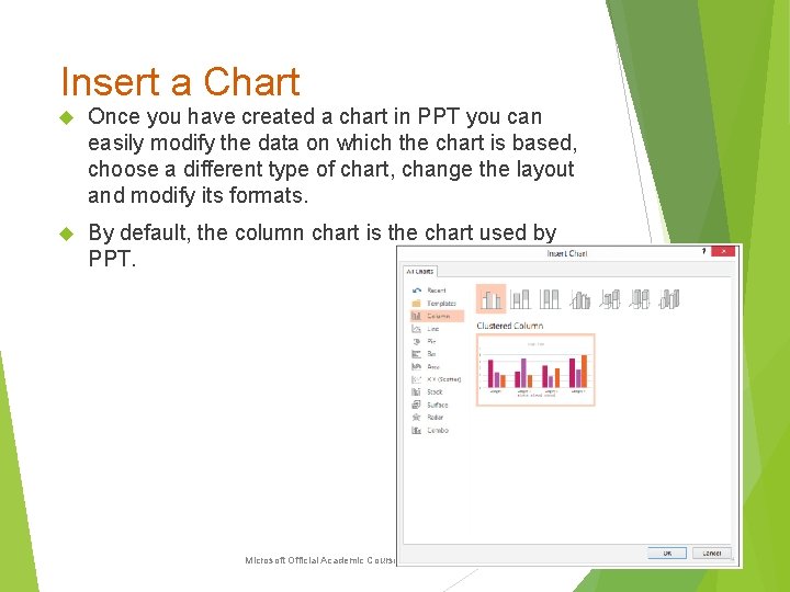
Insert a Chart Once you have created a chart in PPT you can easily modify the data on which the chart is based, choose a different type of chart, change the layout and modify its formats. By default, the column chart is the chart used by PPT. © 2014, John Wiley & Sons, Inc. Microsoft Official Academic Course, Microsoft Word 2013 3

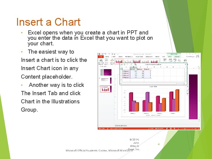
Insert a Chart Excel opens when you create a chart in PPT and you enter the data in Excel that you want to plot on your chart. • The easiest way to Insert a chart is to click the Insert Chart icon in any Content placeholder. • Another way is to click The Insert Tab and click Chart in the Illustrations Group. • © 2014, John Wiley & Sons, Inc. Microsoft Official Academic Course, Microsoft Word 2013 4

Charts You can edit the worksheet data any item you want by clicking the Edit Data button on the Chart Tools Design tab which appears when a chart is selected. When you click Edit Data, a menu appears offering for you to edit the data in PPT (Edit data) or in Excel (Edit Data in Excel 2013). 2/23/2021 5

Chart Types: Each PPT chart type is designed to present a specific type of data. When you create a chart, you should select the chart type that will best display your data. Some of the most commonly used chart types are: Column charts Bar charts Line charts Pie charts Area charts 2/23/2021 6

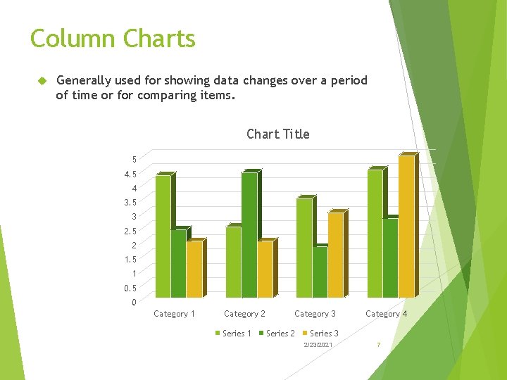
Column Charts Generally used for showing data changes over a period of time or for comparing items. Chart Title 5 4 3. 5 3 2. 5 2 1. 5 1 0. 5 0 Category 1 Category 2 Series 1 Category 3 Series 2 Category 4 Series 3 2/23/2021 7

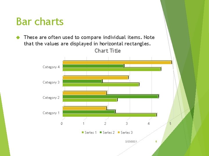
Bar charts These are often used to compare individual items. Note that the values are displayed in horizontal rectangles. Chart Title Category 4 Category 3 Category 2 Category 1 0 1 2 Series 1 Series 2 3 4 5 Series 3 2/23/2021 8

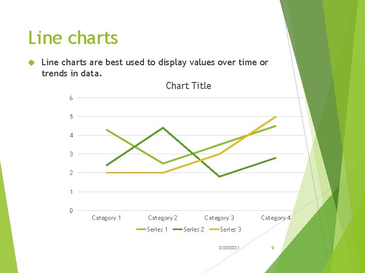
Line charts are best used to display values over time or trends in data. Chart Title 6 5 4 3 2 1 0 Category 1 Category 2 Series 1 Category 3 Series 2 Category 4 Series 3 2/23/2021 9

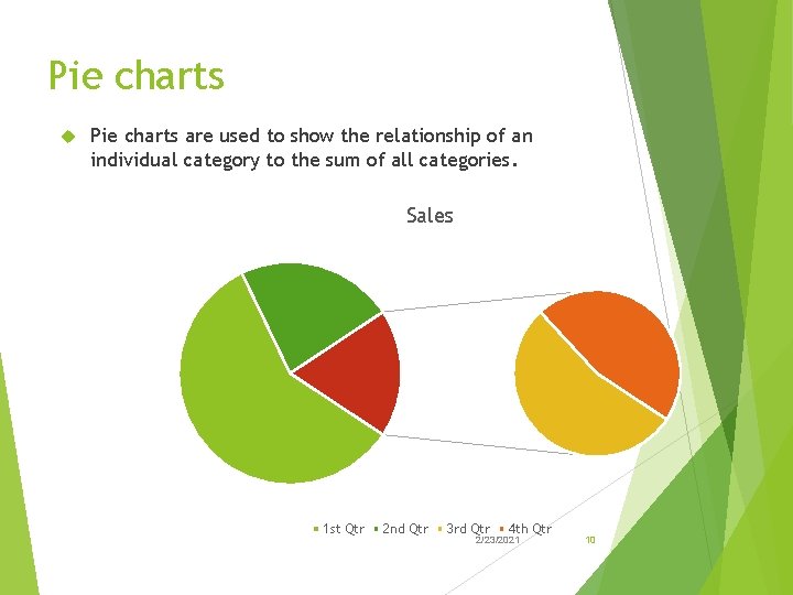
Pie charts are used to show the relationship of an individual category to the sum of all categories. Sales 1 st Qtr 2 nd Qtr 3 rd Qtr 4 th Qtr 2/23/2021 10

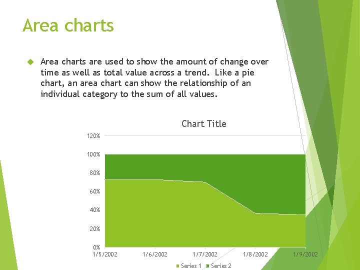
Area charts are used to show the amount of change over time as well as total value across a trend. Like a pie chart, an area chart can show the relationship of an individual category to the sum of all values. Chart Title 120% 100% 80% 60% 40% 20% 0% 1/5/2002 2/23/2021 1/6/2002 1/7/2002 Series 1 Series 2 11 1/8/2002 1/9/2002

Import an Excel Chart You can create the chart in Excel and then copy the completed chart to PPT using the Clipboard. Excel‘s charting tools are virtually identical to those in PPT so there is little reason to create the chart in Excel first. But, if the chart already exists copying it to PPT. Can save you some time. © 2014, John Wiley & Sons, Inc. Microsoft Official Academic Course, Microsoft Word 2013 12

Resize and Move a Chart • In addition to moving the individual elements within a chart, you can move and resize the chart itself. • The dotted areas on the chart‘s border are sizing handles. • You can resize any object by dragging a slide or corner handle of its container. • Note that if you drag a slide handle you may stretch the container and distorting its contents. • Hold down Shift to maintain the height-width ratio (the aspect ratio). • A four-headed arrow is what the insertion point looks like when you can drag. © 2014, John Wiley & Sons, Inc. Microsoft Official Academic Course, Microsoft Word 2013 13

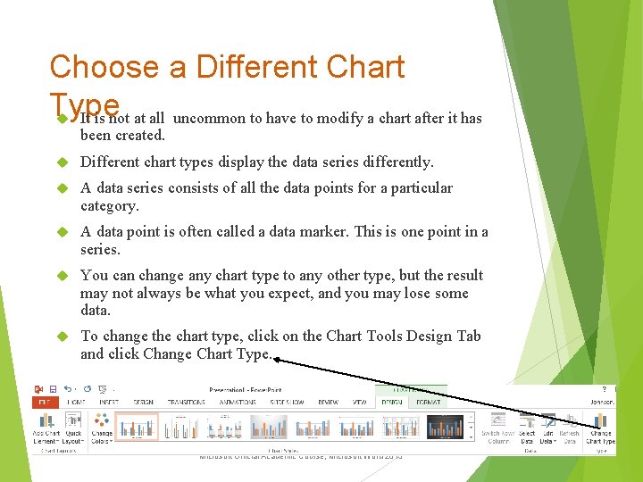
Choose a Different Chart Type It is not at all uncommon to have to modify a chart after it has been created. Different chart types display the data series differently. A data series consists of all the data points for a particular category. A data point is often called a data marker. This is one point in a series. You can change any chart type to any other type, but the result may not always be what you expect, and you may lose some data. To change the chart type, click on the Chart Tools Design Tab and click Change Chart Type. © 2014, John Wiley & Sons, Inc. Microsoft Official Academic Course, Microsoft Word 2013 14

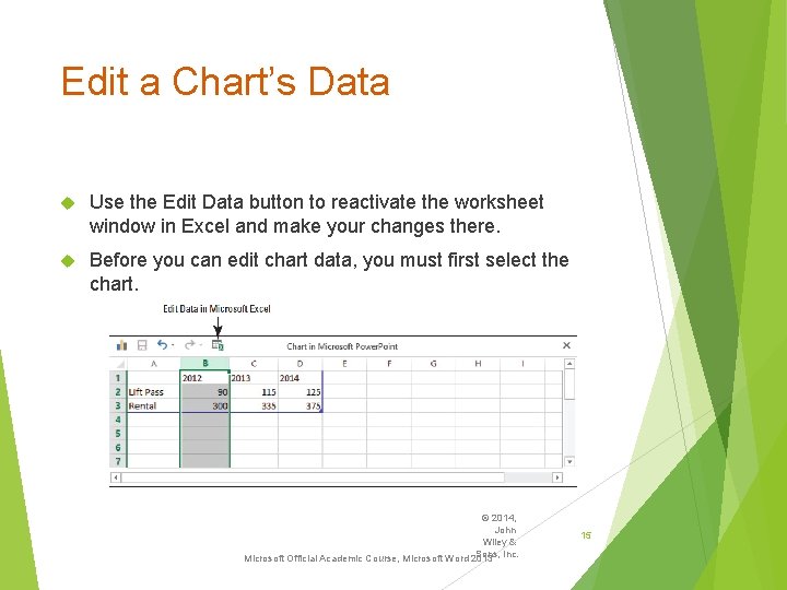
Edit a Chart’s Data Use the Edit Data button to reactivate the worksheet window in Excel and make your changes there. Before you can edit chart data, you must first select the chart. © 2014, John Wiley & Sons, Inc. Microsoft Official Academic Course, Microsoft Word 2013 15

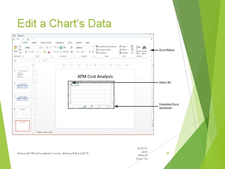
Edit a Chart’s Data Microsoft Official Academic Course, Microsoft Word 2013 © 2014, John Wiley & Sons, Inc. 16

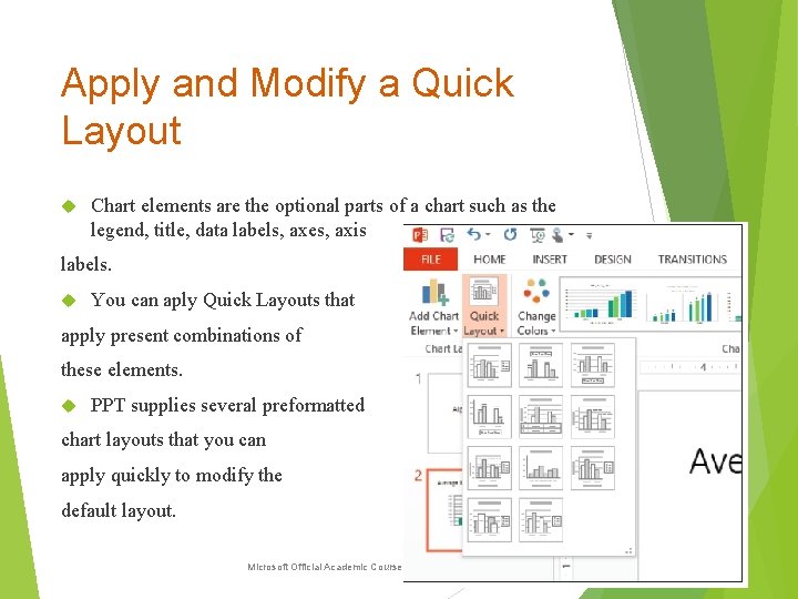
Apply and Modify a Quick Layout Chart elements are the optional parts of a chart such as the legend, title, data labels, axes, axis labels. You can aply Quick Layouts that apply present combinations of these elements. PPT supplies several preformatted chart layouts that you can apply quickly to modify the default layout. © 2014, John Wiley & Sons, Inc. Microsoft Official Academic Course, Microsoft Word 2013 17

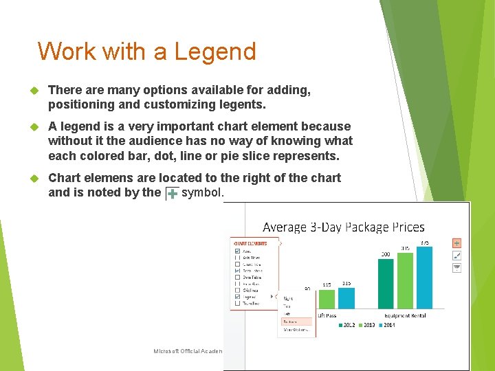
Work with a Legend There are many options available for adding, positioning and customizing legents. A legend is a very important chart element because without it the audience has no way of knowing what each colored bar, dot, line or pie slice represents. Chart elemens are located to the right of the chart and is noted by the symbol. © 2014, John Wiley & Sons, Inc. Microsoft Official Academic Course, Microsoft Word 2013 18

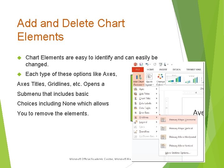
Add and Delete Chart Elements are easy to identify and can easily be changed. Each type of these options like Axes, Axes Titles, Gridlines, etc. Opens a Submenu that includes basic Choices including None which allows You to remove the elements. © 2014, John Wiley & Sons, Inc. Microsoft Official Academic Course, Microsoft Word 2013 19

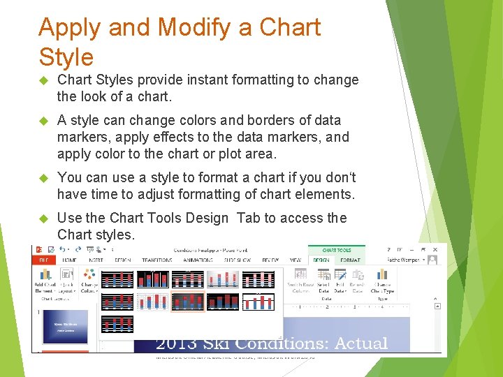
Apply and Modify a Chart Styles provide instant formatting to change the look of a chart. A style can change colors and borders of data markers, apply effects to the data markers, and apply color to the chart or plot area. You can use a style to format a chart if you don‘t have time to adjust formatting of chart elements. Use the Chart Tools Design Tab to access the Chart styles. © 2014, John Wiley & Sons, Inc. Microsoft Official Academic Course, Microsoft Word 2013 20

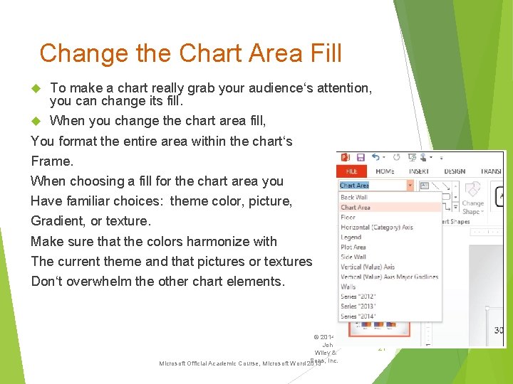
Change the Chart Area Fill To make a chart really grab your audience‘s attention, you can change its fill. When you change the chart area fill, You format the entire area within the chart‘s Frame. When choosing a fill for the chart area you Have familiar choices: theme color, picture, Gradient, or texture. Make sure that the colors harmonize with The current theme and that pictures or textures Don‘t overwhelm the other chart elements. © 2014, John Wiley & Sons, Inc. Microsoft Official Academic Course, Microsoft Word 2013 21

Change the Chart Area Fill • Caution: Don‘t confuse the chart area with the plot area. • The chart area includes everything inside the chart‘s frame. • The plot area includes only the area within the chart‘s frame where the data is plotted. The plot area typically excludes the extra elements like the legend and chart title. © 2014, John Wiley & Sons, Inc. Microsoft Official Academic Course, Microsoft Word 2013 22

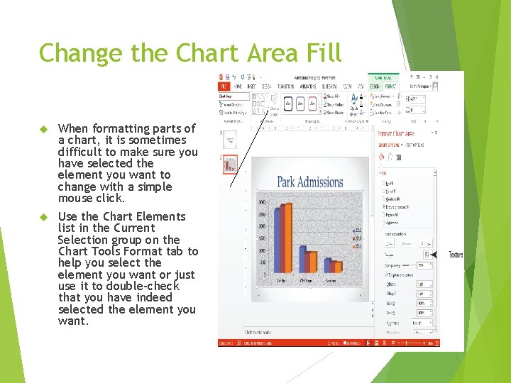
Change the Chart Area Fill When formatting parts of a chart, it is sometimes difficult to make sure you have selected the element you want to change with a simple mouse click. Use the Chart Elements list in the Current Selection group on the Chart Tools Format tab to help you select the element you want or just use it to double-check that you have indeed selected the element you want. 2/23/2021 23

Apply a Border to the Chart Area • By default, the chart area does not display a border. • The lack of a border allows the chart to blend in with the background of the slide. • If you prefer, you can apply a border that clearly identifies the chart area. If that is the case, you need to add a border to your chart. • Click the outer border of the chart first. On the Chart Tools Format tab, click Format Selection in the Current selection group to open the Format Chart Area task pane. • Then click on the Border heading to expand the border options. • Notice you can change the border color and the width. • To see the changes you have made, simply click off the chart area. © 2014, John Wiley & Sons, Inc. Microsoft Official Academic Course, Microsoft Word 2013 24

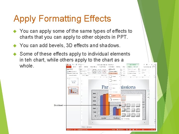
Apply Formatting Effects You can apply some of the same types of effects to charts that you can apply to other objects in PPT. You can add bevels, 3 D effects and shadows. Some of these effects apply to individual elements in teh chart, while others apply to the chart as a whole. © 2014, John Wiley & Sons, Inc. Microsoft Official Academic Course, Microsoft Word 2013 25

Format a Chart’s Data Series A chart‘s data series is the visual display of the actual data points. Data series can be columns, bars, lines or pie slices. You can give a chart considerably more visual appeal by customizing data series fill and border options and by applying effects. If you want to format a single data bar, click it twice. To format the entire data series, click it once. Use the Chart Tools Format tab © 2014, John Wiley & Sons, Inc. Microsoft Official Academic Course, Microsoft Word 2013 26

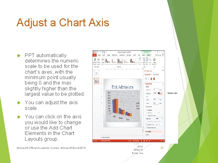
Adjust a Chart Axis PPT automatically determines the numeric scale to be used for the chart‘s axes, with the minimum point usually being 0 and the max slightly higher than the largest value to be plotted. You can adjust the axis scale. You can click on the axis you would like to change or use the Add Chart Elements in the Chart Layouts group. Microsoft Official Academic Course, Microsoft Word 2013 © 2014, John Wiley & Sons, Inc. 27