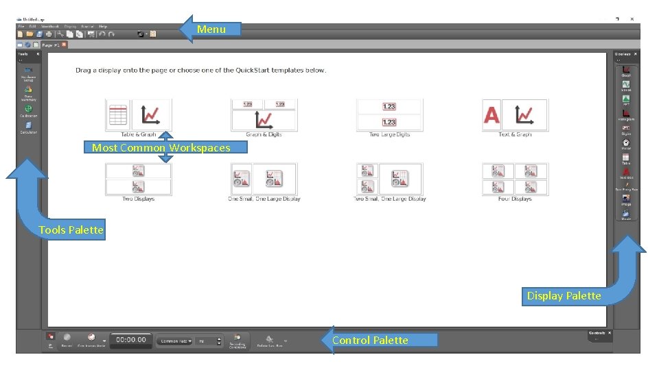
Menu Most Common Workspaces Tools Palette Display Palette

![1. If you don’t see a palette, click [Workbook] in the menu 2. Click 1. If you don’t see a palette, click [Workbook] in the menu 2. Click](https://slidetodoc.com/presentation_image/5c1a4bd79512ba33a7aaeb940dd19b4e/image-3.jpg)
![Clicking [Hardware Setup] should give an image of the PASCO 850 Universal Interface. If Clicking [Hardware Setup] should give an image of the PASCO 850 Universal Interface. If](https://slidetodoc.com/presentation_image/5c1a4bd79512ba33a7aaeb940dd19b4e/image-5.jpg)
![When you are ready, click [Record] to begin collecting data. The [Record] button will When you are ready, click [Record] to begin collecting data. The [Record] button will](https://slidetodoc.com/presentation_image/5c1a4bd79512ba33a7aaeb940dd19b4e/image-7.jpg)
- Slides: 12


Menu Most Common Workspaces Tools Palette Display Palette Control Palette
![1 If you dont see a palette click Workbook in the menu 2 Click 1. If you don’t see a palette, click [Workbook] in the menu 2. Click](https://slidetodoc.com/presentation_image/5c1a4bd79512ba33a7aaeb940dd19b4e/image-3.jpg)
1. If you don’t see a palette, click [Workbook] in the menu 2. Click to display or remove whichever palette you like. 3. When you are ready to take and display data, select [Table & Graph]

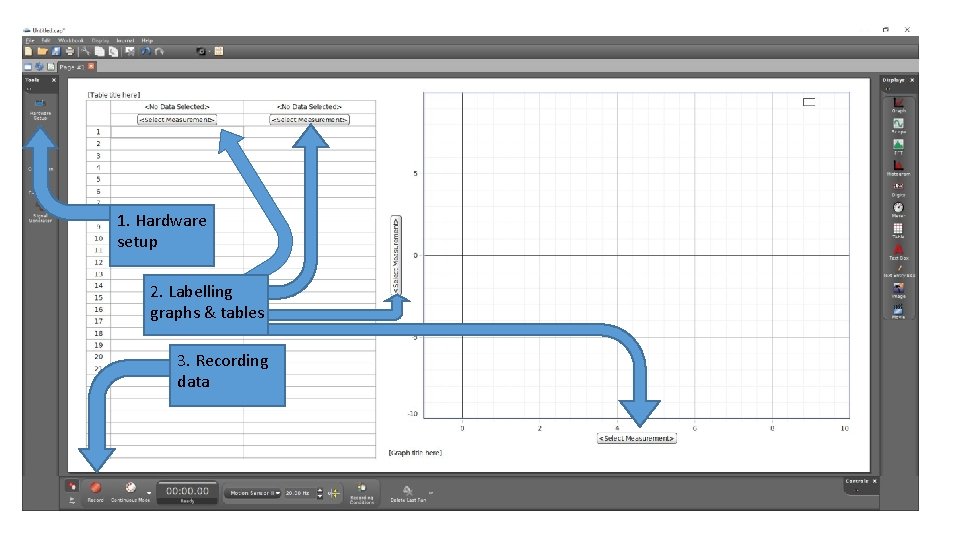
1. Hardware setup 2. Labelling graphs & tables 3. Recording data
![Clicking Hardware Setup should give an image of the PASCO 850 Universal Interface If Clicking [Hardware Setup] should give an image of the PASCO 850 Universal Interface. If](https://slidetodoc.com/presentation_image/5c1a4bd79512ba33a7aaeb940dd19b4e/image-5.jpg)
Clicking [Hardware Setup] should give an image of the PASCO 850 Universal Interface. If not, click [Choose Interface]. You might need to open the [Manually Choose], then check PASCO 850 Universal Interface. The PASCO Interface will allow different measuring devices. To plug in the motion sensor, right-click on the left-most digital input, then scroll down and select the [Motion Sensor II]. The motion sensor has two plugs. • Remember to turn on the PASCO Interface. (The actual equipment. ) • The yellow plug should be in digital-input 1. The black plug should be in digital-input 2.

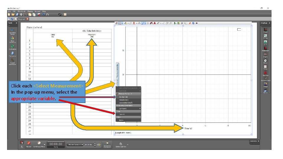
Click each <Select Measurement> In the pop-up menu, select the appropriate variable.
![When you are ready click Record to begin collecting data The Record button will When you are ready, click [Record] to begin collecting data. The [Record] button will](https://slidetodoc.com/presentation_image/5c1a4bd79512ba33a7aaeb940dd19b4e/image-7.jpg)
When you are ready, click [Record] to begin collecting data. The [Record] button will become a [Stop] button while the data is being collected. The graphs and table should fill with data as it is collected. When you are done, click [Stop] to end the data collection.

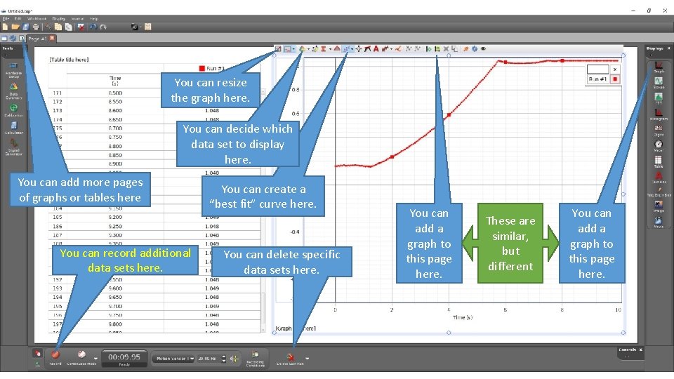
You can resize the graph here. You can decide which data set to display here. You can add more pages of graphs or tables here You can record additional data sets here. You can create a “best fit” curve here. You can delete specific data sets here. You can add a graph to this page here. These are similar, but different You can add a graph to this page here.

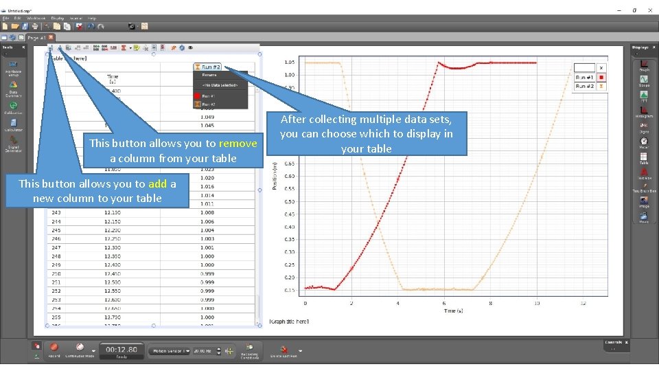
This button allows you to remove a column from your table This button allows you to add a new column to your table After collecting multiple data sets, you can choose which to display in your table

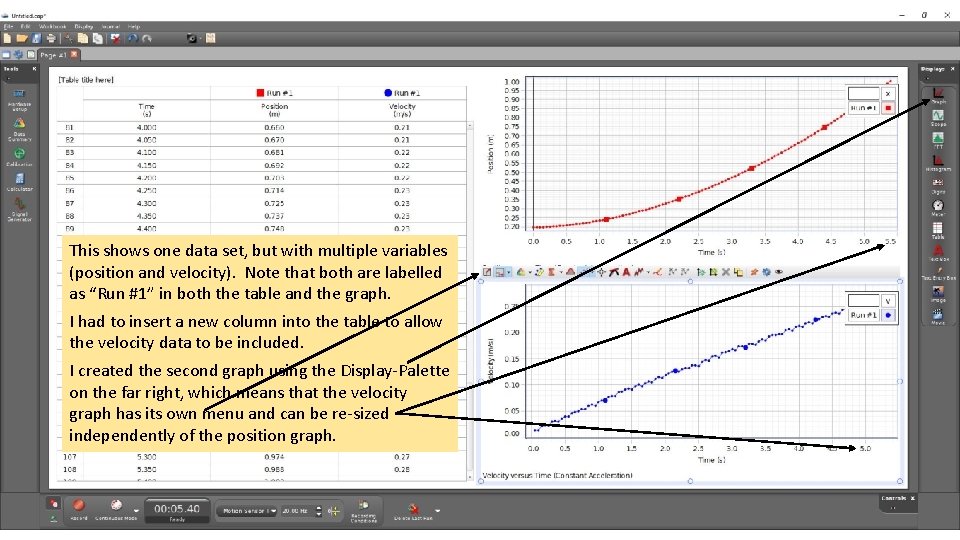
This shows one data set, but with multiple variables (position and velocity). Note that both are labelled as “Run #1” in both the table and the graph. I had to insert a new column into the table to allow the velocity data to be included. I created the second graph using the Display-Palette on the far right, which means that the velocity graph has its own menu and can be re-sized independently of the position graph.

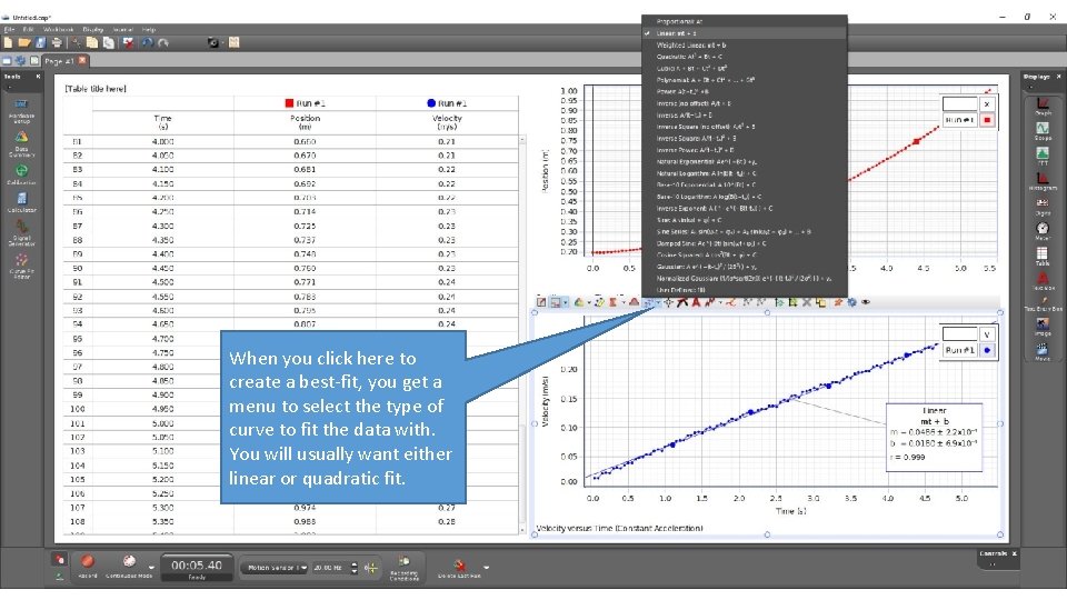
When you click here to create a best-fit, you get a menu to select the type of curve to fit the data with. You will usually want either linear or quadratic fit.

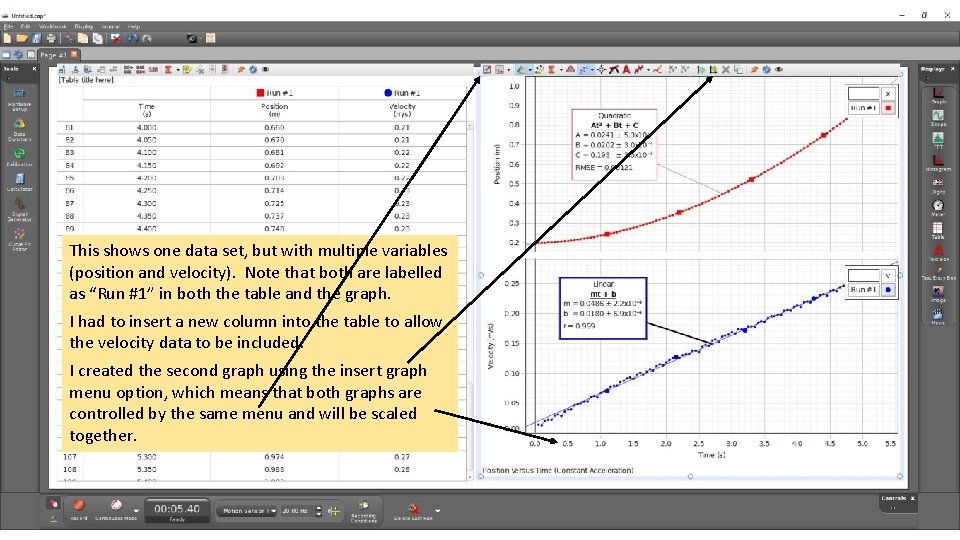
This shows one data set, but with multiple variables (position and velocity). Note that both are labelled as “Run #1” in both the table and the graph. I had to insert a new column into the table to allow the velocity data to be included. I created the second graph using the insert graph menu option, which means that both graphs are controlled by the same menu and will be scaled together.