Media Products On A Cover Page One convention
- Slides: 15

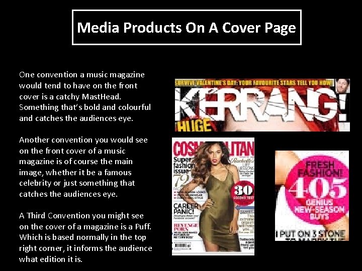
Media Products On A Cover Page One convention a music magazine would tend to have on the front cover is a catchy Mast. Head. Something that’s bold and colourful and catches the audiences eye. Another convention you would see on the front cover of a music magazine is of course the main image, whether it be a famous celebrity or just something that catches the audiences eye. A Third Convention you might see on the cover of a magazine is a Puff. Which is based normally in the top right corner, it informs the audience what edition it is.

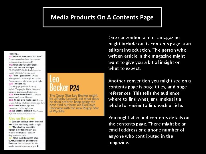
Media Products On A Contents Page One convention a music magazine might include on its contents page is an editors introduction. The person who writ an article in the magazine might want to give you a bit of insight on what to expect. Another convention you might see on a contents page is page titles, and page references. This tells the audience where to find what, and makes it a whole lot easier to find each article. You might also find contents details on the contents page. There might be an email address or a phone number of anyone who contributed in the magazine.

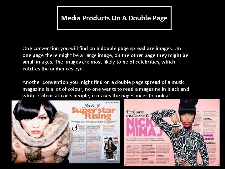
Media Products On A Double Page One convention you will find on a double page spread are images. On one page there might be a Large image, on the other page they might be small images. The images are most likely to be of celebrities, which catches the audiences eye. Another convention you might find on a double page spread of a music magazine is a lot of colour, no one wants to read a magazine in black and white. Colour attracts people, it makes the pages nicer to look at.

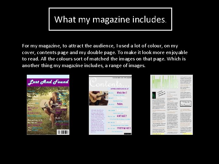
What I Included On My Cover, Contents and Double Page. On my cover page I included a large image to attract the audience of a celebrity that’s in my magazine. Also on my cover page I included a lot of colour, which definitely attracts the audience, it’s not a boring, dull cover page. On my double page spread I included an interview with my chosen celebrity, Luna Monroe. This is what makes teens and young adults want to buy the magazine, because they get an insight into their favourite celebrities lives. On my contents page I included a lot of bright colours, like my cover page. The colours on the contents page are quite similar colours to the cover page. I also included an editors speech, where I basically let the reader in on what theyre going to find out in the magazine.

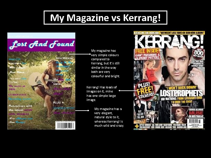
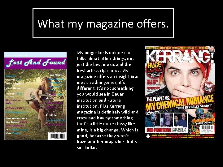
My Magazine vs Kerrang! My magazine has very simple colours compared to Kerrang, but it’s still similar in the way both are very colourful and bright. Kerrang! Has loads of images on it, mine has one simple large image. My magazine has a very elegant, natural style to it, whereas Kerrang! Is much wild and crazy.

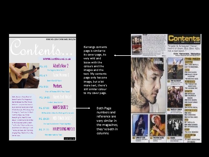
Kerrangs contents page is similar to its cover page, its very wild and loose with the colours and the images and the text. My contents page only has one image, but a lot more text, there’s still similar colour to my cover page. Both Page numbers and reference are very similar in the magazines, they're both in columns.

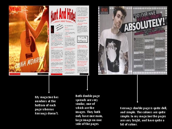
My magazine has numbers at the bottom of each page whereas Kerrangs doesn’t. Both double page spreads are very similar, one of which are the images. They both only have one main, large image on one side of the pages. Kerrangs double page is quite dull, and simple. The colours are quite simple. In my magazine the pages are very bright, and have quite a bit of colour.

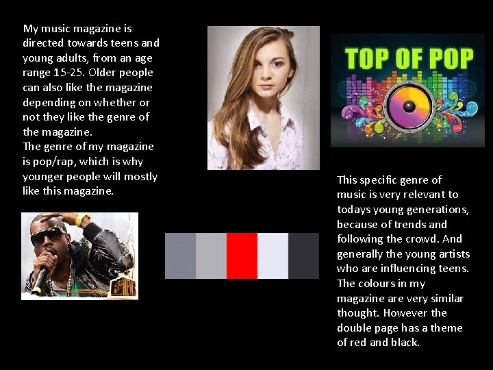
My music magazine is directed towards teens and young adults, from an age range 15 -25. Older people can also like the magazine depending on whether or not they like the genre of the magazine. The genre of my magazine is pop/rap, which is why younger people will mostly like this magazine. This specific genre of music is very relevant to todays young generations, because of trends and following the crowd. And generally the young artists who are influencing teens. The colours in my magazine are very similar thought. However the double page has a theme of red and black.

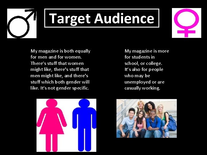
Target Audience My magazine is both equally for men and for women. There’s stuff that women might like, there's stuff that men might like, and there's stuff which both gender will like. It’s not gender specific. My magazine is more for students in school, or college. It’s also for people who may be unemployed or are casually working.

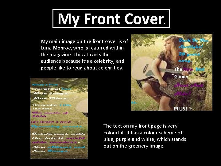
My Front Cover . My main image on the front cover is of Luna Monroe, who is featured within the magazine. This attracts the audience because it’s a celebrity, and people like to read about celebrities. The text on my front page is very colourful. It has a colour scheme of blue, purple and white, which stands out on the greenery image.

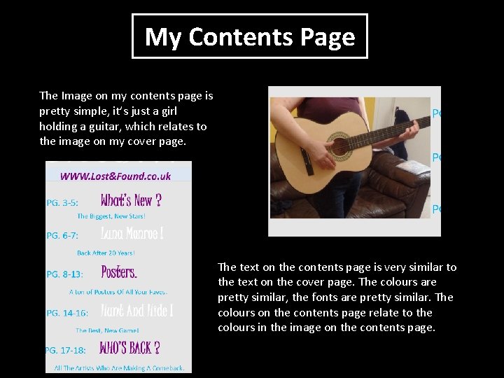
My Contents Page The Image on my contents page is pretty simple, it’s just a girl holding a guitar, which relates to the image on my cover page. The text on the contents page is very similar to the text on the cover page. The colours are pretty similar, the fonts are pretty similar. The colours on the contents page relate to the colours in the image on the contents page.

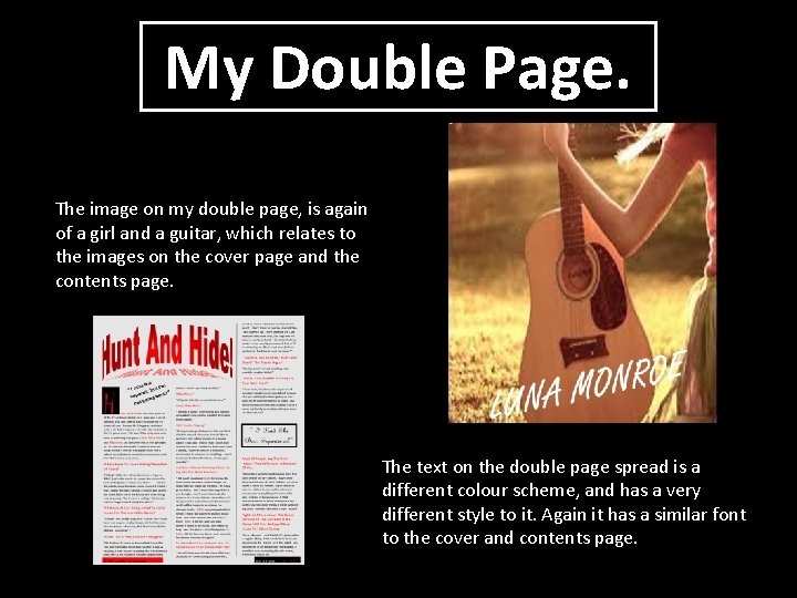
My Double Page. The image on my double page, is again of a girl and a guitar, which relates to the images on the cover page and the contents page. The text on the double page spread is a different colour scheme, and has a very different style to it. Again it has a similar font to the cover and contents page.

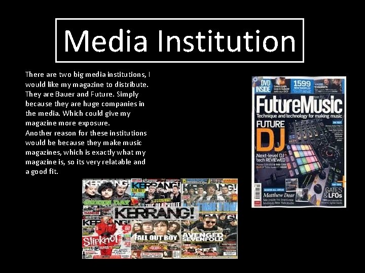
Media Institution There are two big media institutions, I would like my magazine to distribute. They are Bauer and Future. Simply because they are huge companies in the media. Which could give my magazine more exposure. Another reason for these institutions would be because they make music magazines, which is exactly what my magazine is, so its very relatable and a good fit.

What my magazine offers. My magazine is unique and talks about other things, not just the best music and the best artists right now. My magazine offers an insight into music within games, it’s different. It’s not something you would see in Bauer institution and Future institution. Plus Kerrang magazine is definitely wild and crazy and having something that’s a little more classy like mine, is a big change. Which is good, because they won’t have another magazine that’s so similar.

What my magazine includes. For my magazine, to attract the audience, I used a lot of colour, on my cover, contents page and my double page. To make it look more enjoyable to read. All the colours sort of matched the images on that page. Which is another thing my magazine includes, a range of images.