Measures of Dispersion boxplots RANGE difference between highest
Measures of Dispersion boxplots
RANGE • difference between highest and lowest value; gives us some idea of how much variation there is in the categories of a variable (some variables have more response categories than others) • generally, the higher the range, the more variation in the categories of response; the smaller the range, the less variation in the categories of response
Quartiles • • • divides data into four groups: Q 1 = the bottom 25% of scores; Q 2 = median, or 50% of scores, and Q 3 = 75% of all scores. 50% of scores fall between Q 1 and Q 3
Inter. Quartile Range (IQR) • measure of dispersion that tells us about the distribution of responses to a variable in relation to the median • can be used with ordinal or numerical variables, and tells us the range of values that encompass the middle 50% of the respondents to a variable
BOXPLOTS • also known as box-and-whiskers, is a graphical representation of the fivenumber summary. • Plot the quartiles on a graph, and make a box around Q 1 and Q 3, with a line for the median (Q 2) in the middle. • Plot the lowest and highest points, and connect these with ‘whiskers’.
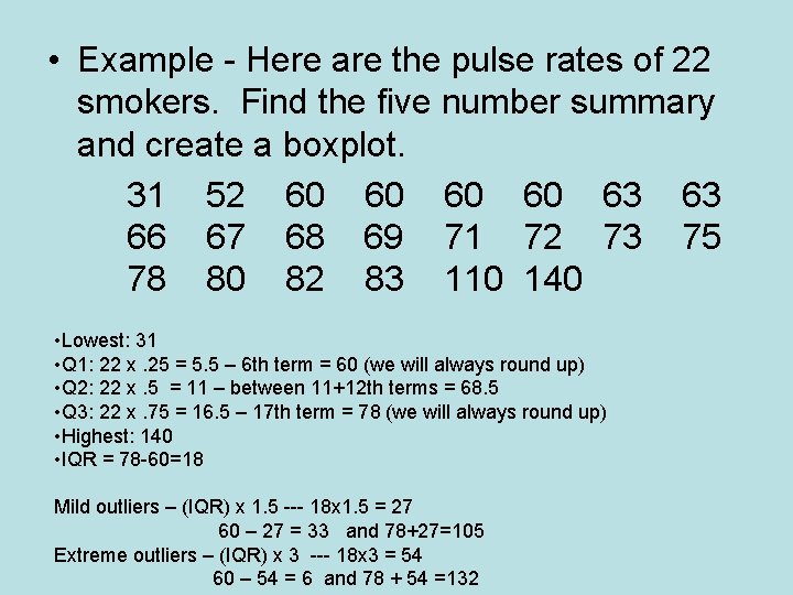
• Example - Here are the pulse rates of 22 smokers. Find the five number summary and create a boxplot. 31 52 60 60 63 63 66 67 68 69 71 72 73 75 78 80 82 83 110 140 • Lowest: 31 • Q 1: 22 x. 25 = 5. 5 – 6 th term = 60 (we will always round up) • Q 2: 22 x. 5 = 11 – between 11+12 th terms = 68. 5 • Q 3: 22 x. 75 = 16. 5 – 17 th term = 78 (we will always round up) • Highest: 140 • IQR = 78 -60=18 Mild outliers – (IQR) x 1. 5 --- 18 x 1. 5 = 27 60 – 27 = 33 and 78+27=105 Extreme outliers – (IQR) x 3 --- 18 x 3 = 54 60 – 54 = 6 and 78 + 54 =132
- Slides: 6