MEASURES OF CENTRALITY Last lecture summary Which graphs

")


![Male Applied Admitted Rate [%] MAJOR A 900 450 MAJOR B 100 10 www.](https://slidetodoc.com/presentation_image/037abd923fcab9ece699b4cf67b713a1/image-9.jpg "Male Applied Admitted Rate [%] MAJOR A 900 450 MAJOR B 100 10 www.")
![Male Applied Admitted Rate [%] MAJOR A 900 450 50 MAJOR B 100 10](https://slidetodoc.com/presentation_image/037abd923fcab9ece699b4cf67b713a1/image-10.jpg "Male Applied Admitted Rate [%] MAJOR A 900 450 50 MAJOR B 100 10")
![Female Applied Admitted Rate [%] MAJOR A 100 80 MAJOR B 900 180 www.](https://slidetodoc.com/presentation_image/037abd923fcab9ece699b4cf67b713a1/image-11.jpg "Female Applied Admitted Rate [%] MAJOR A 100 80 MAJOR B 900 180 www.")
![Female Applied Admitted Rate [%] MAJOR A 100 80 80 MAJOR B 900 180](https://slidetodoc.com/presentation_image/037abd923fcab9ece699b4cf67b713a1/image-12.jpg "Female Applied Admitted Rate [%] MAJOR A 100 80 80 MAJOR B 900 180")
![Gender bias Applied Admitted Rate [%] MAJOR A 900 450 50 MAJOR B 100](https://slidetodoc.com/presentation_image/037abd923fcab9ece699b4cf67b713a1/image-13.jpg "Gender bias Applied Admitted Rate [%] MAJOR A 900 450 50 MAJOR B 100")
![Gender bias Applied Admitted Rate [%] MAJOR A 900 450 50 MAJOR B 100](https://slidetodoc.com/presentation_image/037abd923fcab9ece699b4cf67b713a1/image-14.jpg "Gender bias Applied Admitted Rate [%] MAJOR A 900 450 50 MAJOR B 100")
![Gender bias Rate [%] MAJOR A 50 MAJOR B 10 Both 46 Rate [%]](https://slidetodoc.com/presentation_image/037abd923fcab9ece699b4cf67b713a1/image-15.jpg "Gender bias Rate [%] MAJOR A 50 MAJOR B 10 Both 46 Rate [%]")


 variables • categories that have no particular order • example:")
 quantitative (kvantitativní) continuous (spojitá) discrete (diskrétní) categorical (kategorická) ordinal (ordinální)")


")


![Percentiles věk [roky] http: //www. rustovyhormon. cz/on-line-rustove-grafy](https://slidetodoc.com/presentation_image/037abd923fcab9ece699b4cf67b713a1/image-48.jpg "Percentiles věk [roky] http: //www. rustovyhormon. cz/on-line-rustove-grafy")


- Slides: 51
MEASURES OF CENTRALITY
Last lecture summary • Which graphs did we meet? • scatter plot (bodový graf) • bar chart (sloupcový graf) • histogram • pie chart (koláčový graf) • How do they work, what are their advantages and/or disadvantages?
SDA girls – histogram of heights 2014 n = 48 or N = 48 bin size = 3. 8
Distributions negatively skewed to the left e. g. , life expectancy positively skewed to the left e. g. , body height e. g. , income http: //turnthewheel. org/free-textbooks/street-smart-stats/
STATISTICS IS BEATIFUL new stuff
Life expectancy data • Watch TED talk by Hans Rosling, Gapminder Foundation: http: //www. ted. com/talks/hans_rosling_shows_the_best_s tats_you_ve_ever_seen. html
STATISTICS IS DEEP
UC Berkeley Th ou gh d at a ar Si e fa m ke ps on , t he ’s p pa ra ar ad do x ox is th e sa m e www. udacity. com – Introduction to statistics
Male Applied Admitted Rate [%] MAJOR A 900 450 MAJOR B 100 10 www. udacity. com – Introduction to statistics
Male Applied Admitted Rate [%] MAJOR A 900 450 50 MAJOR B 100 10 10 www. udacity. com – Introduction to statistics
Female Applied Admitted Rate [%] MAJOR A 100 80 MAJOR B 900 180 www. udacity. com – Introduction to statistics
Female Applied Admitted Rate [%] MAJOR A 100 80 80 MAJOR B 900 180 20 www. udacity. com – Introduction to statistics
Gender bias Applied Admitted Rate [%] MAJOR A 900 450 50 MAJOR B 100 10 10 Applied Admitted Rate [%] MAJOR A 100 80 80 MAJOR B 900 180 20 What do you think, is there a gender bias? Who do you think is favored? Male or female? www. udacity. com – Introduction to statistics
Gender bias Applied Admitted Rate [%] MAJOR A 900 450 50 MAJOR B 100 10 10 Both 1000 46 Applied Admitted Rate [%] MAJOR A 100 80 80 MAJOR B 900 180 20 Both 1000 26 male female www. udacity. com – Introduction to statistics
Gender bias Rate [%] MAJOR A 50 MAJOR B 10 Both 46 Rate [%] MAJOR A 80 MAJOR B 20 Both 26 male female www. udacity. com – Introduction to statistics
Statistics is ambiguous • This example ilustrates how ambiguous the statistics is. • In choosing how to graph your data you may majorily impact what people believe to be the case. “I never believe in statistics I didn’t doctor myself. ” “Nikdy nevěřím statistice, kterou si sám nezfalšuji. ” Who said that? Winston Churchill www. udacity. com – Introduction to statistics
What is statistics? • Statistics – the science of collecting, organizing, summarizing, analyzing and interpreting data • Goal – use imperfect information (our data) to infer facts, make predictions, and make decisions • Descriptive statistic – describing and summarising data with numbers or pictures • Inferential statistics – making conclusions or decisions based on data
Variables • variable – a value or characteristics that can vary from individual to individual • example: favorite color, age • How variables are classified? • quantitative variable – numerical values, often with units of measurement, arise from the how much/how many question, example: age, annual income, number children • continuous (spojitá proměnná), example: height, weight • discrete (diskrétní proměnná), example: number of children • continuous variables can be discretized
Variables • categorical (qualitative) variables • categories that have no particular order • example: favorite color, gender, nationality • ordinal • they are not numerical but their values have a natural order • example: tempterature low/medium/high
Variables variable (proměnná) quantitative (kvantitativní) continuous (spojitá) discrete (diskrétní) categorical (kategorická) ordinal (ordinální)
Choosing a profession Chemistry Geography 50 000 – 60 000 40 000 – 55 000 www. udacity. com – Statistics
Choosing a profession • We made an interval estimate. • But ideally we want one number that describes the entire dataset. This allows us to quickly summarize all our data. www. udacity. com – Statistics
Choosing a profession Chemistry Geography 1. The value at which frequency is highest. 2. The value where frequency is lowest. 3. Value in the middle. 4. Biggest value of x-axis. 5. Mean www. udacity. com – Statistics
Three big M’s Chemistry Geography • The value at which frequency is highest is called the mode. i. e. the most common value is the mode. • The value in the middle of the distribution is called the median. • The mean is the mean (average is the synonymum). www. udacity. com – Statistics
Quick quiz • What is the mode in our data? 2 5 6 5 2 6 9 8 5 2 3 5 www. udacity. com – Statistics
Mode in negatively skewed distribution www. udacity. com – Statistics
Mode in uniform distribution www. udacity. com – Statistics
Multimodal distribution www. udacity. com – Statistics
Mode in categorical data www. udacity. com – Statistics
More of mode True or False? 1. 2. 3. 4. The mode can be used to describe any type of data we have, whether it’s numerical or categorical. All scores in the dataset affect the mode. If we take a lot of samples from the same population, the mode will be the same in each sample. There is an equation for the mode. • Ad 3. • http: //onlinestatbook. com/stat_sim/sampling_dist/ • http: //www. shodor. org/interactivate/activities/Histogram/ - mode changes as you change a bin size. • Because 3. is not true, we can’t use mode to learn something about our population. Mode depends on how you present the data. www. udacity. com – Statistics
Life expectancy data www. coursera. org – Statistics: Making Sense of Data
Minimum minimum = 47. 8 Sierra Leone www. coursera. org – Statistics: Making Sense of Data
Maximum maximum = 84. 3 Japan www. coursera. org – Statistics: Making Sense of Data
Life expectancy data all countries www. coursera. org – Statistics: Making Sense of Data
Life expectancy data half larger 73. 2 half smaller 1 Egypt 99 197 www. coursera. org – Statistics: Making Sense of Data
Life expectancy data Maximum = 83. 4 Median = 73. 2 Minimum = 47. 8 www. coursera. org – Statistics: Making Sense of Data
Q 1 1 st quartile = 64. 7 Sao Tomé & Príncipe 1 50 (¼ way) 197 www. coursera. org – Statistics: Making Sense of Data
Q 1 1 st quartile = 64. 7 ¼ smaller ¾ larger www. coursera. org – Statistics: Making Sense of Data
Q 3 3 rd quartile = 76. 7 Netherland Antilles 1 148 (¾ way) 197 www. coursera. org – Statistics: Making Sense of Data
Q 3 3 rd quartile = 76. 7 ¾ smaller ¼ larger www. coursera. org – Statistics: Making Sense of Data
Life expectancy data Maximum = 83. 4 3 rd quartile = 76. 7 Median = 73. 2 1 st quartile = 64. 7 Minimum = 47. 8 www. coursera. org – Statistics: Making Sense of Data
Box Plot www. coursera. org – Statistics: Making Sense of Data
Box plot maximum median 3 rd quartile 1 st quartile minimum
Modified box plot outliers 1. 5 x IQR interquartile range outliers
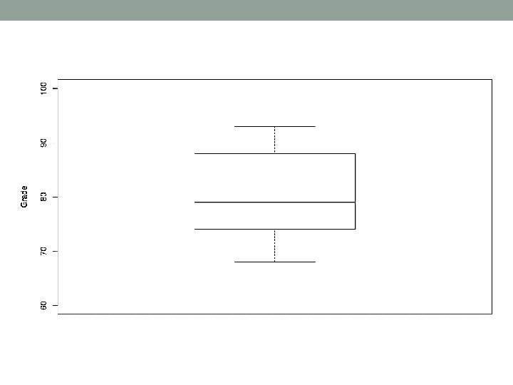
Quartiles, median – how to do it? Find min, max, median, Q 1, Q 3 in these data. Then, draw the box plot. 79, 68, 88, 69, 90, 74, 87, 93, 76 www. coursera. org – Statistics: Making Sense of Data
Another example 78, 93, 68, 84, 90, 74 Min. 1 st Qu. Median 3 rd Qu. Max. 68. 00 75. 00 81. 00 88. 50 93. 00
Percentiles věk [roky] http: //www. rustovyhormon. cz/on-line-rustove-grafy
3 rd M – Mean •
33 750 Robust statistic 33 750 44 000 45 566 Salary of 25 players of the American football (NY red Bulls) in 2012. 65 000 median = 112 495 95 000 mean = 518 311 103 500 112 495 138 188 141 666 181 500 185 000 190 000 194 375 195 000 205 000 292 500 301 999 4 600 000 5 600 000 Mean is not a robust statistic. Median is a robust statistic.
33 750 Trimmed mean 10% trimmed mean … eliminate upper and lower 10% of data 44 000 Trimmed mean is more robust. 44 000 45 566 65 000 95 000 103 500 112 495 138 188 141 666 181 500 185 000 190 000 194 375 195 000 205 000 292 500 301 999 4 600 000 5 600 000 median = 112 495 mean = 518 311 10% trimmed mean = 128 109