MEASURE EVALUATION Data Quality Assurance Workshop Session 6

- Slides: 21

MEASURE EVALUATION Data Quality Assurance Workshop Session: 6 Understanding & Using the RDQA Tool Output

Topics to Cover ØCharts and graphs overview ØHow to interpret RDQA graphs • Bar charts • Spider graphs ØLine graphs

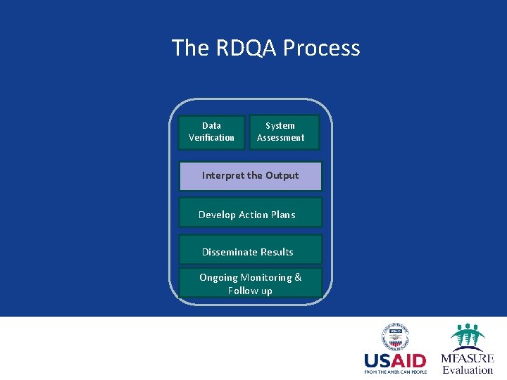
The RDQA Process Data Verification System Assessment Interpret the Output Develop Action Plans Disseminate Results Ongoing Monitoring & Follow up

Charts & Graphs Ø Charts and graphs summarize information visually § Advantage: Information is easier to understand § Disadvantage: You might loose some of the detail Ø RDQA tool automatically generates summary graphs of assessment data

Basic Guidance for Building Graphs q Ensure graph has a title q Label the components of your graph q Indicate source of data with date q Provide number of observations (n=xx) as a reference point q Add footnote if more information is needed

Interpreting Graphs The summary statistics that are calculated include the following: q Strength of the Data Management and Reporting System based on a review of the programme’s data collection and reporting system q Accuracy of Reported Data through the Calculation of Verification Factors generated from the recounting exercise performed at each level of the reporting system q Availability, Completeness and Timeliness of Reports through percentages calculated at the Health District(s) and the national level

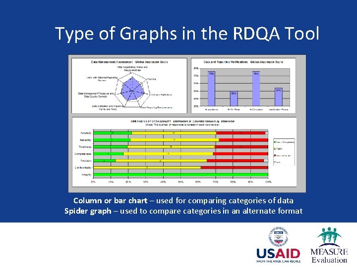
Type of Graphs in the RDQA Tool Column or bar chart – used for comparing categories of data Spider graph – used to compare categories in an alternate format

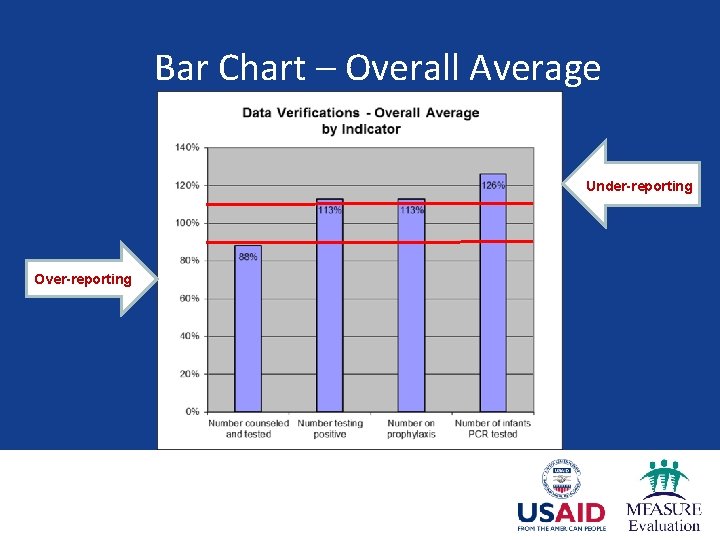
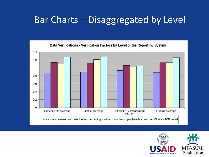
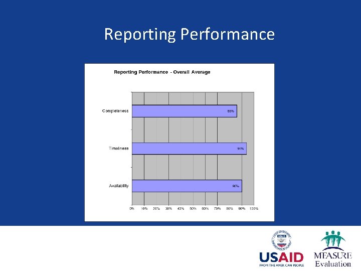
Bar Charts in the RDQA Tool Ø Generated on the Global Dashboard, intermediate aggregation and service delivery point sheets Ø Include charts for both data verification and system assessment outputs Ø At the intermediate aggregation and Global level, data on reporting performance is also on a chart.

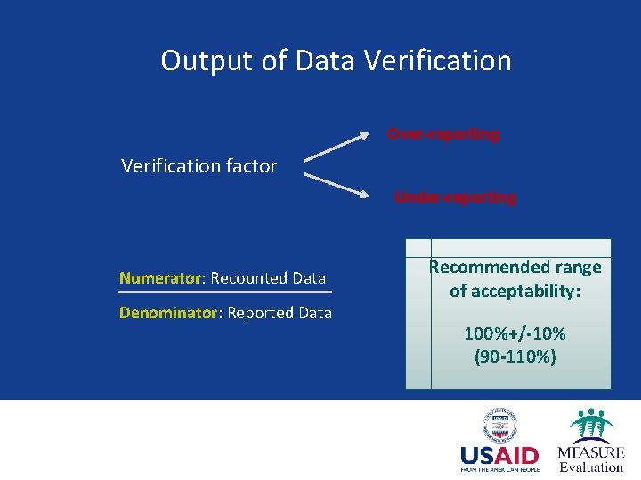
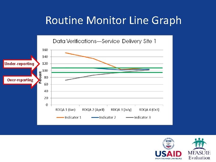
Output of Data Verification Over-reporting Verification factor Under-reporting Numerator: Recounted Data Denominator: Reported Data Recommended range of acceptability: 100%+/-10% (90 -110%)

Bar Chart – Overall Average Under-reporting Over-reporting

Bar Charts – Disaggregated by Level

Reporting Performance

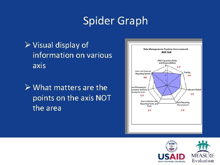
Spider Graph Ø Visual display of information on various axis Ø What matters are the points on the axis NOT the area

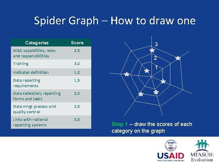
Spider Graph – How to draw one Categories Score M&E capabilities, roles and responsibilities 2. 5 Training 3. 0 Indicator definition 1. 0 Data reporting requirements 1. 5 Data collection, reporting forms and tools 2. 0 Data mngt process and quality control 2. 5 Links with national reporting systems 0. 5 3 2 1 Step 1 – draw the scores of each category on the graph

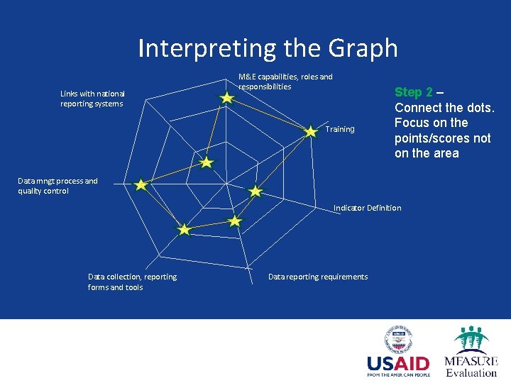
Interpreting the Graph Links with national reporting systems M&E capabilities, roles and responsibilities Training Step 2 – Connect the dots. Focus on the points/scores not on the area Data mngt process and quality control Indicator Definition Data collection, reporting forms and tools Data reporting requirements

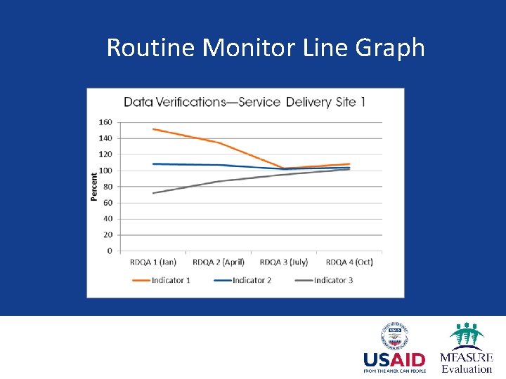
Line Graphs Ø Track outcomes from repeat data verifications and system assessments Ø Important for routine monitoring Ø Chart data by service delivery site and by district Ø Require you to build the graph yourself

Routine Monitor Line Graph

Routine Monitor Line Graph Under-reporting Over-reporting

Questions & Answers

MEASURE Evaluation is funded by the U. S. Agency for International Development (USAID) and implemented by the Carolina Population Center at the University of North Carolina at Chapel Hill in partnership with Futures Group, ICF International, John Snow, Inc. , Management Sciences for Health, and Tulane University. Views expressed in this presentation do not necessarily reflect the views of USAID or the U. S. government. MEASURE Evaluation is the USAID Global Health Bureau's primary vehicle for supporting improvements in monitoring and evaluation in population, health and nutrition worldwide.

www. measureevaluation. org