Math in Our World Section 12 2 Picturing

- Slides: 21

Math in Our World Section 12. 2 Picturing Data

Learning Objectives q Draw bar graphs and pie charts. q Draw histograms and frequency polygons. q Draw time series graphs.

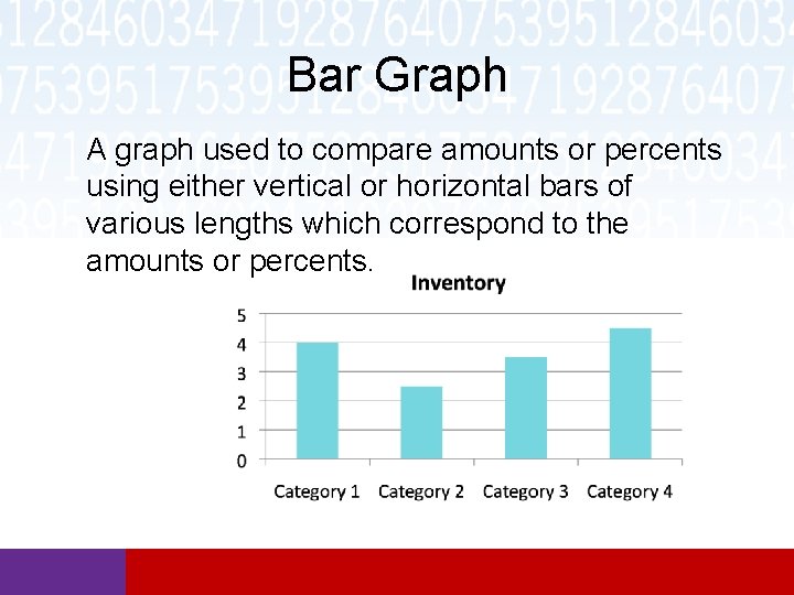
Bar Graph A graph used to compare amounts or percents using either vertical or horizontal bars of various lengths which correspond to the amounts or percents.

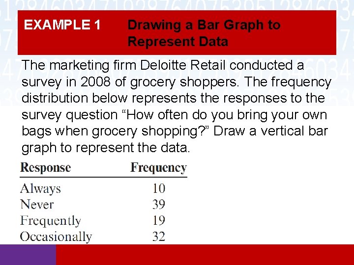
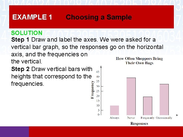
EXAMPLE 1 Drawing a Bar Graph to Represent Data The marketing firm Deloitte Retail conducted a survey in 2008 of grocery shoppers. The frequency distribution below represents the responses to the survey question “How often do you bring your own bags when grocery shopping? ” Draw a vertical bar graph to represent the data.

EXAMPLE 1 Choosing a Sample SOLUTION Step 1 Draw and label the axes. We were asked for a vertical bar graph, so the responses go on the horizontal axis, and the frequencies on the vertical. Step 2 Draw vertical bars with heights that correspond to the frequencies.

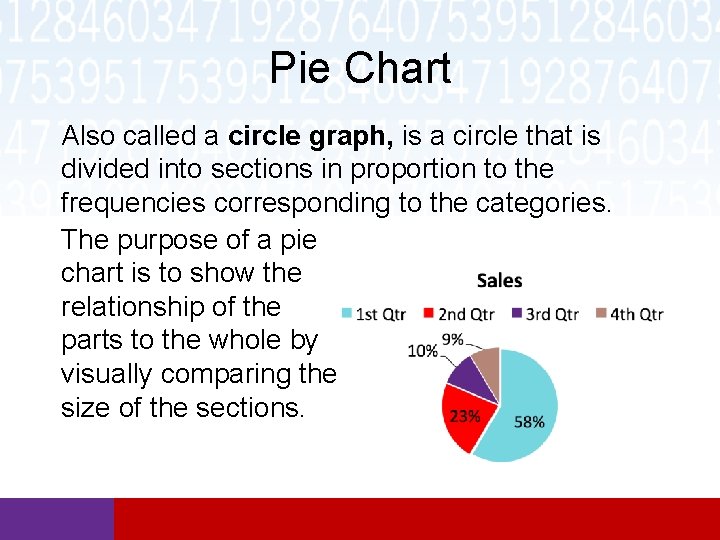
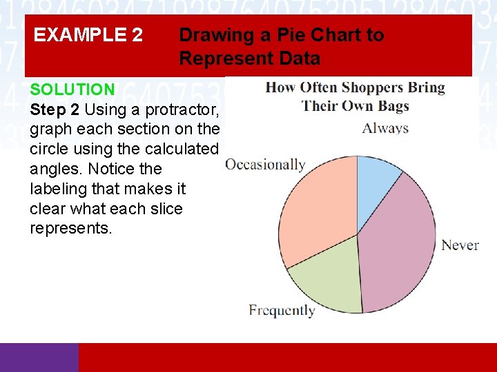
Pie Chart Also called a circle graph, is a circle that is divided into sections in proportion to the frequencies corresponding to the categories. The purpose of a pie chart is to show the relationship of the parts to the whole by visually comparing the size of the sections.

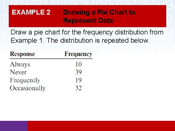
EXAMPLE 2 Drawing a Pie Chart to Represent Data Draw a pie chart for the frequency distribution from Example 1. The distribution is repeated below.

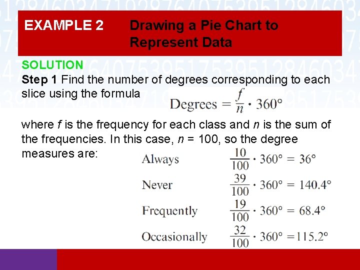
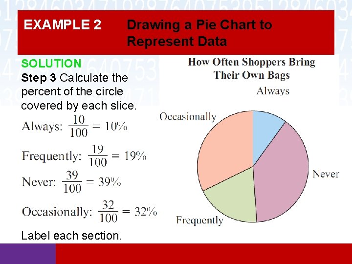
EXAMPLE 2 Drawing a Pie Chart to Represent Data SOLUTION Step 1 Find the number of degrees corresponding to each slice using the formula where f is the frequency for each class and n is the sum of the frequencies. In this case, n = 100, so the degree measures are:

EXAMPLE 2 Drawing a Pie Chart to Represent Data SOLUTION Step 2 Using a protractor, graph each section on the circle using the calculated angles. Notice the labeling that makes it clear what each slice represents.

EXAMPLE 2 Drawing a Pie Chart to Represent Data SOLUTION Step 3 Calculate the percent of the circle covered by each slice. Label each section.

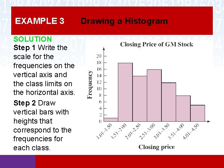
Histograms A histogram is similar to a vertical bar graph in that the heights of the bars correspond to frequencies. The difference is that class limits are placed on the horizontal axis, rather than categories.

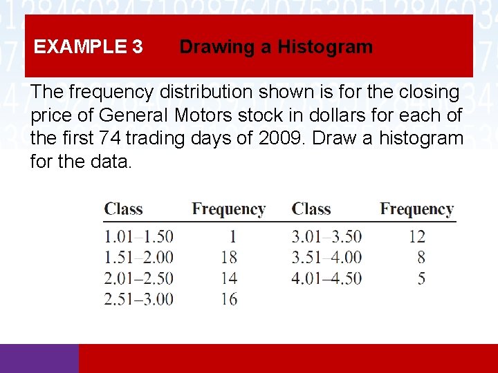
EXAMPLE 3 Drawing a Histogram The frequency distribution shown is for the closing price of General Motors stock in dollars for each of the first 74 trading days of 2009. Draw a histogram for the data.

EXAMPLE 3 SOLUTION Step 1 Write the scale for the frequencies on the vertical axis and the class limits on the horizontal axis. Step 2 Draw vertical bars with heights that correspond to the frequencies for each class. Drawing a Histogram

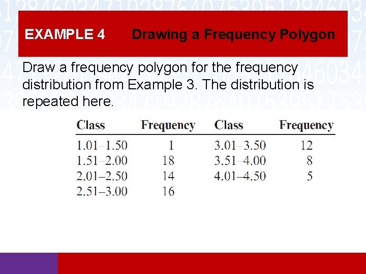
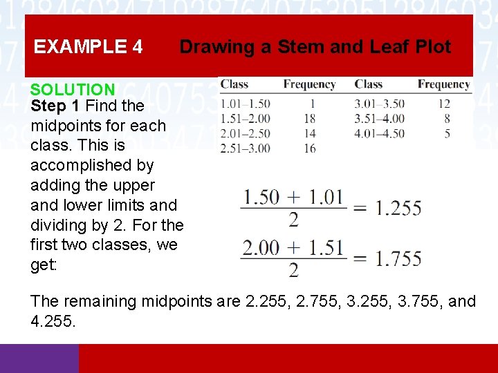
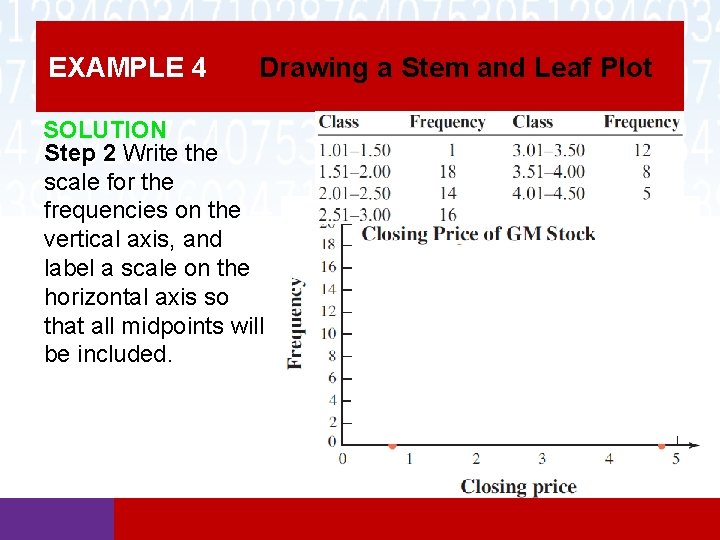
Frequency Polygons A frequency polygon is similar to a histogram, but instead of bars, a series of line segments is drawn connecting the midpoints of the classes. The heights of those points match the heights of the bars in a histogram.

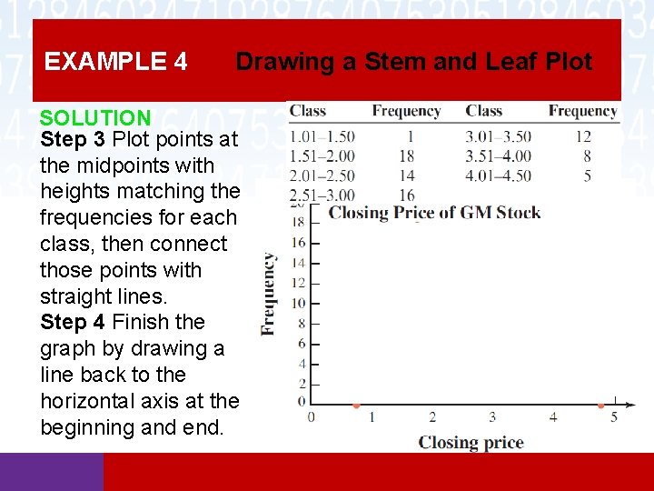
EXAMPLE 4 Drawing a Frequency Polygon Draw a frequency polygon for the frequency distribution from Example 3. The distribution is repeated here.

EXAMPLE 4 Drawing a Stem and Leaf Plot SOLUTION Step 1 Find the midpoints for each class. This is accomplished by adding the upper and lower limits and dividing by 2. For the first two classes, we get: The remaining midpoints are 2. 255, 2. 755, 3. 255, 3. 755, and 4. 255.

EXAMPLE 4 Drawing a Stem and Leaf Plot SOLUTION Step 2 Write the scale for the frequencies on the vertical axis, and label a scale on the horizontal axis so that all midpoints will be included.

EXAMPLE 4 Drawing a Stem and Leaf Plot SOLUTION Step 3 Plot points at the midpoints with heights matching the frequencies for each class, then connect those points with straight lines. Step 4 Finish the graph by drawing a line back to the horizontal axis at the beginning and end.

Time Series Graphs A time series graph can be drawn for data collected over a period of time. This type of graph is used primarily to show trends, like prices rising or falling, for the time period. There are three types of trends. Secular trends are viewed over a long period of time, such as yearly. Cyclical trends show oscillating patterns. Seasonal trends show the values of a commodity for shorter periods of the year, such as fall, winter, spring, and summer.

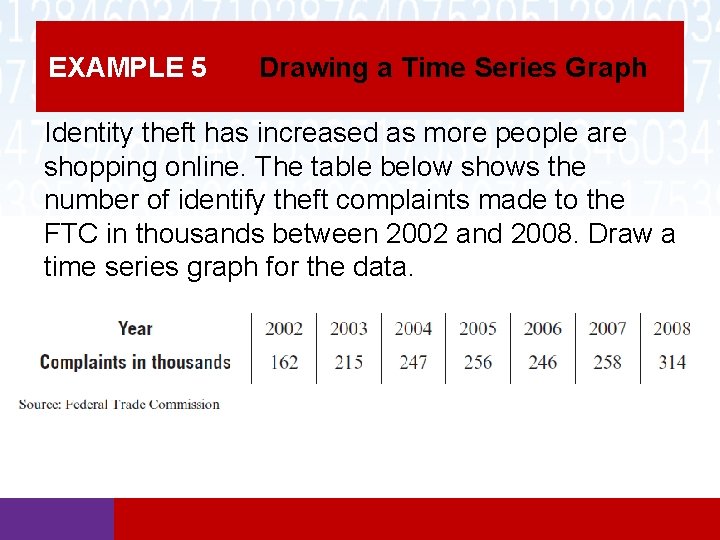
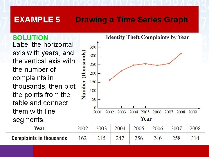
EXAMPLE 5 Drawing a Time Series Graph Identity theft has increased as more people are shopping online. The table below shows the number of identify theft complaints made to the FTC in thousands between 2002 and 2008. Draw a time series graph for the data.

EXAMPLE 5 Drawing a Time Series Graph SOLUTION Label the horizontal axis with years, and the vertical axis with the number of complaints in thousands, then plot the points from the table and connect them with line segments.