MAP PATTERN COMPARISON A basic tool of geographic

MAP PATTERN COMPARISON A basic tool of geographic analysis
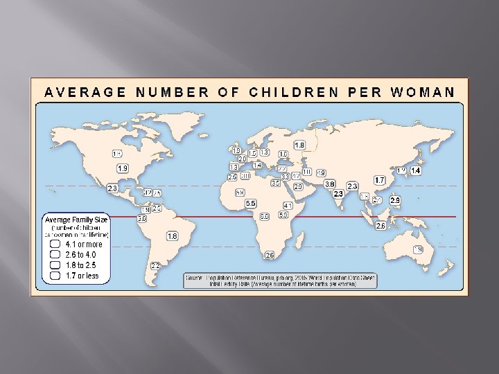


How do these two maps compare?

The key to making a scientific comparison of map patterns is to make a data form where you can write the names of the countries (or states, etc. )

Step 1. Identify all the countries in the top group on one map.

Step 1. Identify all the countries in the top group on one map. One way to do this is to choose a color sequence and color the boxes. Your colors should follow the cartographic rule: “darker means more. ”

Step 1. Identify all the countries in the top group on one map. An easier way is to color only the top group. Eventually, you can train yourself to “see” the group without coloring it.

Step 2. Pick any country in the top group on one map and find it on the other map.

Step 2. Pick any country in the top group on one map and find it on the other map.

Step 3. See what group this country is in on the second map.

Step 3. If you need to, find the name of that country on a reference map.

Congo Step 4. Write the name of the country in the proper box on the data form.

Step 5. Continue until you have done all the countries in both the top and bottom group on one map.

Step 6. Examine your data form. If all the country names Butlower if all left the and country names are in the upper right boxes, are inmap the upper leftare andpositively lower right boxes, the patterns related the(high map on patterns negatively related one isare high on the other, (high on low one on is low the other, vice versa). oneon is low on theand other).

Step 7. Try to interpret your results. In this example, it makes sense that a country where women have a lot of children would also have many people under age 15. We chose a simple example so that we could focus on the skill.

Conclusion Map pattern comparison can be a powerful tool for geographic analysis. It can help us identify relationships that are worth investigating, You get the point. . . even for topics that might be quite controversial. you can use this tool For example, . . . you could compare maps that show: to investigate a lot of topics Gasoline taxes roadcan condition in different states whereand people have very strong opinions. Average income and Democratic or Republican vote When you do this, you must remember on thing: Marijuana use and suicide in different towns correlation does not always mean causation. Surveillance cameras and crime on street corners Even when it does, Indoor rock concerts and hearing loss you still have to investigate to figure out what is laws the cause Gun registration and murder rates and what is the effect! Income taxes and job creation in different states

P. S. If you have the time, you can make your investigation more accurate by writing the names of every country on the map in the proper box on a more detailed data form

If you do that for the two maps in this presentation, you get a pattern that is still positively correlated, but there are some countries that are higher on one map than you would expect based on their score on the other map. This can be a lot of work if you do it by hand. Fortunately, there are computer programs that do the analysis quickly and accurately. You still have to know how to interpret the results! Bonus: A good map reader can learn how to do it “by eye” and get fairly accurate results. That’s a worthwhile skill to have!

- Slides: 20