
MAP ELEMENTS Cartographic Design for GIS Geog 340



- Slides: 108
MAP ELEMENTS Cartographic Design for GIS (Geog. 340) Prof. Hugh Howard American River College
PRELUDE: ALIGNMENT and CENTERING
ALIGNMENT and CENTERING • • Alignment and centering of map features is a common task Can be performed through “visual approximation” – Features look properly aligned or centered • Can also be performed through precise measurement – Features are exactly aligned or centered, using software controls
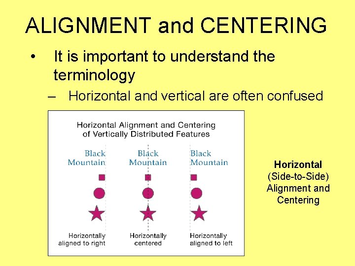
ALIGNMENT and CENTERING • It is important to understand the terminology – Horizontal and vertical are often confused Horizontal (Side-to-Side) Alignment and Centering
ALIGNMENT and CENTERING • It is important to understand the terminology (cont. ) – Horizontal and vertical are often confused Vertical (Top-to-Bottom) Alignment and Centering
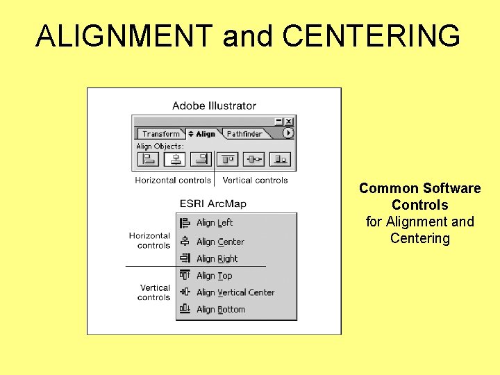
ALIGNMENT and CENTERING Common Software Controls for Alignment and Centering
INTRODUCTION to MAP ELEMENTS
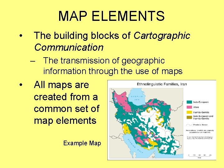
MAP ELEMENTS • The building blocks of Cartographic Communication – The transmission of geographic information through the use of maps • All maps are created from a common set of map elements Example Map
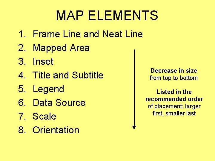
MAP ELEMENTS 1. 2. 3. 4. 5. 6. 7. 8. Frame Line and Neat Line Mapped Area Inset Decrease in size Title and Subtitle from top to bottom Legend Listed in the recommended order Data Source of placement: larger first, smaller last Scale Orientation
MAP ELEMENTS • Available Space – Areas on a page or screen that can be used to place map elements – “White Space” • The cartographer constantly evaluates the relationship between map elements and available space – Map elements are often visually centered within appropriate areas of available space
MAP ELEMENTS • It is the cartographer’s job to make all decisions regarding map elements – Which to include, and which to omit – How to implement them in the most appropriate manner • Virtually every decision the cartographer makes is guided by – The map user (the intended audience) – The purpose of the map
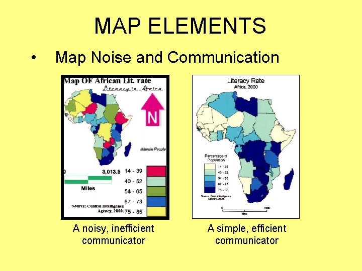
MAP ELEMENTS • Map Noise – Inappropriate symbolization, design, and typography that interfere with the map user’s ability to interpret the map • A goal of Cartographic Design – Is to minimize map noise, and create maps that efficiently communicate geographic information
MAP ELEMENTS • Map Noise and Communication A noisy, inefficient communicator A simple, efficient communicator
MAP ELEMENTS • • I will present many rules and guidelines relating to map elements Rules and guidelines are derived from – – Convention Research Common Sense To a lesser degree, my opinion, and the opinions of my peers
MAP ELEMENTS • Follow these rules and guidelines – Break the rules only after a foundation of knowledge and experience has been built • Always be prepared to explain or defend your design decisions – Think carefully about everything you do – Do not do something simply because you saw it on another map – Do not passively accept software defaults
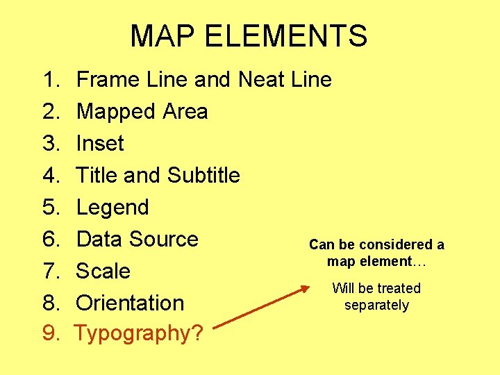
MAP ELEMENTS 1. 2. 3. 4. 5. 6. 7. 8. 9. Frame Line and Neat Line Mapped Area Inset Title and Subtitle Legend Data Source Can be considered a map element… Scale Will be treated separately Orientation Typography?
FRAME LINE and NEAT LINE
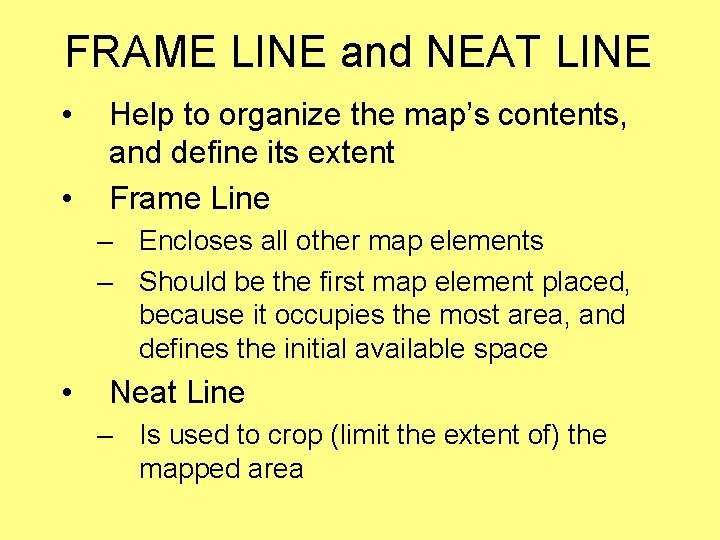
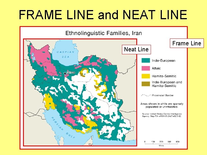
FRAME LINE and NEAT LINE • • Help to organize the map’s contents, and define its extent Frame Line – Encloses all other map elements – Should be the first map element placed, because it occupies the most area, and defines the initial available space • Neat Line – Is used to crop (limit the extent of) the mapped area
FRAME LINE and NEAT LINE Neat Line Frame Line
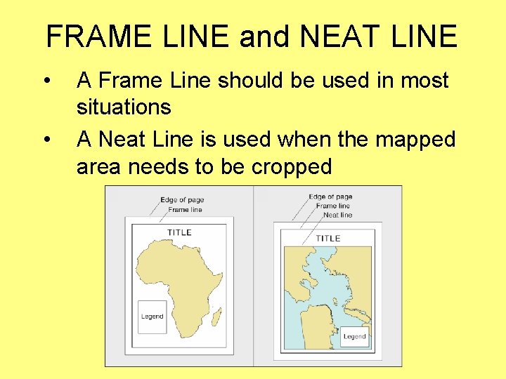
FRAME LINE and NEAT LINE • • A Frame Line should be used in most situations A Neat Line is used when the mapped area needs to be cropped
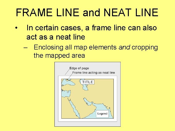
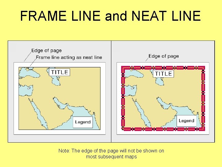
FRAME LINE and NEAT LINE • In certain cases, a frame line can also act as a neat line – Enclosing all map elements and cropping the mapped area
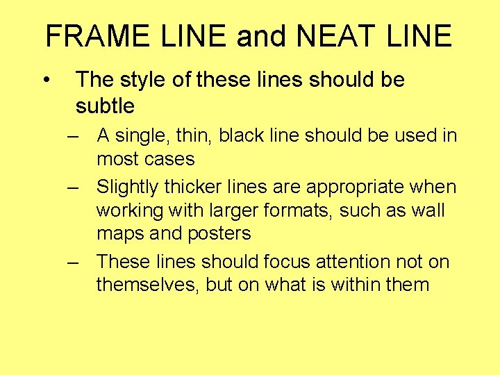
FRAME LINE and NEAT LINE • The style of these lines should be subtle – A single, thin, black line should be used in most cases – Slightly thicker lines are appropriate when working with larger formats, such as wall maps and posters – These lines should focus attention not on themselves, but on what is within them
FRAME LINE and NEAT LINE Note: The edge of the page will not be shown on most subsequent maps
MAPPED AREA
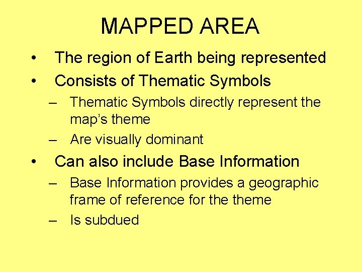
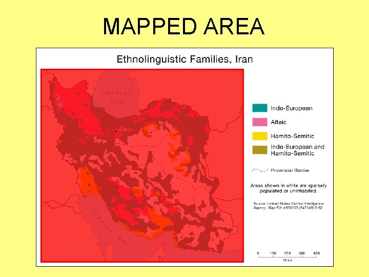
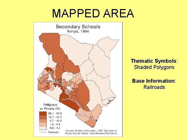
MAPPED AREA • • The region of Earth being represented Consists of Thematic Symbols – Thematic Symbols directly represent the map’s theme – Are visually dominant • Can also include Base Information – Base Information provides a geographic frame of reference for theme – Is subdued
MAPPED AREA
MAPPED AREA Thematic Symbols: Shaded Polygons Base Information: Railroads
MAPPED AREA • There are two varieties of mapped area, distinguished by how they represent the geographic region of interest – Floating – Cropped
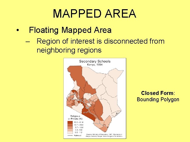
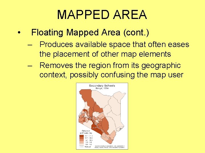
MAPPED AREA • Floating Mapped Area – Region of interest is disconnected from neighboring regions Closed Form: Bounding Polygon
MAPPED AREA • Floating Mapped Area (cont. ) – Produces available space that often eases the placement of other map elements – Removes the region from its geographic context, possibly confusing the map user
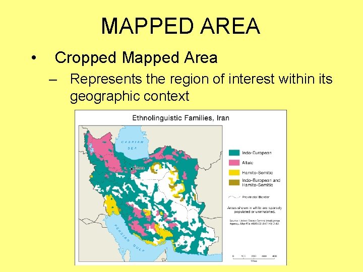
MAPPED AREA • Cropped Mapped Area – Represents the region of interest within its geographic context
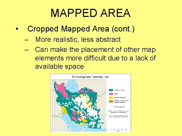
MAPPED AREA • Cropped Mapped Area (cont. ) – More realistic, less abstract – Can make the placement of other map elements more difficult due to a lack of available space
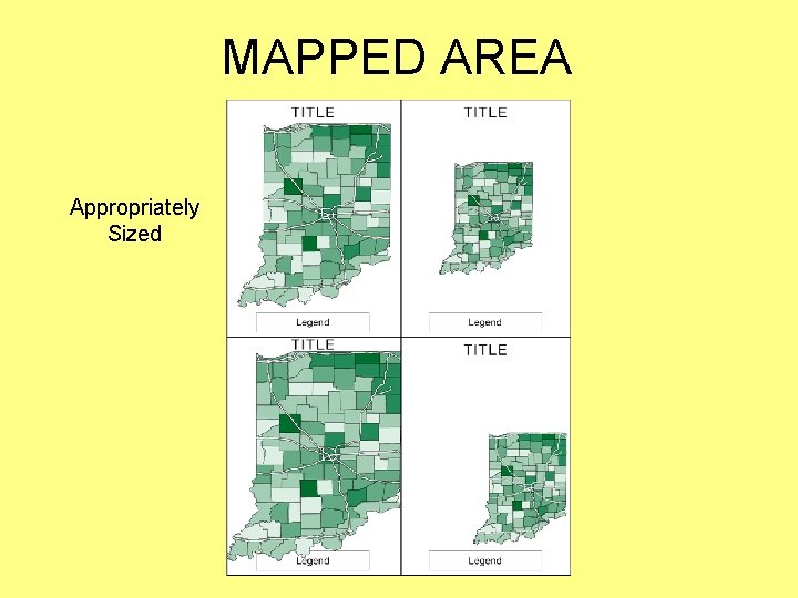
MAPPED AREA • Make the mapped area as large as possible within the available space – Without being “too close” to the frame line – While leaving ample room for the remaining map elements • Maximum area is important – The mapped area—thematic symbols in particular—is instrumental in communicating the map’s information
MAPPED AREA Appropriately Sized
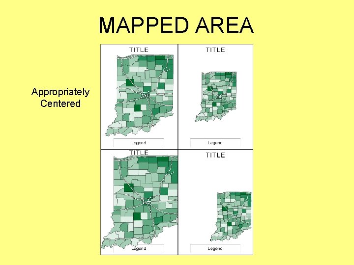
MAPPED AREA • Try to visually center the mapped area both horizontally (side-to-side) and vertically (top-to-bottom) – Within the available space, as defined by the frame line • This will not always result in an appropriate placement – But should be tried first
MAPPED AREA Appropriately Centered
INSET
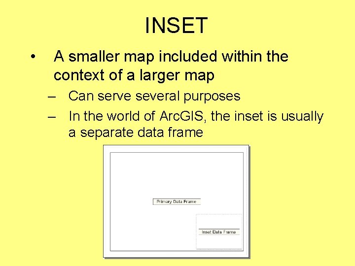
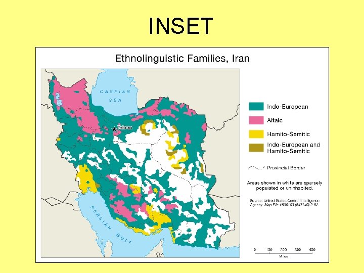
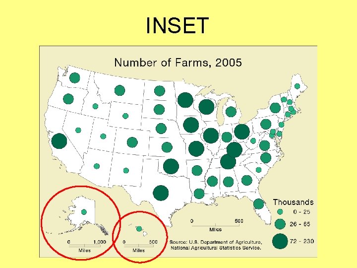
INSET • A smaller map included within the context of a larger map – Can serve several purposes – In the world of Arc. GIS, the inset is usually a separate data frame
INSET
INSET
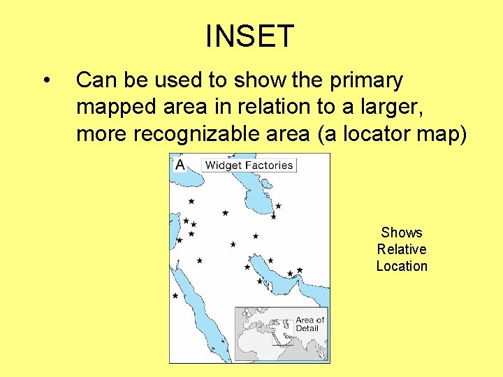
INSET • Can be used to show the primary mapped area in relation to a larger, more recognizable area (a locator map) Shows Relative Location
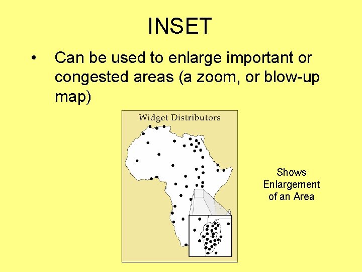
INSET • Can be used to enlarge important or congested areas (a zoom, or blow-up map) Shows Enlargement of an Area
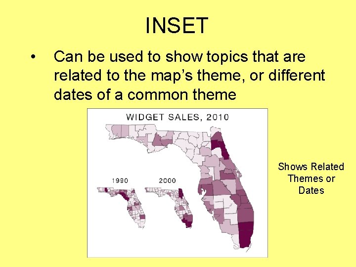
INSET • Can be used to show topics that are related to the map’s theme, or different dates of a common theme Shows Related Themes or Dates
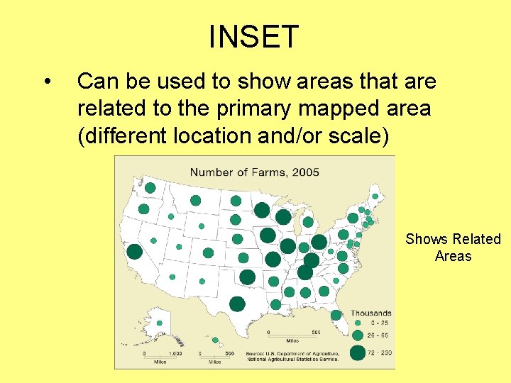
INSET • Can be used to show areas that are related to the primary mapped area (different location and/or scale) Shows Related Areas
TITLE and SUBTITLE
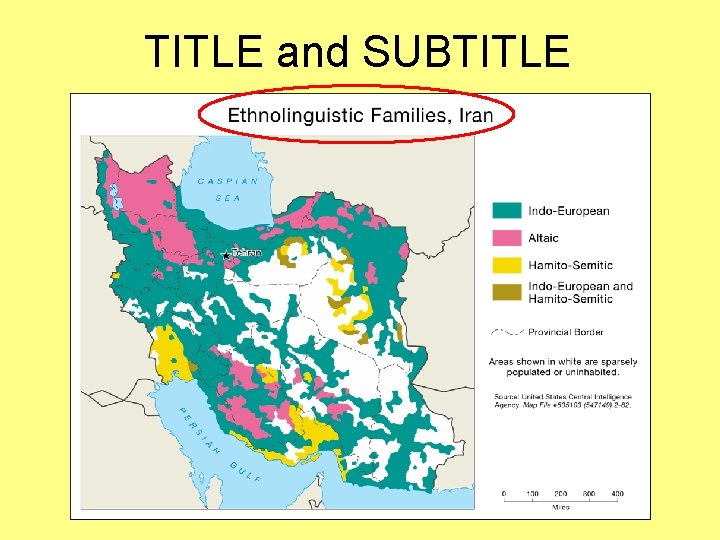
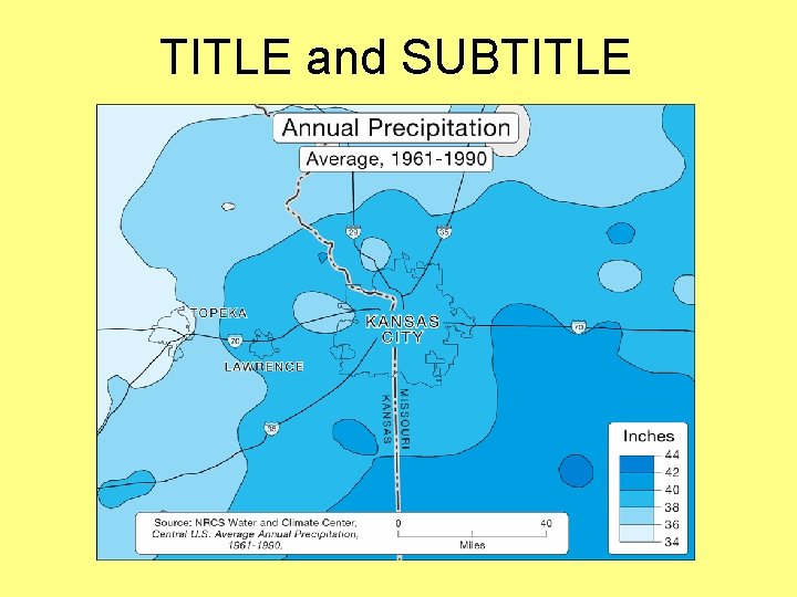
TITLE and SUBTITLE • • The title and subtitle tell the map user what the map is about Most thematic maps require a title – A title is sometimes omitted when a map is used as a figure in a written document, assuming that the title is clearly expressed in the figure caption – A well-crafted title can draw attention to a map
TITLE and SUBTITLE
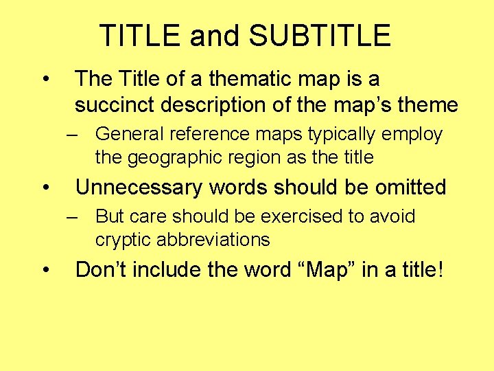
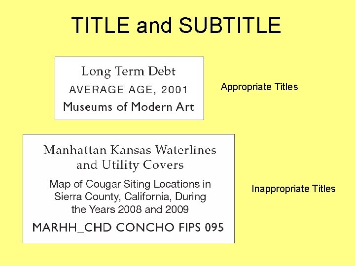
TITLE and SUBTITLE • The Title of a thematic map is a succinct description of the map’s theme – General reference maps typically employ the geographic region as the title • Unnecessary words should be omitted – But care should be exercised to avoid cryptic abbreviations • Don’t include the word “Map” in a title!
TITLE and SUBTITLE Appropriate Titles Inappropriate Titles
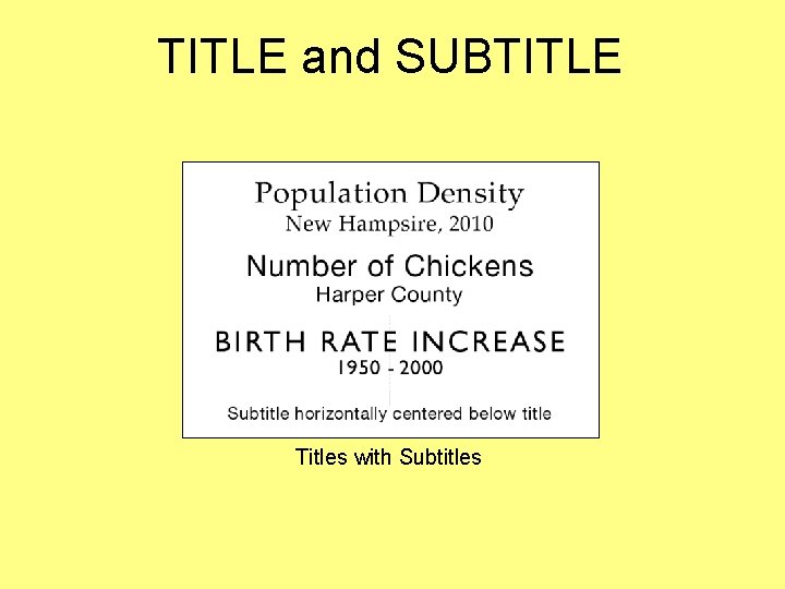
TITLE and SUBTITLE • The subtitle, if employed, is used to further explain the title – The geographic region and date are common components of the subtitle – The geographic region is often omitted (when it is easily identifiable) • The subtitle should be horizontally centered below the title (center justified)
TITLE and SUBTITLE Titles with Subtitles
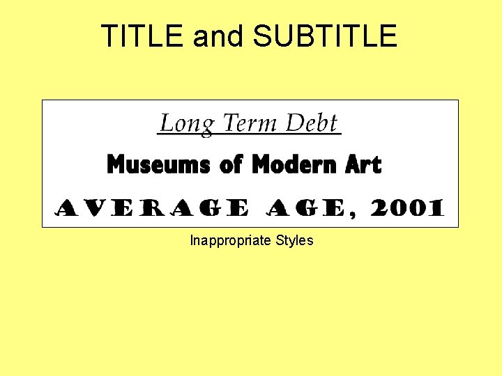
TITLE and SUBTITLE • The style of the Title and Subtitle should be plain – Avoid italics and ornate type styles – Think twice about using bold (not required if appropriate type sizes are chosen) – Use a subtle bounding box around the title and subtitle only if it is necessary to mask the underlying mapped area to improve legibility
TITLE and SUBTITLE Inappropriate Styles
TITLE and SUBTITLE • The title should generally be the largest type on a thematic map – The subtitle should be visibly smaller • • Both the title and subtitle should be limited to one line each in most cases If possible, place the title at top-center, where the map user is accustomed to seeing titles
TITLE and SUBTITLE
LEGEND
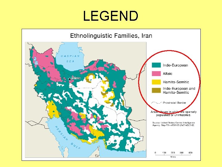
LEGEND • Defines the symbols found on a map – On a thematic map, thematic symbols are defined, in addition to symbols for base information that are not self-explanatory – Legends for general reference maps often define all symbols found on the map— even if self-explanatory
LEGEND
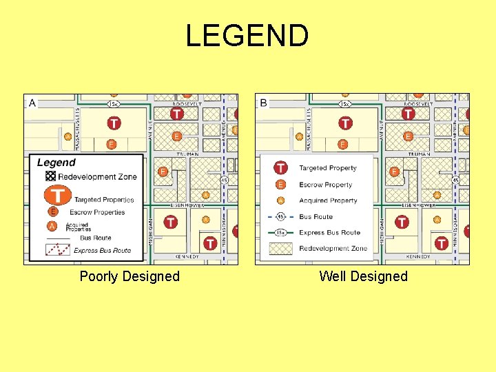
LEGEND • The style of the legend should be clear and straightforward – Use a subtle bounding box around the legend only if necessary • Ensure that symbols in the legend are identical to those found within the mapped area – This includes size, color, and orientation • Don’t include the word “Legend”!
LEGEND Poorly Designed Well Designed
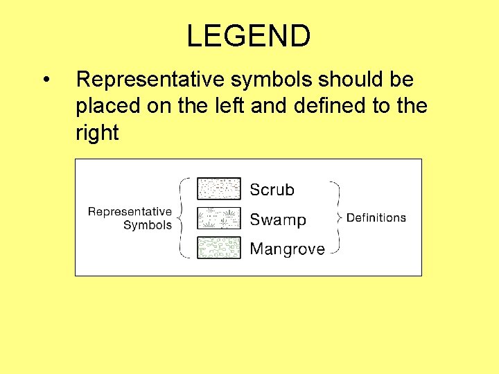
LEGEND • Representative symbols should be placed on the left and defined to the right
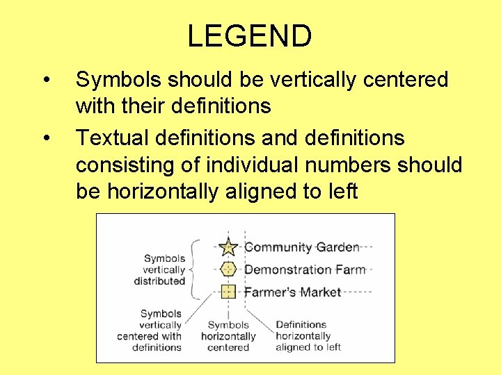
LEGEND • • Symbols should be vertically centered with their definitions Textual definitions and definitions consisting of individual numbers should be horizontally aligned to left
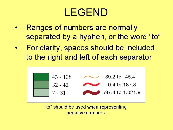
LEGEND • • Ranges of numbers are normally separated by a hyphen, or the word “to” For clarity, spaces should be included to the right and left of each separator “to” should be used when representing negative numbers
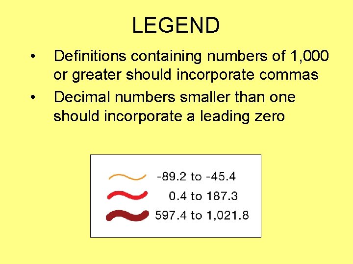
LEGEND • • Definitions containing numbers of 1, 000 or greater should incorporate commas Decimal numbers smaller than one should incorporate a leading zero
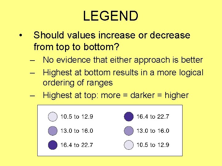
LEGEND • Should values increase or decrease from top to bottom? – No evidence that either approach is better – Highest at bottom results in a more logical ordering of ranges – Highest at top: more = darker = higher
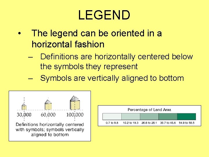
LEGEND • The legend can be oriented in a horizontal fashion – Definitions are horizontally centered below the symbols they represent – Symbols are vertically aligned to bottom
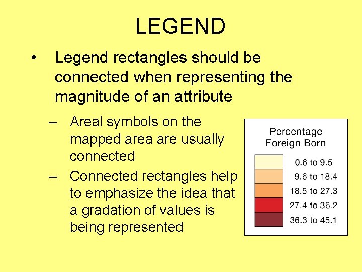
LEGEND • Legend rectangles should be connected when representing the magnitude of an attribute – Areal symbols on the mapped area are usually connected – Connected rectangles help to emphasize the idea that a gradation of values is being represented
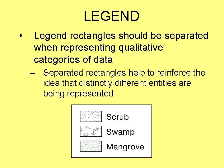
LEGEND • Legend rectangles should be separated when representing qualitative categories of data – Separated rectangles help to reinforce the idea that distinctly different entities are being represented
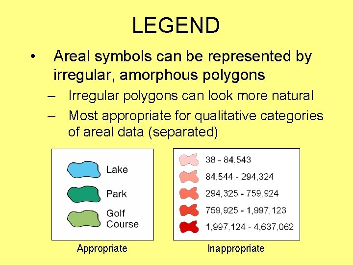
LEGEND • Areal symbols can be represented by irregular, amorphous polygons – Irregular polygons can look more natural – Most appropriate for qualitative categories of areal data (separated) Appropriate Inappropriate
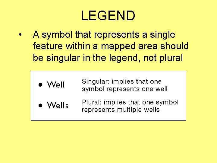
LEGEND • A symbol that represents a single feature within a mapped area should be singular in the legend, not plural
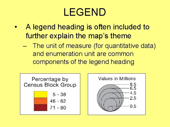
LEGEND • A legend heading is often included to further explain the map’s theme – The unit of measure (for quantitative data) and enumeration unit are common components of the legend heading
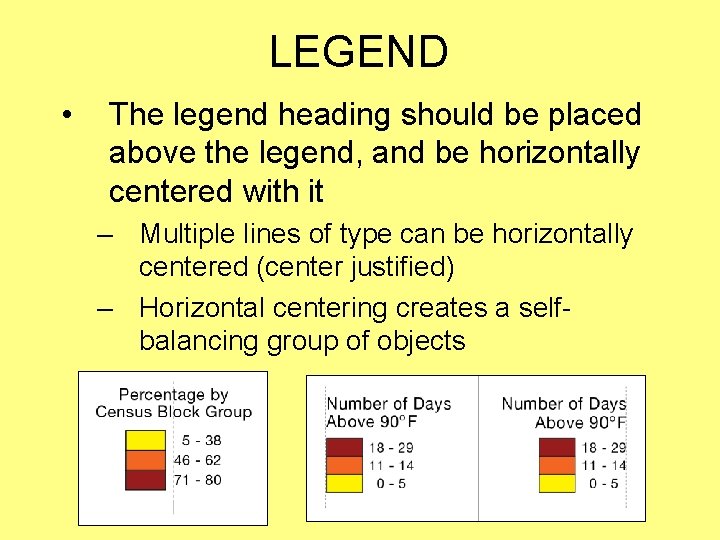
LEGEND • The legend heading should be placed above the legend, and be horizontally centered with it – Multiple lines of type can be horizontally centered (center justified) – Horizontal centering creates a selfbalancing group of objects
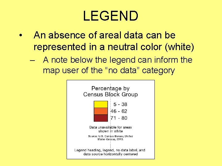
LEGEND • An absence of areal data can be represented in a neutral color (white) – A note below the legend can inform the map user of the “no data” category
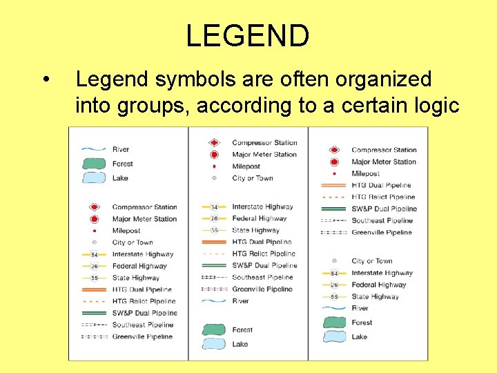
LEGEND • Legend symbols are often organized into groups, according to a certain logic
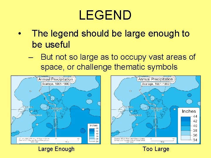
LEGEND • The legend should be large enough to be useful – But not so large as to occupy vast areas of space, or challenge thematic symbols Large Enough Too Large
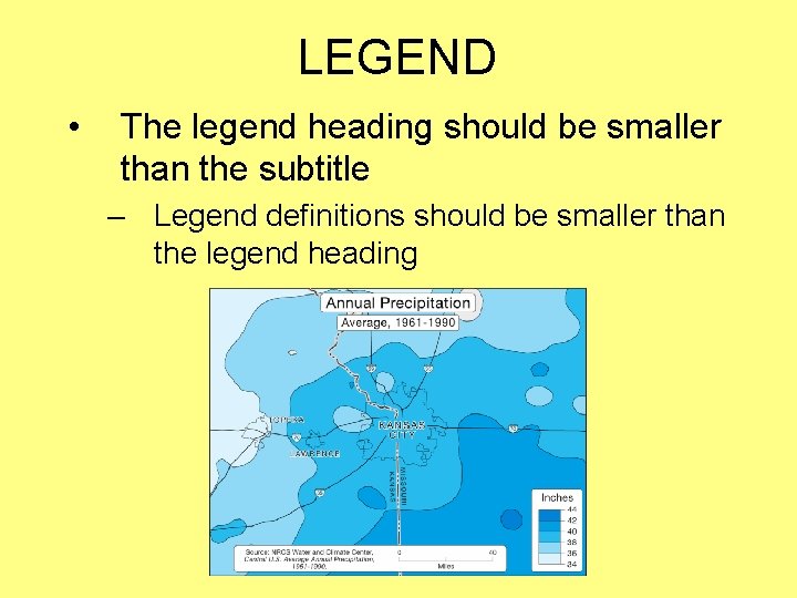
LEGEND • The legend heading should be smaller than the subtitle – Legend definitions should be smaller than the legend heading
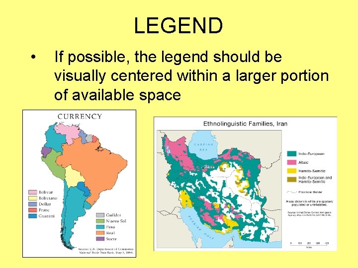
LEGEND • If possible, the legend should be visually centered within a larger portion of available space
DATA SOURCE
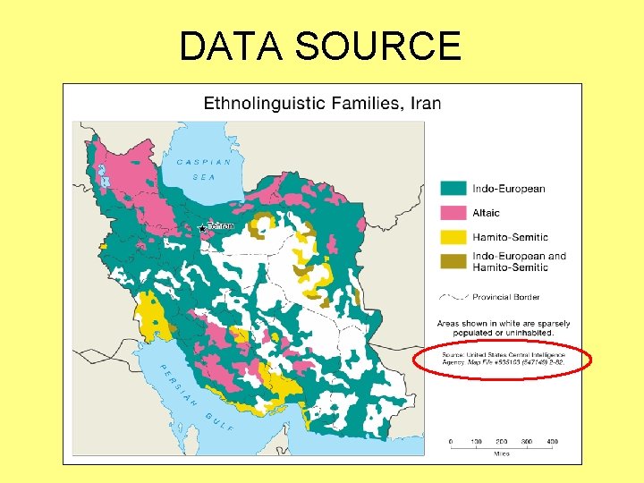
DATA SOURCE • Allows the map user to determine where thematic data were obtained – Sources of base information are normally omitted from thematic maps • Should be formatted similar to a standard bibliographic reference – But is often more concise and less formal
DATA SOURCE
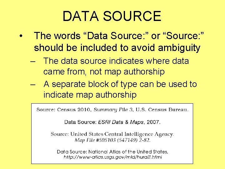
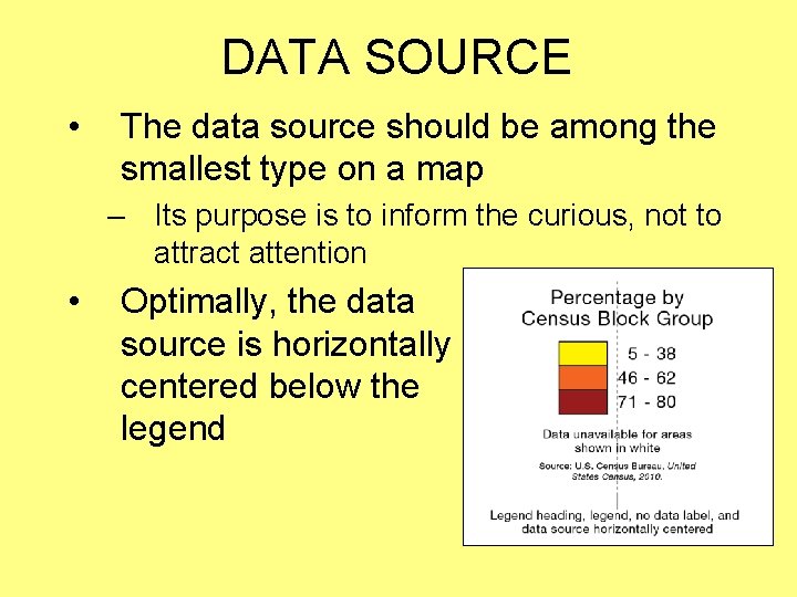
DATA SOURCE • The words “Data Source: ” or “Source: ” should be included to avoid ambiguity – The data source indicates where data came from, not map authorship – A separate block of type can be used to indicate map authorship
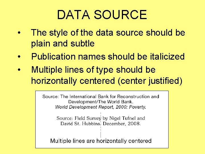
DATA SOURCE • • • The style of the data source should be plain and subtle Publication names should be italicized Multiple lines of type should be horizontally centered (center justified)
DATA SOURCE • The data source should be among the smallest type on a map – Its purpose is to inform the curious, not to attract attention • Optimally, the data source is horizontally centered below the legend
SCALE
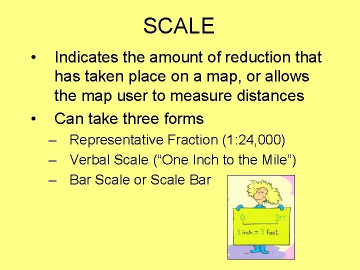
SCALE • • Indicates the amount of reduction that has taken place on a map, or allows the map user to measure distances Can take three forms – Representative Fraction (1: 24, 000) – Verbal Scale (“One Inch to the Mile”) – Bar Scale or Scale Bar
SCALE
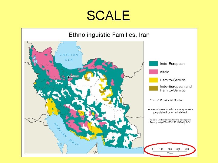
SCALE • The bar scale is the preferred format for inclusion on a thematic map – Resembles a ruler that can easily be used to measure distances on a map – Remains true when a map is enlarged or reduced (representative fractions and verbal scales don’t)
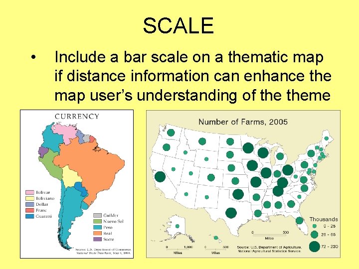
SCALE • Include a bar scale on a thematic map if distance information can enhance the map user’s understanding of theme
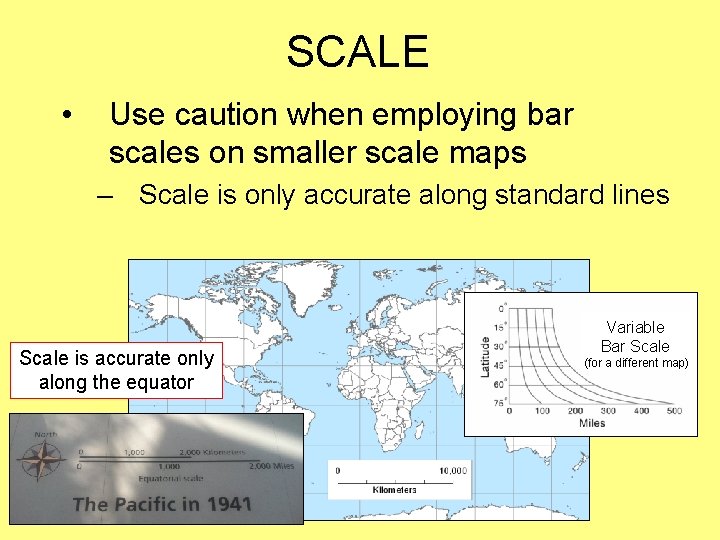
SCALE • Use caution when employing bar scales on smaller scale maps – Scale is only accurate along standard lines Scale is accurate only along the equator Variable Bar Scale (for a different map)
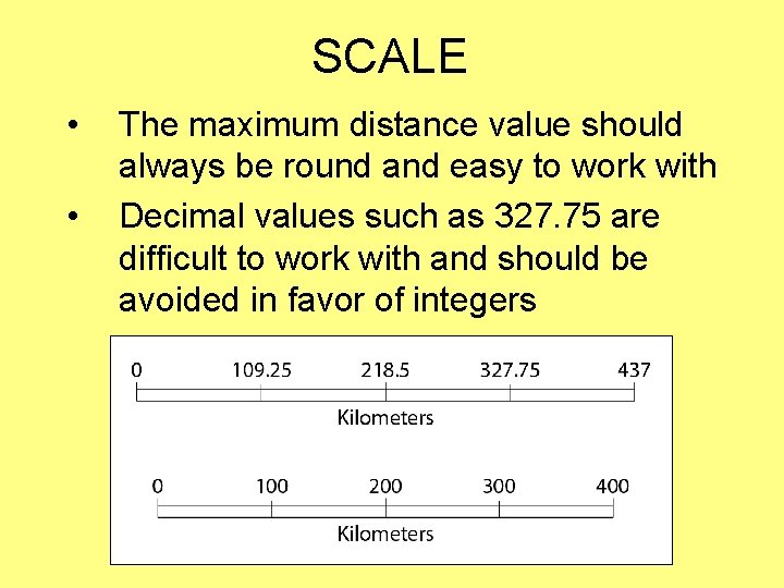
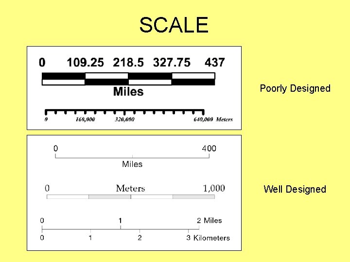
SCALE • • The maximum distance value should always be round and easy to work with Decimal values such as 327. 75 are difficult to work with and should be avoided in favor of integers
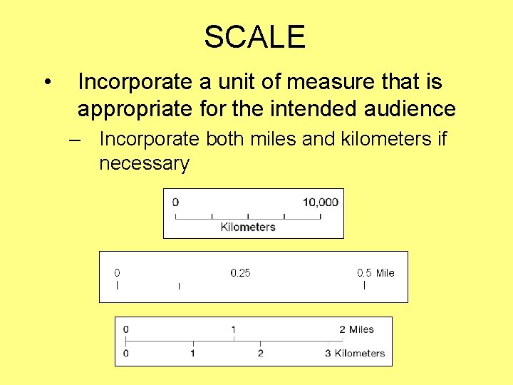
SCALE • Incorporate a unit of measure that is appropriate for the intended audience – Incorporate both miles and kilometers if necessary
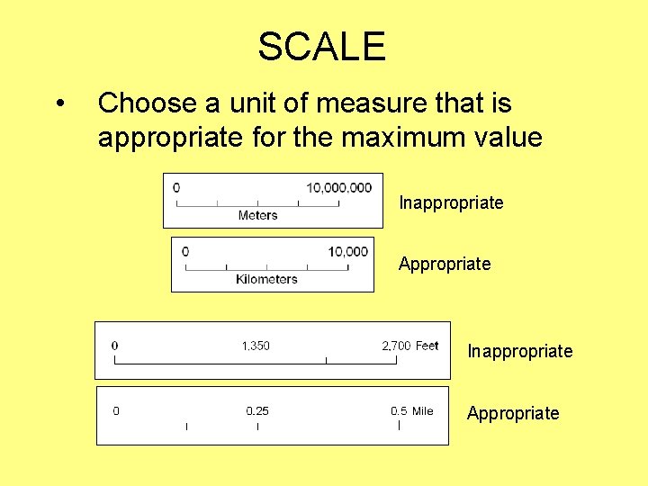
SCALE • Choose a unit of measure that is appropriate for the maximum value Inappropriate Appropriate
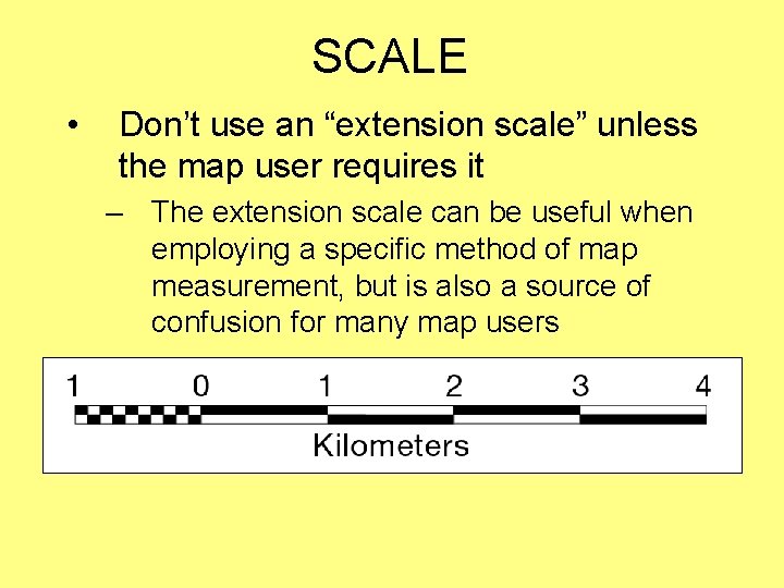
SCALE • Don’t use an “extension scale” unless the map user requires it – The extension scale can be useful when employing a specific method of map measurement, but is also a source of confusion for many map users
SCALE • The style of the bar scale should be simple and subtle; it should not attract attention – Bulky and complex designs should be avoided – Line weights should be fine and type should be among the smallest on a map – Avoid the use of bold and italic type styles – Include a small number of intermediate tic marks
SCALE Poorly Designed Well Designed
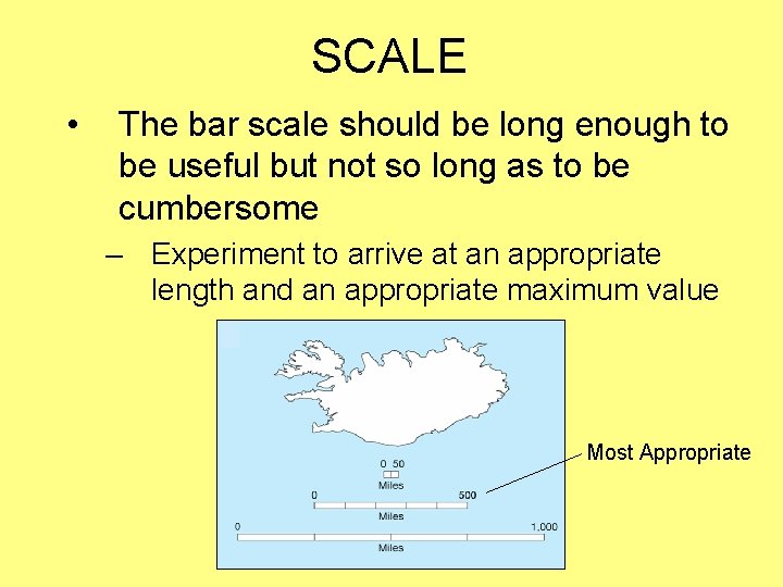
SCALE • The bar scale should be long enough to be useful but not so long as to be cumbersome – Experiment to arrive at an appropriate length and an appropriate maximum value Most Appropriate
ORIENTATION
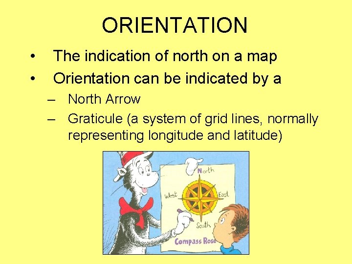
ORIENTATION • • The indication of north on a map Orientation can be indicated by a – North Arrow – Graticule (a system of grid lines, normally representing longitude and latitude)
ORIENTATION
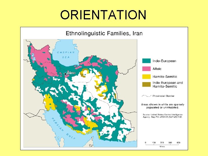
ORIENTATION • A north arrow is not required on every map! – The orientation of maps with north at the top is a long-standing tradition – It is assumed that “north is at the top” of most modern maps
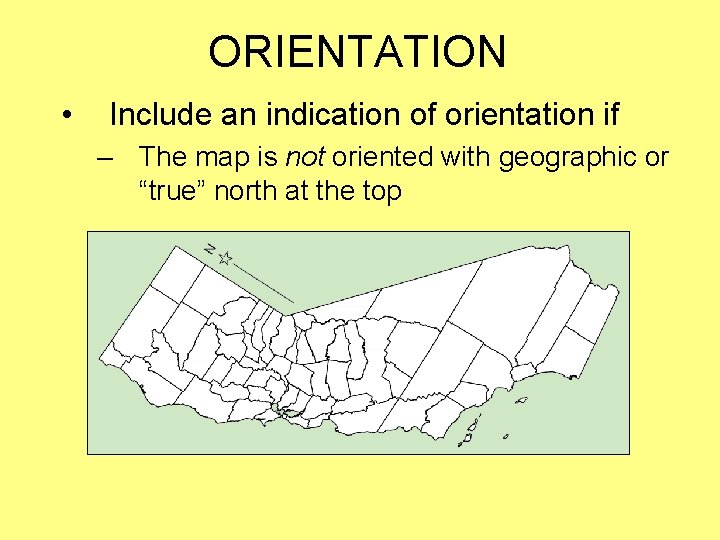
ORIENTATION • Include an indication of orientation if – The map is not oriented with geographic or “true” north at the top
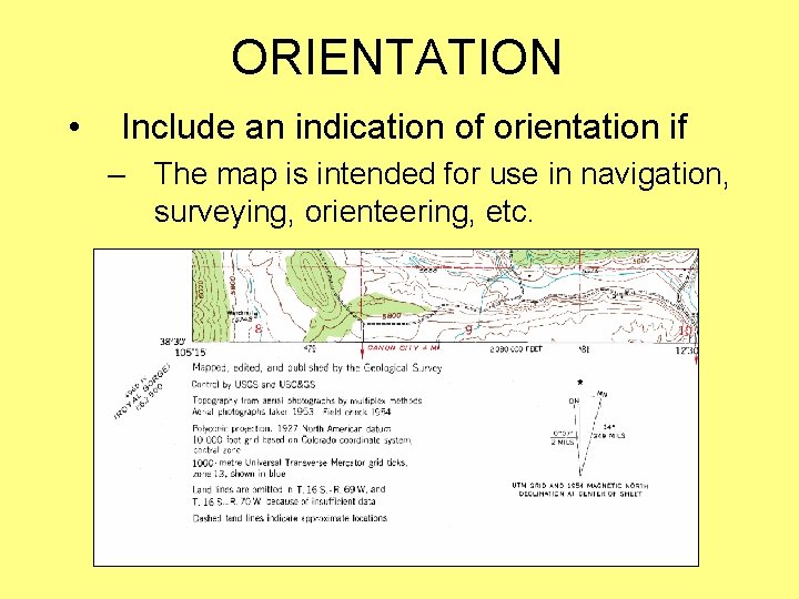
ORIENTATION • Include an indication of orientation if – The map is intended for use in navigation, surveying, orienteering, etc.
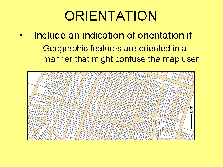
ORIENTATION • Include an indication of orientation if – Geographic features are oriented in a manner that might confuse the map user
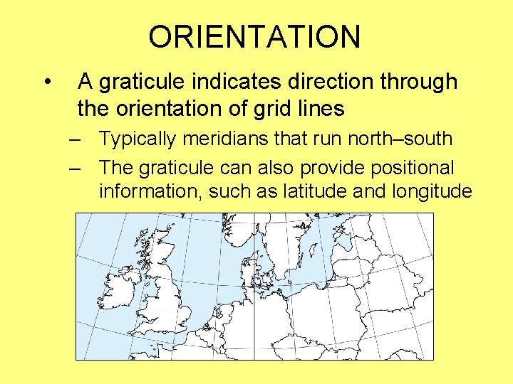
ORIENTATION • A graticule indicates direction through the orientation of grid lines – Typically meridians that run north–south – The graticule can also provide positional information, such as latitude and longitude
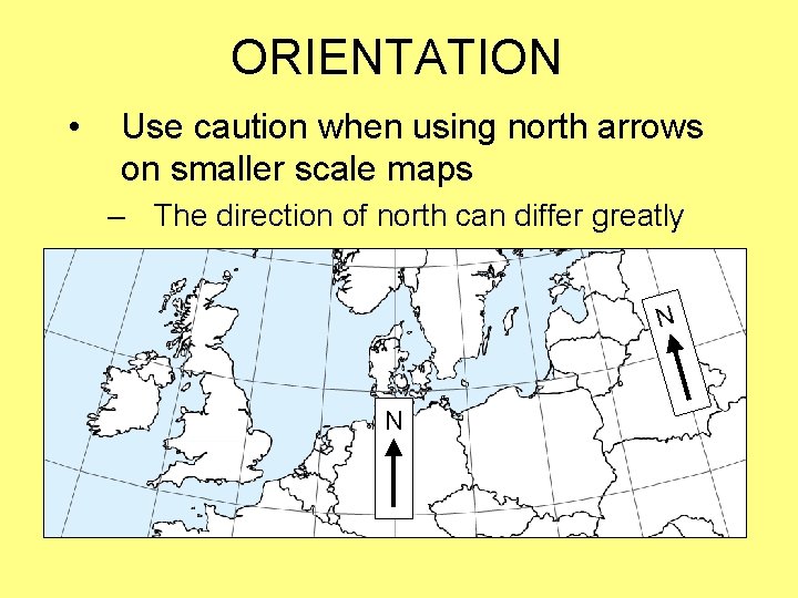
ORIENTATION • Use caution when using north arrows on smaller scale maps – The direction of north can differ greatly N N
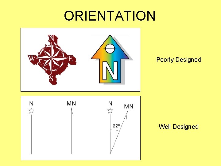
ORIENTATION • The style of the north arrow and graticule should be simple and subtle; they should not attract attention – Bulky and complex designs should be avoided – Line weights should be fine and type should be among the smallest on a map – Only north should be indicated (if necessary, the map user can infer the other cardinal directions)
ORIENTATION Poorly Designed Well Designed
MAP ELEMENTS Cartographic Design for GIS (Geog. 340) Prof. Hugh Howard American River College