Map Basic principles of cartographic design Makram Muradalshaikh
Map Basic principles of cartographic design Makram Murad-al-shaikh M. S. Cartography Esri education delivery team
Cartographic concepts • Cartography defined • The communication channel - Why maps fail • Objectives & limitations affecting design • Cartographic design issues • Abuse of GIS cartography Map
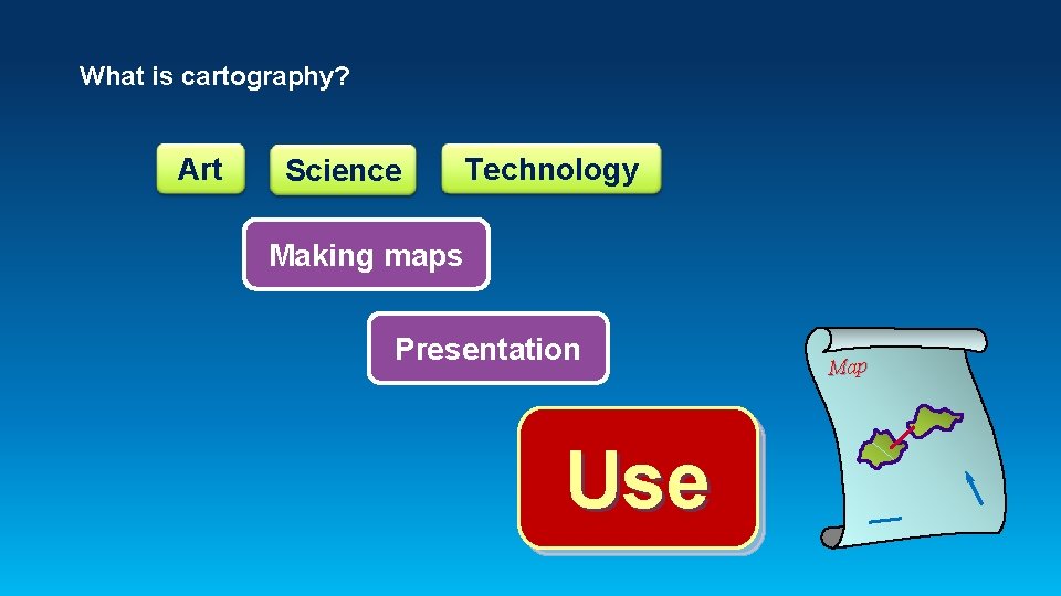
What is cartography? Art Science Technology Making maps Presentation Use Map
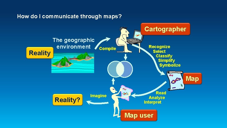
How do I communicate through maps? Cartographer Reality The geographic environment Recognize Select Classify Simplify Symbolize Compile Map Reality? Imagine Read Analyze Interpret Map user Map
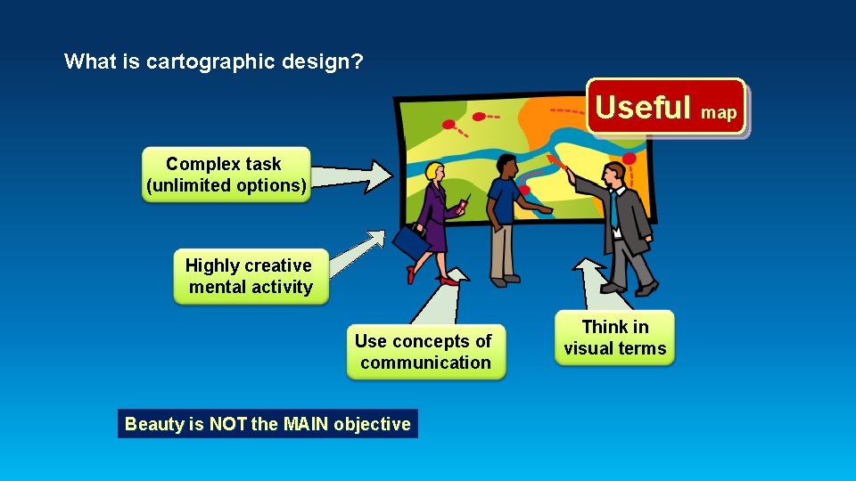
What is cartographic design? Useful map Complex task (unlimited options) Highly creative mental activity Use concepts of communication Beauty is NOT the MAIN objective Think in visual terms
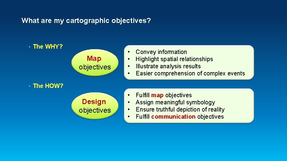
What are my cartographic objectives? • • The WHY? Map objectives • • Convey information Highlight spatial relationships Illustrate analysis results Easier comprehension of complex events Design objectives • • Fulfill map objectives Assign meaningful symbology Ensure truthful depiction of reality Fulfill communication objectives The HOW?
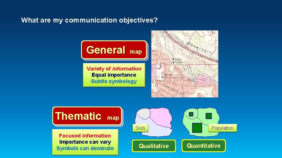
What are my communication objectives? General map Variety of information Equal importance Subtle symbology Thematic map Soils Focused information Importance can vary Symbols can dominate Qualitative Population Quantitative
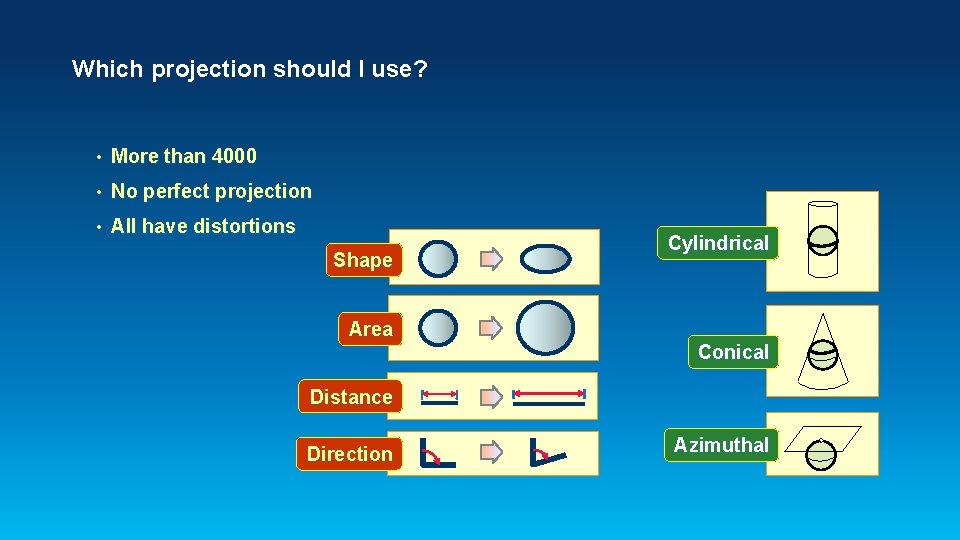
Which projection should I use? • More than 4000 • No perfect projection • All have distortions Shape Area Cylindrical Conical Distance Direction Azimuthal
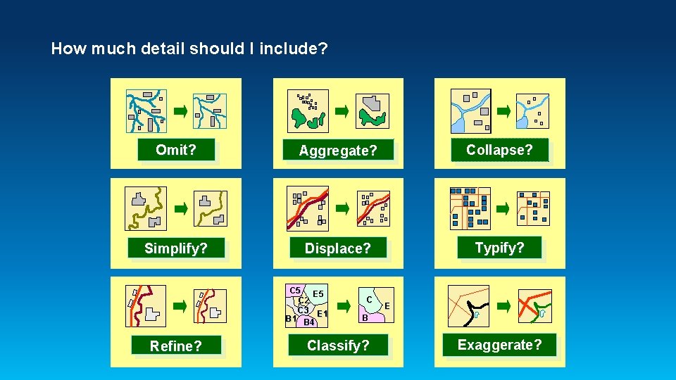
How much detail should I include? Omit? Aggregate? Collapse? Simplify? Displace? Typify? C 5 E 5 C 2 C 3 E 1 B 4 Refine? C E B Classify? Exaggerate?
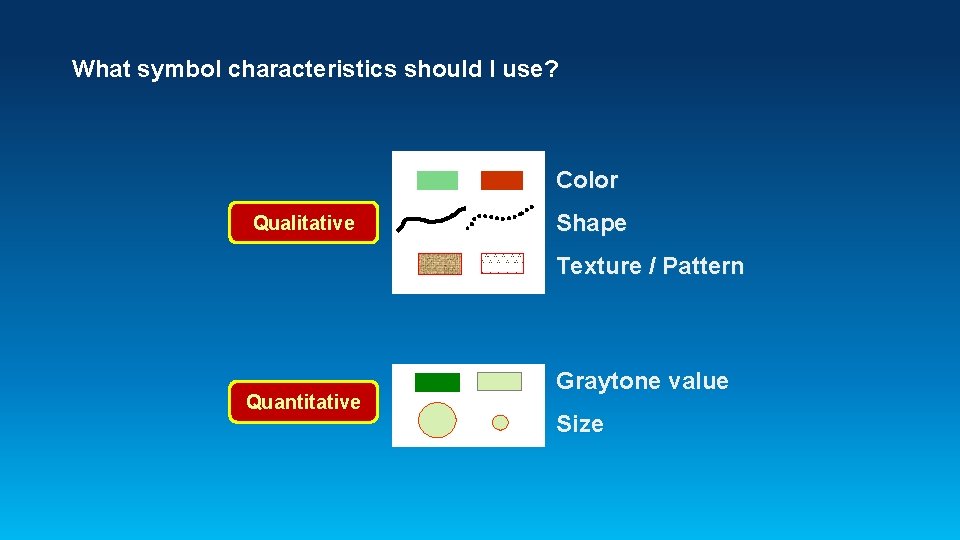
What symbol characteristics should I use? Color Qualitative Shape Texture / Pattern Quantitative Graytone value Size
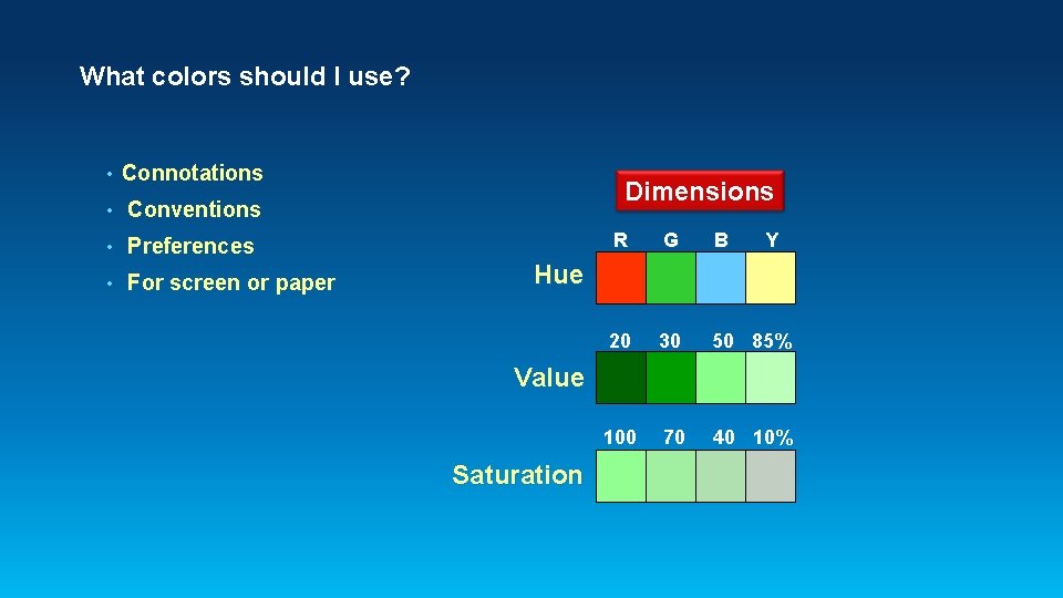
What colors should I use? • Connotations • Conventions • Preferences • For screen or paper Dimensions R G B Y 20 30 50 85% 100 70 40 10% Hue Value Saturation
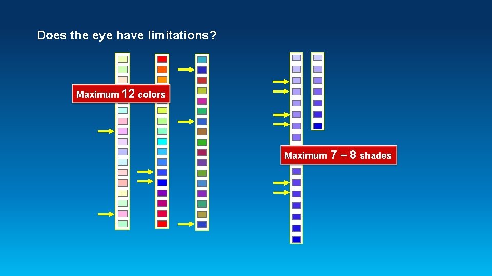
Does the eye have limitations? Maximum 12 colors Maximum 7 – 8 shades
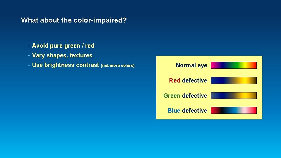
What about the color-impaired? • Avoid pure green / red • Vary shapes, textures • Use brightness contrast (not more colors) Normal eye Red defective Green defective Blue defective
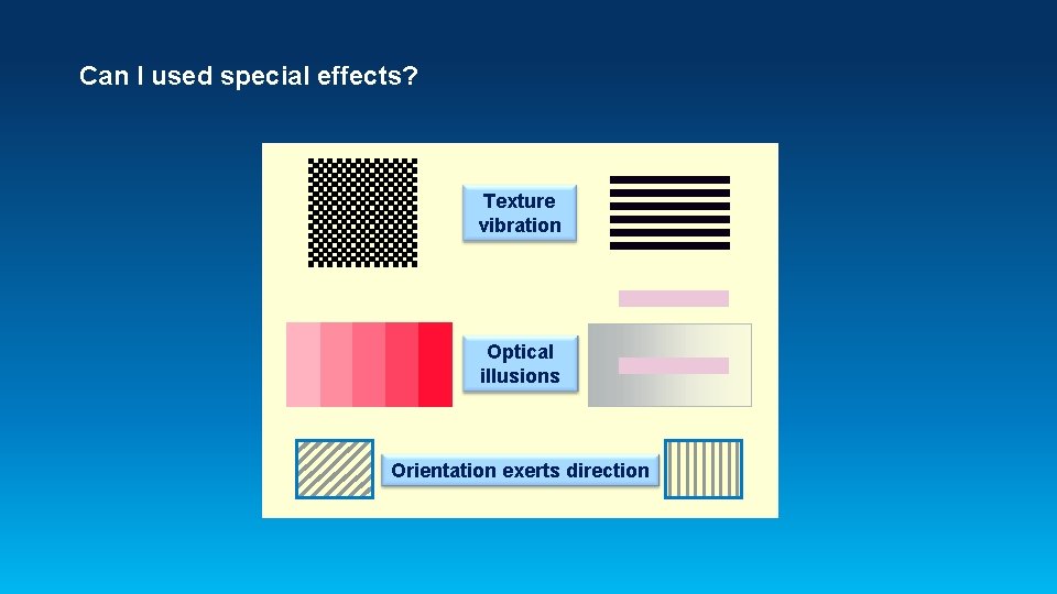
Can I used special effects? Texture vibration Optical illusions Orientation exerts direction
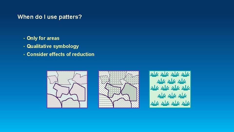
When do I use patters? • Only for areas • Qualitative symbology • Consider effects of reduction
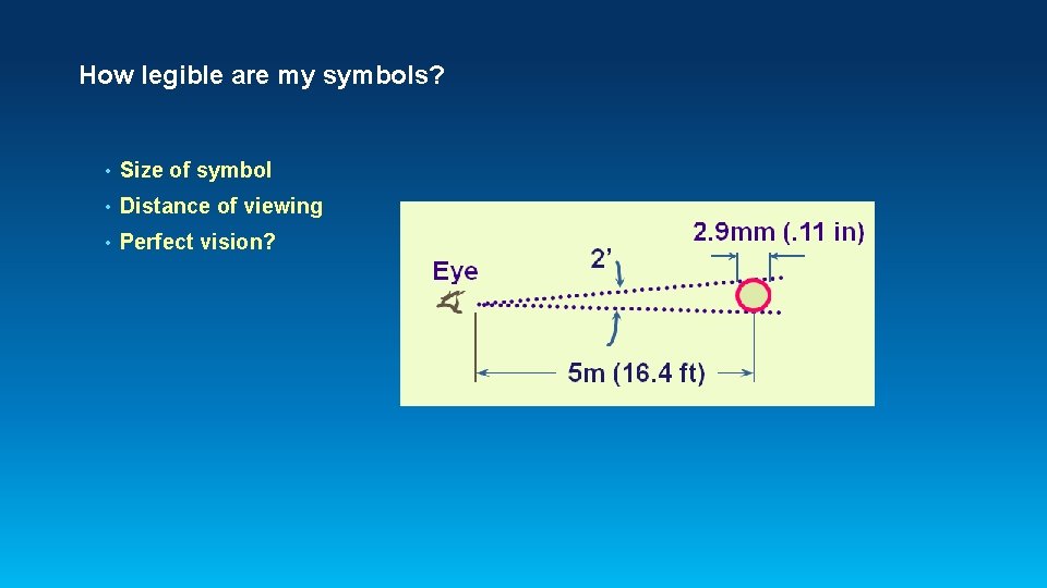
How legible are my symbols? • Size of symbol • Distance of viewing • Perfect vision?
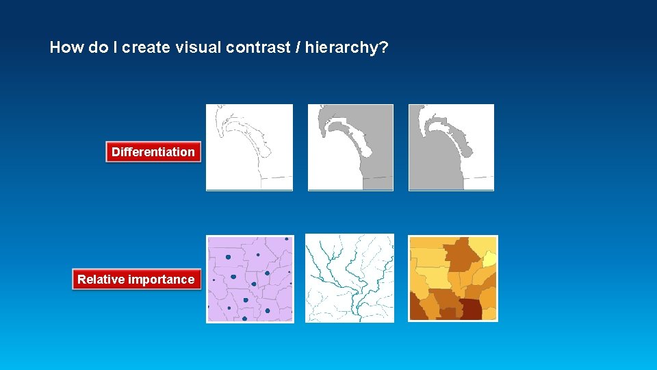
How do I create visual contrast / hierarchy? Differentiation Relative importance
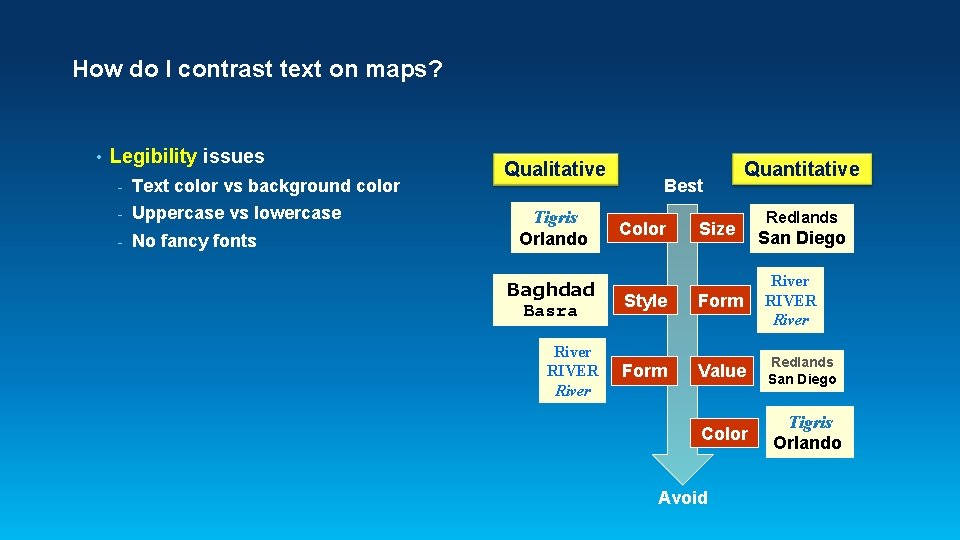
How do I contrast text on maps? • Legibility issues - Text color vs background color - Uppercase vs lowercase - No fancy fonts Qualitative Tigris Orlando Best Color Quantitative Size Redlands San Diego Baghdad Basra Style Form River RIVER River Form Value Redlands San Diego Color Avoid Tigris Orlando
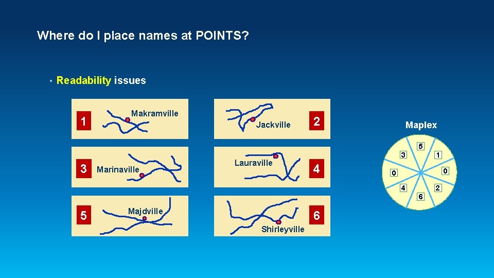
Where do I place names at POINTS? • Readability issues 1 Makramville Jackville 2 Maplex 5 3 Marinaville Lauraville 3 4 1 0 0 4 2 6 5 Majdville 6 Shirleyville
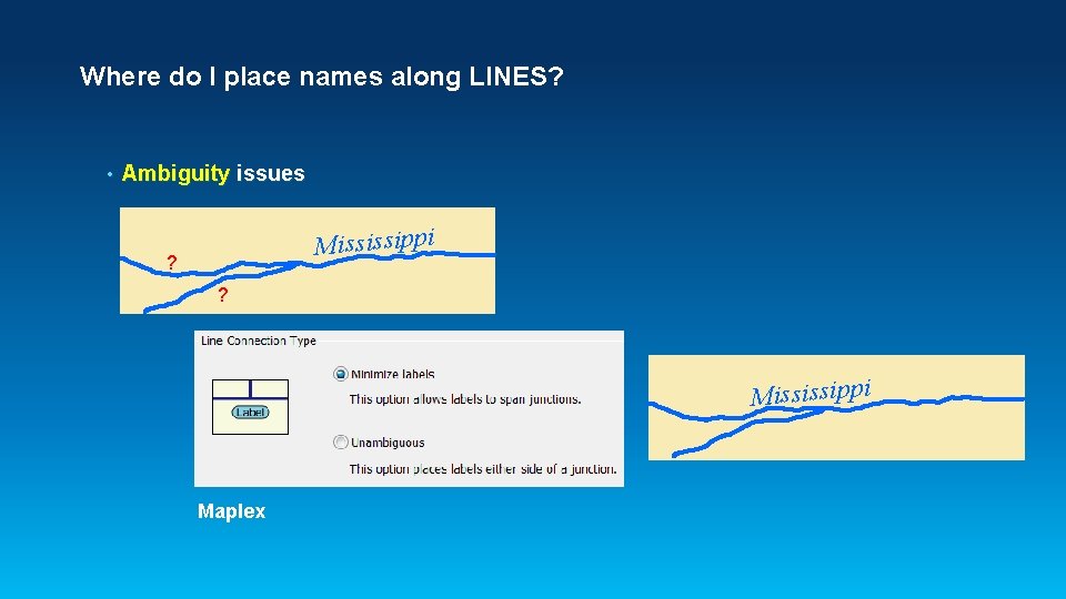
Where do I place names along LINES? • Ambiguity issues Mississippi ? ? Mississippi Maplex
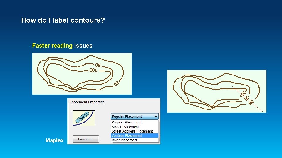
How do I label contours? Faster reading issues 100 90 10 90 0 80 • Maplex 80
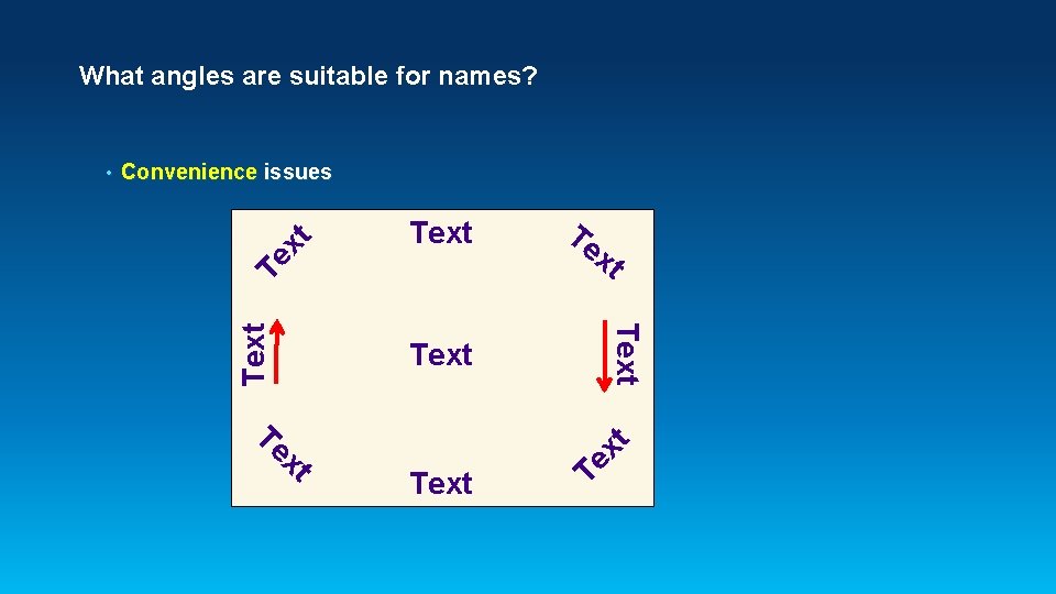
What angles are suitable for names? Text Te xt xt Text Te Text Te x xt Convenience issues Text •
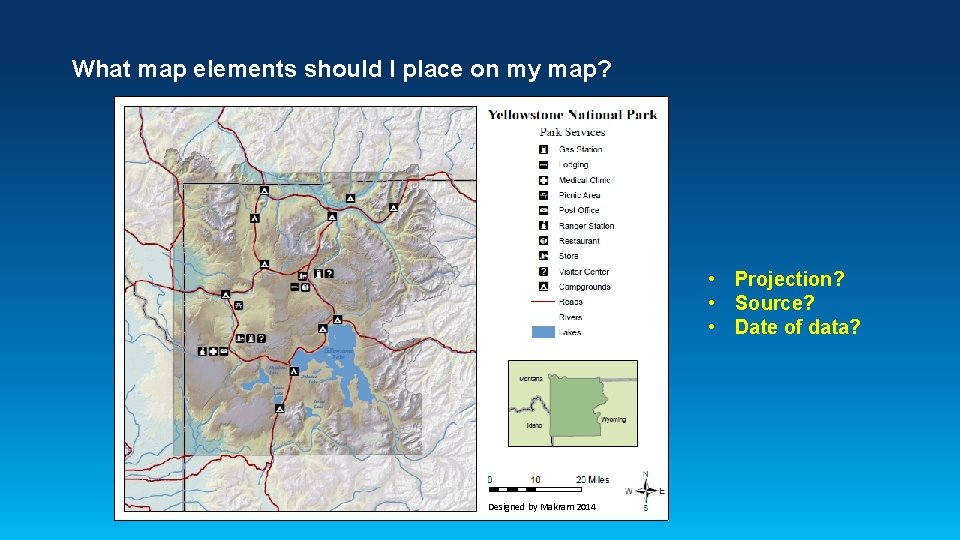
What map elements should I place on my map? • Projection? • Source? • Date of data? Designed by Makram 2014
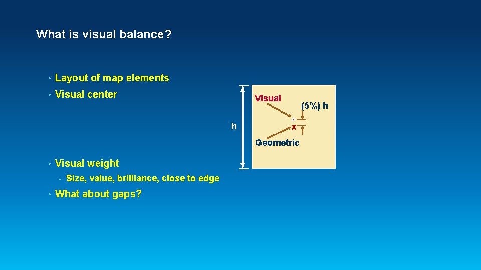
What is visual balance? • Layout of map elements • Visual center Visual h (5%) h x Geometric • Visual weight - • Size, value, brilliance, close to edge What about gaps?
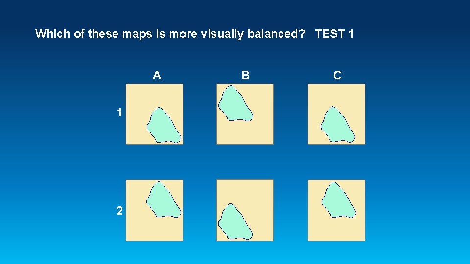
Which of these maps is more visually balanced? TEST 1 A 1 2 B C
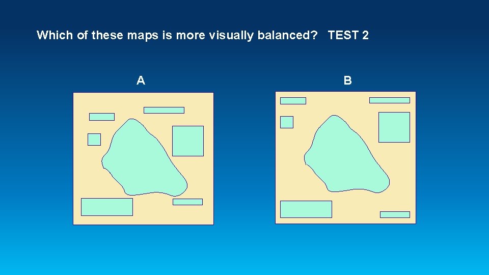
Which of these maps is more visually balanced? TEST 2 A B
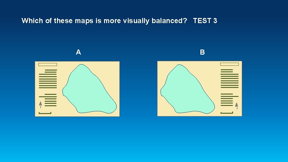
Which of these maps is more visually balanced? TEST 3 A B
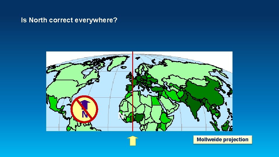
Is North correct everywhere? N N Mollweide projection
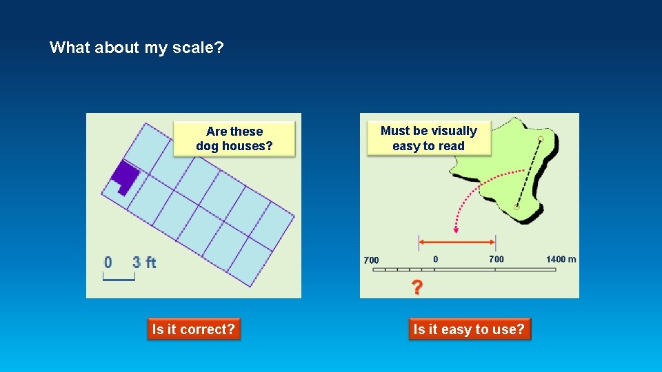
What about my scale? Are these dog houses? Is it correct? Must be visually easy to read Is it easy to use?
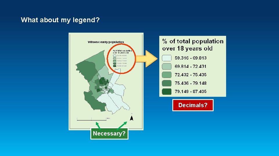
What about my legend? Decimals? Necessary?
What about maps for publishing in Arc. GIS Online? • Cartography vs performance • Avoid • - Advanced Drawing Options in Arc. Map - Multiple layer symbols - Picture symbols - Dash line patterns, splining, and offsets - Dot density fills - Text halo masks and text fill patterns - Complex SQL statements for text OR publish the map as a cached map service

Map Always ? ? ? Think of the User

Questions?
Where can I read more about cartographic design? Brewer, Cynthia A. Designing Better Maps – A Guide for GIS Users, Esri Press, 2005, ISBN 1 -58948 -089 -9 Brewer, Cynthia A. Designed Maps — A Sourcebook for GIS Users, Esri Press, 2008, ISBN 1 -58948 -160 -7 Imhof, Eduard. “Positioning Names on Maps”, The American Cartographer, Vol. 2, No. 2, pp. 128 -144, 1975. Kachel, Bill O'Sullivan. “Cartographic Design Using ARC/INFO” poster, Esri Users Conference, 1995. Monmonier, Mark. How to Lie with Maps, The University of Chicago Press, 2 nd ed. , 1996. ISBN 0 -226 -53420 -0 Murad-al-shaikh, Makram, Cartography with Arc. GIS course manuals, Esr. I, Inc. Course version 2. 1, May 2007. Okabe, Masataka and Kei Ito. How to make figures and presentations that are friendly to color blind people, Aug. 2002. Robinson, Arthur H et al. Elements of Cartography, 6 th ed. , John Wiley & Sons, Inc. , 1995. ISBN 0 -471 -55579 -7
- Slides: 34