Managing the Graphical Interface by Using CSS Lesson

Managing the Graphical Interface by Using CSS Lesson 7
Exam Objective Matrix Skills/Concepts MTA Exam Objectives Managing the Graphical Interface with CSS Manage the graphical interface by using CSS (3. 4)
border-radius Property • Creates rounded corners around layout elements, like headers, footers, sidebars, graphics boxes, and outlines around images • border-radius is a length, which is usually expressed in pixels or ems but can be a percentage
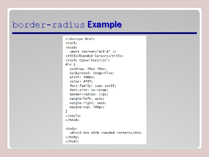
border-radius Example
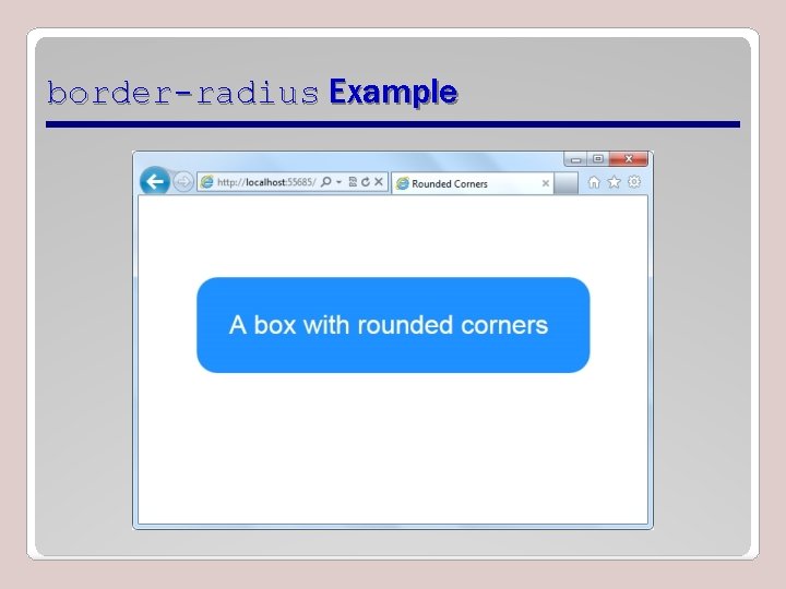
border-radius Example
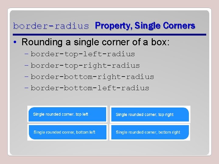
border-radius Property, Single Corners • Rounding a single corner of a box: – border-top-left-radius – border-top-right-radius – border-bottom-left-radius
box-shadow Property • Creates drop shadows around layout elements • CSS syntax for creating a shadow: box-shadow: h-shadow v-shadow blur spread color inset; • Required: h-shadow and v-shadow attributes set the horizontal and vertical position of the shadow in relation to the box • Optional: blur, spread, color, and inset
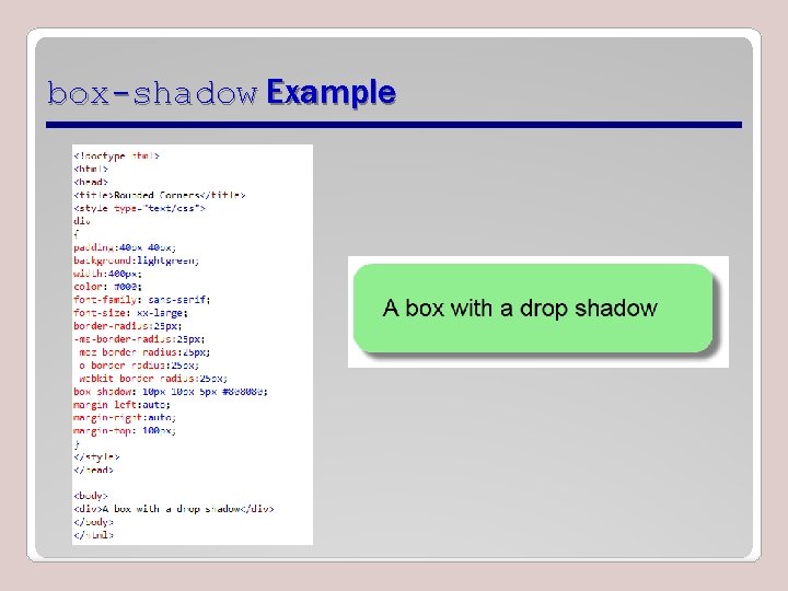
box-shadow Example
Opacity and Transparency • An opaque item does not let light pass through, whereas you can see through a transparent item. • Syntax for applying a transparency to an image or other element: opacity: value • Value is a floating-point value between 0. 0 (100% transparent) and 1. 0 (100% opaque)
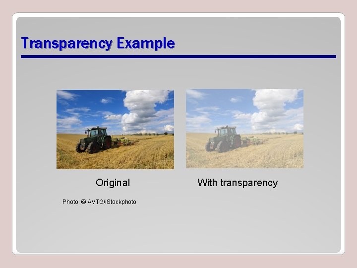
Transparency Example Original Photo: © AVTG/i. Stockphoto With transparency
CSS Gradients • Gradient is a smooth change of colors, within the same hue or starting with one color and ending with a different color • Used for subtle shading within backgrounds, button embellishments, and more • Created as methods to the CSS background property
CSS Gradient Methods • CSS 3 gradient methods: – linear-gradient: Creates a gradient from top to bottom or vice versa, or from corner to corner – radial-gradient: Creates a gradient that radiates out from a central point – repeating-linear-gradient: Creates a repeating linear gradient, which results in straight bands of gradient color – repeating-radial-gradient: Creates a repeating radial gradient, which results in circular bands of gradient color
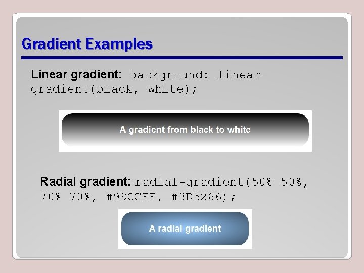
Gradient Examples Linear gradient: background: lineargradient(black, white); Radial gradient: radial-gradient(50% 50%, 70%, #99 CCFF, #3 D 5266);

Color Interpolation and Color Stops • CSS gradients support color interpolation in the alpha color space – Part of the red blue green alpha (RGBA) color model • Can specify multiple color stops, with an RGBA color and position for each one • Example of the use of rgba colors: linear-gradient(to right, rgba(255, 0)
CSS Font-related Properties • font-family specifies the font for an element • font-size specifies the size of a font • font-style specifies the style of a font, such as normal italics, or oblique • font-variant specifies whether text should be displayed in small caps • font-weight specifies the thickness of font characters
Web-safe Fonts • A set of standard fonts typically located on a user’s computer and that generally render consistently in the majority of browsers • Not appropriate for brand identity for many companies • Limited choices
Web Open Font Format (WOFF) • Allows developers to use almost any font • Are compressed True Type, Open. Type, or Open Font Format fonts that contain additional metadata • Are usually hosted on a server; CSS references font and server or URL
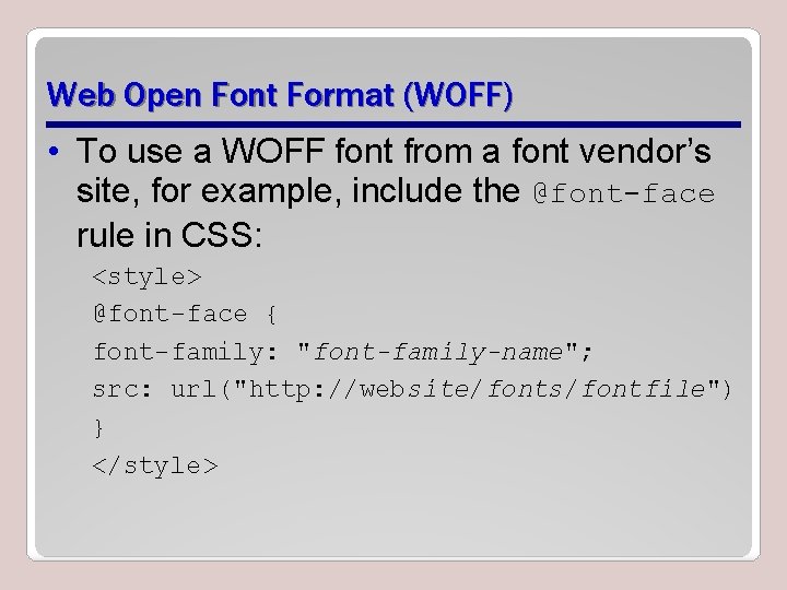
Web Open Font Format (WOFF) • To use a WOFF font from a font vendor’s site, for example, include the @font-face rule in CSS: <style> @font-face { font-family: "font-family-name"; src: url("http: //website/fonts/fontfile") } </style>
2 D and 3 D Transformations • A transform is an effect that lets you change the size, shape, and position of an element. • Transformations use the transform property. – Methods: matrix, perspective, rotate, scale, skew, translate • To see the “action” of a transformation requires Java. Script; using only CSS shows the before and after effects of properties and their values.
2 D Translation • To translate an element means to move it without rotating, skewing, or otherwise turning the image. • Use the translate() method in CSS and provide x- and y-axis values to position the element relative to its original or default position. – x-axis value specifies the left position of the element – y-axis value specifies the top position.
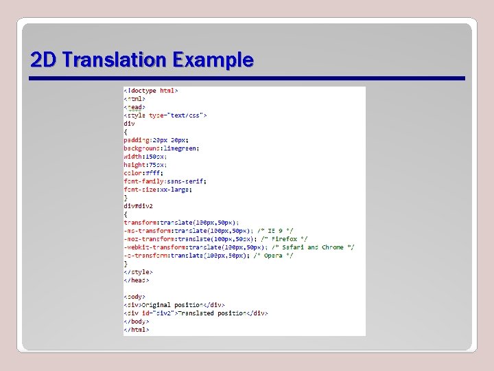
2 D Translation Example
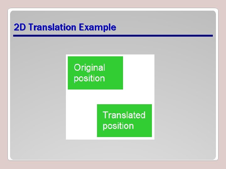
2 D Translation Example
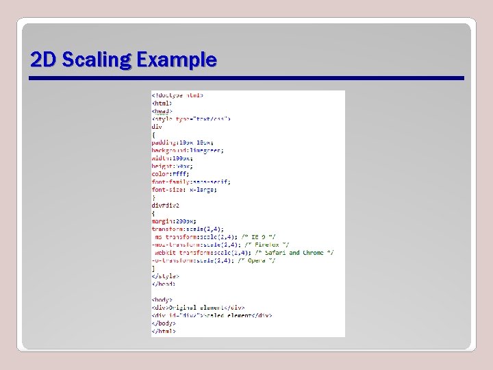
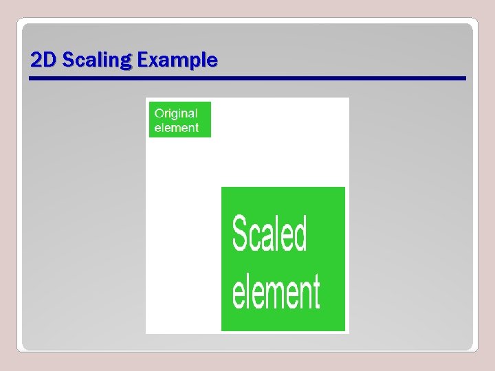
2 D Scaling • To scale an element is to increase or decrease its size. • Use the scale() method in CSS and provide x-axis (width) and y-axis (height) values. • The example on the following two slides increases the width of the element two times its original size, and increases the height four times its original size: transform: scale(2, 4);
2 D Scaling Example
2 D Scaling Example
2 D Rotation • To rotate an element turns it clockwise by a specified number of degrees. • Use the rotate() method in CSS and specify the degrees of rotation. • The example on the following two slides rotates an element by 30 degrees in the 2 D plane: transform: rotate(30 deg);
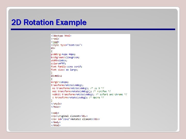
2 D Rotation Example
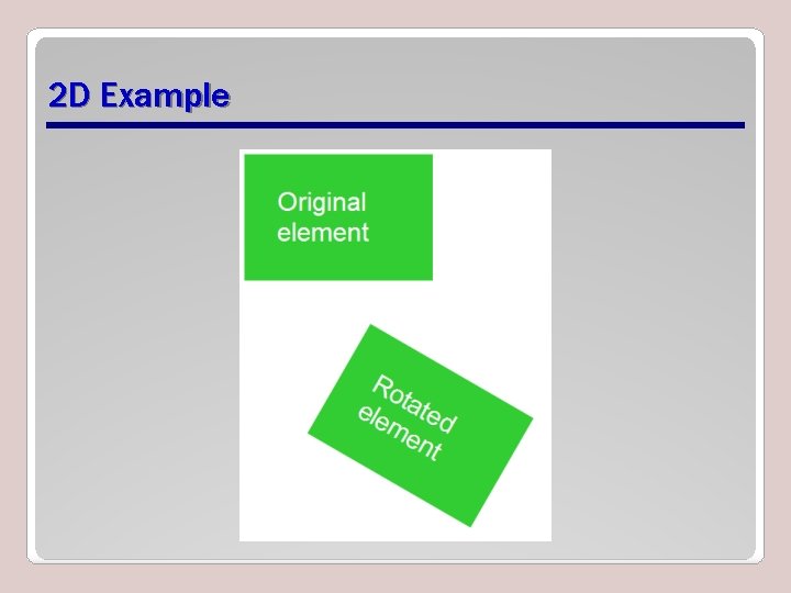
2 D Example
3 D Rotation • 3 D rotation uses the rotate. X() and rotate. Y() methods. – rotate. X(): Element rotates around its x- axis – rotate. Y(): Element rotates around its y- axis
2 D Skewing • To skew an element is to stretch it in one or more directions. • Use the skew() method and provide x-axis and y-axis values, in degrees, to create an angular shape. • The example on the following two slides turns an element 20 degrees around the xaxis and 30 degrees around the y-axis: transform: skew(20 deg, 30 deg);
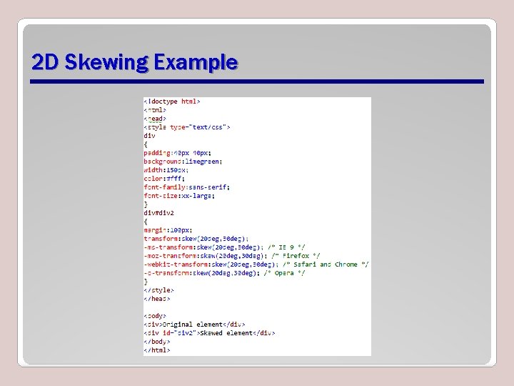
2 D Skewing Example
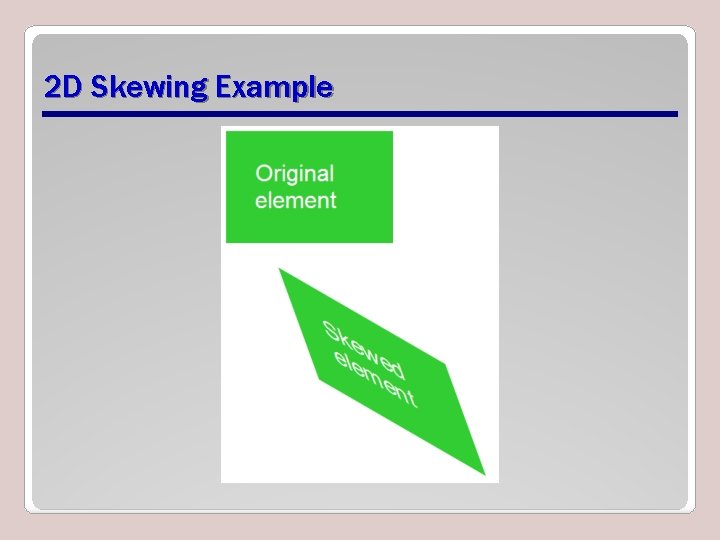
2 D Skewing Example
3 D Skewing • 3 D skewing uses the skew. X() and skew. Y() methods to skew an element around its x-axis and y-axis, respectively. • As an example, the following code skews an element 45 degrees: transform: skew. X(45 deg);
3 D Perspective • The CSS 3 3 D perspective property defines how a browser renders the depth of a 3 D transformed element. • The property takes on a number value: lower values (in the range of 1 to 1000) create a more pronounced effect than higher values.
Transition • A transition is a change from one thing to another; in CSS, a transition is the change in an element from one style to another. • In CSS 3, the action of a transition renders onscreen—no Java. Script is needed! • The transition property requires the CSS property to be acted upon during the transition.
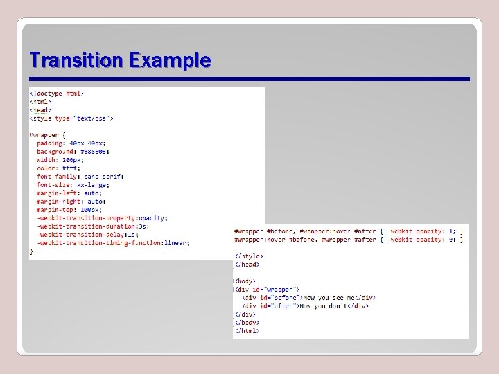
Transition Example
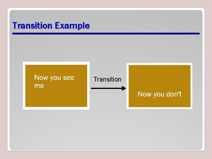
Transition Example Transition
Animation • An animation is the display of a sequence of static images at a fast enough speed to create the illusion of movement. • Transitions and animations are similar in that they both use timings. • Many properties used in animations are similar to transitions. • An important difference is that animations use keyframes, which give you control over parts of the animation.
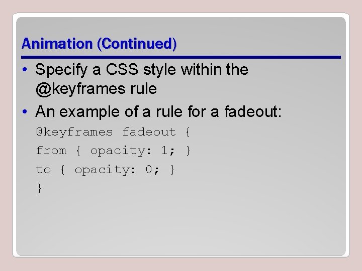
Animation (Continued) • Specify a CSS style within the @keyframes rule • An example of a rule for a fadeout: @keyframes fadeout { from { opacity: 1; } to { opacity: 0; } }
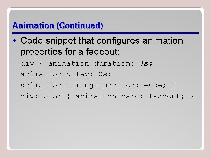
Animation (Continued) • Code snippet that configures animation properties for a fadeout: div { animation-duration: 3 s; animation-delay: 0 s; animation-timing-function: ease; } div: hover { animation-name: fadeout; }
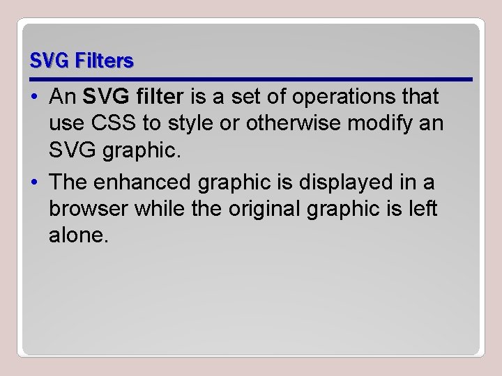
SVG Filters • An SVG filter is a set of operations that use CSS to style or otherwise modify an SVG graphic. • The enhanced graphic is displayed in a browser while the original graphic is left alone.
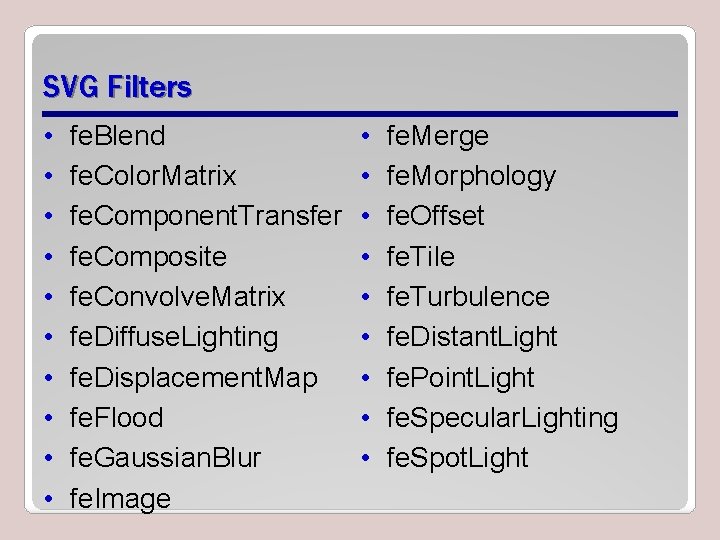
SVG Filters • • • fe. Blend fe. Color. Matrix fe. Component. Transfer fe. Composite fe. Convolve. Matrix fe. Diffuse. Lighting fe. Displacement. Map fe. Flood fe. Gaussian. Blur fe. Image • • • fe. Merge fe. Morphology fe. Offset fe. Tile fe. Turbulence fe. Distant. Light fe. Point. Light fe. Specular. Lighting fe. Spot. Light
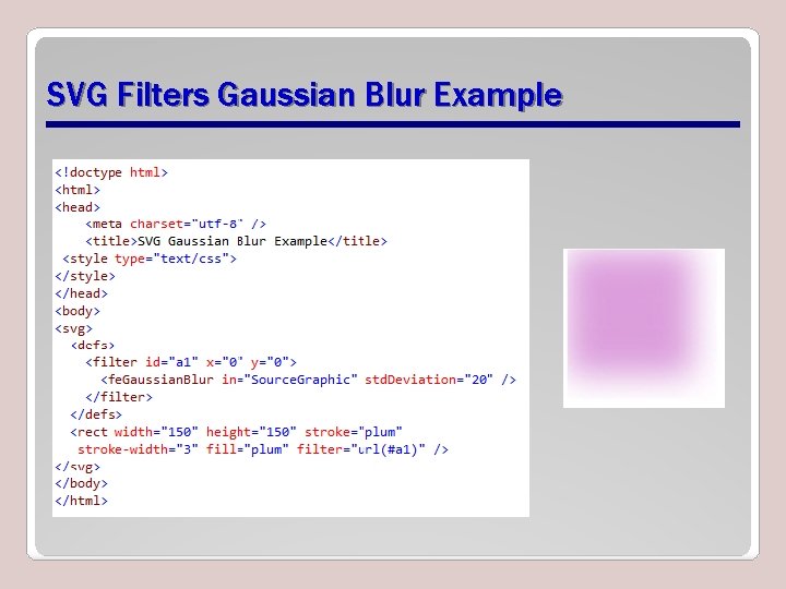
SVG Filters Gaussian Blur Example
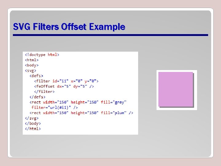
SVG Filters Offset Example
Canvas • Use canvas to draw pixel-based shapes. • The canvas element accepts only two attributes—height and width. • You can use most CSS properties to style the canvas element, adding color, gradients, pattern fills, transformation, animation, and much more.
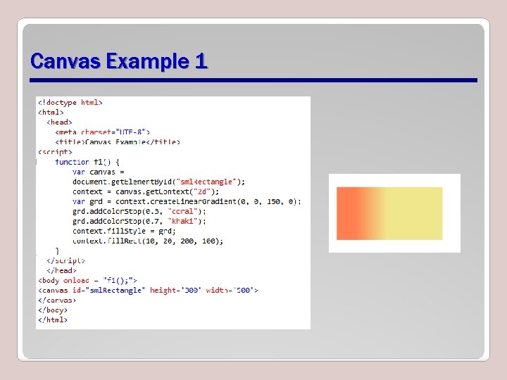
Canvas Example 1
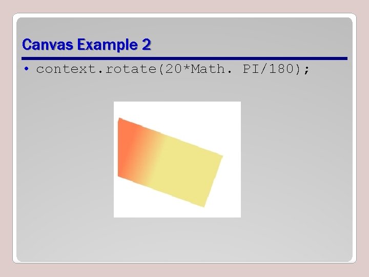
Canvas Example 2 • context. rotate(20*Math. PI/180);
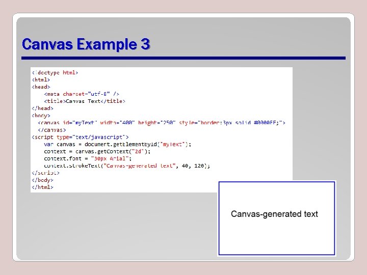
Canvas Example 3
Recap • • • Graphics effects Transparency and opacity Background gradients Web-safe fonts and the Web Open Font Format 2 D and 3 D transformations – – – Translation Scaling Rotation Skewing 3 D perspective • Transitions and animations • SVG filters • Canvas
- Slides: 49