Making Science Graphs and Interpreting Data Line Graphs

- Slides: 10

Making Science Graphs and Interpreting Data

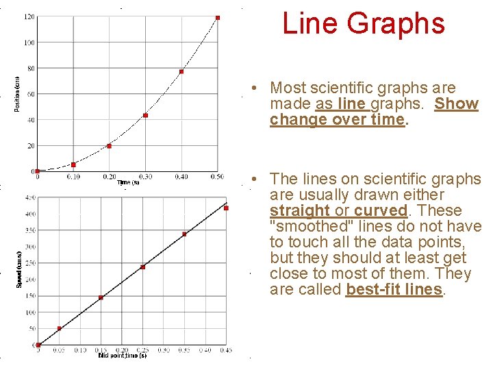
Line Graphs • Most scientific graphs are made as line graphs. Show change over time. • The lines on scientific graphs are usually drawn either straight or curved. These "smoothed" lines do not have to touch all the data points, but they should at least get close to most of them. They are called best-fit lines.

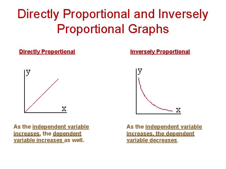
Directly Proportional and Inversely Proportional Graphs Directly Proportional As the independent variable increases, the dependent variable increases as well. Inversely Proportional As the independent variable increases, the dependent variable decreases.

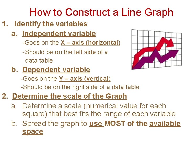
How to Construct a Line Graph 1. Identify the variables a. Independent variable -Goes on the X – axis (horizontal) -Should be on the left side of a data table b. Dependent variable -Goes on the Y – axis (vertical) -Should be on the right side of a data table 2. Determine the scale of the Graph a. Determine a scale (numerical value for each square) that best fits the range of each variable b. Spread the graph to use MOST of the available space

How to Construct a Line Graph 3. Number and Label Each Axis a. This tells what the lines on your graph represent. Label each axis with appropriate units. 4. Plot the Data Points a. plot each data value on the graph with a dot. 5. Draw the Graph a. draw a curve or line that best fits the data points. 6. Title the Graph a. Your title should clearly tell what the graph is about. b. If your graph has more than one set of data, provide a key to identify the different lines.

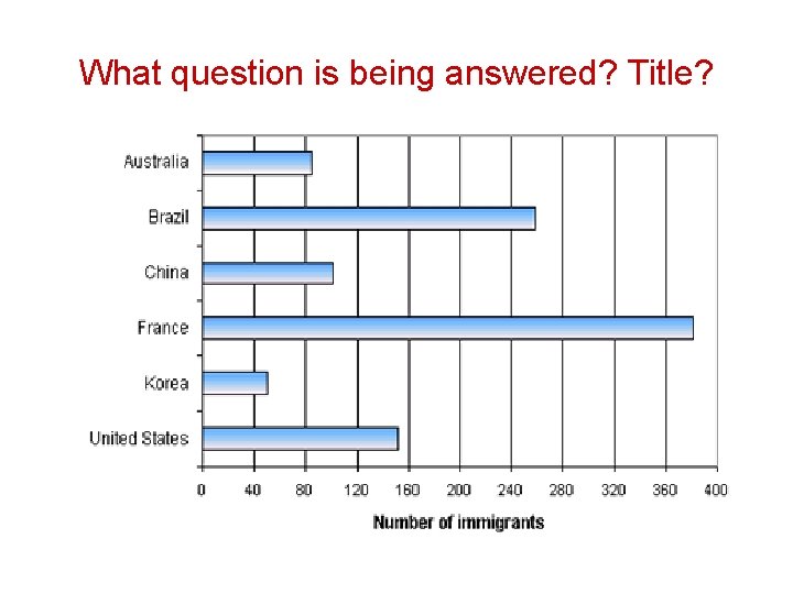
Bar Graph • The data for this graph are non-numerical and discrete for at least one variable. There are no dependent and independent variables. Axes may be reversed to give a graph with the categories on the x axis. • Bar graphs can therefore be drawn horizontally or vertically. This type of graph is very useful for comparing two or more similar items.

What question is being answered? Title?

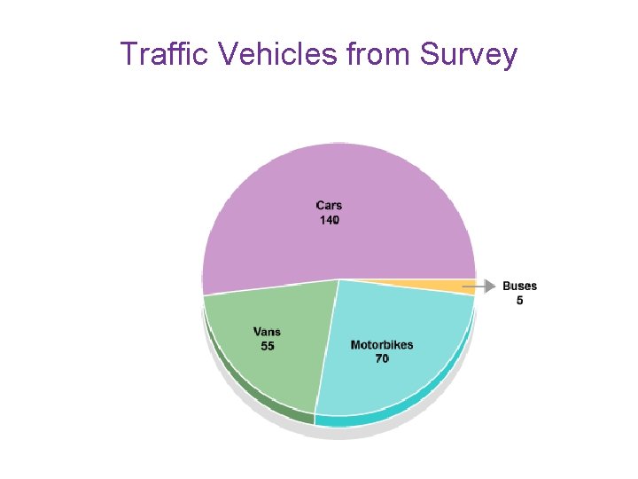
• Used for percentages or parts of a whole. There are 360º on a circle. You must use a compass and a protractor. – Take the # and divide it by the total # “surveyed”. Then multiply it by 360. This will give you the angle to use for the protractor. Do the same for every number you are making a piece of the pie for. • A circle is divided according to the proportion of counts in each category. • Not suitable for data sets with a very large number of categories (more than 6)

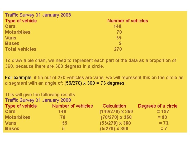
Traffic Survey 31 January 2008 Type of vehicle Cars Motorbikes Vans Buses Total vehicles Number of vehicles 140 70 55 5 270 To draw a pie chart, we need to represent each part of the data as a proportion of 360, because there are 360 degrees in a circle. For example, if 55 out of 270 vehicles are vans, we will represent this on the circle as a segment with an angle of: (55/270) x 360 = 73 degrees. This will give the following results: Traffic Survey 31 January 2008 Type of vehicle Number of vehicles Cars 140 Motorbikes 70 Vans 55 Buses 5 Calculation (140/270) x 360 (70/270) x 360 (55/270) x 360 (5/270) x 360 Degrees of a circle = 187 = 93 = 73 =7

Traffic Vehicles from Survey