Making Power Point documents as accessible as possible
Making Power. Point documents as accessible as possible Angela Cockburn CDIO Digital Inclusion, Standards and Culture team 20 May 2020
Background This set of slides summarises the tips shared during the ‘Making Power. Point documents as accessible as possible’ session CDIO’s Digital Inclusion, Standards and Culture team ran as part of Global Accessibility Awareness Day 2020. Angela Cockburn CDIO, Digital Inclusion, Standards and Culture
Font and font size Font: Use a font such as Arial or Calibri – NOT Times New Roman Font size: Have your main text no smaller than 14 pt – ideally minimum of 18 pt Angela Cockburn CDIO, Digital Inclusion, Standards and Culture
Formatting your text Don’t justify your text Use the features provided by Microsoft such as bullet lists or numbered lists Add space before and after paragraphs rather than having blank lines. Use the line spacing feature on the Home menu Angela Cockburn CDIO, Digital Inclusion, Standards and Culture
Presenting content on your slides Making the message you want to convey is not about restricting how you do it – making something accessible to everyone is not about being all plain text on a slide. Just means there a few things to think about to make sure it works for everyone. The following slides highlight a few things to be aware of when using • Tables • Colour • Visual interpretation of data and use of images Angela Cockburn CDIO, Digital Inclusion, Standards and Culture
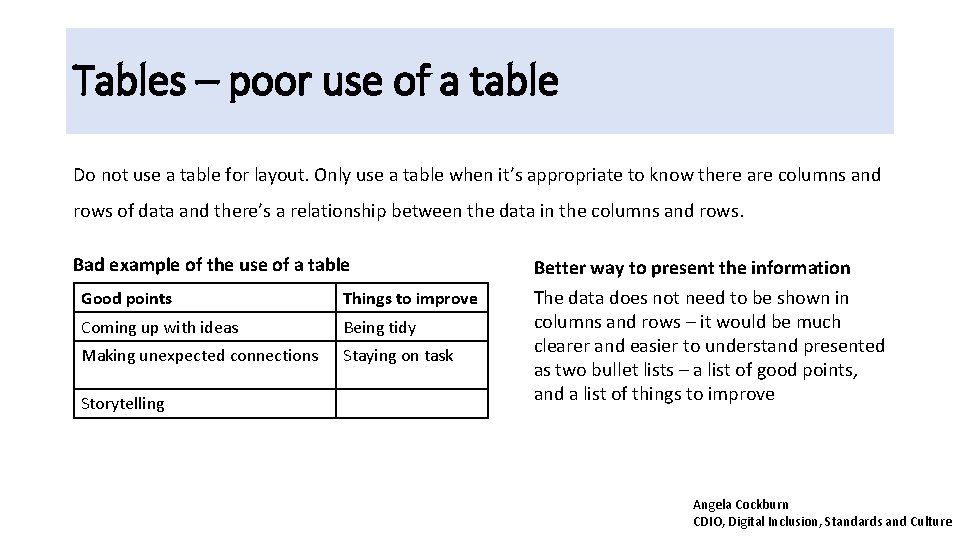
Tables – poor use of a table Do not use a table for layout. Only use a table when it’s appropriate to know there are columns and rows of data and there’s a relationship between the data in the columns and rows. Bad example of the use of a table Good points Things to improve Coming up with ideas Being tidy Making unexpected connections Staying on task Storytelling Better way to present the information The data does not need to be shown in columns and rows – it would be much clearer and easier to understand presented as two bullet lists – a list of good points, and a list of things to improve Angela Cockburn CDIO, Digital Inclusion, Standards and Culture
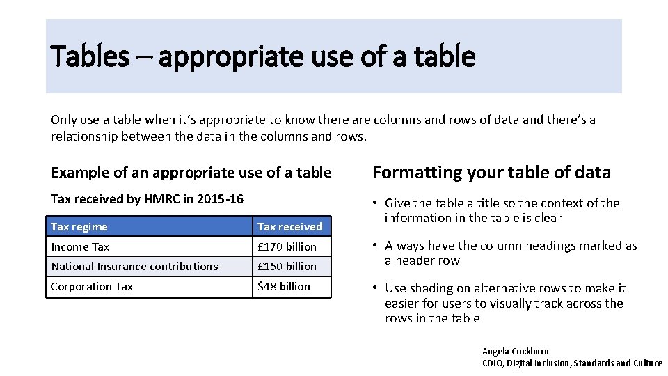
Tables – appropriate use of a table Only use a table when it’s appropriate to know there are columns and rows of data and there’s a relationship between the data in the columns and rows. Example of an appropriate use of a table Formatting your table of data Tax received by HMRC in 2015 -16 • Give the table a title so the context of the information in the table is clear Tax regime Tax received Income Tax £ 170 billion National Insurance contributions £ 150 billion Corporation Tax $48 billion • Always have the column headings marked as a header row • Use shading on alternative rows to make it easier for users to visually track across the rows in the table Angela Cockburn CDIO, Digital Inclusion, Standards and Culture
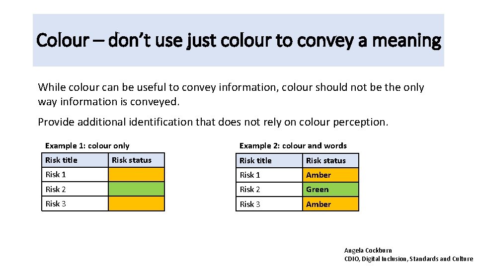
Colour – don’t use just colour to convey a meaning While colour can be useful to convey information, colour should not be the only way information is conveyed. Provide additional identification that does not rely on colour perception. Example 1: colour only Example 2: colour and words Risk title Risk status Risk 1 Amber Risk 2 Green Risk 3 Amber Risk status Angela Cockburn CDIO, Digital Inclusion, Standards and Culture
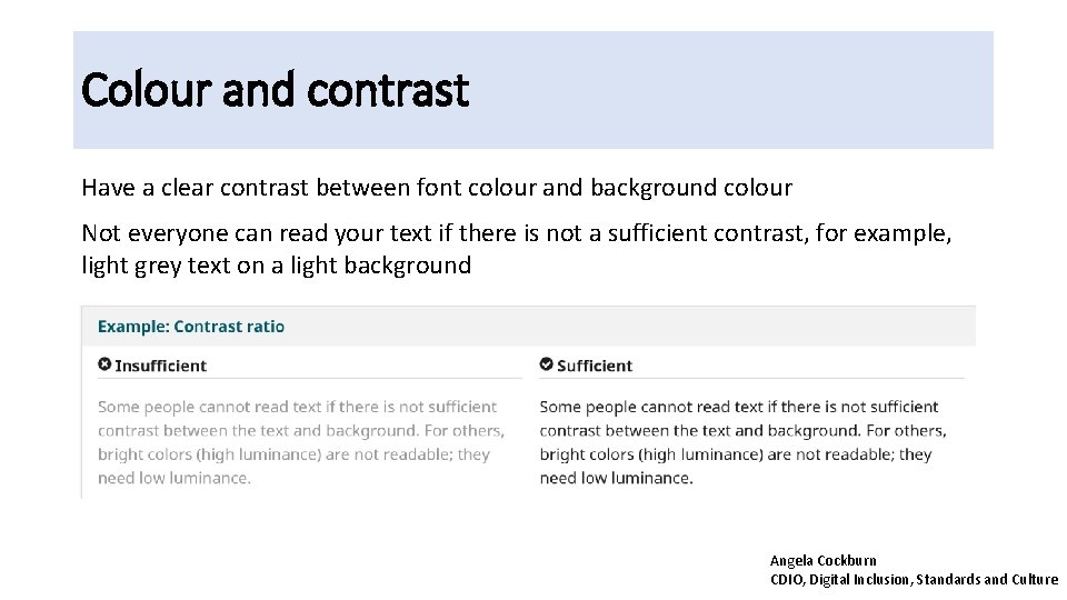
Colour and contrast Have a clear contrast between font colour and background colour Not everyone can read your text if there is not a sufficient contrast, for example, light grey text on a light background Angela Cockburn CDIO, Digital Inclusion, Standards and Culture
Visual interpretation of data and images For some users images and picture can make your information hard to use – but for others it is a great way to convey information. We just need to make sure we have that happy balance. Just means there a few things to think about to make sure it works for everyone Angela Cockburn CDIO, Digital Inclusion, Standards and Culture
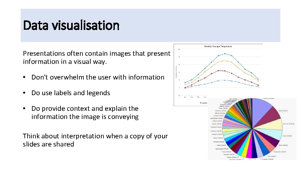
Data visualisation Presentations often contain images that present information in a visual way. • Don't overwhelm the user with information • Do use labels and legends • Do provide context and explain the information the image is conveying Think about interpretation when a copy of your slides are shared
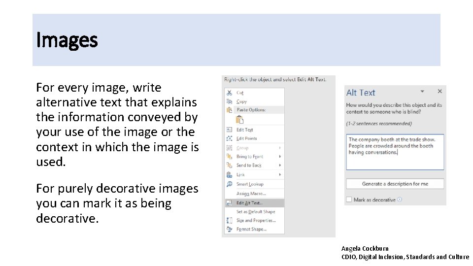
Images For every image, write alternative text that explains the information conveyed by your use of the image or the context in which the image is used. For purely decorative images you can mark it as being decorative. Angela Cockburn CDIO, Digital Inclusion, Standards and Culture
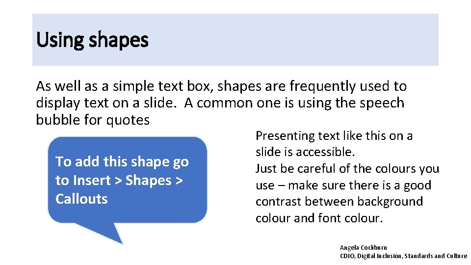
Using shapes As well as a simple text box, shapes are frequently used to display text on a slide. A common one is using the speech bubble for quotes To add this shape go to Insert > Shapes > Callouts Presenting text like this on a slide is accessible. Just be careful of the colours you use – make sure there is a good contrast between background colour and font colour. Angela Cockburn CDIO, Digital Inclusion, Standards and Culture
And finally… check your document • Make sure each slide has a title • Check the readability of your content Use the readability tools (Review > Spelling) or Hemingway app (web) • Use the accessibility check facility (Review > Check Accessibility) see also the advice on creating documents using Office 365 products from Microsoft (web) • Check the reading order of each slide (Home > Arrange > Selection pane) Angela Cockburn CDIO, Digital Inclusion, Standards and Culture
- Slides: 14