Making effective presentation with Power Point and structuring


- Slides: 54
Making effective presentation: with Power. Point and structuring a scientific talk Dr. Muhsen A. M. Al-ibadi Quantum Chemistry Group Head Of quality assurance and Academic Accreditation Kufa University 1
Making effective presentation: with Power. Point and structuring a scientific talk • Effective Power. Point presentation • Good Presentation • structuring a scientific talk. 2
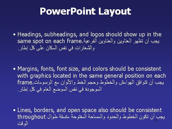
Making effective presentation: with powerpoint and structuring a scientific talk • Power. Point presentation guidelines for the use of fonts, colors, and graphics when preparing Power. Point presentations. • We may not be experts at public speaking, but we are all experts at listening to talks. • The media should enhance the presentation, not BE the presentation. • Remember, only you can prevent “Death by Power. Point” 6
9
Fonts What font to use ? ? ? • Choose a clean font that is easy to read. Recommended fonts: Arial, Tahoma, Veranda. ﺍﺧﺘﺮ ﺧﺍ ﻭﺍﺿﺤﺎ ﺳﻬﻞ ﺍﻟﻘﺮﺍﺀﺓ • Standardize the Font Throughout ﺗﻮﺣﻴﺪ ﺍﻟﺨﻂ • Stick with one or two types of fonts ﺍﻟﺘﺰﻡ ﺑﺎﺳﺘﺨﺪﺍﻡ ﻧﻮﻉ ﻭﺍﺣﺪ ﺃﻮ ﻧﻮﻋﻴﻦ ﻣﻦ ﺍﻟﺨﻄﻮﻁ 12
Font Size Type size should be 20 points or larger: 20 point 24 point 28 point 36 point 40 point 13
Font Size ¬ The larger, the better. Remember, your slides must be easy to read, even at the back of the room. ﺗﺬﻛﺮ ﺃﻦ ﺍﻟﺸﺮﺍﺋﺢ ﺍﻟﺨﺎﺻﺔ ﺑﻚ ﻳﺠﺐ ﺃﻦ. ﻛﺎﻥ ﺫﻟﻚ ﺃﻔﻀﻞ ، ﻛﻠﻤﺎ ﻛﺎﻥ ﺣﺠﻢ ﺍﻟﺨﻂ ﺃﻜﺒﺮ ﺣﺘﻰ ﻓﻲ ﺍﻟﺠﺰﺀ ﺍﻟﺨﻠﻔﻲ ﻣﻦ ﺍﻟﻘﺎﻋﺔ ، ﺗﻜﻮﻥ ﺳﻬﻠﺔ ﺍﻟﻘﺮﺍﺀﺓ • This is a good title size 40 point • A good subtitle or bullet point size 32 point • Content text should be no smaller than 24 point 14 • This font size is not recommended for content. 12 point.
Font Size ¬ Combining small font sizes with bold or italics is not recommended: ﻻ ﻳﻨﺼﺢ ﺑﺪﻣﺞ ﺃﺤﺠﺎﻡ ﺍﻟﺨﻄﻮﻁ ﺍﻟﺼﻐﻴﺮﺓ ﻣﻊ ﻏﺎﻣﻖ ﺃﻮ ﻣﺎﺋﻞ ¬ What does this say? Garamond Font, Italic, Bold 12 pt. • This is very difficult to read. Times Font, Bold, 12 pt. • This point could be lost. Century Gothic Font, Bold, Italic, 14 pt. • No one will be able to read this. Gill Sans Font, Condensed Bold, 12 pt ¬Small fonts are okay for a footer, such as: ﺍﻟﺨﻄﻮﻁ ﺍﻟﺼﻐﻴﺮﺓ ﻣﻘﺒﻮﻟﺔ ﻟﺘﺬﻳﻴﻞ ﺍﻟﺼﻔﺤﺔ References Date: 17/2/2020 kufa university 15
Fonts • Don’t Sacrifice Readability for Style 16
Caps and Italics • AVOID USING ALL CAPITAL LETTERS • Italics ﺍﻟﺨﻂ ﺍﻟﻤﺎﺋﻞ ﻳﺴﺘﺨﺪﻡ ﻓﻲ – Used for “quotes” – Used to highlight thoughts – Used for book and journal titles 17
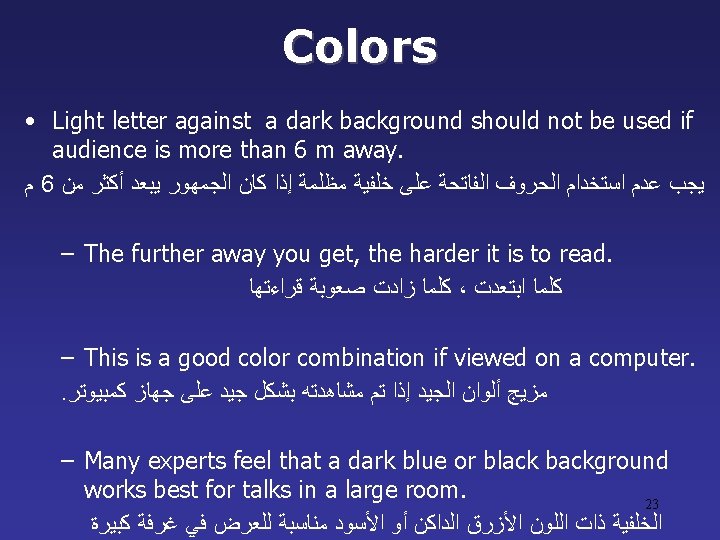
C o l o rs ﺍﻻﻟﻮﺍﻥ • Reds and oranges are high-energy but can be difficult to stay focused on. • Greens, blues, and browns are mellower, but not as attention grabbing. • Reds and Greens can be difficult to see for those who are color blind. 21
Avoid These Combinations • Examples: –Green on Blue –Dark Yellow on Green –Purple on Blue –Orange on Green –Red on Green 22
Background Colors Remember: easy to read! ﺗﺬﻛﺮ ﺩﺍﺋﻤﺎ ﺍﻥ ﺗﺴﺘﺨﺪﻡ ﺧﻠﻔﻴﺔ ﺳﻬﻠﺔ ﻟﻠﻘﺮﺍﺀﺓ This is a good mix of colors. easy to read! This is a bad mix of colors. Low contrast. Unreadable! This is a bad mix of colors. Avoid bright colors on white. Unreadable! 25
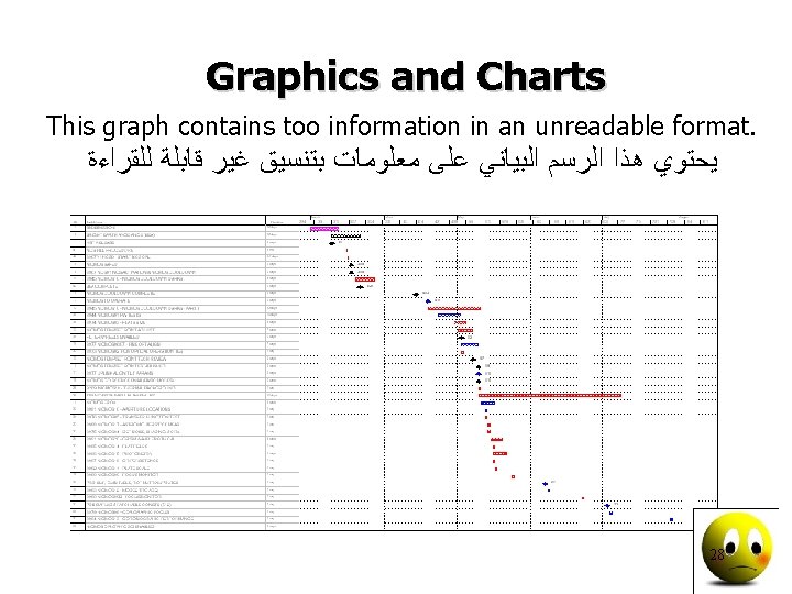
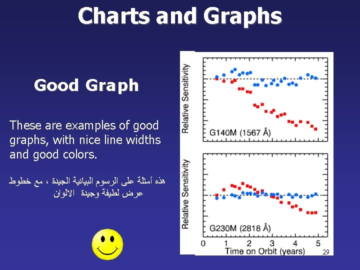
Charts and Graphs 30
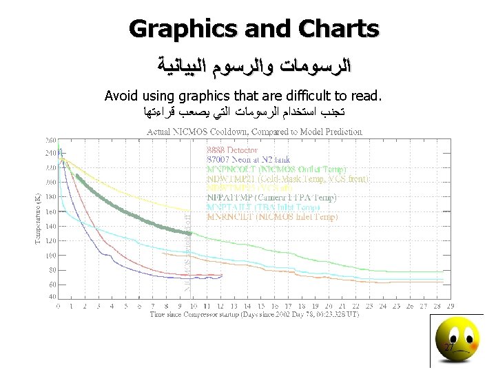
Charts and Graphs 80 70 60 50 40 Mode A Mode B Mode C 30 20 10 Europe North America Australia 0 31
This is a good, readable table. Tables, especially large ones, should be placed on a separate slide. 4/19 Fri 109 NICMOS restarted, Ne-loop control continues 4/22 Mon 112 Change to mounting cup control 4/23 Tue 134 Return to Ne control, Filter wheel test begins 4/24 Wed 155 Increase control temperature to allow for +2 K variations 4/25 Thur 165 Begin darks every 3 rd orbit 4/26 Fri 174 DQE test visit 1; Control temp +0. 5 K 32
34
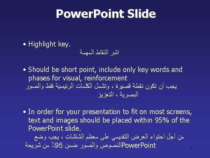
Avoid the “All Word” Slide ﺗﺠﻨﺐ ﺍﻟﻌﺮﺽ ﻣﻦ ﻫﺬﺍ ﺍﻟﻨﻮﻉ Another thing to avoid is the use of a large block paragraph to introduce your information. Attendees do not like to have what is on the screen, read to them verbatim. So, please use short, bulleted statements and avoid typing out your whole presentation on to the slides. Also, it is difficult for some to listen and read a large amount of text at the same time. 39
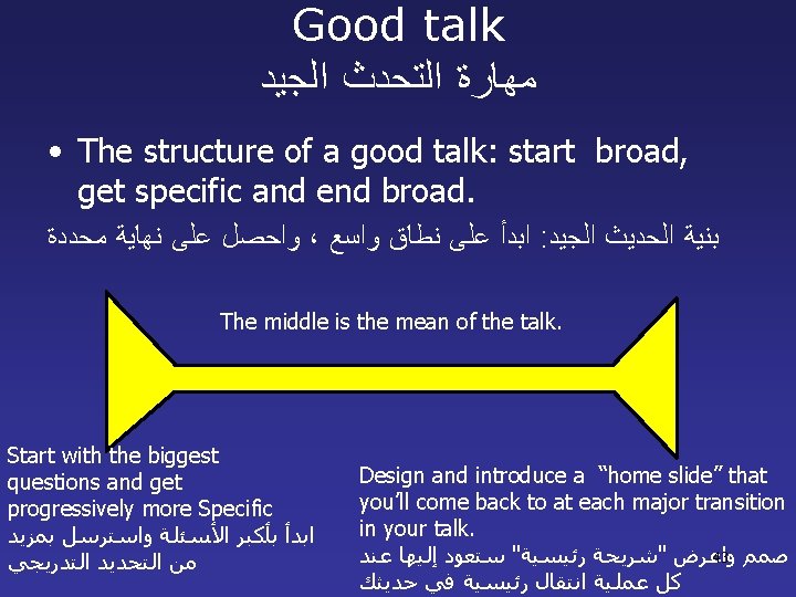
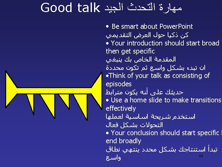
Good talk ﻣﻬﺎﺭﺓ ﺍﻟﺘﺤﺪﺙ ﺍﻟﺠﻴﺪ Audience attention curve. 42
Thank you for your attention 45
Presentation skills • How Good Are Your Presentation Skills? • How do you feel when you have to make a presentation? • Are you well prepared and relaxed, confident. • Or is the thought of standing on a podium, holding a microphone, enough to give you stage fright? • Enjoy it or not, presenting 46
Presentation skills • 14 -32 Your presentations are quite weak and boring. There are lots of ways to bring more excitement to what, and how, you present. You simply need more practice developing the right kind of content, and learning to use your nervousness to create a positive flow of energy. build your self-confidence. • 33 -51 Your presentations are OK, and they're typical of average presenters. The impression you leave isn't good or bad. • 52 -70 Super job! You're giving excellent presentations. They're interesting and well suited to the audience. Review your strategies and challenge yourself to continue 47 improving your presentation skills.
Becoming a Better Presenter • 1. Understanding your audience. • 2. Preparing your content. • 3. Delivering confidently. • 4. Controlling the environment. 48
1. Understanding your audience • Determine who the members of the audience are. • Find out what they want and expect? What do they need to learn? • what do they already know that you don't have to repeat? • Create an outline for your presentation, and ask for advance feedback on your proposed content 49
2. Preparing Your Content • • • Identify a few key points. Don't include every detail Use an outline Start and end strongly Use examples 50
2. Preparing Your Content • Get the attention of your audience: Use an interesting 'hook' or opening point, like a shocking statistic. Be provocative and stimulating, not boring or calm. • Create a need: Convince the audience there's a problem, explain how it affects them – and persuade them that things need to change. • Define your solution: Explain what you think needs to be done. • Describe a detailed picture of success (or failure): Give the audience a vision; something they can see, hear, taste, and touch. • Ask the audience to do something right away: Get the audience involved right from the start. Then it's usually much easier to keep them engaged and active in your cause 51
3. Delivering confidently • • • Practice to build confidence. Be flexible Welcome statements from the audience Use slides and other visual aids Keep your visuals simple and brief Manage your stress - physical relaxation techniques - imagery - build your self-confidence 52
4. Controlling the environment • Practice in the presentation room. • Do your own setup • Test your timing 53
Thank you for your attention 54