Make and Use Bar Graphs Unit Represent and

Make and Use Bar Graphs Unit: Represent and Interpret Data MAFS. 3. MD. 2. 3 I can make, read, and interpret bar graphs.
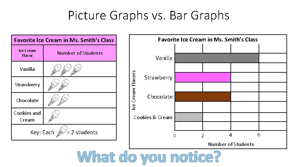
Picture Graphs vs. Bar Graphs Favorite Ice Cream in Ms. Smith’s Class Ice Cream Flavor Number of Students Ice Cream Flavors Vanilla Strawberry Chocolate Cookies and Cream Key: Each Vanilla Strawberry Chocolate Cookies & Cream = 2 students 0 4 2 Number of Students What do you notice? 6
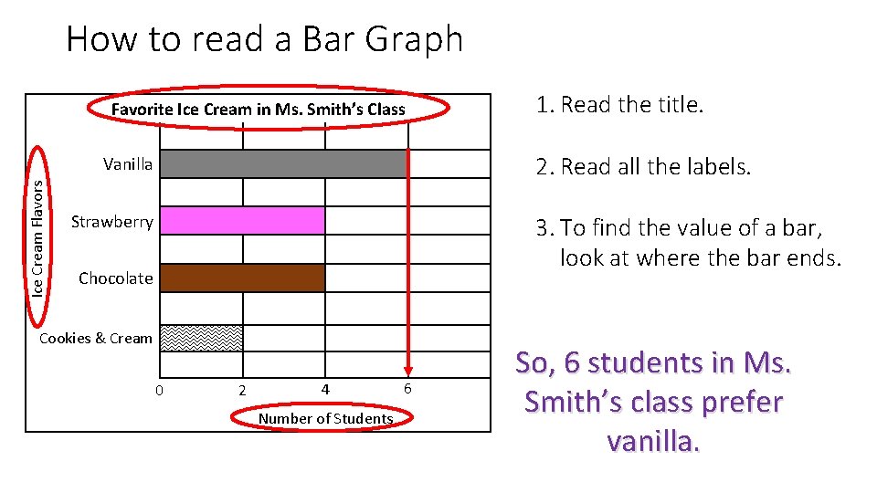
How to read a Bar Graph Favorite Ice Cream in Ms. Smith’s Class 2. Read all the labels. Vanilla Ice Cream Flavors 1. Read the title. Strawberry 3. To find the value of a bar, look at where the bar ends. Chocolate Cookies & Cream 0 2 4 Number of Students 6 So, 6 students in Ms. Smith’s class prefer vanilla.
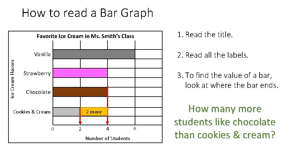
How to read a Bar Graph Favorite Ice Cream in Ms. Smith’s Class 2. Read all the labels. Vanilla Ice Cream Flavors 1. Read the title. Strawberry 3. To find the value of a bar, look at where the bar ends. Chocolate 2 more Cookies & Cream 0 2 4 Number of Students 6 How many more students like chocolate than cookies & cream?
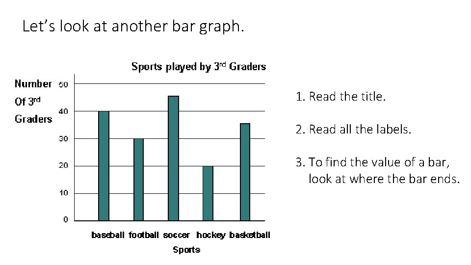
Let’s look at another bar graph. 1. Read the title. 2. Read all the labels. 3. To find the value of a bar, look at where the bar ends.
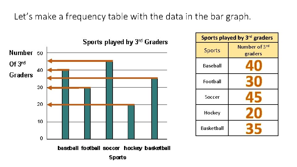
Let’s make a frequency table with the data in the bar graph. Sports played by 3 rd graders Sports Baseball Football Soccer Hockey Basketball Number of 3 rd graders 40 30 45 20 35
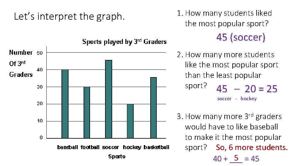
Let’s interpret the graph. 1. How many students liked the most popular sport? 45 (soccer) 2. How many more students like the most popular sport than the least popular sport? 45 – 20 = 25 soccer - hockey 3. How many more 3 rd graders would have to like baseball to make it the most popular sport? So, 6 more students. 5 = 45 40 + ___
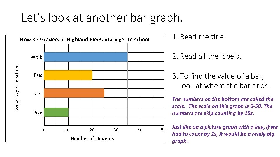
Let’s look at another bar graph. 1. Read the title. How 3 rd Graders at Highland Elementary get to school 2. Read all the labels. Ways to get to school Walk 3. To find the value of a bar, look at where the bar ends. Bus Car The numbers on the bottom are called the scale. The scale on this graph is 0 -50. The numbers are skip counting by 10 s. Bike 0 10 20 30 Number of Students 40 50 Just like on a picture graph with a key, if we had to count by 1 s, it would be a really big graph.
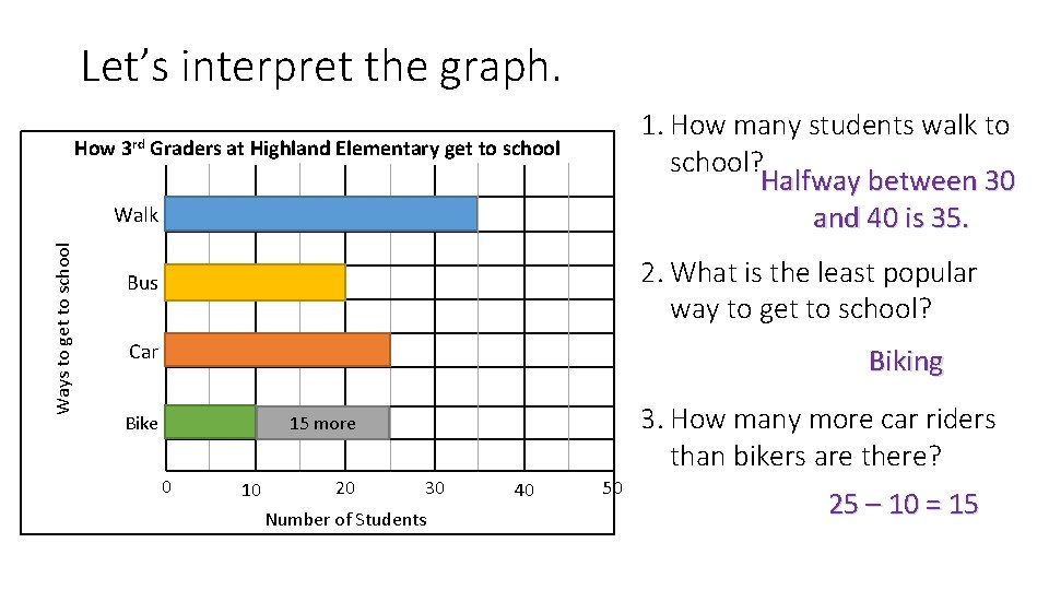
Let’s interpret the graph. 1. How many students walk to school? Halfway between 30 and 40 is 35. How 3 rd Graders at Highland Elementary get to school Ways to get to school Walk 2. What is the least popular way to get to school? Bus Car Biking 3. How many more car riders than bikers are there? 15 more Bike 0 10 20 30 Number of Students 40 50 25 – 10 = 15
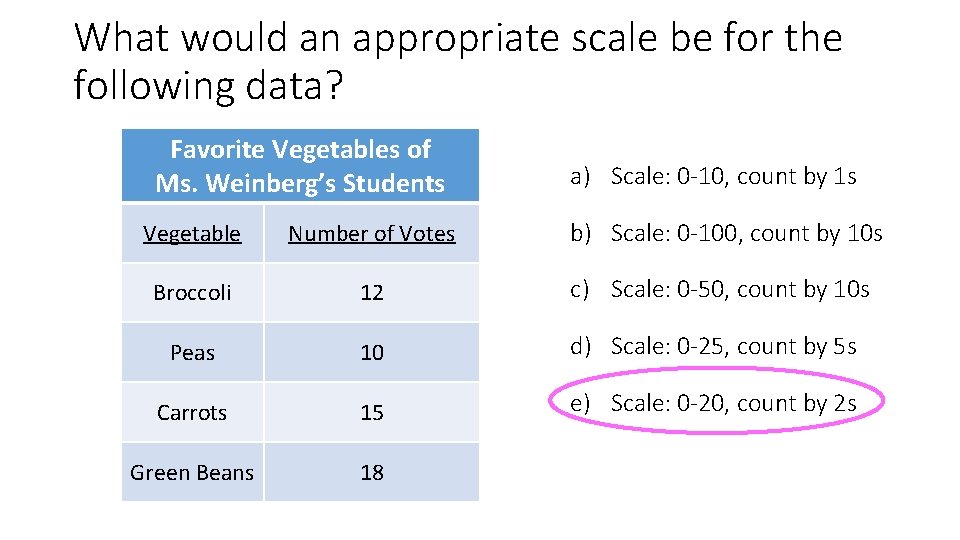
What would an appropriate scale be for the following data? Favorite Vegetables of Ms. Weinberg’s Students a) Scale: 0 -10, count by 1 s Vegetable Number of Votes b) Scale: 0 -100, count by 10 s Broccoli 12 c) Scale: 0 -50, count by 10 s Peas 10 d) Scale: 0 -25, count by 5 s Carrots 15 e) Scale: 0 -20, count by 2 s Green Beans 18
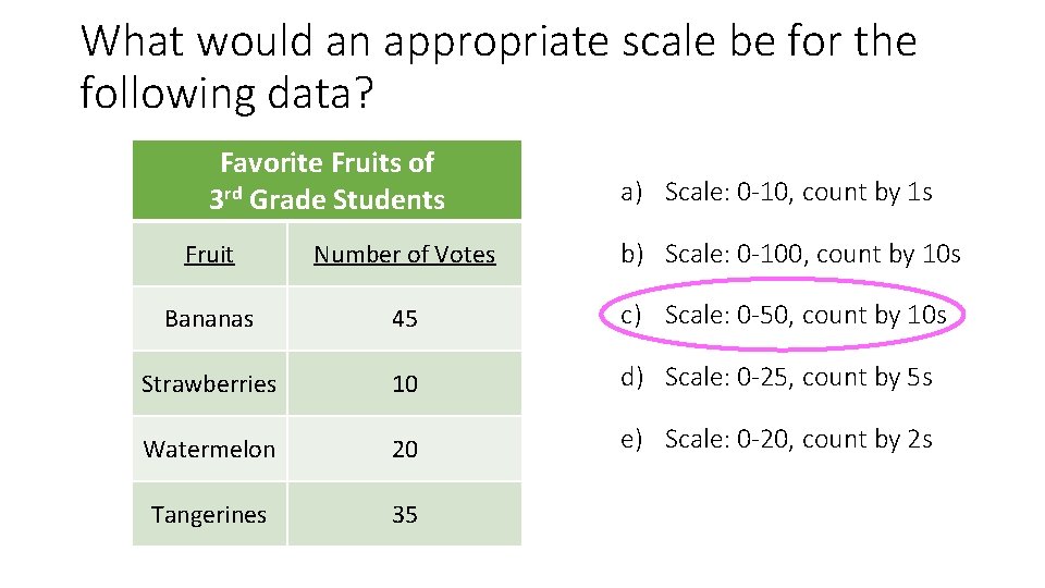
What would an appropriate scale be for the following data? Favorite Fruits of 3 rd Grade Students a) Scale: 0 -10, count by 1 s Fruit Number of Votes b) Scale: 0 -100, count by 10 s Bananas 45 c) Scale: 0 -50, count by 10 s Strawberries 10 d) Scale: 0 -25, count by 5 s Watermelon 20 e) Scale: 0 -20, count by 2 s Tangerines 35
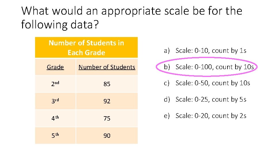
What would an appropriate scale be for the following data? Number of Students in Each Grade a) Scale: 0 -10, count by 1 s Grade Number of Students b) Scale: 0 -100, count by 10 s 2 nd 85 c) Scale: 0 -50, count by 10 s 3 rd 92 d) Scale: 0 -25, count by 5 s 4 th 75 e) Scale: 0 -20, count by 2 s 5 th 90
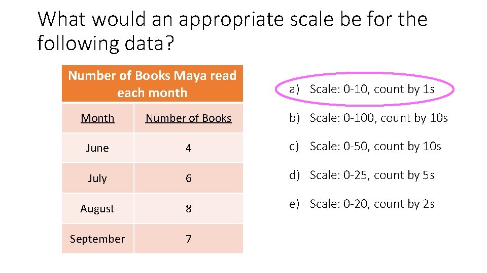
What would an appropriate scale be for the following data? Number of Books Maya read each month a) Scale: 0 -10, count by 1 s Month Number of Books b) Scale: 0 -100, count by 10 s June 4 c) Scale: 0 -50, count by 10 s July 6 d) Scale: 0 -25, count by 5 s August 8 e) Scale: 0 -20, count by 2 s September 7
Your Turn • Use your frequency table or your picture graph from earlier this week. • Turn it into a bar graph. • Use an appropriate scale (but always start at 0). • Write 3 observations about the data in your bar graph.

Wrap-Up • How is a bar graph like a picture graph? • How is a bar graph different from a picture graph? • What features of a bar graph help you to interpret it? • How do you know what an appropriate scale for your bar graph should be?
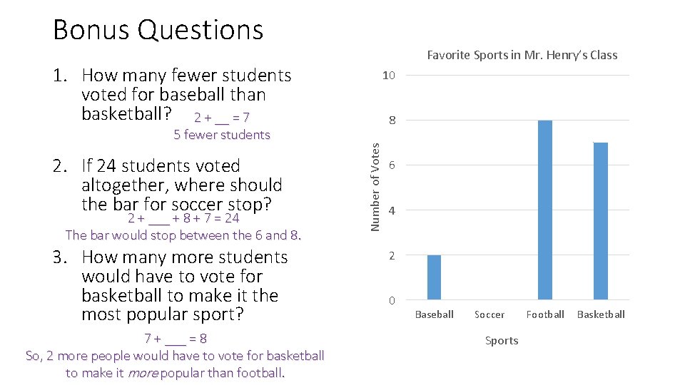
Bonus Questions Favorite Sports in Mr. Henry’s Class 1. How many fewer students voted for baseball than basketball? 2 + __ = 7 2. If 24 students voted altogether, where should the bar for soccer stop? 2 + ___ + 8 + 7 = 24 The bar would stop between the 6 and 8. 3. How many more students would have to vote for basketball to make it the most popular sport? 7 + ___ = 8 So, 2 more people would have to vote for basketball to make it more popular than football. 8 Number of Votes 5 fewer students 10 6 4 2 0 Baseball Soccer Sports Football Basketball
- Slides: 16