Magazines Analysis of two front cover magazines Nicki
- Slides: 3

Magazines Analysis of two front cover magazines

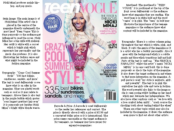
Nicki Minaj produces mainly hiphop, and pop music. Masthead: The masthead is ‘TEEN VOGUE’ it is positioned at the top of the front cover deliberately so the audience know what magazine they are reading. The word teen is in white bold and the word ‘vogue’ is in pink. The ‘teen’ in bold may illustrate the importance of the teenage magazine so the audience know what content will be included in the magazine. Main Image: The main image is of Nicki Minaj (The artist) she is placed in the centre of the magazine directly underneath the mast head ‘Teen Vogue 'This is done purposely so the audience get influenced to read the cover, Nicki Minaj has a big smile with makeup. Her outfit is white with a corset which is bright pink which represents her personality and the music she produces. It is also illustrating her fashion sense and what might be included in the fashion magazine. Typography: ‘Crazy Cool Summer Style!’ ‘ 335 best bikinis, sundresses, sandals, and more’ The text is used deliberately so we know what is on offer in the magazine. They use playful words such as cool as it may relate to teenagers. Above there is also text in the purple bubble which quotes ‘your longest prettiest hair ever’ It is purposely put besides Nicki Minaj’s bright white blonde weave. Barcode & Price: A barcode is used deliberately so the reader has references and contact. The price is directly above it with a price of £ 2. 99 and a converted dollar price as it is international. The price seems reasonable as the target audience is for teenagers, no teenager may have money for expensive magazines. Typography: There is a colour scheme going throughout the text which is white, pink, and black. It suits the genre of the magazine as it is a artist who has a bubbly personality. Also it goes with the background which is a subtle purple and blue which transitions half and half. Parts of the text is serif e. g. ‘The FIERCE & FABULOUS’ whilst the artist’s name ‘NICKI MINAJ’ is in sans-serif bold, this is done purposely as she is the topic of the magazine. It also draws the target audience in and where to find more information on the magazine. A pull quote is used “my style is euphoric, girly, and powerful”. The text is in pink this symbolises her girly side and taste in fashion. The word powerful also links to the image as she is seen posing whilst holding up her hand which may detonate her independence. We also have other captions such as ‘we love with a love symbol jaden smith’, ‘crash course the shocking truth about texting behind the wheel’ These are other topics which may also be included in the magazine, it draws the audience even more to find out about other artists.

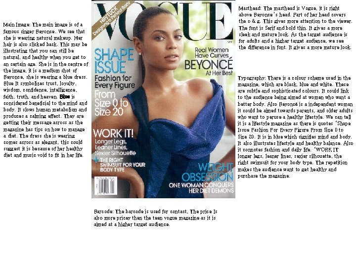
Masthead: The masthead is Vogue, it is right above Beyonce’s head. Part of her head covers the o & g. This gives more attention to the viewer. The font is Serif and bold thin. It gives a more sleek and mature look. As the target audience is for adults and a higher target audience, we see the difference in font. It gives a more mature look. Main Image: The main image is of a famous singer Beyonce. We see that she is wearing natural makeup. Her hair is also slicked back. This may be illustrating that you can still be natural, and healthy when you get to an certain age. She is in the centre of the image, it is a medium shot of Beyonce, she is wearing a blue dress. Blue It symbolizes trust, loyalty, wisdom, confidence, intelligence, faith, truth, and heaven. Blue is considered beneficial to the mind and body. It slows human metabolism and produces a calming effect. They are getting their message across as the magazine has tips on how to manage a diet. The dress she is wearing comes across as elegant, this could suggest it is because of her healthy diet and music void to fit in her life. Typography: There is a colour scheme used in the magazine, which are black, blue and white. These are subtle and sophisticated colours. It could link to the audience being aimed at women who want a better body. Also Beyoncé is a independent woman it could be aimed towards parents, and older adults who want to peruse a healthy lifestyle. We can tell it is a lifestyle magazine as there is quotes ‘Shape Issue Fashion For Every Figure From Size 0 to Size 20. It is in blue which signifies mind and body. It also illustrates lifestyle and healthy balance. Also it connotes fashion and daily life. ‘WORK IT longer legs, leaner lines, sexier silhouette, the right swimsuit for your body type. The repetition makes the audience want to get healthy and purchase the magazine. Barcode: The barcode is used for contact, The price Is also more pricey then the teen vogue magazine as it is aimed at a higher target audience.