MAGAZINE FRONT COVER EVALUATION This is the front
- Slides: 6

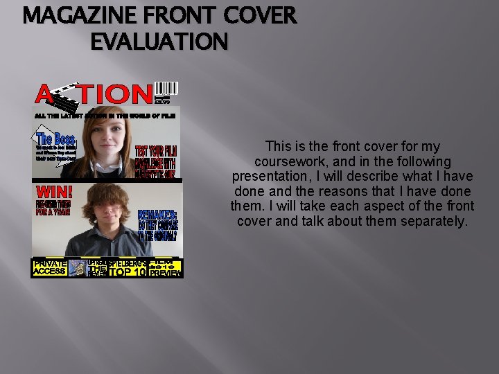
MAGAZINE FRONT COVER EVALUATION This is the front cover for my coursework, and in the following presentation, I will describe what I have done and the reasons that I have done them. I will take each aspect of the front cover and talk about them separately.

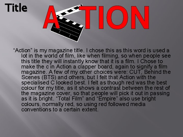
Title “Action” is my magazine title. I chose this as this word is used a lot in the world of film, like when filming, so when people see this title they will instantly know that it is a film. I Chose to make the c in Action a clapper board, again to signify a film magazine. A few of my other choices were: CUT, Behind the Scenes (BTS) and others, but I felt that Action with the specialised C looked best. I felt as though red was the best colour for my title, as it shows a contrast between the rest of the magazine cover, so that people will pick it out in passing as it is bright. “Total Film” and “Empire” also use bright colours, normally red, so using red followed media conventions to a certain extent.

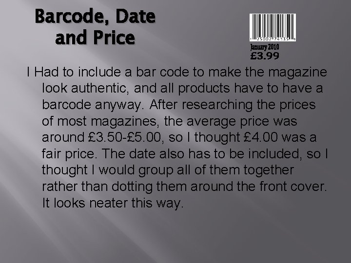
Barcode, Date and Price I Had to include a bar code to make the magazine look authentic, and all products have to have a barcode anyway. After researching the prices of most magazines, the average price was around £ 3. 50 -£ 5. 00, so I thought £ 4. 00 was a fair price. The date also has to be included, so I thought I would group all of them together rather than dotting them around the front cover. It looks neater this way.

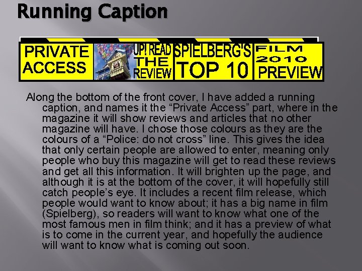
Running Caption Along the bottom of the front cover, I have added a running caption, and names it the “Private Access” part, where in the magazine it will show reviews and articles that no other magazine will have. I chose those colours as they are the colours of a “Police: do not cross” line. This gives the idea that only certain people are allowed to enter, meaning only people who buy this magazine will get to read these reviews and get all this information. It will brighten up the page, and although it is at the bottom of the cover, it will hopefully still catch people’s eye. It includes a recent film release, which people would want to know about; it has a big name in film (Spielberg), so readers will want to know what one of the most famous men in film think; and it has a preview of what is to come in the current year, and hopefully the audience will want to know what is coming out soon.

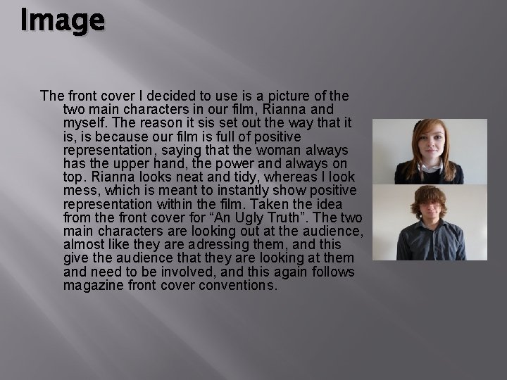
Image The front cover I decided to use is a picture of the two main characters in our film, Rianna and myself. The reason it sis set out the way that it is, is because our film is full of positive representation, saying that the woman always has the upper hand, the power and always on top. Rianna looks neat and tidy, whereas I look mess, which is meant to instantly show positive representation within the film. Taken the idea from the front cover for “An Ugly Truth”. The two main characters are looking out at the audience, almost like they are adressing them, and this give the audience that they are looking at them and need to be involved, and this again follows magazine front cover conventions.

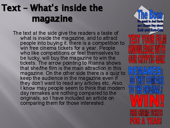
Text – What’s inside the magazine The text at the side give the readers a taste of what is inside the magazine, and to attract people into buying it, there is a competition to win free cinema tickets for a year. People who like competitions or feel themselves to be lucky, will buy the magazine to win the tickets. The arrow pointing to Rianna shows that she/the film is the main attraction in this magazine. On the other side there is a quiz to keep the audience in the magazine even if they don’t want to read any articles etc. Also, I know may people seem to think that modern day remakes are nothing compared to the originals, so I have included an article on comparing them for those interested.