Magazine Analysis By Chloe Layout of the Magazine
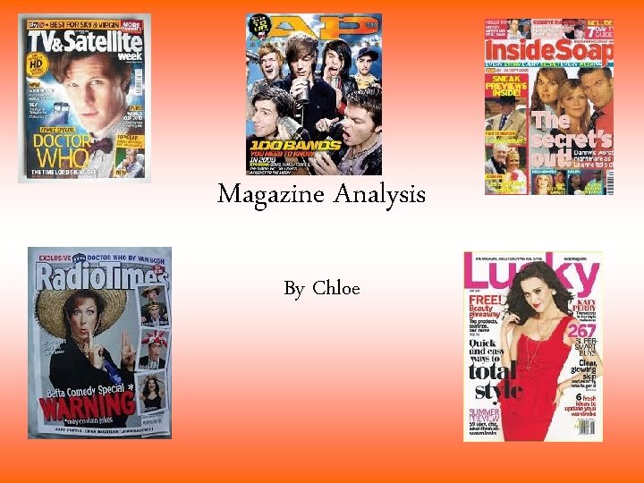
Magazine Analysis By Chloe
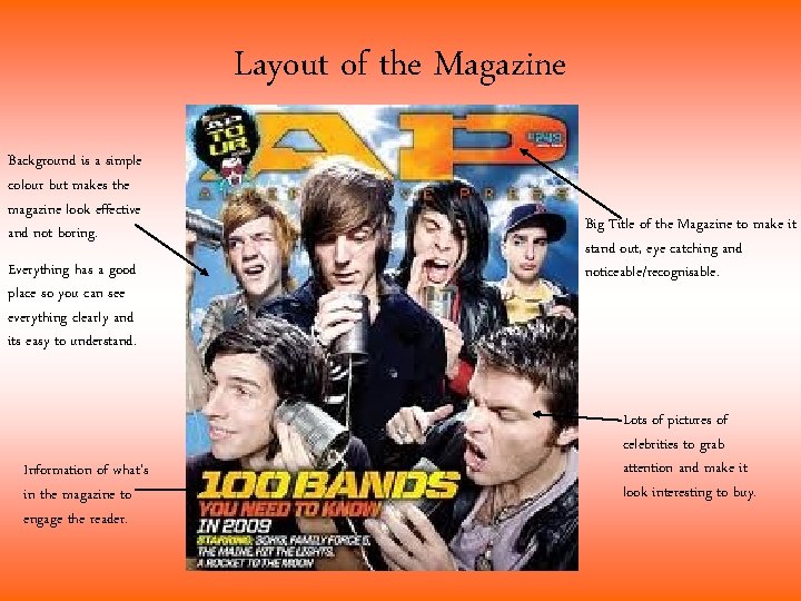
Layout of the Magazine Background is a simple colour but makes the magazine look effective and not boring. Everything has a good place so you can see everything clearly and its easy to understand. Information of what’s in the magazine to engage the reader. Big Title of the Magazine to make it stand out, eye catching and noticeable/recognisable. Lots of pictures of celebrities to grab attention and make it look interesting to buy.
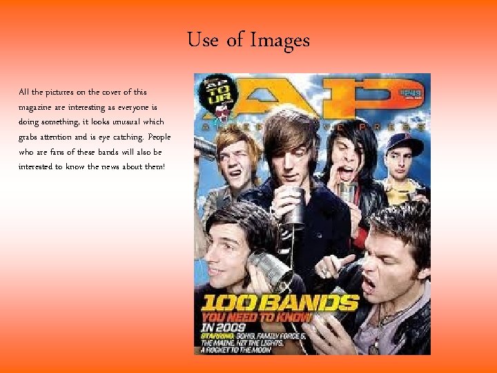
Use of Images All the pictures on the cover of this magazine are interesting as everyone is doing something, it looks unusual which grabs attention and is eye catching. People who are fans of these bands will also be interested to know the news about them!
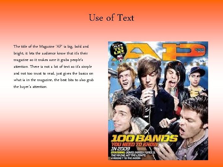
Use of Text The title of the Magazine ‘AP’ is big, bold and bright, it lets the audience know that it’s their magazine so it makes sure it grabs people’s attention. There is not a lot of text so it’s simple and not too must to read, just gives the basics on what is in the magazine, the best bits to also grab the buyer’s attention.
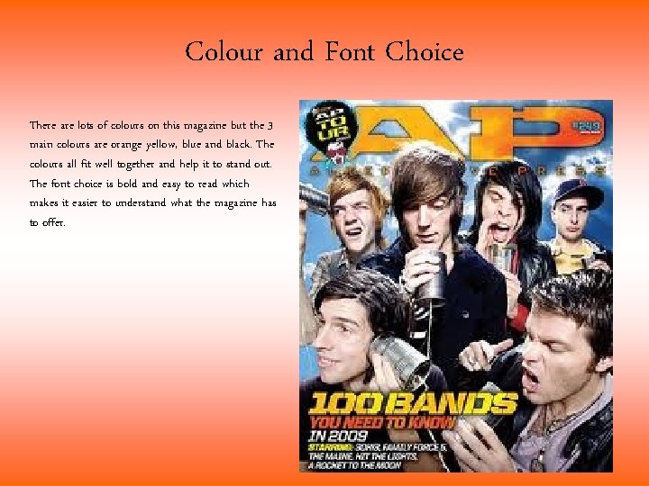
Colour and Font Choice There are lots of colours on this magazine but the 3 main colours are orange yellow, blue and black. The colours all fit well together and help it to stand out. The font choice is bold and easy to read which makes it easier to understand what the magazine has to offer.
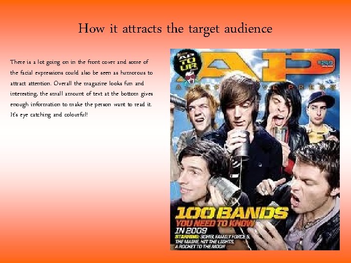
How it attracts the target audience There is a lot going on in the front cover and some of the facial expressions could also be seen as humorous to attract attention. Overall the magazine looks fun and interesting, the small amount of text at the bottom gives enough information to make the person want to read it. It’s eye catching and colourful!
- Slides: 6