LIS 650 lecture 2 Major CSS Thomas Krichel


- Slides: 59

LIS 650 lecture 2 Major CSS Thomas Krichel 2006 -02 -17

today • • • Introduction to style sheets How to give style sheet data Basic CSS selectors Some important properties Some less important properties

style sheets • Style sheets are the officially sanctioned way to add style to your document • We will cover Cascading Style Sheets CSS. • This is the default style sheet language. • We are discussing version 2. 1. This is not yet a W 3 C recommendation, but it is in last call. • You can read all about it at http: //www. w 3. org/TR/CSS 21/

what is in a style sheet? • A style sheet is a sequence of style rules. • In the sheet, one rule follows the other. There is no nesting of rules. • Therefore the way rules are written in a style sheet is much simpler than the way elements are written in XML. • Remember that in XML we have nesting of elements.

what is a style rule about? • It is about two or three things – Where to find what to style? – How style it? --> selector • Which property to set? --> property name • Which value to give to the property? --> property value • In this lecture I will use the following syntax – Write property names as {property-name: } – Write property values as ‘value’

why are they “cascading”? • You can have many style sheet in different places. Style sheets comes in the form of rules: “at this place, do that”. • Where there are many rules, there is potential for conflict. We do not learn the exact rules here but note – Some rules are read after others other. Later rules override earlier rules. – Some rules concern more specific locations than others. The specific rules override general rules.

in-element style • You can add a style= attribute to any element that admits the core attributes as in <element style="style">. . <element> where style is a style sheet. There is no selector. • Example: <h 1 style="color: blue">I am so blue</h 1> • Such a declaration only takes effect for the element concerned. • I do not recommend this.

document level style • You can add a <style> element as child of the <head>. The style sheet is the contents of <style> <head><style> stylesheet </style></head> • <style> takes the core attributes. • It takes a type= attribute, "text/css" is the default value. • It takes the media= attribute for the intended media. This attribute allows you to set write different styles for different media. See later slide.

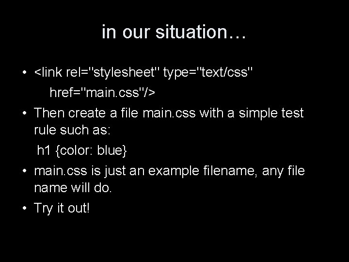
linking to an external style sheet • This is the best way! Use the same style sheet file for all the pages in your site, by adding to every pages something like • <link rel="stylesheet" type="text/css" href="URI"/> where URI is a URI where the style sheet is to be downloaded from. On wotan, this can just be the file name. • type= and href= are required attributes here. • Example: <link rel="stylesheet" type="text/css" href="http: //openlib. org/home/krichel. css">

in our situation… • <link rel="stylesheet" type="text/css" href="main. css"/> • Then create a file main. css with a simple test rule such as: h 1 {color: blue} • main. css is just an example filename, any file name will do. • Try it out!

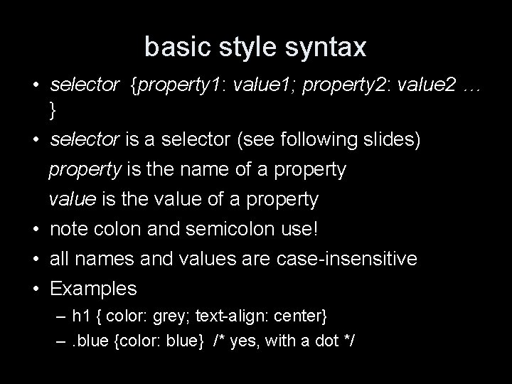
basic style syntax • selector {property 1: value 1; property 2: value 2 … } • selector is a selector (see following slides) property is the name of a property value is the value of a property • note colon and semicolon use! • all names and values are case-insensitive • Examples – h 1 { color: grey; text-align: center} –. blue {color: blue} /* yes, with a dot */

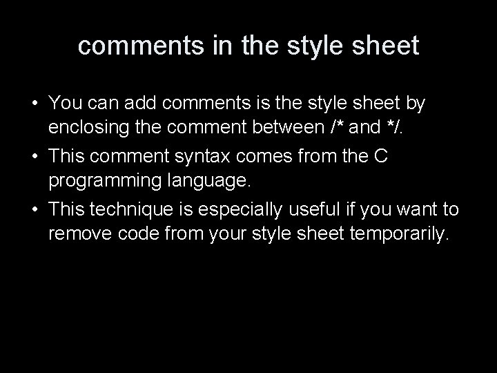
comments in the style sheet • You can add comments is the style sheet by enclosing the comment between /* and */. • This comment syntax comes from the C programming language. • This technique is especially useful if you want to remove code from your style sheet temporarily.

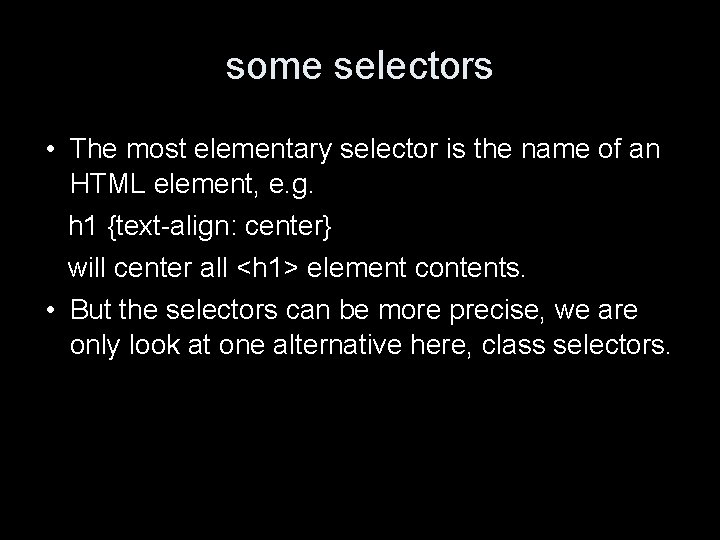
some selectors • The most elementary selector is the name of an HTML element, e. g. h 1 {text-align: center} will center all <h 1> element contents. • But the selectors can be more precise, we are only look at one alternative here, class selectors.

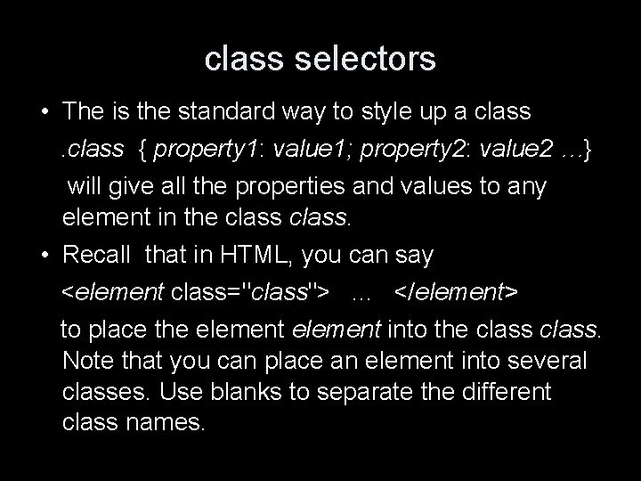
class selectors • The is the standard way to style up a class { property 1: value 1; property 2: value 2 …} will give all the properties and values to any element in the class. • Recall that in HTML, you can say <element class="class">. . . </element> to place the element into the class. Note that you can place an element into several classes. Use blanks to separate the different class names.

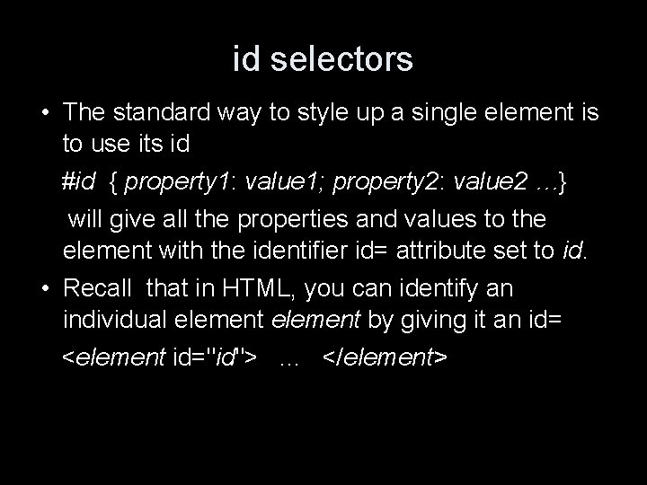
id selectors • The standard way to style up a single element is to use its id #id { property 1: value 1; property 2: value 2 …} will give all the properties and values to the element with the identifier id= attribute set to id. • Recall that in HTML, you can identify an individual element by giving it an id= <element id="id">. . . </element>

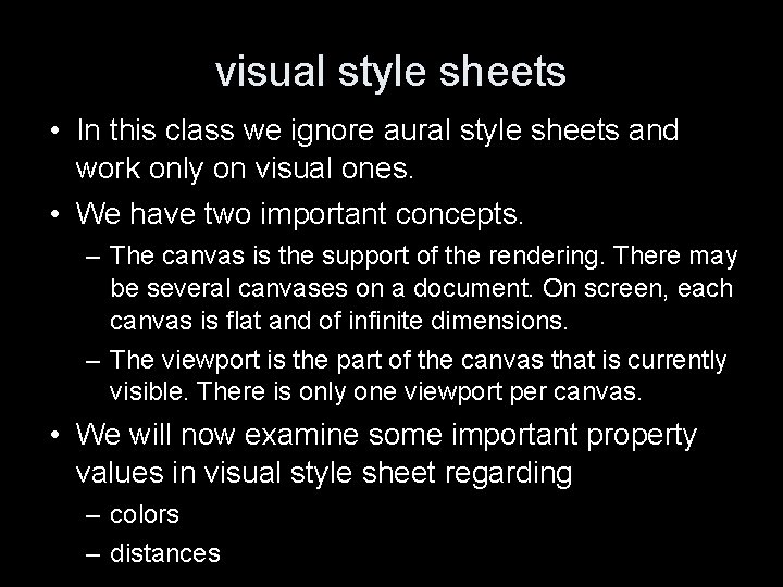
visual style sheets • In this class we ignore aural style sheets and work only on visual ones. • We have two important concepts. – The canvas is the support of the rendering. There may be several canvases on a document. On screen, each canvas is flat and of infinite dimensions. – The viewport is the part of the canvas that is currently visible. There is only one viewport per canvas. • We will now examine some important property values in visual style sheet regarding – colors – distances

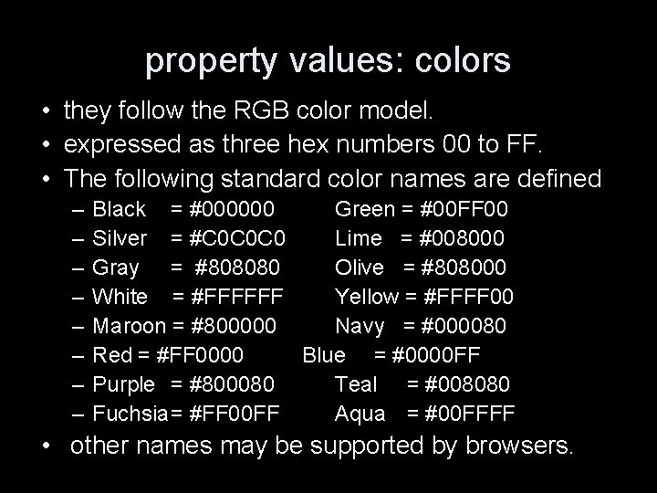
property values: colors • they follow the RGB color model. • expressed as three hex numbers 00 to FF. • The following standard color names are defined – – – – Black = #000000 Green = #00 FF 00 Silver = #C 0 C 0 C 0 Lime = #008000 Gray = #808080 Olive = #808000 White = #FFFFFF Yellow = #FFFF 00 Maroon = #800000 Navy = #000080 Red = #FF 0000 Blue = #0000 FF Purple = #800080 Teal = #008080 Fuchsia= #FF 00 FF Aqua = #00 FFFF • other names may be supported by browsers.

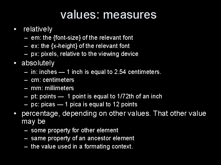
values: measures • relatively – em: the {font-size} of the relevant font – ex: the {x-height} of the relevant font – px: pixels, relative to the viewing device • absolutely – – – in: inches — 1 inch is equal to 2. 54 centimeters. cm: centimeters mm: millimeters pt: points — 1 point is equal to 1/72 th of an inch pc: picas — 1 pica is equal to 12 points • percentage, depending on other values. That other value may be – some property for other element – same property of an ancestor element – the value used in a formating context.

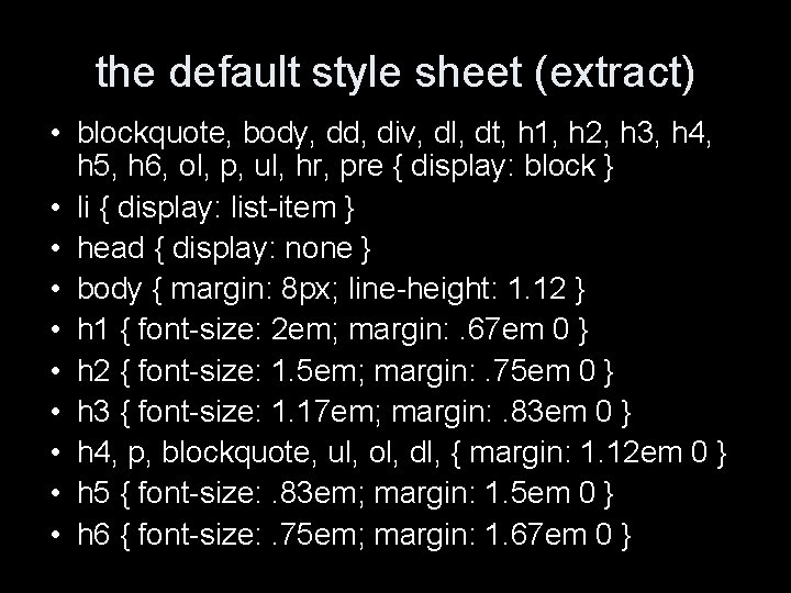
the default style sheet (extract) • blockquote, body, dd, div, dl, dt, h 1, h 2, h 3, h 4, h 5, h 6, ol, p, ul, hr, pre { display: block } • li { display: list-item } • head { display: none } • body { margin: 8 px; line-height: 1. 12 } • h 1 { font-size: 2 em; margin: . 67 em 0 } • h 2 { font-size: 1. 5 em; margin: . 75 em 0 } • h 3 { font-size: 1. 17 em; margin: . 83 em 0 } • h 4, p, blockquote, ul, ol, dl, { margin: 1. 12 em 0 } • h 5 { font-size: . 83 em; margin: 1. 5 em 0 } • h 6 { font-size: . 75 em; margin: 1. 67 em 0 }

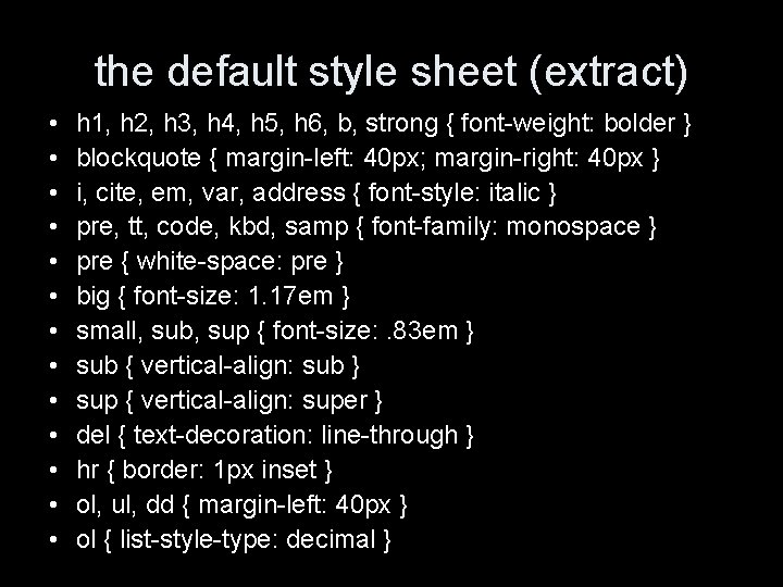
the default style sheet (extract) • • • • h 1, h 2, h 3, h 4, h 5, h 6, b, strong { font-weight: bolder } blockquote { margin-left: 40 px; margin-right: 40 px } i, cite, em, var, address { font-style: italic } pre, tt, code, kbd, samp { font-family: monospace } pre { white-space: pre } big { font-size: 1. 17 em } small, sub, sup { font-size: . 83 em } sub { vertical-align: sub } sup { vertical-align: super } del { text-decoration: line-through } hr { border: 1 px inset } ol, ul, dd { margin-left: 40 px } ol { list-style-type: decimal }

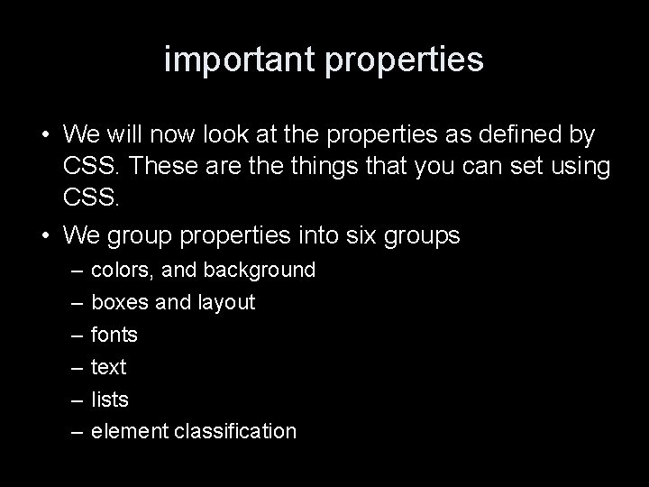
important properties • We will now look at the properties as defined by CSS. These are things that you can set using CSS. • We group properties into six groups – – – colors, and background boxes and layout fonts text lists element classification

color & background properties • {color: } sets the foreground color of an element. • {background-color: } gives the color of the background • {background-image: url(URI) } places a picture found at a URI. • {background-repeat: } can take the value ‘repeat’ (default), ‘repeat-x’, ‘repeat-y’, and ‘no-repeat’. • {background-attachment: } can take the value of ‘fixed’ or ‘scroll’ (default) to say if the image scrolls with the viewport.

color & background properties II • {background-position: } property places the background image. It can take values – – '0% 0%' to '100%' 'length' to put length of offset from top left mixing both is allowed ‘top’, ‘center’, ‘bottom’ and ‘left’, ‘right’, ‘center’ can be used too

normal flow • In general, every piece of HTML is placed into a conceptual thingy called a box. • In visual formatting, we can think about the box as a rectangle that fills the material that is being visualized. – For text-level elements, boxes are set horizontally next to each other. – For block-level elements, boxes are set vertically next to each other.

the box model • The total width that the box occupies is the sum of – – the left and right margin the left and right border width the left and right padding the width of the box‘s contents • The margin concept here is the same as the “spacing” in the tables. • A similar reasoning holds for the height that the box occupies.

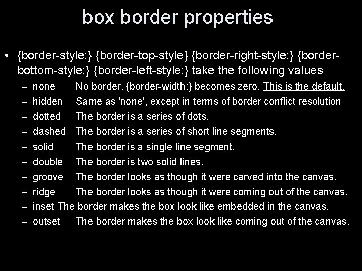
box border properties • {border-style: } {border-top-style} {border-right-style: } {borderbottom-style: } {border-left-style: } take the following values – – – – – none No border. {border-width: } becomes zero. This is the default. hidden Same as 'none', except in terms of border conflict resolution dotted The border is a series of dots. dashed The border is a series of short line segments. solid The border is a single line segment. double The border is two solid lines. groove The border looks as though it were carved into the canvas. ridge The border looks as though it were coming out of the canvas. inset The border makes the box look like embedded in the canvas. outset The border makes the box look like coming out of the canvas.

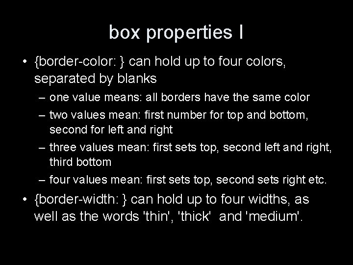
box properties I • {border-color: } can hold up to four colors, separated by blanks – one value means: all borders have the same color – two values mean: first number for top and bottom, second for left and right – three values mean: first sets top, second left and right, third bottom – four values mean: first sets top, second sets right etc. • {border-width: } can hold up to four widths, as well as the words 'thin', 'thick' and 'medium'.

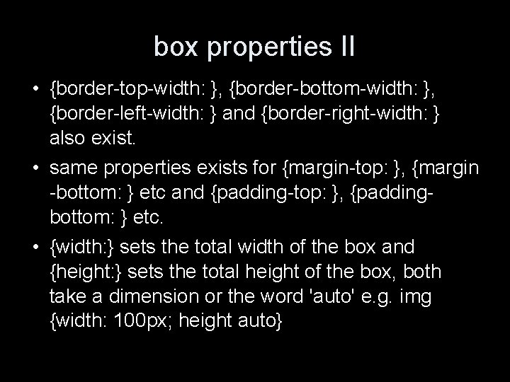
box properties II • {border-top-width: }, {border-bottom-width: }, {border-left-width: } and {border-right-width: } also exist. • same properties exists for {margin-top: }, {margin -bottom: } etc and {padding-top: }, {paddingbottom: } etc. • {width: } sets the total width of the box and {height: } sets the total height of the box, both take a dimension or the word 'auto' e. g. img {width: 100 px; height auto}

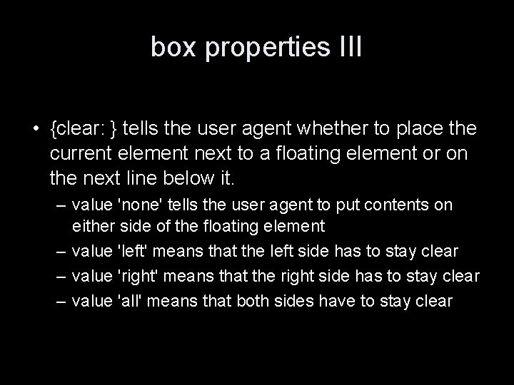
box properties III • {clear: } tells the user agent whether to place the current element next to a floating element or on the next line below it. – value 'none' tells the user agent to put contents on either side of the floating element – value 'left' means that the left side has to stay clear – value 'right' means that the right side has to stay clear – value 'all' means that both sides have to stay clear

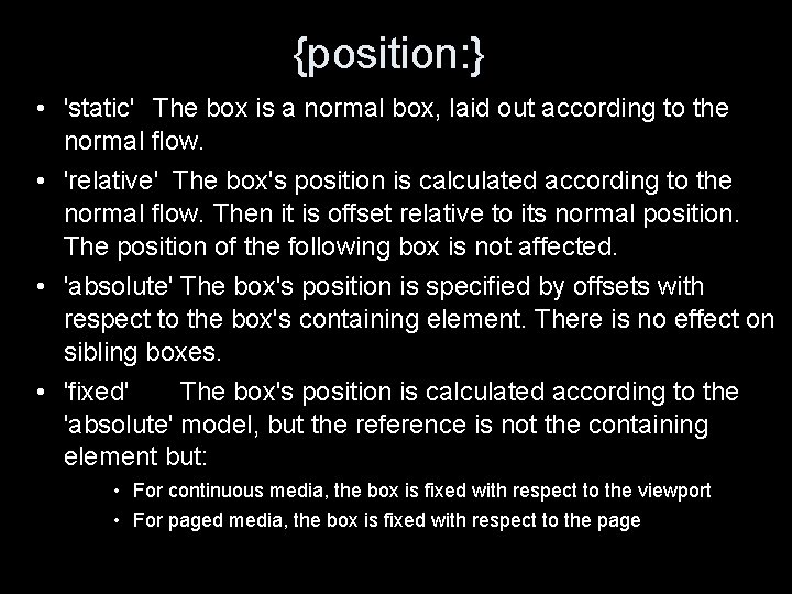
{position: } • 'static' The box is a normal box, laid out according to the normal flow. • 'relative' The box's position is calculated according to the normal flow. Then it is offset relative to its normal position. The position of the following box is not affected. • 'absolute' The box's position is specified by offsets with respect to the box's containing element. There is no effect on sibling boxes. • 'fixed' The box's position is calculated according to the 'absolute' model, but the reference is not the containing element but: • For continuous media, the box is fixed with respect to the viewport • For paged media, the box is fixed with respect to the page

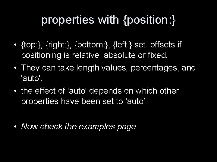
properties with {position: } • {top: }, {right: }, {bottom: }, {left: } set offsets if positioning is relative, absolute or fixed. • They can take length values, percentages, and 'auto'. • the effect of 'auto' depends on which other properties have been set to 'auto‘ • Now check the examples page.

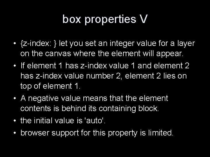
box properties V • {z-index: } let you set an integer value for a layer on the canvas where the element will appear. • If element 1 has z-index value 1 and element 2 has z-index value number 2, element 2 lies on top of element 1. • A negative value means that the element contents is behind its containing block. • the initial value is 'auto'. • browser support for this property is limited.

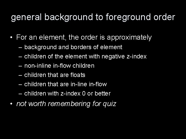
general background to foreground order • For an element, the order is approximately – – – background and borders of element children of the element with negative z-index non-inline in-flow children that are floats children that are in-line in-flow children with z-index 0 or better • not worth remembering for quiz

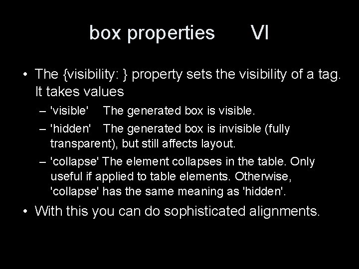
box properties VI • The {visibility: } property sets the visibility of a tag. It takes values – 'visible' The generated box is visible. – 'hidden' The generated box is invisible (fully transparent), but still affects layout. – 'collapse' The element collapses in the table. Only useful if applied to table elements. Otherwise, 'collapse' has the same meaning as 'hidden'. • With this you can do sophisticated alignments.

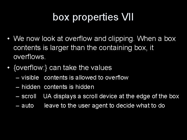
box properties VII • We now look at overflow and clipping. When a box contents is larger than the containing box, it overflows. • {overflow: } can take the values – – visible hidden scroll auto contents is allowed to overflow contents is hidden UA displays a scroll device at the edge of the box leave to the user agent to decide what to do

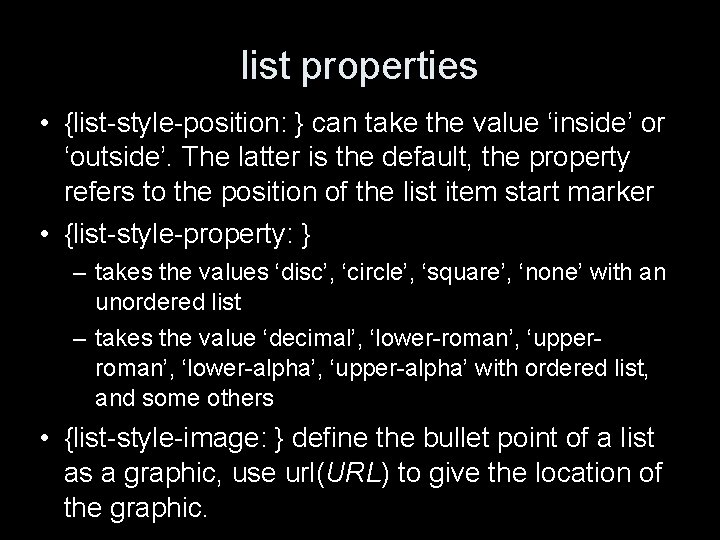
list properties • {list-style-position: } can take the value ‘inside’ or ‘outside’. The latter is the default, the property refers to the position of the list item start marker • {list-style-property: } – takes the values ‘disc’, ‘circle’, ‘square’, ‘none’ with an unordered list – takes the value ‘decimal’, ‘lower-roman’, ‘upperroman’, ‘lower-alpha’, ‘upper-alpha’ with ordered list, and some others • {list-style-image: } define the bullet point of a list as a graphic, use url(URL) to give the location of the graphic.

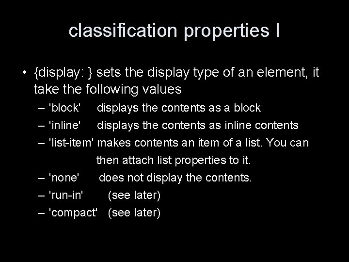
classification properties I • {display: } sets the display type of an element, it take the following values – 'block' displays the contents as a block – 'inline' displays the contents as inline contents – 'list-item' makes contents an item of a list. You can then attach list properties to it. – 'none' does not display the contents. – 'run-in' (see later) – 'compact' (see later)

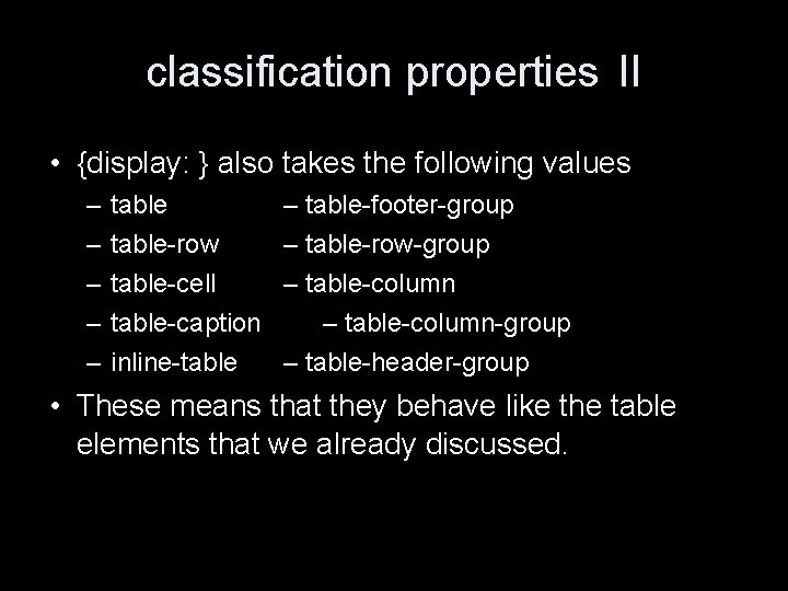
classification properties II • {display: } also takes the following values – – – table-row table-cell table-caption inline-table – table-footer-group – table-row-group – table-column-group – table-header-group • These means that they behave like the table elements that we already discussed.

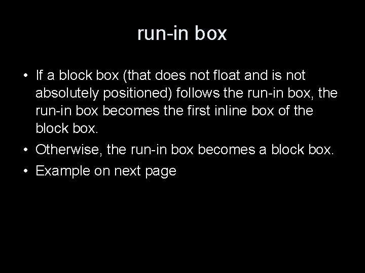
run-in box • If a block box (that does not float and is not absolutely positioned) follows the run-in box, the run-in box becomes the first inline box of the block box. • Otherwise, the run-in box becomes a block box. • Example on next page

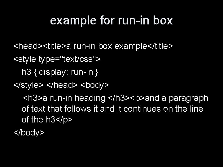
example for run-in box <head><title>a run-in box example</title> <style type="text/css"> h 3 { display: run-in } </style> </head> <body> <h 3>a run-in heading </h 3><p>and a paragraph of text that follows it and it continues on the line of the h 3</p> </body>

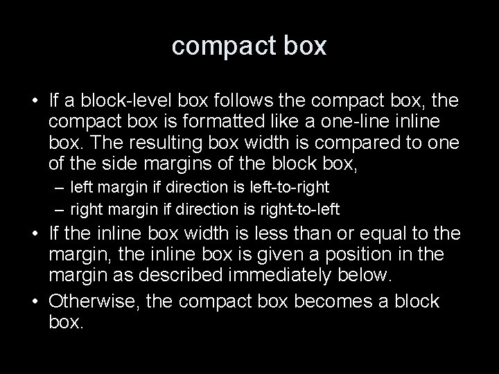
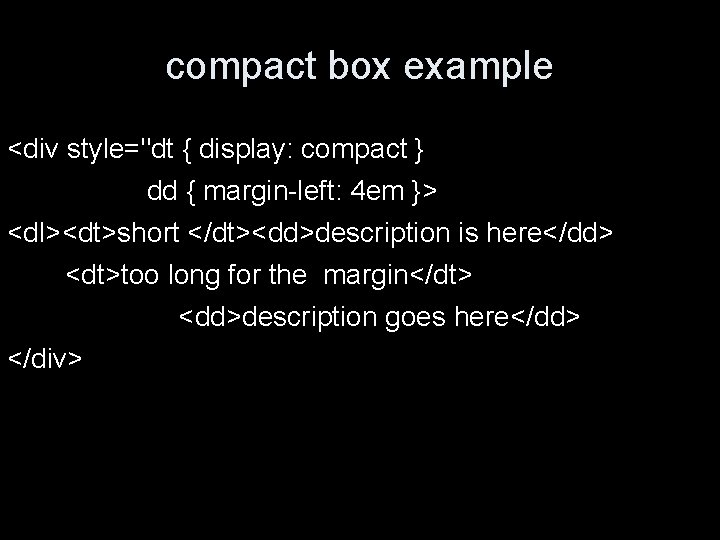
compact box • If a block-level box follows the compact box, the compact box is formatted like a one-line inline box. The resulting box width is compared to one of the side margins of the block box, – left margin if direction is left-to-right – right margin if direction is right-to-left • If the inline box width is less than or equal to the margin, the inline box is given a position in the margin as described immediately below. • Otherwise, the compact box becomes a block box.

compact box example <div style="dt { display: compact } dd { margin-left: 4 em }> <dl><dt>short </dt><dd>description is here</dd> <dt>too long for the margin</dt> <dd>description goes here</dd> </div>

classification properties III • The {whitespace: } property controls the display of white space in a block level tag. – 'normal' collapses white space – 'pre' value similar to <pre> tag – 'nowrap' ignores carriage returns only • It seemed not to work in firefox last time I tried.

text properties I • {letter-spacing: } set the spacing between letters, takes a length value or the word 'normal' • {word-spacing: } same as for letter-spacing • {line-height: } sets the distance between several lines of an element's contents, – in pt or pixel numbers – % age (referring to a percentage of current font size) – with a number (referring to a multiplicity of the size of the text) – 'normal'

text properties II • {text-align: } can take the values ‘left’ ‘right’ ‘center’ and ‘justify’. • {text-decoration: } can take the values ‘underline’, ‘overline’, ‘line-through’ and ‘blink’. • {text-indent: }, {margin-left: } take length units but are best expressed in the relative "em" unit. • {vertical-align: } can take the values ‘baseline’, ‘middle’, ‘sub’, ‘super’, ‘text-top’, ‘text-bottom’, ‘top’, ‘bottom’, as well as percentages. • {text-transform: } can take the value ‘uppercase’, ‘lowercase’, ‘capitalize’ and ‘none’.

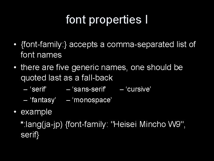
font properties I • {font-family: } accepts a comma-separated list of font names • there are five generic names, one should be quoted last as a fall-back – ‘serif’ – ‘fantasy’ – ‘sans-serif’ – ‘monospace’ – ‘cursive’ • example *: lang(ja-jp) {font-family: "Heisei Mincho W 9", serif}

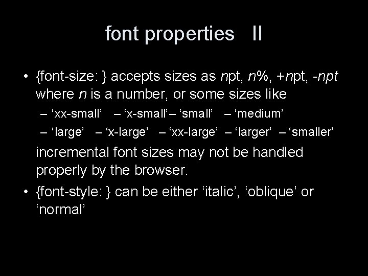
font properties II • {font-size: } accepts sizes as npt, n%, +npt, -npt where n is a number, or some sizes like – ‘xx-small’ – ‘x-small’– ‘small’ – ‘medium’ – ‘large’ – ‘x-large’ – ‘xx-large’ – ‘larger’ – ‘smaller’ incremental font sizes may not be handled properly by the browser. • {font-style: } can be either ‘italic’, ‘oblique’ or ‘normal’

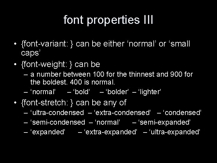
font properties III • {font-variant: } can be either ‘normal’ or ‘small caps’ • {font-weight: } can be – a number between 100 for the thinnest and 900 for the boldest. 400 is normal. – ‘normal’ – ‘bolder’ – ‘lighter’ • {font-stretch: } can be any of – ‘ultra-condensed – ‘extra-condensed’ – ‘semi-condensed – ‘normal’ – ‘semi-expanded’ – ‘extra-expanded’ – ‘ultra-expanded’

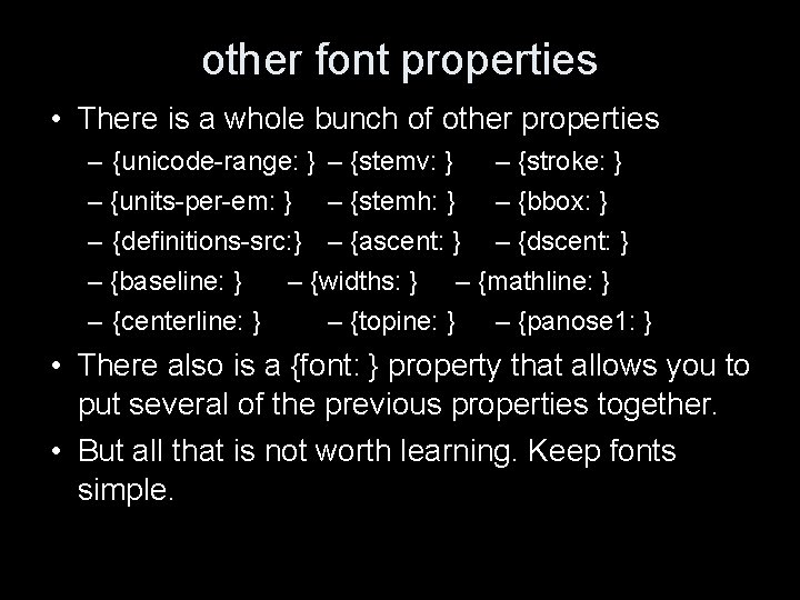
other font properties • There is a whole bunch of other properties – {unicode-range: } – {stemv: } – {stroke: } – {units-per-em: } – {stemh: } – {bbox: } – {definitions-src: } – {ascent: } – {dscent: } – {baseline: } – {widths: } – {mathline: } – {centerline: } – {topine: } – {panose 1: } • There also is a {font: } property that allows you to put several of the previous properties together. • But all that is not worth learning. Keep fonts simple.

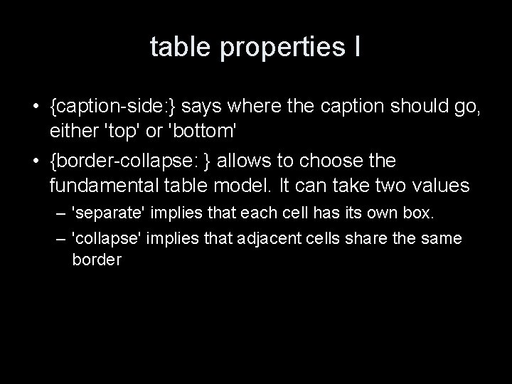
table properties I • {caption-side: } says where the caption should go, either 'top' or 'bottom' • {border-collapse: } allows to choose the fundamental table model. It can take two values – 'separate' implies that each cell has its own box. – 'collapse' implies that adjacent cells share the same border

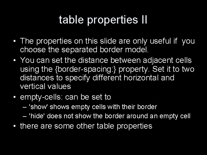
table properties II • The properties on this slide are only useful if you choose the separated border model. • You can set the distance between adjacent cells using the {border-spacing: } property. Set it to two distances to specify different horizontal and vertical values • empty-cells: can be set to – 'show' shows empty cells with their border – 'hide' does not show the border around an empty cell • there are some other table properties

Lesk in HTML/CSS • I have struggled to reproduce the Lesk tables in the examples area. • It is at doc/examples after the directory of the course home page. • You can see a version with CSS and a version without CSS.

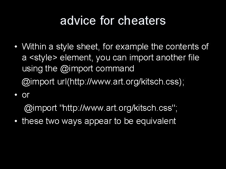
advice for cheaters • Within a style sheet, for example the contents of a <style> element, you can import another file using the @import command @import url(http: //www. art. org/kitsch. css); • or @import "http: //www. art. org/kitsch. css"; • these two ways appear to be equivalent

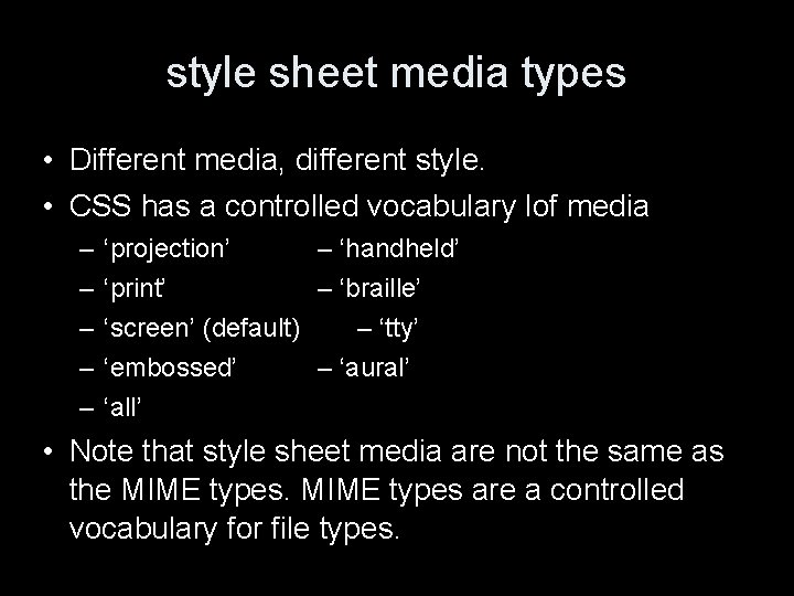
style sheet media types • Different media, different style. • CSS has a controlled vocabulary lof media – – – ‘projection’ – ‘handheld’ ‘print’ – ‘braille’ ‘screen’ (default) – ‘tty’ ‘embossed’ – ‘aural’ ‘all’ • Note that style sheet media are not the same as the MIME types are a controlled vocabulary for file types.

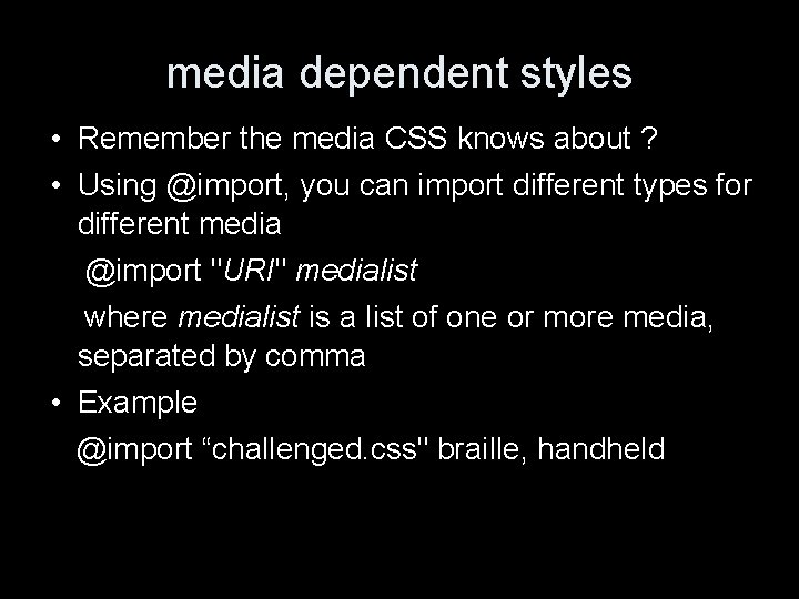
media dependent styles • Remember the media CSS knows about ? • Using @import, you can import different types for different media @import "URI" medialist where medialist is a list of one or more media, separated by comma • Example @import “challenged. css" braille, handheld

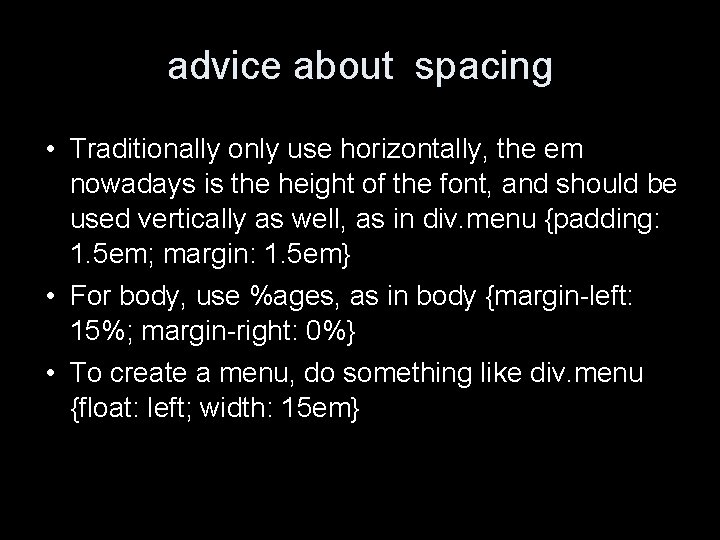
advice about spacing • Traditionally only use horizontally, the em nowadays is the height of the font, and should be used vertically as well, as in div. menu {padding: 1. 5 em; margin: 1. 5 em} • For body, use %ages, as in body {margin-left: 15%; margin-right: 0%} • To create a menu, do something like div. menu {float: left; width: 15 em}

the 'inherit' value • Each property can have the 'inherit' value. In this case, the value of the property for the element is determined by the containing element. • Sometimes, 'inherit' is the default value.

validating CSS • It is at http: //jigsaw. w 3. org/css-validator/ • Check your style sheet there when you wonder why the damn thing does not work. • Note that checking the style sheet will not be part of the assessment of the web site.

http: //openlib. org/home/krichel Thank you for your attention!